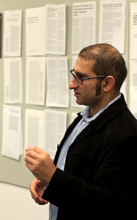
Earlier in the year Reading alumnus Adi Stern, now the Head of the Visual Communication department at Bezalel Academy of Art and Design, invited Gerry Leonidas to give two lectures and work with students of the academy. One lecture was for a wide audience in the academy and visitors (entitled “Where is type now?”) and one for the annual staff meeting of the Academy, on the approach taken at Reading in integrating research and teaching in design. Haaretz reporter Yuval Saar interviewed Gerry during the trip, and the interview is now online (in Hebrew).
Author: Test User
MATD project work in Instapaper

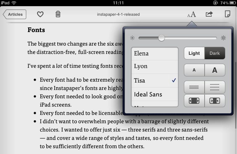
The latest update to Instapaper (AppleStore link) includes six new typefaces, including two that started as MATD student projects: FF Tisa by Mitja Miklavčič (2006) and Elena by Nicole Dotin (2007). Instapaper, a 4+ rated app, allows the user to collect content for reading in a highly user-friendly environment on an iPhone, iPad, or a personal computer. Extended commentary (and an image of Elena on the iPad) over at Typenotes.
A word (in your eye) from Ken Garland
Photographer, typographer, author, and teacher Ken Garland will be visiting the Department on Wednesday 14 March to talk at 2pm in the Madejski theatre, Agriculture.
You can see some of his archive of design work at www.kengarland.co.uk
Greek typography and typeface design in New York

Five years after the first Greek Week-End in New York, Gerry Leonidas will return to the TDC. Already in 2007 Greek was becoming a central part of most large typeface projects, especially international branding applications. In the intervening years Greek has become a key aspect of professional designers’ skills, and a regular expectation in job postings. Just as importantly, Greek represents a particularly rewarding challenge for designers, combining a long and complex development with a relatively wide space for designers to experiment. The two-and-a-half day workshop will start with a hands-on research session, and include seminars on aspects of Greek typeface design, in-depth reviews of reference contemporary typefaces, and design critiques of work by the participants.
Gerry will also deliver a lecture at the TDC Salon on the deign of the forthcoming Greek-English Intermediate Lexicon, a major new publication by Cambridge University Press, now in its final stages. The Lexicon takes advantage of recent developments in typeface design, and offers insights into a particularly challenging typographic brief.
Live on BBC Radio Berkshire
We’re live this morning on BBC Radio Berkshire with Maggie Philbin in the Department. Listen in on 95.4FM / 104.1FM / DAB
Typography goes to Buckingham Palace

We weren’t allowed to take photographs inside the Palace, so here are staff and students in the courtyard, still in a daze after the splendid ceremony and being presented to the Duke of Edinburgh (who, it can be revealed, likes his iPad because the type is big enough to read). From left to right: Edward Liu (MA Information Design), Pooja Saxena (MA Typeface Design), Eric Kindel, Paul Luna, Jeanne-Louise Moys (PhD student), Hannah Smith (BA Graphic Communication, Part 3), Sue Walker. Jake Giltsoff (BA Graphic Communication, Part 2) escaped before the picture was taken.
Reading alumni carve poems into the Yorkshire moors
A series of seven poems by Simon Armitage are being carved into stones on the moors along the Pennine Watershed in Yorkshire by Reading Typography alumni Pip Hall and Wayne Hart. This short film shows Pip at work.
The Stanza Stones project is a collaboration between Mr Armitage, the Ilkley Literary Festival and imove, Yorkshire’s cultural project for the London 2012 Olympics.
The poems will be designed by lettercarver Pip Hall and carved by her and her apprentice, Wayne Hart, with some of the work taking place on location.
The first verses to be completed, on Pule Hill, were done on location and took a month to complete, with each of the 360 characters taking between seven and 10 minutes to carve.

Pip Hall said: ‘It feels quite a responsibility to try and make something which I feel very happy with and something which is hopefully going to enhance the landscape and people’s enjoyment of those areas.’
Pip is training Wayne Hart with the support of a two-year Apprenticeship Scheme run by the Memorial Arts Charity.
Read more and watch the video at BBC Leeds & West Yorkshire. (Top picture: BBC; lower picture: Ilkley Literature Festival)
Wednesday seminar: Apsmart

Daniel Lewington of Apsmart will be speaking to our MAs on Wednesday 22 February at 4pm. Daniel is Apsmart’s Head of Strategy and User Experience, and he previously worked at some of Europe’s leading agencies, including Dare, agency.com, Method, and The Brand Union in London, and Sinnerschrader in Hamburg. During that time he has occupied roles as Creative Director, User Experience Director, Managing Client Director, and Head of Digital.
Art/Typography talks (continued) …
Sara De Bondt & Antony Hudek | Occasional Papers
Wednesday 8 February 2012
Nike theatre, Agriculture | 2–2.50pm
Founded in 2008 by graphic designer Sara De Bondt and art historian Antony Hudek, Occasional Papers is a non-profit publisher of affordable books devoted to the histories of art, design, and film. OP titles are distributed by Central Books in the UK, Motto in the EU and Textfield in the US and have included re-printings of texts and book works by artists such as Stephen Willlats, Lizzie Borden, John Latham, and Art in Ruins, alongside commentaries on the work of designers such as Ken Briggs. In 2009 they published The Form of the Book Book, a collection of essays on book design, following a conference organised by Sara De Bondt and Fraser Muggeridge at St Bride Library in London. Antony Hudek is currently a Mellon Research Fellow at University College London and Sara De Bondt runs her design studio, combining book and graphic design work with teaching at KASK in Ghent.
External links:
www.occasionalpapers.org
www.saradebondt.com
Does good design translate? A LUCID event
A one-day symposium for postgraduate students will be held in the Department on Wednesday 25 January 2012, 11.00am – 7.30pm
This will be the final LUCID networking event. The day will include:
- a review session with Professor James Hartley, Honorary Research Professor, School of Psychology, University of Keele
- a discussion led by participants from Brazilian universities on the challenges in information design in Brazil
- show-and-tell session based on the collections and archives in Typography, led by Professor Michael Twyman
- early evening talk by Dr Christopher Burke on the making of the films produced by the Isotype Institute in the 1940s, followed by the showing of the some of the films
LUCID is a network funded by AHRC and hosted at the University of Reading
This event is open to taught and research postgraduates and is free to attend. For more information contact lucid@reading,ac.uk


