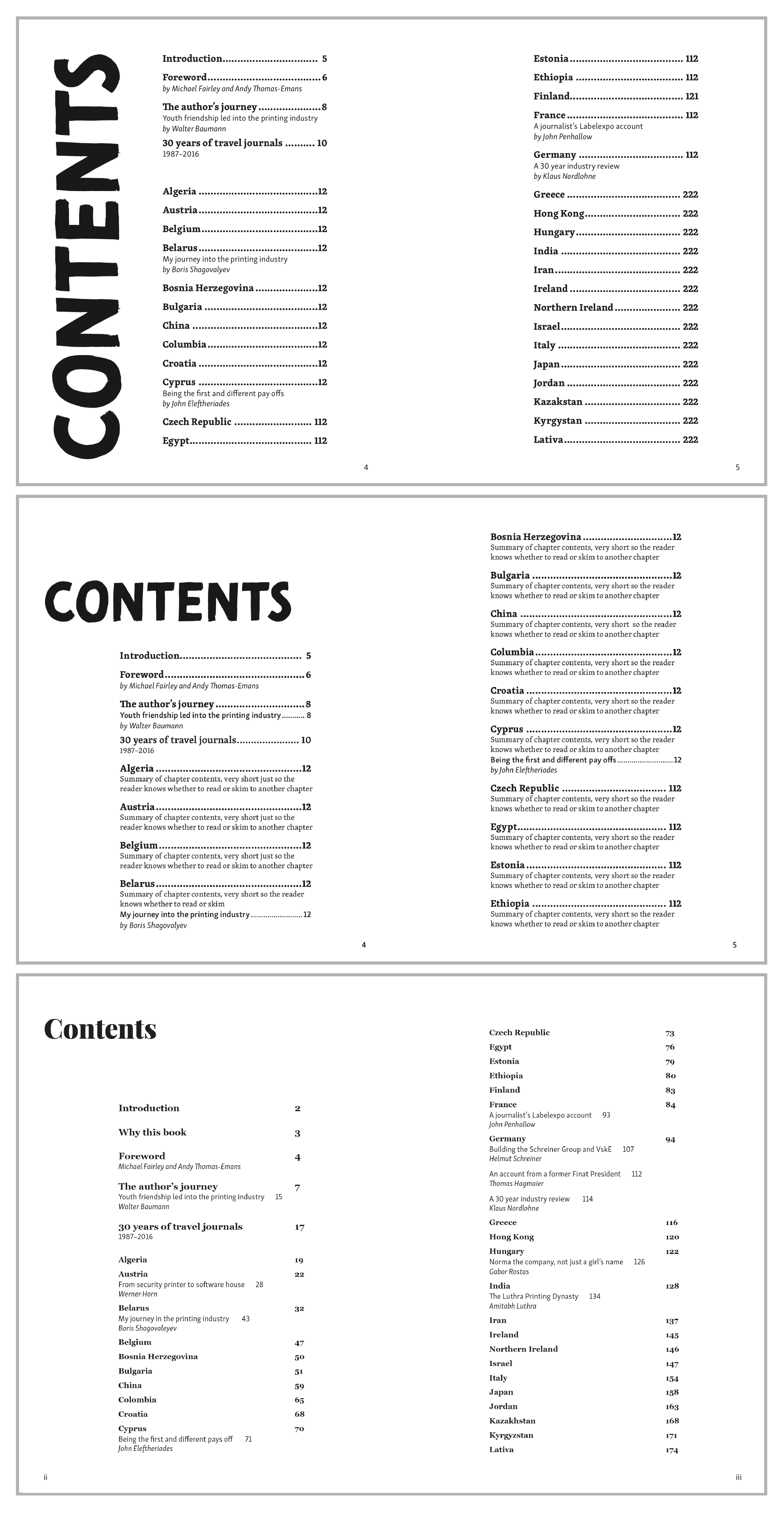
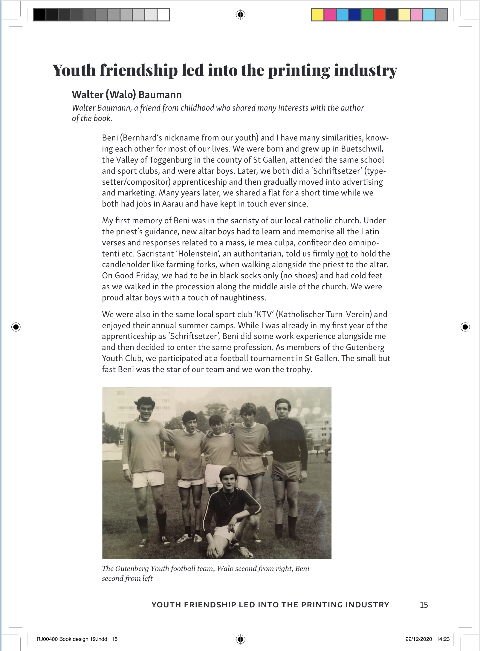
Year: 2021

Wychwood Project Rebrand

Background

The Wychwood Project is a registered conservation charity located in Wychwood, covering an area of 120 square miles. Its focus is to encourage and help locals to understand, conserve and restore the landscapes and habitats. The charity was started in 2000 with the branding remaining the same since its initial establishment. It now needs a refresh of the entire brand identity which will increase the engagement and reflect the conservation efforts in the local area. 


Brief/restated brief 

We aimed to create a professional brand identity that portrays the organisation’s values of conserving the landscape, wildlife and inhabitants in the Wychwood area. The new brand identity also had to ensure that it could be used to promote the charity and attract both a younger demographic as well as the current one. By applying the brand identity to different social media platforms such as Facebook, Instagram and twitter. We also designed a website storyboard that maps out an improved golden pathway, which the client can later develop into a fully realised website. For the visual identity the client requested to include some motifs from the old logo including the Oak tree and colours correlating to the theme of ‘conservation’. To create a recognisable brand identity that portrays the organisation’s values and message.


Deliverables 

The deliverables included a brand assets (e.g. colours, typography, name, strapline, logo), social media pages and a website storyboard which is consistent with all platforms. The aims for these are to showcase a new take on the brand identity which attempts to engage with a younger demographic whilst also introducing a revised name and strap line which accurately reflect the description of the organisation. 


Research and competitors 

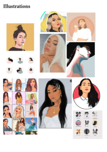
Before starting the sketching process, we researched the different aspects of the organisation by going through their website and social media pages and identifying the most important parts of their work. This included things such as conserving the wildlife, the current oak tree logo and the colours used throughout. These all helped us to map out in which direction our initial logo sketches would go; which we concluded would be based around the ‘nature’ rather than ‘charity’ or ‘conservation’ aspects.

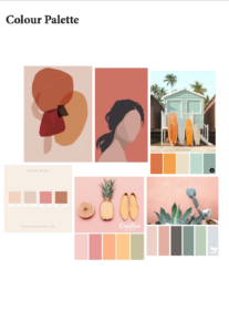
Looking at the current website helped to initialise the colour scheme which encouraged us to create colour scheme mood boards which we felt reflected the organisation. This was then used in the first vector sketches we created, along with some typeface experiments that we carried out. Through our research, we identified several conservation charities and organisations whose work and aims are similar to that of the Wychwood Project. This helped us to compare them, identifying which aspects made them each successful and unique, and what exactly our own designs need to compete. Notable organisations included:

  • RSPB 
  • The Earth Trust 
  • The Wildlife Trust 
  • WWF 

After comparing their brand identities, websites and social media pages, we noticed several features which each organisation shared that arguably made them successful in their field. These include:

  • The use of high quality photography to portray their organisation and its activities 
  • The use of colour across all platforms to create a unique brand identity which stands out from the rest and allows users to identify the organisation 
  • A mix of full length images and smaller images across their websites to keep users engaged 

The current audience for the Wychwood Project are typically older members who have time to volunteer in the activities. These members help the charity as they are willing to invest money into the projects. With the rebrand of the charity, the client wanted to maintain this current audience whilst also being able to engage to a wider demographic, such as families and children as well as local businesses and societal groups. 


Design development:

  • Name and strapline

In terms of the name and strapline, we researched other charities and organisations in the same field and analysed what works and what doesn’t; which are the most successful in reflecting their aims and values. We curated a list based on this which we felt were in line with Wychwood’s own aims. We curated a list of name and strapline ideas, where the client chose their favorite leading us to coming to a decision on which we should use. 

The final name: Wychwood Forest Trust

The final strapline: For wildlife and wild places


  • Logo

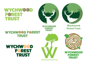
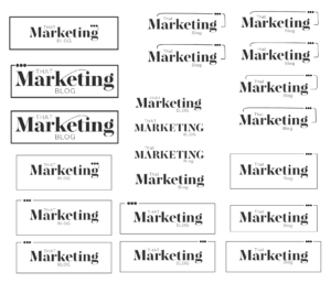
We sketched some initial ideas based on the client’s feedback. This involved the concept of an oak tree which would help to portray the organisation clearly to all users. After several experimentations with this idea, we decided to broaden our design concept beyond the simple idea of an oak tree and explore other elements. Referring back to the user study that we have made earlier we wanted the whole brand to be contemporary yet still connect to the existing market. This enabled us not only to create a design which was visually more appealing and generally unique, but also to break away from the regular circular design and play around with layout and colour. 

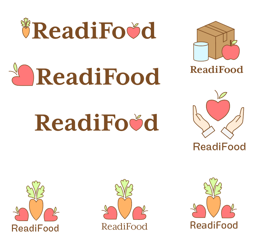
Using the client’s feedback for the new set of designs we managed to narrow down three visually different styles on which we could improve, we started to experiment with colour choice, typeface and the positioning of elements. The first logo is a hand-edited typeface created from an already existing typeface which we believe enables a sense of identity to the brand. The second logo is based around the basic idea of a tree, whilst combining other elements to create a unique visual design. The use of the owl and tree in conjunction with the ‘W’ creates an individual identity which audiences can easily relate to the organisation. The third Logo focuses on other elements of the Wychwood area rather than just the idea of an oak tree. The deer is the most visually recognisable and so can be identified by members of any age group.

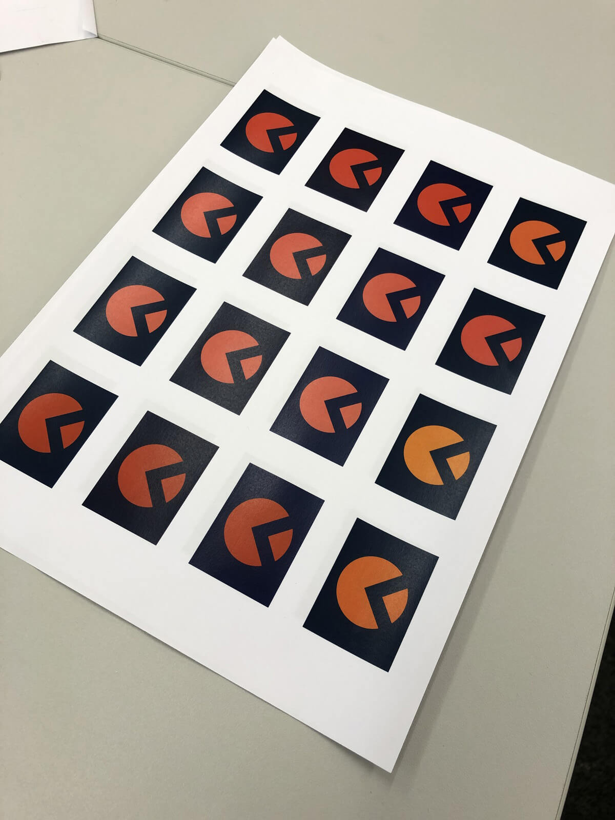
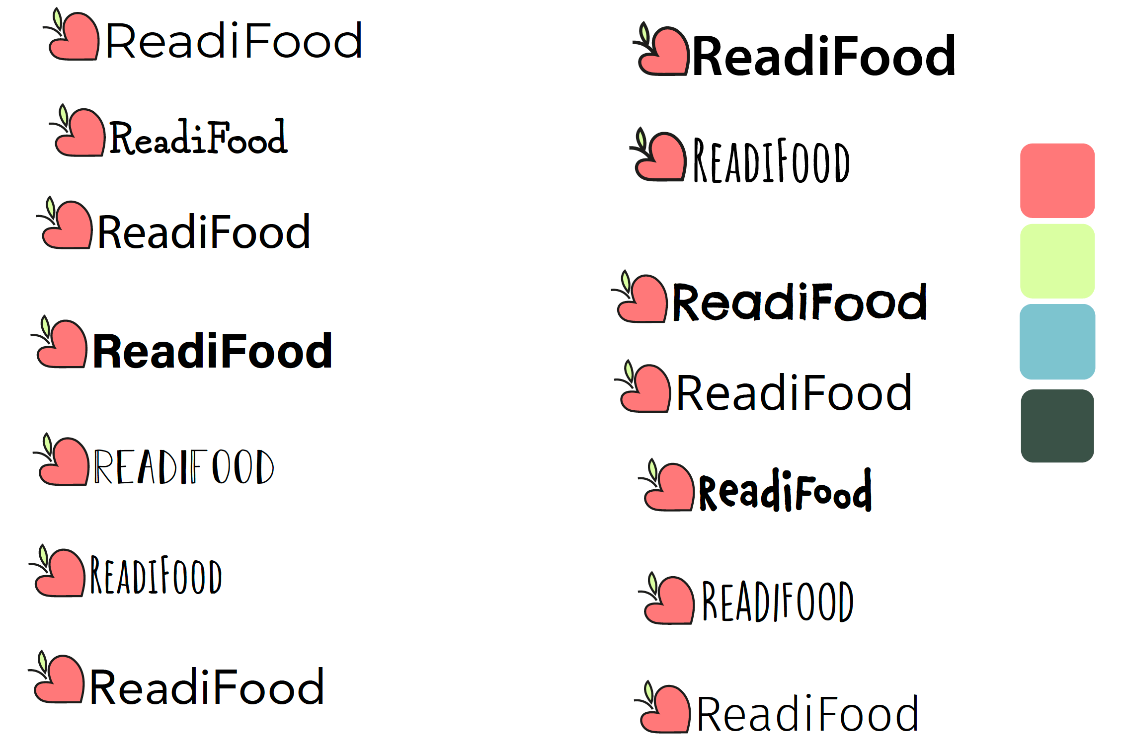
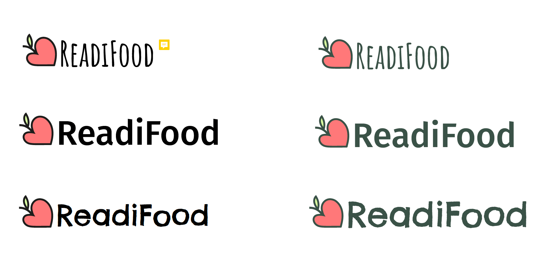
While designing the logos we explored different colours schemes that had neutral tones with accented colours. Eventually, we stuck with a natural colour scheme to ensure that Wychwood’s message of conserving wildlife was still portrayed. As for the typography, the two chosen typefaces worked the best with the logos, colour scheme and layout. 


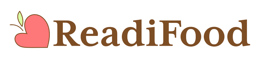
After back and forth feedback we reverted back to the core oak tree image, as it is what viewers associate the organisation with. For the final logo, it is based around the idea of a tree but presented in a graphic way. We revived the original logo with a contemporary twist, having redrawn the tree and re-coloured it to create an individual identity that is both nostalgic and relevant. Creating a silhouette makes the logo clear and cohesive, as well as allowing it to work more efficiently as a logo at any size. The bright, acidic green colour reflects the aim of engaging with a younger audience and allows the tree to be both recognisable and intriguing.
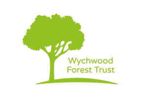
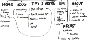
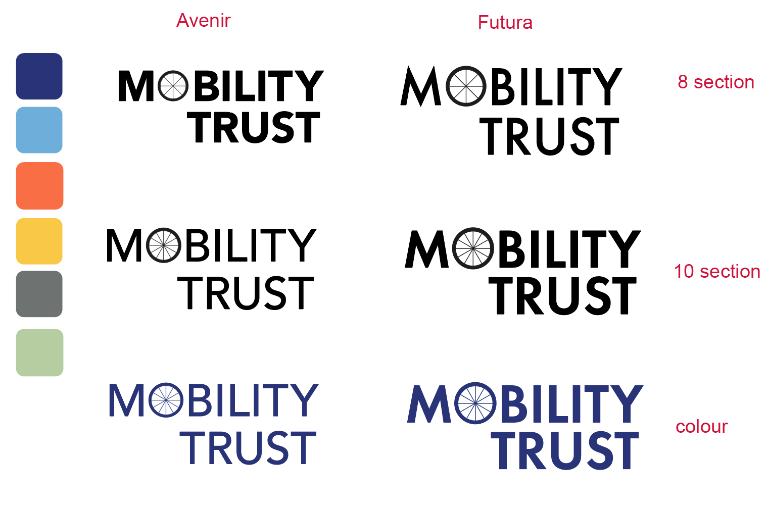
  • Typography 

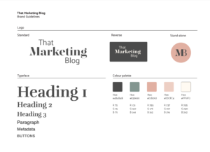
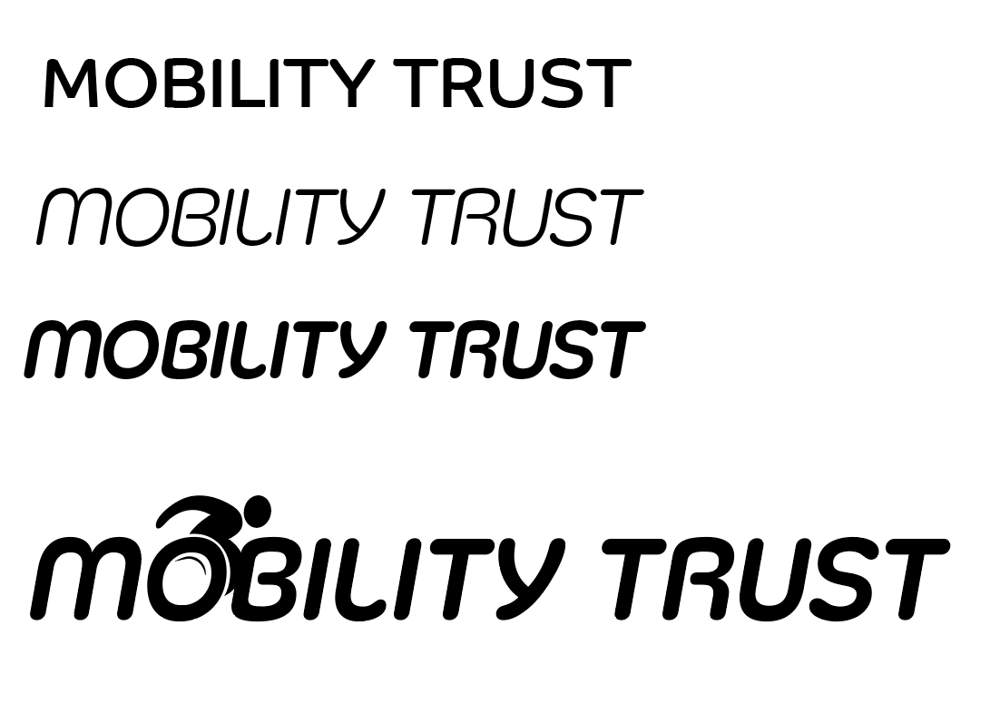
The typefaces chosen are suitable for the organisation as they are legible and accurately reflect the organisation’s values of conserving wildlife and wild places. They were also chosen as they are timeless therefore unlikely to feel outdated. For the logo we used ‘Varela Round Regular’ using the acidic green as a dominant colour.  Based on our typographic knowledge we attempted to change the clients’ mind regarding this typeface, as we believed it would be too light to work when scaled down, however the client insisted on this typeface. For the headings we used ‘Montserrat Regular’ in the same green. As for the body text, we used ‘Asap Regular’ in a stone grey colour.

Logo: 20pt 

Body text: 25pt 

Headings: 40pt 

Website menu text: 30pt 

Website buttons: 60pt 

Strapline on website header: 100pt 

Website information (at bottom of page): 23pt 

All type sizes are relative to the website page size.
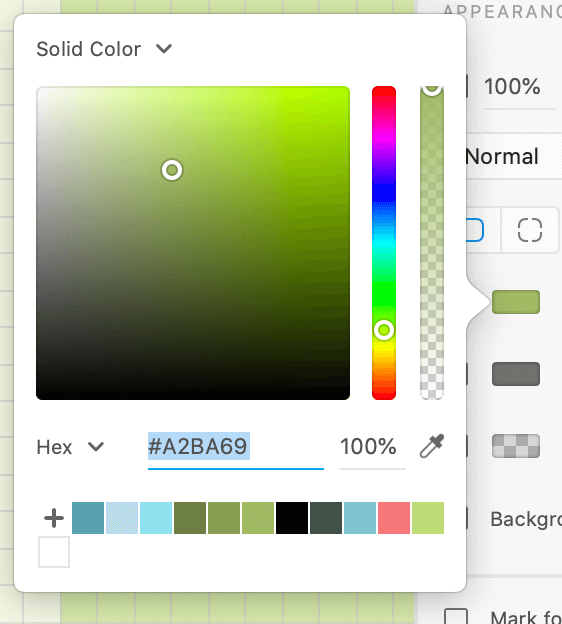
 

  • Colour scheme 

For the colour scheme we referenced the original branding while giving it a more contemporary feel. Using neutral tones throughout, alongside a vibrant green and neutral lilac. The green would be used to separate information (used in headings, boxes and contact icons) while the lilac is used in the form of interactive buttons (sign up, donate and support). Both these colours are emphasised in the cover and display photos. The background colour used for the website is a green-tone white that acts as a backdrop for the acidic green headings, lilac boxes and grey tone body text.


  • Social media

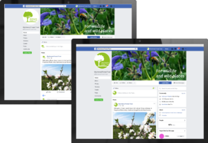
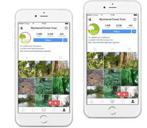
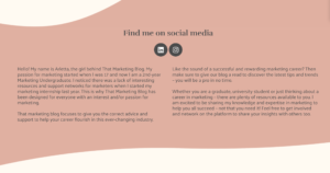
We chose three main platforms to focus on social media presence which are Facebook, Instagram and twitter. For the social media pages we combined both photography from the organisation’s existing websites and social media with our logo along with the matching colour scheme, to create a sense of cohesion among all platforms. The layout and size of elements within the logo were tested with the mockups to ensure that they were legible at any size required.

Facebook: the mockup for the logo can be used across all social media platforms. The photography is chosen to be cohesive with the logo design. The continuous use of green and the minimalist photography helps the audience to focus their attention on mostly the logo which is the first sense of the organisation’s identity which will be seen. Facebook mockups with the logo in both of its variants. Custom header pictures which include the strapline for the organisation. 


Instagram: the focus of the Instagram page is to create a complete individual identity for the organisation by combining both the logo design and the strapline. The mockup for the logo can be used across all social media platforms. The first mockup uses the logo in its original form, with green on white. We zoomed in on the logo to make the best use of the small space for the logo within the Instagram circle, to give focus. The second mockup uses the logo in its reversed colour form, with the white on green, which can be used as an alternate option. 


Twitter: having the mockups with the logo in both of its variants. Custom header pictures which include the strapline for the organisation. The mockup uses the same layout and image treatment as the Facebook page, creating a sense of cohesion throughout all the social media platforms. 
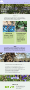
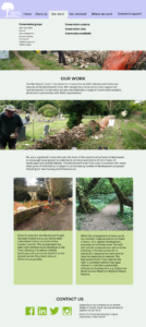
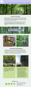
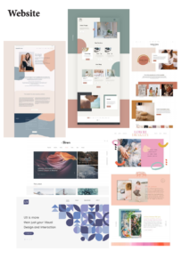
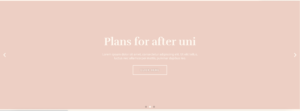
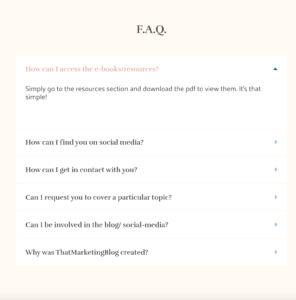
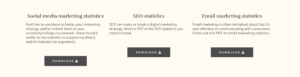
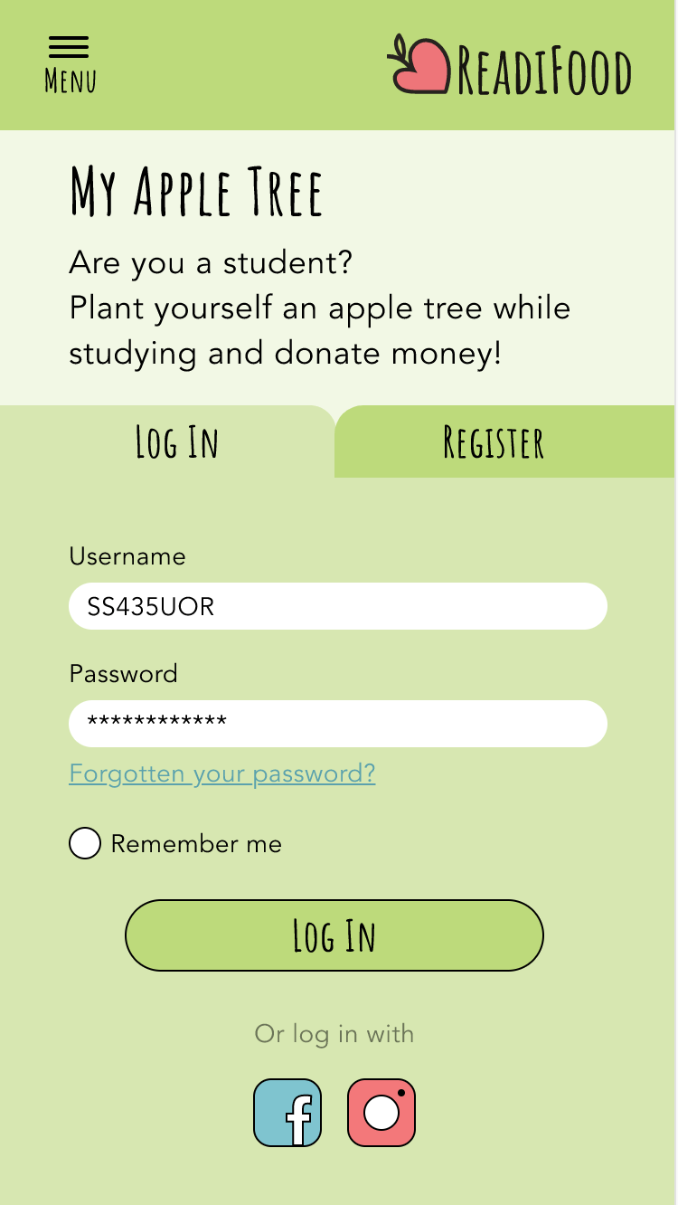
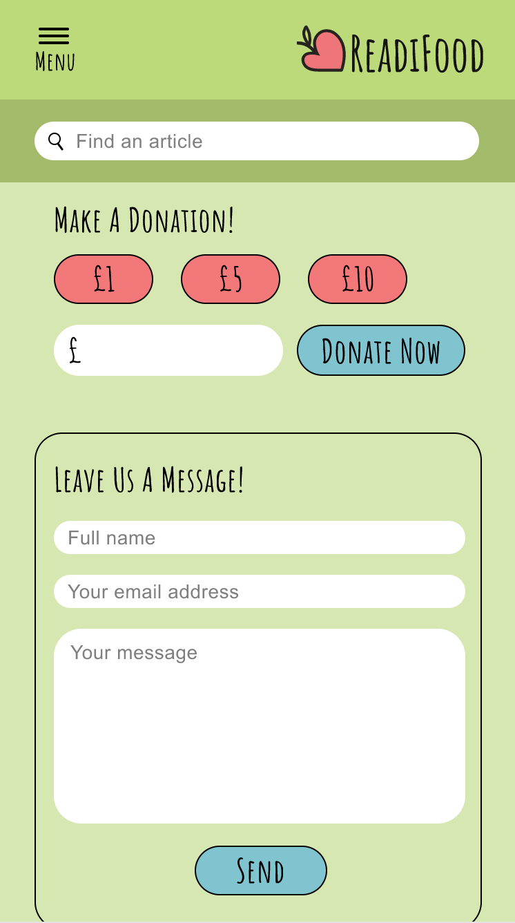
 

  • Website golden path

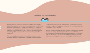
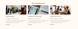
For the prototype we chose to do a golden path for the website. This included pages such as  the ‘Homepage’, ‘About us’ and ‘Donate and Support’. The design of the website pages are both simple and professional. It has a basic linear format which is seen on most websites, allowing it to be visually engaging to a wide audience and easy to update. We incorporated elements of the logo within most of the website such as the tree silhouette and solid coloured boxes to create cohesion. The background colour used is a pale green that acts as a backdrop for the acidic green headings and grey tone body text. We packaged the website storyboard to have screenshots of each page, a walkthrough of the prototype and the website assets used.


Reflection

We believe that we have created a refreshed brand identity which differentiates the Wychwood charity from other similar organisations whilst also clearly portraying its aims and values. One of the main challenges that we faced was not receiving enough feedback in time. Our schedules had to work around the clients, which made it harder to plan out future input logs and the different steps for our design stages. Another challenge we faced was the fact that we were unable to visit the site which meant that we did not have a full sense of what the organisation entailed, making research slightly harder as all we had to go off of was the organisation website, social media and the information provided by the client. As a whole, the job took much longer than anticipated as it was originally set to be done in June but due to COVID-19 and our main client leaving the organisation, our deadline was extended as the other clients were much more flexible. 

What we learnt from this job is how to effectively manage our time and the workload so that we are constantly on target to reach the deadline. We also learnt how to work with different types of clients and what way is best when dealing with certain problems, such as the client not responding to our emails and calls for three weeks. We both agree that the final logo produced would not have been our first choice due to the fact that we find it to be too generic as there are already many brands and organisations who have a tree within their logo design. Also, we found that it has a direct correspondence to their original logo which we both were trying to steer away from. This was evident in our vast experimentation of logo illustrations and styles where we played around with incorporating animals and even solely typographic designs. We both pushed to have a more current typeface with a thicker output, however the client insisted on having the typeface light and simple. Nonetheless, we had to push our design preferences aside and give the client what they wanted, in return they were extremely satisfied with the end result. Regarding the website, we were relatively happy with the final outcome as it was a refreshed version of the original, being more dynamic for different screen sizes and enhancing the overall user experience with straightforward navigation.

We both worked extremely well as a team, dividing the work equally and helping each other throughout the entire project. Working together also allowed us to manage the time which we put into each deliverable in order to ensure that each was produced to the best of our ability. In future projects, we will make sure to use more persuasive techniques to convince our vision to the client. 

Longhaul Endurance Branding

Background

Longhaul Endurance is an up and coming brand, which aims to provide athletes with high quality performance food. Co-owners Staale and Amelia both saw a gap in the market – most foods manufactured for the athlete on the go, did not come in savoury flavours, and often were full of highly processed chemicals. Being athletes themselves, they wanted to provide a natural alternative which provided a great quality energy source on the go. I was allocated this project in a team of 4 fellow students, consisting of myself, Alex Ganczarski, Liselot van Veen and Louisa Ellis.

Understanding our project better

We began this project by organising to talk to our client, so we could get a better understanding of their aims for their business, what kind of message they’d want to put across, and why exactly they wanted to rebrand. From here, we were able to restate the brief. The client from the beginning was keen to reinforce the idea that their product was unique, and that it was important that the branding expressed their aims to create all natural food, without the crash of sugary alternatives. Another important thing to ascertain from our initial meeting was the proposed audience for this product. The client mentioned that they target those between the ages of 35 and 55 – predominantly those who participate in endurance sports, hikers, or those who enjoyed the outdoors. This meant for us, we needed to create something reasonably clean and professional, that might appeal to that audience. The client also indicated in the meeting that they believed that their current tagline: ‘Prolonged energy release food’ did not represent them as effectively as they would like, and they really wanted to reinforce the ‘natural’ side of their brand.

Their existing brand

Research

In our research, we focused on competitor brands with a similar focus to that of Longhaul Endurance. One particular brand that our client identified that they admired the visual style of was ‘Tribe’ pictured below.  As pictured, ‘Tribe’ employs vibrant colours and textures in a ‘landscape style’ particularly in portrayal of outdoor adventure and hiking. Other brands that could be comparable such as ‘G Endurance’ and ‘SiS’ give more of a clean, clinical sense, potentially more aimed towards gym users, and those who focus on building muscle. From the research, we determined that it would be useful to echo some of these themes in our design process. However, one issue we faced straight away with this idea is that Longhaul focuses on a variety of endurance athletes, rather than a particular focus on one discipline.

A comparison of Longhaul to similar brands

We also had a look at the existing materials already available for Longhaul, and discussed these with the client. They emphasised that they already felt their logo was representative of their brand, and felt professional. They also explained that their budget is quite small, and making drastic changes to their logo would increase their printing costs tenfold. We did try some initial colour changes, and how we could try to minimise the costs of printing – however after further discussion with the client and their printer, we came to the conclusion that we should leave the logo as is, and focus on the visual design of the pouch.

The Pantone colours of the brand
Test prints of brand colours and potential replacements

Design process

We began the design process by individually brainstorming and sketching out our initial ideas for the front of the pouch. From here, we pooled our ideas and met to discuss which ideas we believed had legs. One particular idea I had was using ‘leading eye’ to draw the eye to the pouch in form of a running track.

My initial sketches and ideation for the front of the pouch

From our initial sketches, the next stage of progression involved development digitally. By this stage, our client had provided us with all the EPS files and copy necessary to start working effectively with their existing brand.

Digital development

Again, after developing them digitally, we took the time to assess the designs as a group – this helped us to compare and understand which of our designs we felt worked well, as well as which designs we could exclude from the further development process. Below are four different concepts that we narrowed down our concepts to. In retrospect, as a group we agree that we did produce too many concepts at this stage – basing our decisions on having one concept per person, rather than choosing just a couple concepts that we felt were strong enough to progress.

Just a small selection of digital developments proposed to the client

Our client kindly offered to send us some samples of their pouches – we had a copy of the dimensions of the pouch, but we found it hard to visualise how the design would fit on the pouch, and any potential things we needed to be careful of when designing the pouch. From meetings with each other, as well as our client and supervisor, we were able to work out a couple of layouts we felt worked well to balance the hierarchy of information effectively. We found fairly early on that a space that worked well as a container for information was the same triangular shape as in the logo. From attempting to arrange the information within the triangle, we decided to extend this approach to the outside world. We felt that mountains naturally mirrored the shape we were looking for, and therefore began to focus our strategy on how we could represent mountains in our designs.

Our experimentation of using the triangular shape as a container for information

From here, we wanted to continue this exploration into mountains, as we felt the simple triangle wasn’t enough to show the rugged, textural nature of a mountain. Below, we have further examples of how we incorporated further illustration into our design to create this depth of detail.

Exploration of different approaches in creating the ‘mountain’

Finally, after much exploration, we decided that a polyart style of illustration provided a great balance of rigidity, depth and fun to really emphasise the nature of the brand, and the colours we chose we believe really reflect the savoury, nutritious product within the pouches. We presented our client with this as a proposed outcome, and they seemed to be very impressed.

The polygon mountain style

Our client said: ‘The use of a mountain is very well aligned with the brand image we want to portray. The design works well as a concept that we can apply to new product ranges. It is both clean and eye catching.’

Continuing our design to the back of the pouch

Unfortunately, this project was stalled for a couple of months due to the effects of Covid-19 on their business. The image below compares the existing packaging with the final iteration of our proposed design.

Concluding adjustments and design sign-off

The final part of the design process finally took place when we were able to regain contact with the client. From here, they gave us some helpful feedback to make the adjustments to the designs that they wanted to their design, and we refined our work down to print ready documents using the artworking techniques. Prior to requesting signoff with our supervisor Rob Banham, we had a conversation with him regarding any further considerations he felt we should make – particularly in regard to the print production of our work. From here, we did attempt to contact gualapack (the printing agency that Longhaul used for their work). They were somewhat helpful – however there were some issues with a language barrier to bypass!


Technical preparation

Finally, our designs were signed off by our supervisor Rob, and the design was effectively ready to send to the client. Despite our best efforts to retrieve all the copy for the project, the client was not ready to provide us the ingredients for their two new flavours. Therefore, in another conversation with the client we decided it was worth us simply packaging our indesign files, along with information and a short guide as to how future designers should attempt to adjust the work – in the file transfer to the client was all the information, images and copy we had used, and the documents were ready for final production. This means the final details, alongside additional flavours can be added providing a further scope to our client.

Final front and back designs
Final front designs and colourways for all 4 flavours

Reflection

Although the final deadline well surpassed our original deadline, I’m relieved that we were able to complete the project and create the client a design that they felt represented them, and were proud of. I feel as if our team worked fairly effectively together, and all contributed a sufficient amount to our progress. I would say I’m overall happy with these designs – however there’s a chance we were too broad with our approach too late on in the project – we may have benefitted by having more time to refine our final ideas, particularly for the back of the pouch.

Final feedback from our client

‘It’s been a pleasure working with you all and I’m very impressed and pleased with the final result. So thank you for all your efforts, and for your patience during these lasts few months.’ – Staale Brinchmann, Longhaul

‘We have been extremely impressed with the designs that you have all put forward. We both wish you all the best for the future.’ – Amelia Watts, Longhaul


Reach Out and Connect

Background

A group of volunteers had set up a Facebook page called ‘Mature Engagement’ during the first Covid-19 Lockdown in the UK, the initial idea behind the page was to ‘encourage engagement from mature people who are isolated and anxious’. The purpose of the page was to provide a virtual space for mature people to be able to come to in order to meet new people and create connections that would lead them to feel less isolated during lockdown.

I was brought into the project in order to create a visual identity for the page through producing a profile and banner image as well as offer any design or style advice that the group may need throughout the process.


Restated Brief

Deliverables:

  • To design a banner image for the Facebook group
  • To style the site, based on the graphic recommendations above, choosing fonts and images to complement the messages
  • To assist with the development of the Facebook group with design and style advice

The idea behind the group changed as I attended initial meetings with the clients as they chose to widen their audience by changing their name and change from being a Facebook page to a group. However, this meant that they then had a better understanding on how they wanted to present themselves and what was going to be shared on the online platform.


Research

I was provided information on what the clients wanted the group to represent and provide for people from meetings I attended with them. The idea of a Facebook page changed to being a group, meaning that I only needed to design them a banner image, they also changed the name of the group to ‘Reach Out and Connect’ in order to sum up their idea better.

I was invited to regular group meetings in order to gather a better idea on what the volunteers wanted to be included and shared in the group. Along with their ideas and information they provided me with I also conducted research into other Facebook groups to see how they used the platform as well as defining the terms ‘reach out’ and ‘connect’ in order to think of other visual representations that could be associated with the words.


Design Development

I faced difficulties with the clients as they were undecided on how they wanted the banner image to look, this left me to come up with ideas that I felt most appropriate to the brief whilst trying to include the initial ideas they had mentioned to me. The process became easier when I began to show the clients initial designs I had created and providing small colour and typographical variations so that they were able to see what they did and did not like.  I maintained contact with my supervisor, finding that it was important to ‘provide clients with a controlled set of variations so that you only show what you think is your best work to avoid working on a project you no longer find enjoyable’.

Initial designs for Facebook profile and banner images

As the design process went on, I attended meetings to keep in constant contact with the clients in order to discuss what was happening with the Facebook group and how I could help in any other way, as well as keeping tabs on the ideas they had for me to add to the graphic elements I was creating. The clients and I appreciated the constant contact so they could see what I was working on for them to make changes as well as for me to understand what the group was becoming. As I was able to present approved ideas to the clients they remained happy with my progress and enjoyed the ideas and discussions that I was able to share with them.

Range of developed Facebook banner ideas

Final Outcomes

After providing the clients with design developments and ideas we all finally came to a set of ideas that were most appropriate for the group, once the group had decided that the puzzle banner image seemed to fit the idea and purpose of the group, they requested that the other designs I had created be turned into square images that they could use as posts in the group. After providing them with the final images, they were able to upload them onto their page and provide the group with a visual identity.

Final Facebook banner image
Images to be used as Facebook posts

Reflection

Throughout this project I have come across small challenges such as adapting to the clients changing brief as well as ensuring that I stay on track with the message behind the group they were trying to create. I was lucky in not needing to produce any physical deliverables, meaning I did not have to work with print deadlines or costs. Due to the longer deadline on this project was also a positive as it meant I had time to keep in contact with the clients and my supervisor to ensure I was on track and to fully understand what was required from me in order to complete this job.  When the clients had uploaded the banner image they also posted how happy they were with the final outcome in visualising what the group represented.

Overall, I had a great time working with my clients and have been able to grow in confidence when working with new people and learnt how to contact and have meetings with clients. This has been a fun small project to work on and has allowed me to be able to learn how to organise myself to work on an extra project alongside my third year modules.

Mock up of final banner image and one of the post images

IAWADBD: issue 3 zine

Background

This real job was slightly different than most real jobs. Rather than getting a client brief, we make an ‘I am we are… different by design’ zine, and have done every year since 2017. This zine showcases diversity and inclusion projects from students in the School of Arts and Communication Design and from other significant people in the industry. As students, we go through the entire process of planning, interviewing, writing, and designing. This year, Liselot van Veen and Labiba Haque were team leaders, while Robin Smith and a few third year students had a more general role. Our zine secured the funding to have more copies printed and to be longer (48 pages versus 32), which meant there was more to plan and oversee.

Research

The next stage of the project was to generate some featured article ideas. Our team dedicated one or two meetings to this but, despite the lengthy discussion, it proved difficult.

This issue was longer than the previous two publications. This meant we faced generating more ideas but under the same time crunch. The difficulty also came with thinking of subjects within diversity or projects to discuss that were of enough substance. As well as this, a lot of the ideas had to come from the three of us as a number of the team faced scheduling conflicts and frequently found attending meetings difficult, so this stage took more time than usual. We also were unaware of projects being produced by Film & Theatre students and so had to undertake extra communication tasks to find out. Though ultimately, this hard work paid off as we formed an interesting gamut of topics to discuss.

To start then organising our ideas, we formed a colour-coded document:

Still image of our initial article ideas, taken from our shared Google Doc

The aim was to group articles based on their subject matters for a cohesive reading experience. This was seemingly an effective system as, once shared around the team, everyone was on the same page and knew what was to be included.

Focusing on visual research, we collated idyllic examples on a Pinterest board of other existing spread designs. When making a publication as personal as this, it proved crucial in order to see what was possible and how we can get that emotion and feeling across.

Interviewing and producing articles

We distributed the work fairly among the team. Everyone was assigned with at least two articles to write up. Many of the pieces involved interviews and showcasing the works of others. Therefore, it was essential to follow ethics procedures before conducting interviews. The procedure involved reworking interview questions for review and approval from Jeanne-Louise. After the initial contact, all communications with participants were only to occur through our university email addresses and sent out individually for privacy and data protection. We emailed out specific documents alongside the interview questions to gain informed consent from the participants. Also emailing Victoria the appropriate forms filled out by both interviewers and interviewees as records of participation. Having collected the interview responses, we wrote the articles, sending them to Jeanne-Louise for feedback and worked on correcting them until they could be approved. 

The lengthiest part of the whole process entailed liaising between these various individuals and waiting for responses. However, this was vital in producing quality content at high standards while ensuring everything was ethically and legally secure.

Labiba wrote a think-piece in the zine about decolonising design. Initially, she planned to write about what it was and look into parallels present in Film, Theatre and Television, and Art. However, we did not sufficiently comprehend issues in those disciplines to write about them effectively. Focusing purely on design, she redrafted a more personal response as a designer on this course. As the zine’s purpose is to encourage and highlight diversity in the field, Labiba instead emphasised current issues that we have observed and suggested solutions based on the readings recommended in her article. Unlike academic pieces, writing for editorial purposes encouraged us to consider the audience more and deliver an easy read. Writing the articles enabled us to practice and improve word economy, offering more engaging, impactful and relevant pieces.

Designing

Liselot produced a template with grids to provide guidance for the team’s spread designs as we were making them separately. Though each article was individualised and had a different look and theme – as they should with subjects of this nature as to be personalised to the issue – the zine still needed to be consistent. Having the same grids across each spread meant, though different, they appeared still to belong to the same publication. The template was also useful for a member of our team, Khadjia, who joined from the Art department. She was unfamiliar with InDesign so having a template meant it was easier for her to learn, but also easier for us as typographers to make any fine adjustments later.

Paired with our previous grouping document, we produced a visual pagination to better see the balance of articles.

The pagination for issue 3 – colour-coded to show the balance of the grouping of articles under their umbrella topic

Utilising colour-coding again, we were able to see whether an appropriate amount of pages were dedicated to each group now that we knew how many spreads were required for each article. We ended up with a number of articles being of empowering marginalised groups but, given issue three was being published around the time of BLM and the horrific murder of George Floyd, this was not deemed a problem.

The process by which the spreads were designed was similar to module projects; produce a design, send for feedback, reiterate, and so on. 

The main consideration we had taken from previous years was to rename the paragraph styles to be specific to each article. When collating issues one and two, there was the time-consuming task of resolving the overriding that occurred from multiple files being joined together but InDesign confusing separate styles with the same naming conventions. Whilst significantly better this year as, with the scheduling conflicts of the same team members meaning they also were unable to find time to design their articles, we had fewer people designing and thus less room for error. There were still some difficulties as some had grouped their styles into a folder under their name which, when collated, provided the same issue of overriding. But this did not take as much time to resolve as before. So, if designing issue 4 as a physical zine again, it should be emphasised even more.

Below is an insight into the design process for the spreads we designed: how it started (left) versus how it was when it was printed (right).

‘Ok… you’re letting the grid control the size and placement of the image … think about how the image can be placed so that some of it is in the margin (rather than constrained by the column size) and this will make the layout seem less blocky.’
–Jeanne-Louise Moyes, supervisor, giving feedback on a version of the Toshi Omagari spread design


Collating and copy editing 

The three of us were left with the job of collating the entire zine during the summer after the third years had finished their final year. Luckily, Liselot had undertaken this entire job last year as well with Jeanne-Louise so she knew what we should keep standardised throughout the design process to make this part easier. With the knowledge from before, we were able to spread the workload between us while we were on a Teams call, and had a checklist to go through.

Unfortunately, there were still a few unexpected things that threw us off and made the process longer. There were a few spreads that had been made last minute and were claimed to be finished without the correct sign off. This meant that the design process fully moved into the producing stage. While we did expect this to happen in some way while we were going through the spreads to standardise them, we did not expect to design whole new spreads. This taught us that no matter how much planning, explaining, and chasing you do, the process will not always be correctly followed. We ended up trying to finish these spreads, but they still seem to be lacking something. Luckily, there are more good spreads that overshadow these less successful ones. 

After the three of us were done editing all the spreads, Liselot turned the individual InDesign files into an InDesign book since she also had experience doing this from last year. Although this would have been a great skill for others to learn, our deadline was coming up fast. After this stage, the editing continued when Rachel and Jeanne-Louise found some inconsistencies we had missed. Then the edits were to make sure the file was press-ready. While the design stage took quite some time, the editing stage was the one that was the most stressful, but the one that we learned the most from. We were able to find out what does and does not work based on the designs of other people and how they interact with each other. 

The cover was yet another thing that had to be made last minute, although it did still go through multiple developments. At first, many people in the team wanted to design the cover. However, after a team member had been allocated, seemingly nothing came of it. Realising that the deadline was coming up and there was no work, we had a meeting between us to generate some potential back-up ideas. Following this, Liselot took it upon herself to make a cover that could be used if the original stayed uncompleted. Everybody in the team seemed to like the back-up concept (basing it on protest signs as to relate back to the heavy focus on marginalised groups) which led to further development into the finished cover you can find on the zine today. This incident was a case of occasionally needing to ‘jump-in’ despite a colleague being allocated the role to make sure the final product is finalised in time, and is something the team can be proud of.

COVID-19 issues

In previous years, we booked a room in the department spanning over a few days dedicated to zine production. COVID-19 introduced a new challenge: physically preventing face-to-face meetings, thus forcing us to work remotely from our homes. Suddenly, the process became more individualised as teamworking was difficult in this environment and production ‘days’ turned into ‘weeks’. Therefore, our communication and time management suffered while everyone was adjusting to the new ‘normal’.

We lost the benefits of quick communication. The ethics approval process, and giving and receiving feedback on our spreads took much longer. Instead working in a studio environment, we were all directly emailing our pieces back-and-forth with Jeanne-Louise. All work had to be uploaded to our shared Google Drive to see others’ progress or receive any feedback from the team. We resorted to using Messenger for informal feedback, gaining faster responses from each other in order to replicate that studio environment as best as possible.

Following delivery from the press, we found the body text looked slightly large for the format. Although the size was forgivable, being unable to print and proof while designing stressed its importance. The disruptions in postal services, caused by the pandemic, further delayed the delivery of zines and gratitude notes to our participants. The result of this was email responses thanking participants for their patience with PDF versions of their spreads for the time being. In the end, all participants received their physical copies and were very positive about their experiences being interviewed by us.

‘Thank you for sending me a physical copy of the diversity zine – I thought it was exceptionally presented and a really interesting and insightful read.’ – Lizzie Moran, interviewee from MA Creative Enterprise (film pathway)


Reflection

After being part of last year’s zine, we expected the process to go more efficiently with improvements. We had noted where things went wrong and made it clear how we could improve those aspects. However, the world threw an unexpected turn, where we all had to work remotely and individually. This brought a whole new area of issues. Although stressful during the moment it is happening, this is where we learned the most. 

We produced a quality zine with engaging content and aesthetics. It is impressive that we successfully handled the challenge of managing a team and delivered a complete zine remotely. Acknowledging the current predicament, we realised transferring to an online platform would be best. Thus, plans for a monthly blog with promotional social media posts are currently underway for 2021/22.

Movie: a journal of film criticism. Issue 9.

Background

The Head of the School of Arts & Communication Design at the University of Reading, Professor John Gibbs, required a student to design issue 9 of Movie: A Journal of Film Criticism that followed Martha Macri’s new design system, created the previous year for issue 8. This journal originated from Movie the printed journal which was published between 1962 and 2000 by the late Ian A. Cameron. It has since been designed digitally for online reading and is a rolling journal, meaning that articles are added to the journal throughout the year. The articles respond to a variety of themes such as focus and contemporary film style and intention in film and television criticism. It is mainly concerned with the aesthetics of film and television-style, theory, analysis, and evaluation of film and television.  Movie issue 9 includes written articles and audio-visual essays. John Gibbs expressed that this issue must follow the new layout designed in the previous year because it enables the film frames to be integrated into the text. The website showcasing the journals also includes eBooks, which John was keen to redesign so that they created a sense of unity with the journal issues.

After the editorial module in the summer term of my first year, I was eager to explore this design field further. It was an exciting opportunity to work with text, image, and layout in a logical way but also to create a visual aesthetic that readers would enjoy. Being able to design for such a broad interest like film instantly grabbed my attention and I was intrigued by the idea of using someone else’s design and making it my own. Designing eBooks was also a completely new field to me, therefore I thought that it would be the perfect opportunity to develop my skills and knowledge within editorial design.

Brief

The objective of the project was to design the next issue of Movie, building on the previous two issues. The images in the issue should integrate with the text so that it relates to written content. Most of the work would take place between November and March but the journal’s practice is to produce a rolling issue. This means that additional articles can be added after the issue is launched at the end of October 2020. A Movie eBook designed as pdf’s was also to be produced alongside Issue 9, following a similar style to the issue.

Process

Initial contact with the client

Collaborating with a client from my University was beneficial to me because it meant that he was accustomed to working alongside students. This also meant that I could meet my client in person because he is based on campus. From our initial meeting, we agreed that our main form of communication would be via email, but we could also meet in person for updates on the project if needed. Email seemed sensible because my client is working with a team of authors, therefore it would be the most convenient way to receive feedback from them that can be passed onto me. The pandemic prevented us from meeting in person, but we were able to converse regularly by email and have Teams meetings if necessary.

The initial meeting with the client gave me the opportunity to clarify what he required. At this point, we did not have a confirmed deadline but I was aware that the journal was a running issue so I would be required to design articles after issue 9 was published. As the process also depended on the author’s confirmation of the design of their article, it became a lengthy progression. This process was also made longer due to the pandemic because it meant the project fell over summer when it was harder to reach the authors.

InDesign files

To begin the design process, I retrieved files from the designer of issue 8. My client requested that I use this design template for issue 9, which meant I had to adapt my design skills into an existing design. However, I was still critical of the existing files in order to improve the design and have control over the work. I spent time analysing the original file to gain familiarity and to ensure I used the paragraph and character style sheets consistently throughout the issue. This also allowed me to gain justifications from the previous designer as to why they made certain editorial decisions and whether these were important to follow through into issue 9 of Movie. Overall, the templates look very similar and I ensured that the images corresponded with the text throughout because the client expressed how vital this was. I used appropriate files and design guidelines such as page layout, the grid, typesetting, images and the cover design.

Design development

When I first started this project, I found it slightly overwhelming because I had never worked with so much text and image. It took me a while to become completely familiar with the paragraph and character styles, as well as finding consistency with spacing and the grid. After becoming familiar with these aspects, it was easier to successfully integrate the images which improved the flow of the text.

I found that feedback was very useful because there were often small aspects that I would miss out due to the volume of text I was working with. Gaining feedback from a range of authors gave me an insight into how feedback is carried out in the editorial industry. I also found it interesting to see how different editors and authors provided feedback. Some were through email with page numbers for reference, whereas others edited the pdfs they had been sent. I have been able to adapt to these different styles and ensure that I follow their instructions carefully, so I did not miss anything. This could sometimes be difficult, especially when explaining where in the text amendments need to be made.

‘Brilliant! Looks great, and the images are grouped and paginated perfectly. Please pass on my compliments to Beth for the design.’ – Article author

Cover experiments for issue 9 of Movie.

Around halfway through the design process of issue 9, I received useful feedback from my supervisor. He expressed that I should improve on the previous students work where I see an opportunity to do so. Until this point I had not been confident enough to do this, even when I may have seen aspects that I knew could be improved. After this, I felt confident in changing these parts to improve the design further for the client. One of the main changes I made was to the opening pages of each article. The idea was to create a clear colour scheme for each type of article that flowed throughout the issue and make it easier for the reader to navigate. I came up with a variety of possibilities and sent these to my client. We decided on a coloured outline box for the title with the name of the movie in that same colour. This corresponded with the running heads. I also adjusted the contents page and the credits, so the text flowed better.

‘This is really good work’ – James Lloyd, Project supervisor

Opening page experiments for the student essays. Experimenting with colour and running heads.

eBooks

Initial design ideas

For the initial stages of the eBook design, I asked my client to send me images of the original Movie books to ensure I included traditional aspects in them. They had to be sent via email due to the pandemic which was a shame because it would have been beneficial to see them in person. After receiving the text, I began designing the books. I used the same square format as the original books but used similar paragraph and character styles to issue 9 because I wanted the issue and the eBooks to look coherent and have a modern twist on the traditional design.

Examples from the original Movie books sent to me by the client.

Development

After the client was happy with the original template, I input the text and images for the other three books. This was time-consuming, but it was enjoyable because I was so familiar with the paragraph and character styles, as well as space between image and text to make sure it flowed. This made the whole process logical and overall, really satisfying. Again, I was working with a number of professionals which meant the process took a little longer. I received amendments back and forth between authors in order to make sure everyone was happy. Most of these amendments included missed italics or grammar/wording that needed changing.

The client requested the addition of keywords to each eBook to aid search engine optimisation. This was a completely new feature to me, but it was a lot more straightforward than I predicted. This provided me with a new skill that I am sure I will use again.

‘I really enjoyed working on the proof. I think your design is excellent, distinctive, and very readable. I tried it on my computer screen and on iBook on an iPad and it worked well in both contexts.’ – John Gibbs, head of the School of Arts & Communication Design

Covers

I then began to work on the cover for each eBook. The client expressed that he would like each of the books to work as a series but also fit with the style of the journal. My initial ideas included showcasing a range of images from each book on the cover or use one large image which would fit the style of issue 9. The client chose a range of images, so I created a simple grid system that would work for each eBook, using the same typeface and rule as the journal to create coherency. I thought showcasing a range of images within the eBook was effective because each book contains a variety of movies and it gives the reader an idea of the content. It also meant that one movie was not more important than the others.

Initial eBook cover experiments for Filmmakers’ Choices using a single image from a movie within the book.

While designing the covers the client and other authors suggested I design a logo for the cover of each eBook. This would show that they were part of a series and separate from the journals. I created a simple logo that incorporated a rule and used the original typeface from the Movie journals. I ensured that it was simple to prevent overpowering the images on the cover.

Experiments with the placement of the Movie eBook logo on the cover of Filmmakers’ Choices.
Final cover designs for Reading Buffy, Filmmakers’ Choices, Movies and Tone, and The Police Series eBooks.

Reflection

The design aspect of this project was quite straightforward due to the existing template. I also used a very similar one for the eBooks, which made it easier for me to design because I was already familiar with the files. This project has been heavily reliant on ensuring all my files are organised. This includes labeling them with different versions (For example Filename_V01, Filename_V02, etc.). This also refers to keeping the existing paragraph and character style organised as I added new styles to the existing ones. This was important to avoid confusion, especially when adding new articles and helped to keep each article consistent. I believe I was able to execute this successfully and I hope that the files will be clear for the designer who takes on the design of issue 10 of Movie. In order to make this easier for the next designer, I have created a template to help them understand the design elements and organisation.

I have learnt a lot from this project. To begin with I found it overwhelming but I have learnt how to work with large volumes of text and image and input them into a document that follows a strict design system. Using another designer’s existing style sheets has also taught me the importance of keeping InDesign files organised and I was thankful that the previous design did this. Having the ability to adapt and use an existing file will be a useful skill to have for future industry work.

I have developed a professional relationship with my client through regular contact via email when necessary. My client has always been easy to reach and was happy to answer any of my questions which made the flow of communication much easier. They have informed me when amendments are needed throughout the process and ensured that I have had plenty of time to make changes before deadlines. This has given me the confidence to develop my communication skills and I feel that I am now able to contact clients on a professional and confident level. This skill will be beneficial to me when developing relationships with clients in the design world.

Overall, I believe that I have met the client’s needs in achieving issue 9 of Movie that aligns with the work of the previous designer by integrating text and image, as well as keeping some original Movie design aspects. I was also able to design four eBooks that took inspiration from the journal but provide a slightly different feel. This project took longer than I had expected, however, this was due to the pandemic and the publication being a rolling issue. This meant that I was working with more authors, who were submitting their articles at different times. I was also really happy to continue working on this project because I have thoroughly enjoyed it, particularly designing the eBooks. Through this project I have learnt how to communicate with clients in a confident and professional manner, learnt how to organise and use InDesign for large files, and learnt how to create consistency between documents. I have received some lovely feedback throughout the process, which has been very rewarding, and I have been thrilled with how happy everyone has been with both issue 9 of Movie and the eBooks.

‘Thanks very much, Beth – they look great!’ – John Gibbs, head of the School of Arts & Communication Design

‘Wow! I am THRILLED by the layout! Please tell everyone involved how much I appreciate their ingenuity and vision. Their solution overlaying the grid atop the frame is both elegant and convincing. I am so moved that I wish I could hug everyone in thanks.’ – Marshall Deutelbaum, article author.

Read issue 9 here.

Read the eBooks here.

The opening page for the first article in issue 9 of Movie.
A page from the eBook of Filmmakers’ Choices.

That Marketing Blog

To visit That Marketing Blog, go to: http://thatmarketingblog.com/

Background

That marketing blog began as an idea of a collective place of resources for students. It grew from ideation and research to include more useful information to a larger group of audiences. ‘That Marketing Blog’ is now a webpage with regularly updated posts, career tips, university advice resources and fun marketing updates. The main goal is to provide information to prospective students about the route of learning, but also to discuss marketing devices used in real life for students already studying. The project began with a marketing student who felt the resources she had found were lacking and was inspired by other students studying marketing who had produced blogs on the subject. 


Primary deliverables:

  • Website
  • Branding 
  • Illustration


Secondary deliverables:

  • Social media content
  • Client-facing videos
  • PDF templates


The aims were:

  • To allow the audience to use the site to gain general knowledge or find study material.
  • To be functional so the user can find the information aimed at them.
  • To be functional so the client can continuously update the site with new content.
  • To provide an appropriate brand identity that is informal enough to show a ‘personality’ so marketing is not portrayed as ‘robotic’. The personality must also represent the feminine side of the client but maintain a professional appearance.
  • To present the brand accurately and in an appealing way through social media and aid with the production of templates for future posts on these sites.


Research

Target audience

From initial meetings with the client, we had detailed conversations about the specific audience that they wanted to aim at. The primary audience was students studying marketing who may be interested in the content as an additional resource outside of their degree. Since the client is a university student herself, she drew from her own experience and conversations she had with colleagues to evidence the users. It was decided that the blog site would be a resource for:

  • University students studying marketing
  • Graduates and ‘up-and-coming’ professional
  • Prospective students looking to study marketing

The overarching purpose of the blog site is to support extracurricular reading around the subject area with the sharing of course content and key learning outcomes. For prospective students, we decided to include ‘uni advice’ content so that advice can be given retrospectively from the client who can give information based on her own experiences.

The client also stressed that they wanted to target women more than men as they wanted to produce content about women in the marketing industry and have the brand being woman empowering. We took this on board and researched competitors with this in mind and built this user group into our design work.


Competitor research

When researching existing marketing blogs, two direct competitors focused on women in the industry of marketing. These were Pretty little marketer and Girls in marketing. After studying both these brands’ content, we gained a good understanding of the conventions of independent blog sites, types of engagement and activity on social media and how content was grouped and structured within the website. We also looked at the stylistic way that they marketed themselves to the target demographic. As we researched this, we found norms that lay beneath the surface, most notably the use of an approachable visual style that was engaging and ‘girly’ while remaining classy and ‘business casual’ in aesthetic.


Visual style

Since the target user would be using the blog as an extracurricular activity that is closely linked to their subject area, we felt that it was necessary to make the designs seem lighter-hearted and fun rather than heavy and serious. This seemed important to engage the user by creating a more humanistic experience. 


Primary Deliverables’ design Development

Information architecture

For the design process of the website, we began by discussing with the client and analysing what content needed to be included (this information is shown in fig. 1). Once this was confirmed, we drew various iterations of a site map to decide how would be best to structure the information, so that it logically made sense and could be found with ease. For this, we considered two potential user flows; browsing for leisure and researching for specific content. Taking into account both of these, we made sure the navigation headings were self-explanatory in their naming. A problem that we came across was that the client wanted to fix the uni advice and career tips information. But after having some discussions we settled on having two separate pages as the sections, although similar in content, catering for 2 different user groups – prospective students and graduates.

Fig. 1 First version of the site map


Ideation

Once we finalised our information structure, we began to brainstorm ideas for how to best target the demographic and the types of styles that might work best. For this, we created a series of moodboards (shown in fig. 2-5), each focusing on the various deliverables to look at how we could span a visual style across all outcomes. Again, with the moodboards, we thought a lot about how best to capture the type of message and user group. After discussing with the client, the two main stylistic elements to be decided from the moodboards was the use of contrasting thick and thin strokes and the use of irregular shapes to create sectioning. An idea to further this concept, which was eventually discarded, was the use of the irregular shapes  in the illustration style too. Another illustration style that we considered was the use of photography with graphically drawn enhancements to create a balance between professional and casual through the use of contrast with a more professional photography element.

Fig. 2-5 images of moodboards


Low-fidelity designs

Based on our finalised site map and moodboard ideation, we produced some diverging wireframe idea (shown in fig. 6-8). Through this, we explored different ways that we could layout the information that was to go on each page as well as playing around with rough ideas for the user interface. The main focus for the wire-framing state was to decide how we would lay out the website and where the information and images would be placed. One thing that we didn’t take into account, that should have been considered was how the layouts would transition to mobile and tablet versions. This was something, that we had trouble with later in our design process and upon reflection should have been thought about at this stage.


Fig. 6-8 A selection of the initial wireframes


Identity design

Following on from our exploration of graphical styling with our moodboards, we began the identity design by discussing how the logo and illustration would work together. From this, we decided to have a typographic logo to complement the illustrations and shapes. With a typographic logo in mind, we drew up sketches of layout and arrangement ideas based on the name ’That Marketing Blog’, (shown in fig. 9). The logo was then iterated in black and white as we wanted to ensure that the contrast worked before experimenting with colour variations. The client suggested that they wanted a neutral colour palette heavily featured with shades of beige. While we experimented with this, we thought that some more contrasting colours would work better and achieve the more ‘neutralised’ look by muting the tone.

For the logo, we initially produced the logo (fig. 10). However, we found that when testing the legibility, due to the great contrast from thick to thin, the thin lights become invisible and smaller sizes and so we had to make adjustments. To solve this issue, we increased the size of ‘that’ and ‘blog, which we think was effective (fig. 11). In addition to the main logo, we produced a circular logo variant that just included the ‘MB’ initials for social media profiles, where the space is rather limited. For this, we struggled with whether to include the initial ‘T’ as well since it seemed counterintuitive to leave it out, but after testing with users and discussing both at the real jobs meetings and with the client and supervisor, we decided that the ‘MB’ alone worked best and was most suitable. 

The second element of the identity we designed was the illustration of the client and the shapes that were to feature on the website background as well as the social media content in the end. While we did not have an exact idea of what needed to be drawn, we finalised the general concept of how the shapes would be used and how they aesthetically would work within the brand identity. While this seemed like a more secondary idea at the time, this came to be a strong aspect of the brand as it is more unique and creates a recognisable quality and fluid atmosphere to all the deliverables.

Fig. 9 Initial sketches of logo


Fig. 10-11  Before and after of adjusted logo

Fig. 12 Brand guidelines


Overcoming technical barriers

Previously to building the site neither of us on the project had any experience with WordPress or how to go about constructing a successful site. We, therefore, began by watching a variety of tutorials to get the best outlook on where to start. After a few failures by going in the wrong directions with free templates and plugins, we found that to achieve a strong design the Elementor plugin would be the way to go. By going down this route, we needed to weigh up the pros and cons based on cost and other achievable ways to present to the client. We decided that to achieve the various elements required, Elementor pro was a useful solution.

Later down the line, we found we had a significant issue when applying the shape backgrounds to the site. We used trial and error to find a solution that would place the shapes behind the right sections, including changing the background colour to an image that included these shapes, adding background images to certain sections, and placing them as individual shapes behind other elements. There were various problems with all of these solutions, but the most significant is that we hadn’t found a way to make the shape grow with the text and fit a mobile screen. After troubleshooting, we found a solution to separating the parts of the shape into a ‘top’, ‘middle’, and ‘bottom’ section (shown in fig. 13). The middle would be a square set to the background of the element, with the other two set as shapes that would sit above and below it. This allowed the shape to grow with the text and avoided shapes moving in awkward places when applied to mobile.

We also reached difficulties when it came to applying the designs on mobile. As well as the shapes rescaling (which was fixed in the solution above), the text needed rescaling for different screen sizes and the margins too. We have learned from this issue, the significance of the transforming of information, and how it is essential to go into the production knowing how these will affect the designs. If we were to do this again, we would consider working with percentages of element sizes – so they scale automatically.

Fig. 13 Shape backgrounds applied


Website design 

When designing the site, we had a strict list of elements that needed to be included based on the site site maps. We added this based on what was available via the Elementor plugin and styled them with our branding choices already previously decided.

When making choices around the blog posts, there was a lot to consider in terms of pages, number of posts and how each would relate visually to its section. We began with the main blog posts and sectioned them by their categories. These would sit on the main blog post page. We decided each category would highlight the most recent three posts and keep the remaining in its’ sections archive, which could be viewed by clicking the ‘view more’ button. We decided on this number as it allowed the overall blog page to not become too difficult to navigate through, which would be much easier for the user to browse. After trying out different numbers of posts on a single line, we came to the conclusion that three gave a good size to balance out nicely with the rest of the site (shown in fig. 13). Posts on the ‘uni advice’ and ‘careers tips’ pages needed to be distinct from the regular blogs pages, as these were set to be ‘extras’ that are separate from the regularly updated blogs page. These were therefore styled in a two column grid, of which the posts were much wider individually.

We added pictures for mock up to give the client a recommendation on how the types of images that work with the colour scheme and the effectiveness of well chosen photographs. As these are only placeholders and the client will be replacing them, we recommended that images like the ones chosen would be ideal and talked through how to find good quality material (image placeholders shown in Fig. 14). Though we cannot be sure this advice will be followed, we felt it was important to have this discussion and felt it was well received.

Fig. 14 Post widget previewing three most recent posts


When making choices on how to present certain information, we looked carefully at the elements available from the Elementor plugin. Sometimes, particular elements would be a more user-friendly experience than placing the information naturally. For example, the carousel being used for introducing highlights from the site was more engaging than to use text alone (shown in fig. 15). This was due to the short snippet of information it gave, with it changing at a regular pace. The ‘FAQs’ element (shown in fig. 16) allowed us to use information in a way that is interactable, as the section could be clicked on to reveal the answer. Although this could be produced in an alternatively engaging way, the interactivity certainly gave a strong impression to receiving information.

Fig. 15 Image of the carousel section


Fig. 16 Image of the FAQs section


After deciding on the blog posts styling, we kept the layout in groups of three where applicable. For example, the PDF download section under ‘resources’ has a similar weight to it from these blog posts (shown in fig. 17). The footer text was also similarly positioned in this way, but with the key difference being size of text to balance with the small amount of text, as well as achieve a lower hierarchy.

Fig. 17 Image of the downloadable PDFs


When introducing the blog creator on the ‘about’ page, we decided it would be essential to use the illustration effectively with some strong introductory text. This would be important to capture a users’ attention that they may otherwise not be interested in viewing otherwise. The ‘about text’ (shown in fig. 18) that follows from this needed to be similarly short, to keep engagement with the user. We decided to use two text boxes balanced in weight which fit neatly all on the screen with the shape background. By placing the social media links on this section with the description, a more personal connection was created in representing the blog creator as an individual who runs the pages.

Fig. 18 Image of the ‘about text’ section


Forms needed to be functional and friendly. We applied it as the Elementor plugin allowed us to and styled it with the branding. Having the styles applied to this and being able to keep it minimalistic really helped to keep a nice balance with the style (shown in fig. 19).

Fig. 19 Image of a form


Extra elements such as social icons, buttons and the search bar needed to be consistent with the branding. This was done by making choices that fitted with the overall feel of the site. For example, we began by using squared social icons in their original colour. After revisiting, we decided when set as rounded, they fitted with the curves on the site, and the colours being in line with the site’s made the overall appearance more fluent with the site visually.

Introductions to the content on each page seemed needed once reflecting on the quick jump into various elements on most pages compared to the necessary introduction on the ‘home’, ‘blog’ and ‘about’ pages. This, although functionally not necessary due to the underlining reminder on the header, allowed consistency visually, with a more natural user flow into the content.

To ensure our colour palette didn’t need altering and was suitable for colour blind users, we checked our website designs on a colour blindness checker to ensure we had enough contrast (shown in fig. 20).

Fig. 20 Example of the colour blindness tool applied to the site


Secondary deliverables’ design development

Social media content

A part of the project’s goals was to maintain the style across other platforms, such as Instagram and LinkedIn. This included creating styles for the banners and highlights. We decided to take our shape styling and apply this to these sections as this met the goals of consistent branding and being appealing for the social media sites (shown in fig. 21).

Fig. 21 Image of shape styling on social media sites


To maintain the brand identity, we started the client with a set of templates to use for all social media sites. We produced these on adobe sparks as the client had access to this programme. Later in the project, she decided to take the production of the posts in a new direction. She wanted to use already produced templates on a different programme, Canva, as this gave more creative flexibility. We decided as a group to continue in this direction but it would not be practical for us to apply these styles to every post going forward in the future. We, therefore, decided to give her the information of colours, margins, typefaces, alignment and logos to be able to apply the identity herself (shown in fig. 22).

Fig. 22 Example of a later template used


PDF templates

A part of the project involved creating a template for the client to use to create PDF resources for a section of the blog. This involved breaking an example of a document into a simple hierarchy. This needed to be clear for the client to use, as the aim was to allow ease of consistency. We decided Word would be the best programme for this as it was easily outward-facing for the client to access (shown in fig. 23 and 24). A big aim of the template design that the client needed solving was to apply the branding styles to the document. This was applied so the client would not need to change any values independently.

Fig. 23-24 Image of the template given next to a document that uses this information


Client facing videos

For the client to continue with the site independently, certain aspects would need to be updated within the Elementor pro plugin, separate from the blog post area that would be used as standard regularly. We first wrote steps with accompanying screenshots for uploading a blog post, as this was mainly information-based. For the technical areas within the site design itself, we felt explanatory videos would be most effective for the client to follow the information. This is because most processes were relatively simple, but would be most difficult to follow the positioning of the information. A video successfully solved this problem as the user could follow along easily.


Reflection

It has been a great experience to work with the client on this job. We have both learnt a lot from it, especially with the technical issues that we encounter along the way. Through a lot of troubleshooting and research, we were able to solve all our issues and find effective solutions. Overall, we believe that we have produced a strong visual brand that is flexible enough for the client to use on the various platforms while remaining consistent and standardised for maximum recognition. The target user group was carefully considered throughout and we believe that our designs have successfully struck the balance between professional and casual as we set out to do. Our client was very pleased with the deliverables and her ability to weigh in on the design process and put her ideas across, which we always worked through and experimented with. The collaboration was very helpful for us and our working relationship with the client as we were able to glean information from the client with her extensive knowledge of the user group to optimise our designs for our target audience.


Reflecting on the design process, the most challenging obstacle for us was the conversion from desktop design to mobile. We realise now that this should have been a part of our early considerations, but regardless we overcame this issue and produced a website that was versatile for all screen sizes which we believe to be very important for the times we live in with such diverse technology from one person to the next.

Supervisor review

“@isobeladcock and @emilybagnall1 produced a really good first draft of the restated brief. One of the most professional and comprehensive ones I have seen for Real Jobs projects. Well done both.”


Client review

“I am really happy with the designs and website that Emily and Isobel produced. The website is really well put together and looks great! The design process and meetings with them went well and was smooth sailing for the whole duration of the project.”

Fast turnaround logo design project 2021

Brief:

The brief for this project was a bit different from the ones I have previously worked on; this was a two-week turnaround project to create two sets of simple logo guidelines. These guidelines were to be used by part 1 students in their TY1INT mobile design module, and so we had to consider usability for a less experienced group, and how they would go about using these guidelines.

The two brands I would be designing for were ReadiFood (Reading food bank) and Mobility Trust.


Organisation background:

ReadiFood is Reading’s food bank, run by Faith Christian Group. They provide emergency food parcels, sent in crates, to rough sleepers, and others who have been referred (referral only service). 

They have schools, and donators who contribute to the parcels; tins, biscuits, and teabags are some of the most commonly given items, but there are also some toiletries available upon request.

“Urgent Food needs are; Tinned vegetables, tinned fruit, tinned potatoes, packets of biscuits and packs of teabags (80s’ & 160s’), Tinned meat meals (mince& onions, hotdogs, meat pies etc.)”ReadiFood website.

ReadiFood is a member of the Independent Food Aid Network and not affiliated to the Trussell Trust.

People that use the organisation are rough sleepers / homeless people in terms of the receiving side, and then donators and schools will use the service for donating and aiding those in need. 


Mobility Trust provides wheelchairs and scooters to those in need, who may not have the funding.

“Mobility Trust provides powered wheelchairs and scooters for UK residents who have severe disabilities and who cannot obtain such equipment through other means. We aim to reach and help people who, quite simply, have nowhere else to turn. We are the only UK charity that provides such broad support, regardless of age or cause of disabilities.”Mobility Trust website.


Initial Ideas:

With this being a very short project, the initial ideas stage was important in being concise and straight to the point; having a solid starting place for these logo designs would be beneficial in moving forwards at a good pace. I tend to do my drafts/form ideas digitally, as opposed to on paper, as it allows me to copy elements across and re-use them in different ways easily.


ReadiFood drafts
Figure 1: ReadiFood initial drafts, icons and line drawings
Mobility Trust drafts
Figure 2: Mobility Trust initial drafts; imagery and type


Initially, I was more comfortable designing for ReadiFood, as I had a strong concept of the food being heart-shaped, really obviously a charity, or having an apple icon as it was defined, recognizable, and legible. Mobility Trust, I felt should be more type-based due to the lack of imagery involved with inclusivity and the general topic of the charity. I had general ideas (fig 2) like the wheelchair, the wheelchair’s wheel, and a ‘badge’ style design to link closely to the “trust” aspect.


Development of ideas:

Figure 3: Mobility Trust development


Clearly, Mobility Trust was not in a good position, however, I needed to make rapid decisions in order to get the deliverables finished in time. I combined the type and the imagery together (fig 3), to try and form some designs which could be used as logos, with potential stand-alone logos within.

Figure 4, 5, 6: ReadiFood in ‘strong’ colours, ReadiFood in ‘soft’ colours, ReadiFood in ‘soft’ colours combined with type


Figure 7: ReadiFood logo to develop


Feedback at this stage for ReadiFood, my supervisor selected one of my logos to go forwards with (fig 7), and gave the following points:

“In the timeframe, I think this idea has the most potential. I suggest you work on:

1 – typeface choice (something that suits the illustration style)

2 – strengthen the outlines used in the illustration

3 – consider colour palette, is the brown the most suitable?”


Figure 8: Mobility Trust logo to develop

And for Mobility Trust, my supervisor done the same, and selected a logo with the most potential (fig 8):

“I think this has the most potential. Consider the following:

1 – typeface choice to suit the wheel, which is currently a solid line of the same thickness, the current typeface has slight contrast between thick and think strokes

2 – detail on the wheel, consider how small this logo might need to be and, therefore, the loss of detail in the wheel spokes. You may need to reduce the number (making sure it is still recognisable as a wheel)”


Improving developed logos:

The three things to change up with ReadiFood are the typeface, the outline of the illustration, and consideration for the colour palette. Therefore, I brainstormed with a wide range of typefaces (fig 9) in combination with the illustration (which was altered to have a thicker outline), and came up with a colour scheme which could be used. From here, I picked which I thought the strongest choices were for the typeface (fig 10), and pitched them to my client/supervisor.

Figure 9: ReadiFood development, illustration and range of typefaces


Figure 10: Refinement of ReadiFood logo


Feedback at this stage:

“all the colours need to have the same strength. At the moment the lime green needs slightly more strength (probably some black) so that it holds up against the other colours,” and there was a reference for the top left typeface (Amatic), which has a comment icon attached in figure 10. And the selected logo “demonstrates a good choice of typeface to accompany the illustration”


For Mobility Trust, the typeface was also a problem that needed refining, and the detail of the wheel needed exploring. Therefore, I added swatches of two separate monoline typefaces (fig 11) in different weights (Avenir and Futura), in an attempt to match the typeface to the illustration style. Also, I experimented with different levels of detail in the wheel illustration, as well as trying to put together a cohesive and appropriate colour scheme.

Figure 11: Refinement of Mobility Trust logo


Feedback at this stage:

I expressed a preference for the coloured, 10 section Futura swatch, which my supervisor agreed with:

“Agree, this is the stronger idea. Suggest increasing the weight of the lines on the wheel spokes to strengthen these.”

And regarding the colour palette, minus the green swatch, “These seem a strong set to me. They have equal prominence in terms of their brightness, and similar salience (which you want in a colour palette where colours may need to work together and alone).”


Working with guidelines

The sample set of guidelines was provided, so it was a case of changing images and typefaces, and colours, whilst keeping the same standard framework. The following images are the guidelines I submitted, and the guidelines which the part 1 students would be required to choose from (amongst others).


Final feedback from client(s):

“The Readifood one is great. It’s a heart, it’s an apple, it’s a friendly font, its format means it works well in a mobile website header area.”

“I find the Mobility Trust work a bit cold and hard. The wheel looks like a wagon wheel or something from the industrial revolution, and the use of Futura is again rather mechanistic. The overall impression is more machine than human, which is obviously problematic. So do try to ensure that you map out any sensitivities among your stakeholders carefully, and don’t fall into obvious traps.”

From reviewing my work based on these comments, I also felt that the Mobility Trust logo lacked the charity aspect which ReadiFood has, and should have more movement. I aim to progress further on this logo and create something more usable for the charity when I come to submitting my work.


Feedback from Part 1 student/guidelines in use:

As the Part 1 students hadn’t done anything like this before, I was interested to see how they would have used the guidelines which were provided. I contacted 10 part 1 students, 1 of which had used my ReadiFood guidelines.

The questions I asked all students were:

  • Which set of guidelines did you use? And why did you choose those over the others?
  • Did you have any issues with using the guidelines? e.g any colour matchups, live type, etc.,
  • When choosing colours from the palette, did you find yourself having to add more, or struggle to use the colours provided?

One part 1 student, Naomi, came back to me with the following:

I am using the ReadiFood one. Your design attracted me the most at the very first sight haha maybe that’s because of my personal preference, but I really like how simple the logo is and also I think the Amatic font also matches with the logo style. Another point is the heart shape of the logo represents the image of a food bank in my opinion.  As a food bank is a charitable organisation, what they are aimed to do is kinda like ‘spreading love to the people who are in need’. I found your logo is comparatively meaningful so I chose to use it in my prototype.

The guideline is pretty clear, at least I did not struggle with any confusion when using it. About the colour palette,
I think I did add a few more shades when using it, but I am not too sure which colour I added. Maybe I can go and check my file later and see if I can screenshot the palette to you, if that can help with your report! Apart from that, I think I struggled with the font more than the colour. Amatic font has pretty thin strokes. I nearly made all Amatic font in bold to make the text legible enough. Overall, I think you design has a really nice branding for ReadiFood and I enjoyed using it a lot:))
Naomi also attached her prototype and has given me permission to use it here.
It was really helpful to get feedback from someone who used my guidelines, and how I could improve in the future. From looking over the prototype provided, I saw the added swatches which Naomi had put in; all of which were different opacities of the existing swatches, or some which complimented the palette.
I was very pleased to see that Naomi had no issues when implementing the guidelines, and used the colours as intended. I added the blue swatch to act as an action colour, which is how she used it, and the lime green was meant for the background (which was altered to create hierarchy throughout the site). Off the back of this, I probably would have added another green swatch into the palette, as the user had to do this themselves.
Furthermore, Naomi managed to use the typefaces in the way that I intended; with Amatic for the headings, although, she said that she didn’t tend to use the regular weight, so in theory it could be removed from the guidelines. Overall, I am very pleased with how my guidelines were used, and think that this demonstration by Naomi really shows that they were easy to use and implement.
           

Reworking Mobility Trust:

I was unhappy with how Mobility Trust turned out, and so I chose to re-do my design as if I had more time. Notably, a lot of the issues which cropped up were because not enough thought had gone into the user and their needs, as well as the small time frame we were working in.

The main things to address were the overall feel of the logo; it was too rigid and mechanical before, and it should be full of life and movement. To do this, I had ideas of implementing a wheelchair and the acts of movement through italics.

Looking at the typefaces Co Headline (top) and Silicone (regular in centre, bold at the bottom), I liked how they were more rounded and had that movement which Futura does not. I wanted to combine this with a form of illustration, and revisited an earlier idea to have the wheelchair implemented.  I like that Silicone is more friendly and is still equally weighted throughout to emphasize the consistency and trust in the organisation. The colours previously were working well, and so they stayed the same in these reworked ideas.


These logos of fluidity and movement, as well as a friendly and uplifting nature which Mobility Trust requires. When testing this on a sample of 10 people from different backgrounds, 100% of them recognised this as a wheelchair-orientated charity. And with that, I present my refined guidelines for Mobility Trust.


Showcase


Summary

This Real Job was challenging due to the time constraints, but I had a lot of fun doing something I was familiar with doing. It was really rewarding to see my guidelines in use by another student and get their opinions on the work I had done.


Undergraduate recruitment

Overview

Third year students Ruth and Maya and second year students Lucy and Grace were selected to form the ‘Undergraduate Recruitment team’ to increase applications to the BA Graphic Communication course throughout the 2020/21 yearly cycle. The deliverables for the project were to be determined by ‘blue-sky thinking’ and the innovative ideas that were generated, with a variety of possible outcomes, including social media posts, digital or physical brochures/leaflets, presentations and the organisation of online portfolio days. The success of deliverables was measured by the number of applications that the course and department received for the academic year, aiming for a greatly increased number than that of last year.

Aims

  • To increase undergraduate applications for the BA Graphic Communication course
  • To raise awareness of the course to students who may not think of it as a viable option for their career or university experience i.e. those not currently studying art or design
  • To generate innovative and creative long-term methods of promoting the department across the UK
  • To effectively encourage prospective students to apply through the emphasis of key statistics and facts about the unique academic and creative aspects of the course
  • To ensure portfolio days are run in the most effective way despite COVID-19 and so that they are run as similar as they would be if they were in person
  • To increase the use of student-fronted promotion of the course 

Target market

  • Students in their last two years of schools who are preparing for open days and beginning to think about their UCAS application
  • Schools who hold career/university days to help their students explore many different degree paths and specific universities
  • Not just art students but also the academic students who may not have even considered Graphic Communication because they do not yet understand what the course is really about
  • Three specific target groups; prospective students, applicants and offer holders. These groups will all be at different stages of the applicant journey, so it is important that our approach is appropriate for each one
  • Additional considerations for parents, who are interested in the application process for their child

Roles and responsibilities

The roles and responsibilities of the design team varied per deliverable and each team member was heavily involved in the idea and design generation process throughout the project. Additionally, each team member had a specific role that allowed for better team organisation and understanding of individual responsibilities. Ruth was project manager, being the point of communication between the design team and the client, Maya was finance manager investigating the realistic costs of implementing ideas, whilst Lucy was creative director supported by designer Grace. 

Lucy and Grace will continue the project into their third year with new team members in the next academic year, carrying our ideas forward for the next recruitment cycle.

User research

In order to fully understand the deliverables that were required at each point of the applicant cycle, a user journey was developed, mapping the various points at which we could interact with potential applicants and the language that would be used to target them. Figure 1 demonstrates how target users move from being prospects to applicants to offer holders throughout the year and the outcomes involved at each stage to promote the department. Figure 2 explains how this journey fits into the academic recruitment cycle, which is repeated each year, starting in September.

Undergraduate recruitment user journey flow
Figure 1: the user journey undertaken by prospective students over the course of the recruitment cycle and the corresponding actions of the recruitment team to meet their behaviour


Academic Recruitment cycle diagram
Figure 2: how the applicant journey fits into the annual academic recruitment cycle

Outcomes

As the project progressed, a number of outcomes were developed and explored. As a team we were involved in the development of a Facebook group that was aimed at applicants. The purpose of this Facebook group was to create a platform for applicants to ask questions and to engage with the content that we posted. The Facebook group also enabled applicants to link with other students on the course and begin to recognise names from portfolio mornings and applicant sessions. Additionally, we helped to create posts for the department Instagram to promote the course, examples of which are shown in figure 3.

The portfolio mornings and applicant sessions were arguably the biggest part of this real job where most Saturday’s two members of our team would join our supervisor and tutor James and help him run the session. We felt having existing students have some alone time with the applicants helped to make the applicants more comfortable and gave them time to ask us more general questions related to university life. Following each portfolio morning, a personalised mailer was written and sent by Ruth to each applicant turned offer holder, commenting on their individual portfolios and aspects of the course that were discussed in the session. A copy of the departments diversity zine was also sent out, as seen in figure 4. These were also supported by emails and phone calls to the applicants, a personalised approach that proved popular and received positive feedback from the students.

Aside from portfolio days and running the Facebook group we were also tasked with smaller jobs to promote the department. One of these tasks was to create a promotional video for applicants that had a brief introduction about some of the students in the department (including ourselves). The creation of this video had the purpose of showing potential applicants that it doesn’t matter what background they have come from, graphic communication may still suit them. Using a variety of students helped to highlight our range of backgrounds despite still ending up on the same course.

As a team we also created a mailer that was to be sent out alongside our course brochure. We decided as a team that we wanted the mailer to be integrated with the brochure, and thought we could achieve this by creating a folded ‘R’ (for Reading) to sit on the corner of the brochure (figure 5). The ‘R’ contained a personal message from ourselves and also some information about the typeface of the ‘R’.  Although this design was not produced for this year, the concept may be used within the next academic cycle.

Instagram posts
Figure 3: The series of posts designed for social media to promote the course


Image of the mailers sent to students
Figure 4: the mailer containing a personalised written note and a copy of the diversity zine sent to offer holders


The 'R' mailer
Figure 5: the ‘R’ mailer concept that would accompany a course brochure and intended to be sent out to prospects

Team work

As the yearly recruitment cycle progressed, it became clear that working as a team and delegating roles efficiently was the best method of ensuring success. The portfolio days that were held every Saturday from December through to April were mainly hosted by Ruth and Lucy to ensure consistency and so that each week ran smoothly. Ruth and Lucy formed a partnership and by the end were completely confident in running a portfolio day alongside James. Despite Maya and Grace not being involved in all the portfolio days, Ruth and Lucy had briefed us on what we needed to do so that everyone was able to step in if needed. 

Aside from the portfolio days, working as a team was important when trying to create an innovative method to recruit possible students. In our weekly catchup with James we were often briefed with a task to prepare for the following week. We decided it best to think of our own ideas ready for a team meeting where we could then collaborate and develop our ideas further. We found this the most useful method to generate ideas as we sparked thoughts of each other. 

Not only did we work as a team of four but James was also an element of our team where working with him was crucial to progressing through the recruitment cycle. James’ advice and insights into his previous experience of the recruitment cycle was helpful for us when pitching our ideas as James helped us to fine tune our thoughts into a successful plan.

Reflection

Working on this project during the Covid-19 pandemic created various challenges, mainly in generating and implementing mostly digital ideas, compared to the physical and more personable approaches used in previous years. As a team, we were required to adapt past outcomes in order to provide a relatively similar application experience for this academic year and we were conscious of increasing prospect participation at online portfolio days and continued interaction over social media and mailers. 

Measuring our success was slightly different and more difficult compared to other design projects we have worked on in the past, as we were more focused on applicant numbers and response rates, which we did not always have immediate access to due to confidentiality issues. However, it could be considered that this academic year is not comparable with other years due to the pandemic, which will result in changes to applicant behaviour despite our work to improve prospects. 

Overall, we worked coherently as a team throughout the year, having the opportunity to develop our creative thinking and strategy generation within the constraints of a mostly digital space. The project provided experience of working as part of a wider marketing team, as designers, consultants and idea generators, roles that could help inform our practice in our future careers. Personally, I (Ruth) have been able to improve my confidence and social skills in talking to a range of people online, especially at portfolio days answering applicant questions and promoting the department, which I can apply to upcoming job interviews. 

The transition of adapting social skills to work online I (Maya) found initially nerve wracking, however as we began the portfolio days I began to develop more confidence. The skills I developed through the portfolio days will be transferable as I begin to apply for jobs and undergo interviews. Overall, I feel that this job was an exciting job to be a part of, as the success of this real job has a direct impact on our own graphics department, which is unlike other real jobs.

— Ruth Bartley and Maya Goddard


‘Destination’: travel journals book design

Background

Over the last thirty years in the label and packaging printing industry, Swiss-born Bernhard Grob has travelled across the world to promote and sell flexography printing presses for the company Edale Ltd. of which he was a co-owner and Managing Director. During these travels, Grob has written a series of annual travel journals, detailing his experiences, and the developments and issues in the printing industry that he came across, now collated into his book; ‘Destination: Travelling the world for the printing industry.’

Grob enlisted third-year student Ruth to design the inside pages of his book with the main aim of producing a consistent layout appropriate to the content. This would involve proofreading, editing and typesetting the text, and sorting, editing and arranging corresponding imagery. Clarity needed to be achieved, whilst also ensuring that the book remained engaging and interesting. The client stated that they were aiming for this project to be ‘something that is not the norm, something that is different to everything else on the bookshelf, something unique’ and hoped that, as a student designer, Ruth would be able to expand her knowledge of the subject matter whilst also bringing a more youthful and on-trend approach to the design.


Additional stakeholders

The book was originally intended to be printed as part of a live event at the international Drupa print exhibition in Dusseldorf, Germany, initially due to take place in April 2020, then pushed back until 2021, until it was eventually cancelled entirely until 2024, due to Covid-19. Belgium-based digital printers, Xeikon, agreed to produce and print the book, to demonstrate their leading technology and highlight their high-quality digital colour printing.

After printing, the sheets were sent to be bound by book manufacturers Mueller-Martini who produced the final outcomes ready to be distributed. Professional designer Richard Jones was also part of the project as the designer of the book cover.

Throughout the project it was important to consider the various factors and influences on the production of the final book, whilst also maintaining necessary contact with the relevant stakeholders. These industry professionals allowed me to gain valuable insights into the publishing sector, improving my communication skills and expanding my technical knowledge.


Target audience

The publication is aimed at professionals within the printing industry, specifically those producing self-adhesive labels and packaging. The book will help to inform their practice, provide technical knowledge, be a reference point on the development of printing processes and most importantly, detail the entertaining experiences of the author on his travels around the world. It also includes articles from prominent international figures within the industry, whose inclusion will help promote the publication. As the book features many technical aspects, it is unlikely to appeal to the general public who have little knowledge of printing processes, and is therefore not for sale, but rather distributed with financial donations to the department of Typography and Graphic Communication at the University of Reading being welcomed.


Deliverables

  • Proofreading and editing of all text and imagery
  • Design of inside pages for the entire book, specified to be in full CMYK throughout to highlight the high-quality colour printing of Xeikon
  • A loose bookmark that is printed separately and fits into the front of the book containing information regarding donations
  • Input on the design of the cover


Design process

 Research

Receiving and writing the brief was straight-forward in content yet complex in compiling as information was provided in small sections and by a number of stakeholders which I then had to combine into a succinct single brief. After clarifying the responsibilities of each party involved, I had a much clearer understanding of my role within the whole project and what each stakeholder was expecting of me.

Taking inspiration from the Swiss heritage of the client, I carried out research into interesting book layouts (figure 1), within the theme of travel (figure 2), and examples influenced by the famous Swiss style (figure 3), particularly editorial work by Jost Hochuli who is from the same town as the client, St Gallen (figure 4). Additionally, as the chapters of the book were organised by country, I had the idea of incorporating travel stamps into the chapter openers, inspiration of which can be seen in figure 5. Eventually these involved a mixture of illustrated stamps and photographs of the real stamps taken from the client’s various passports over his years of travelling.

Research into the client’s company, Edale Ltd, and the other stakeholders involved (Drupa, Xeikon and Mueller Martini), was also carried out to gain a better understanding of how the book would be produced and distributed, technical aspects involved in the project, and the motivations for each stakeholder in the project. I was also able to broaden my knowledge within the area of flexography and print exhibitions, having the opportunity to collaborate with international companies leading the sector.

Moodboards
Figure 1: mood boards demonstrating research into interesting book layouts
Mood boards on the theme of travel books
Figure 2: research into the design of travel books and journals
Figure 3: research into Swiss style book design
Figure 4: research into the work of Swiss designer Jost Hochuli
Travel stamps inspiration
Figure 5: inspiration for the concept of creating illustrated travel stamps for each country chapter
Content structure

The next step involved the client sending across all of the copy, which included a large text document and a series of photographs, sent both digitally and physically. I then organised these into their relevant country chapters, scanning in the physical photographs and ensuring all images were in CMYK and at least 300ppi, as requested by Xeikon to demonstrate their high-quality digital colour printing. The text was proof-read to ensure typographic consistency, such as capitalisation, the use of commas and correct use of hyphens, and to check for minor grammar errors given that English is the client’s second language.

Having read through the entire text, it was agreed with the client that the order of the content could be moved around slightly. Organised alphabetically by country, the book also contained additional articles written by friends and colleagues of the client, which originally interrupted the main text and disrupted the flow of reading and therefore the potential design and hierarchy. The client therefore allowed me to rearrange these articles to the end of each country chapter, with the addition of short descriptions of the external authors.

This initial stage of the project required great organisational skills, as there are around 60 chapters in the whole book, with a range in the number of images per chapter. This would later demand selective skills, ensuring that the best quality images were included next to the most relevant sections of the text. It also allowed me to fully experience the whole process of copy creation and editing alongside designing, a role I am now more familiar with and can build on in the future if I become a professional editorial designer (a career option I am currently considering).


Initial ideas

Using the content structure as a basis for the design, I created a number of initial layouts using a sample chapter from the text and accompanying images. Figures 6-10 demonstrate how these ideas progressed from initial sketches to digital iterations, experimenting with the grid system, number of columns, image placement, chapter openers, measure and typeface combinations. A key concept that was taken forward from this initial ideas stage was the inclusion of similar serif and sans serif typefaces for the different authors of the book, a serif typeface would be used for the main author (the client) which would be differentiated to the articles written by other authors with a sans serif typeface, ideally within the same type family.

Initial sketches
Figure 6: sketches exploring initial ideas of layout
Initial ideas
Figure 7: digital iterations of initial sketched ideas (ideas in same order as in figure 6)
Chapter opener idea
Figure 8: chapter opener design from idea four, which became the basis for development
General ideas mind map
Figure 9: mind map of general ideas to apply to the design of the book
Typeface exploration
figure 10: initial exploration of typeface combinations and hierarchy


Design development

Over the course of six months, the design progressed substantially. Frequent online meetings with the client proved extremely useful in the development of the design, as a wide range of options were shown and then narrowed down based on personal preference and effectiveness for the large amount of copy.

Taking into account the various levels of text and inspired by the ‘step’ approach often used in Swiss design and by Jost Hochuli, figures 11-14 shows how this typographic design was applied to the content.

After a design direction was established, I attempted to apply it to the copy of the entire book. This highlighted some challenging issues, mostly the unnecessary length of the book created by paragraph spacing (479 pages without images), which was resolved by using indents (figures 14). Additionally, the large number of images sometimes proved difficult to match up to the relevant paragraphs efficiently, however detailed notes from the client helped solve this. Further considerations were then also made, regarding the use of colour throughout the book, the chosen display typeface, spacing between headings and prelims design (figures 15 and 16).

At this point, I referred back to only making amendments to a smaller sample of the book, roughly the first 75 pages, to allow for quicker changes to be made whilst still designing enough of the varying types of content to understand how these would work throughout the rest of the book. After these issues were resolved, the new system was applied to the rest of the content, with only more minor alterations then being carried out afterwards (mainly moving some images around, some grammatical changes, addition of more images that better illustrated the content etc).

Throughout the design process, when it was realised that the book was going to be unnecessarily long, the dimensions of the pages were changed to a more effective size (from 160mm (w) x 200mm (h) to 170mm x 240mm), but all other aspects of the original print specification remained the same.

Design development
Figure 11: experimenting with different chapter opener layouts and text block placement
Design development
Figure 12: testing out using coloured pages to differentiate new chapters, which although bold and eye-catching would result in clashes with the coloured imagery, makes the first page of each chapter appear separate to the rest of its content and was turned down by Xeikon due to the cost of ink
Design development
Figure 13: comparing display typefaces and colour options for new chapters. Gastromond was eventually chosen for the display type, although at a smaller size than shown above, due to supervisor feedback that as a heavy font with only one weight, it should not overpower the rest of the text and should therefore have less prominence on the whole page.
Design development
Figure 14: the development of the design from using paragraph spacing (left) to indents (right) to reduce the overall length of the text. This was implemented after the full book had been formatted and was found to be far too long (479 pages without images) so indents were preferred to cut down on the number of unnecessary pages. The right image also demonstrates the ‘step’ approach used to create hierarchy within a Swiss style.
Design development
Figure 15: some example spreads that demonstrate developments in the use of colour in the text, image treatment, running heads/feet, measure, text placement, type size, display text spacing and the contrast in typefaces for different authors. At this stage, the main body typeface was also changed from Skolar Latin to the more consistent and ‘classic book’ typeface Georgia based on supervisor feedback, which was still paired with Skolar Sans Latin for external authors (compare the body type in figures 14 and 15).
Contents development
Figure 16: the development of the contents page matching developments to the overall design, with the last image being preferred for clarity, length and navigation
Bookmark design

In addition to the design of the inside pages, the client requested the design of a bookmark style slip that would be inserted into the front of the book informing the reader of the possible donations to the department rather than the book being for sale. This used text provided by the client which was then organised typographically to match the design of the inside pages, changing from a horizontal to vertical format to aid the reading experience. The developments of the bookmark can be seen in figure 17.

Figure 17: the different iterations of the bookmark donation slip design, with the final outcome on the right


Production

Professional designer Richard Jones created the cover of the book, combining the themes of travel and printing, through the use of reflected type representative of letterpress processes. I was able to offer some input on the design of the cover, and made some changes to the back and spine, changing the metallic effects to a more legible navy, as can be seen in figures 18 and 19.

The final books were printed in Belgium and France on Xeikon’s SIRIUS and CX500 digital presses, before being sent to Switzerland to be finished by Mueller Martini on their SigmaLine. 1000 copies of the book were produced, 500 for the client and 500 for Xeikon and Mueller Martini to use as technical demonstration pieces for their industry-leading machinery. The production of the book also featured in an international webinar by Xeikon Cafe TV, which can be viewed here: https://go.xeikon.com/l/61642/2021-03-30/3sp4lx2

Although I was not immediately involved in the actual printing and crafting of the final books, it was important that I understood the production processes used and that my files were well-organised and print-ready, to ensure understanding and clarity across the different nationalities involved. Receiving copies of the final book was a really satisfying experience, and it feels like a great achievement to have produced a physical item in a year where digital deliverables have been prioritised. The full book was larger (in depth) than I had expected, as this was the first time I was able to fully visualise all 355 pages, but this only added to the overall feeling of satisfaction in holding something so large that I had designed. I had been slightly worried about the inner margins, but the main text block was appropriately placed on the page, with only some headings reaching into the margin on right-hand pages. However, as these are headings and are therefore in larger coloured type, these are still very legible and do not hinder the reading experience. Some of the images printed quite dark, although these had already been edited to be brighter and was more due to the actual printing outcome rather than the images supplied.

Cover version one
Figure 18: the cover design by Richard Jones
Cover design two
Figure 19: the final cover design, edited by myself, changing the back and spine coloured blocks to navy for improved legibility. Additionally the author’s name was changed to white on the front and spine, and spine text was reduced in size. The text on the back was also edited for clarity and consistency.
Print ready page
Figure 20: an example page from the press ready PDF file, sent over in single pages and will all printers marks included, as requested by Xeikon
The final book
Figure 21: the final books

The final book

The finished book

The finished book

Destination book design

The finished book

The finished book

The finished book

The finished book

The finished book

The finished book

The finished book
Figures 22-32: spreads from the finished book
The finished book
Figure 33: the finished book


Promotion

The client’s extensive connections within the label and packaging printing industry provided the opportunity for an article in Labels & Labelling to discuss his career and promote the release of the book. Pages from this article can be seen in figures 34-36, in which I provided the images that were used. This article was later translated into Russian for their equivalent magazine, again with further images that I provided.

Spreads from Labels and Labelling

Spreads from Labels and Labelling

Spreads from Label and Labelling
Figures 34-36: spreads from the article featuring the client in ‘Labels and Labelling’, including images sent by myself


Reflection

Overall, although a long and sometimes challenging process, the actual designing of the book was interesting and fun, especially as the use of colour in the text was encouraged, something unexpected and different to other books I have designed. Organisational skills were a must-have for this project given the large quantity of copy provided, alongside effective editing and selection skills, which I was able to develop.

It was a pleasure working with the client, his own knowledge of design helped facilitate the process and his feedback was always constructive and honest yet friendly. It has also been a great experience for me to work with industry leading printers, gaining a better understanding of large-scale production processes and technical considerations. I am grateful to have had the opportunity to work on such an international project, with the production, promotion and distribution of the book involving many countries.

As an individual project, I have been able to greatly improve my ability to make critical design judgements, now having more confidence to work independently on such large deliverables and becoming more efficient in managing my workload. I have also developed my professional communication skills, having a great relationship with the client, feeling more authoritative in justifying my design decisions and ensuring effective communication between the various stakeholders involved. I am very pleased with how the final book turned out and feel grateful to have been part of this large-scale project, providing a valuable learning experience that I will be able to discuss in job interviews, something that many students will not have had the opportunity to experience.

If you are interested in receiving a copy of the book please contact bernhardgrob.destination@gmail.com.

Client reflection

“After a relatively short online introduction (as it was during the pandemic), Ruth grasped the ideas and intention of my book quickly, coming up with a detailed brief to ensure we both understood each other. The next step included her various design ideas which we talked through and again, quickly agreed on the chosen version. The real work started once I transferred the 140,000-word document, together with numerous photographs in electronic form, as well as some historic actual photographs and documents. It was a real minefield to put all this into the right order and sequence, but Ruth tackled it in a confident, efficient and prompt manner, with fewer queries than I had anticipated.

Dealing with Ruth throughout the lengthy process was a great pleasure and I much appreciated her professional punctuality, accuracy and attention to detail; something I considered rare in a final year student at university, eager to enter the real business world. Her keen creativity and understanding of the author’s mind-set played a key part in completing the design in such a short period of time, leading to the finished file, ready to go to the digital printing press manufacturer for printing. The only negative outcome is that the planned live book production during Drupa 2021 at the digital press manufacturer’s stand was unable to happen due to Covid.

In conclusion, I can highly commend Ruth as an excellent designer with an understanding for the bigger picture. A competent, driven young person with ambition who can lead from the front in the interests of the customer. I am sure she will go a long way in her future career making full use of her skills and entrepreneurial spirit.” — Bernhard Grob, BMGrob Consulting

Bernhard visiting the department
Figure 37: Bernhard visiting the department and Ruth receiving the finished book