
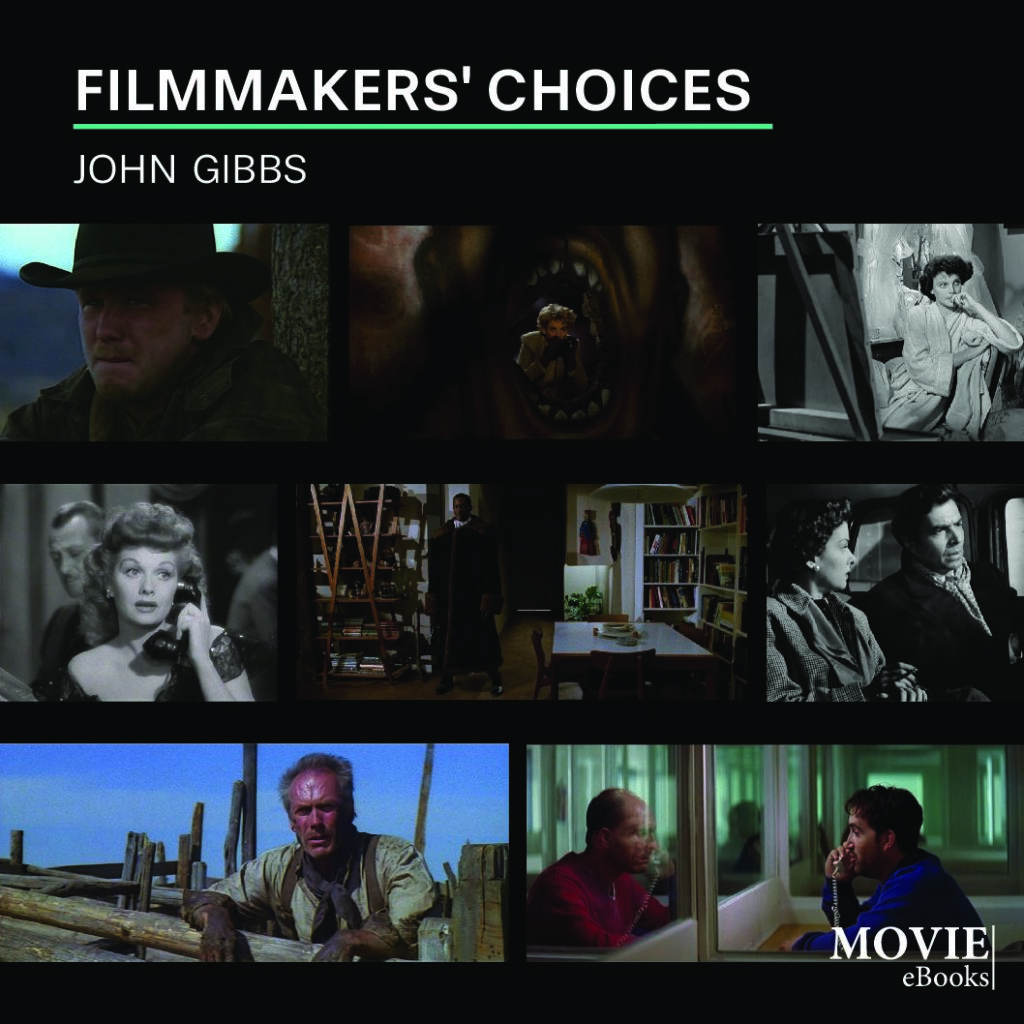
Background
The Head of the School of Arts & Communication Design at the University of Reading, Professor John Gibbs, required a student to design issue 9 of Movie: A Journal of Film Criticism that followed Martha Macri’s new design system, created the previous year for issue 8. This journal originated from Movie the printed journal which was published between 1962 and 2000 by the late Ian A. Cameron. It has since been designed digitally for online reading and is a rolling journal, meaning that articles are added to the journal throughout the year. The articles respond to a variety of themes such as focus and contemporary film style and intention in film and television criticism. It is mainly concerned with the aesthetics of film and television-style, theory, analysis, and evaluation of film and television. Movie issue 9 includes written articles and audio-visual essays. John Gibbs expressed that this issue must follow the new layout designed in the previous year because it enables the film frames to be integrated into the text. The website showcasing the journals also includes eBooks, which John was keen to redesign so that they created a sense of unity with the journal issues.
After the editorial module in the summer term of my first year, I was eager to explore this design field further. It was an exciting opportunity to work with text, image, and layout in a logical way but also to create a visual aesthetic that readers would enjoy. Being able to design for such a broad interest like film instantly grabbed my attention and I was intrigued by the idea of using someone else’s design and making it my own. Designing eBooks was also a completely new field to me, therefore I thought that it would be the perfect opportunity to develop my skills and knowledge within editorial design.
Brief
The objective of the project was to design the next issue of Movie, building on the previous two issues. The images in the issue should integrate with the text so that it relates to written content. Most of the work would take place between November and March but the journal’s practice is to produce a rolling issue. This means that additional articles can be added after the issue is launched at the end of October 2020. A Movie eBook designed as pdf’s was also to be produced alongside Issue 9, following a similar style to the issue.
Process
Initial contact with the client
Collaborating with a client from my University was beneficial to me because it meant that he was accustomed to working alongside students. This also meant that I could meet my client in person because he is based on campus. From our initial meeting, we agreed that our main form of communication would be via email, but we could also meet in person for updates on the project if needed. Email seemed sensible because my client is working with a team of authors, therefore it would be the most convenient way to receive feedback from them that can be passed onto me. The pandemic prevented us from meeting in person, but we were able to converse regularly by email and have Teams meetings if necessary.
The initial meeting with the client gave me the opportunity to clarify what he required. At this point, we did not have a confirmed deadline but I was aware that the journal was a running issue so I would be required to design articles after issue 9 was published. As the process also depended on the author’s confirmation of the design of their article, it became a lengthy progression. This process was also made longer due to the pandemic because it meant the project fell over summer when it was harder to reach the authors.
InDesign files
To begin the design process, I retrieved files from the designer of issue 8. My client requested that I use this design template for issue 9, which meant I had to adapt my design skills into an existing design. However, I was still critical of the existing files in order to improve the design and have control over the work. I spent time analysing the original file to gain familiarity and to ensure I used the paragraph and character style sheets consistently throughout the issue. This also allowed me to gain justifications from the previous designer as to why they made certain editorial decisions and whether these were important to follow through into issue 9 of Movie. Overall, the templates look very similar and I ensured that the images corresponded with the text throughout because the client expressed how vital this was. I used appropriate files and design guidelines such as page layout, the grid, typesetting, images and the cover design.
Design development
When I first started this project, I found it slightly overwhelming because I had never worked with so much text and image. It took me a while to become completely familiar with the paragraph and character styles, as well as finding consistency with spacing and the grid. After becoming familiar with these aspects, it was easier to successfully integrate the images which improved the flow of the text.
I found that feedback was very useful because there were often small aspects that I would miss out due to the volume of text I was working with. Gaining feedback from a range of authors gave me an insight into how feedback is carried out in the editorial industry. I also found it interesting to see how different editors and authors provided feedback. Some were through email with page numbers for reference, whereas others edited the pdfs they had been sent. I have been able to adapt to these different styles and ensure that I follow their instructions carefully, so I did not miss anything. This could sometimes be difficult, especially when explaining where in the text amendments need to be made.
‘Brilliant! Looks great, and the images are grouped and paginated perfectly. Please pass on my compliments to Beth for the design.’ – Article author

Around halfway through the design process of issue 9, I received useful feedback from my supervisor. He expressed that I should improve on the previous students work where I see an opportunity to do so. Until this point I had not been confident enough to do this, even when I may have seen aspects that I knew could be improved. After this, I felt confident in changing these parts to improve the design further for the client. One of the main changes I made was to the opening pages of each article. The idea was to create a clear colour scheme for each type of article that flowed throughout the issue and make it easier for the reader to navigate. I came up with a variety of possibilities and sent these to my client. We decided on a coloured outline box for the title with the name of the movie in that same colour. This corresponded with the running heads. I also adjusted the contents page and the credits, so the text flowed better.
‘This is really good work’ – James Lloyd, Project supervisor

eBooks
Initial design ideas
For the initial stages of the eBook design, I asked my client to send me images of the original Movie books to ensure I included traditional aspects in them. They had to be sent via email due to the pandemic which was a shame because it would have been beneficial to see them in person. After receiving the text, I began designing the books. I used the same square format as the original books but used similar paragraph and character styles to issue 9 because I wanted the issue and the eBooks to look coherent and have a modern twist on the traditional design.

Development
After the client was happy with the original template, I input the text and images for the other three books. This was time-consuming, but it was enjoyable because I was so familiar with the paragraph and character styles, as well as space between image and text to make sure it flowed. This made the whole process logical and overall, really satisfying. Again, I was working with a number of professionals which meant the process took a little longer. I received amendments back and forth between authors in order to make sure everyone was happy. Most of these amendments included missed italics or grammar/wording that needed changing.
The client requested the addition of keywords to each eBook to aid search engine optimisation. This was a completely new feature to me, but it was a lot more straightforward than I predicted. This provided me with a new skill that I am sure I will use again.
‘I really enjoyed working on the proof. I think your design is excellent, distinctive, and very readable. I tried it on my computer screen and on iBook on an iPad and it worked well in both contexts.’ – John Gibbs, head of the School of Arts & Communication Design
Covers
I then began to work on the cover for each eBook. The client expressed that he would like each of the books to work as a series but also fit with the style of the journal. My initial ideas included showcasing a range of images from each book on the cover or use one large image which would fit the style of issue 9. The client chose a range of images, so I created a simple grid system that would work for each eBook, using the same typeface and rule as the journal to create coherency. I thought showcasing a range of images within the eBook was effective because each book contains a variety of movies and it gives the reader an idea of the content. It also meant that one movie was not more important than the others.
While designing the covers the client and other authors suggested I design a logo for the cover of each eBook. This would show that they were part of a series and separate from the journals. I created a simple logo that incorporated a rule and used the original typeface from the Movie journals. I ensured that it was simple to prevent overpowering the images on the cover.


Reflection
The design aspect of this project was quite straightforward due to the existing template. I also used a very similar one for the eBooks, which made it easier for me to design because I was already familiar with the files. This project has been heavily reliant on ensuring all my files are organised. This includes labeling them with different versions (For example Filename_V01, Filename_V02, etc.). This also refers to keeping the existing paragraph and character style organised as I added new styles to the existing ones. This was important to avoid confusion, especially when adding new articles and helped to keep each article consistent. I believe I was able to execute this successfully and I hope that the files will be clear for the designer who takes on the design of issue 10 of Movie. In order to make this easier for the next designer, I have created a template to help them understand the design elements and organisation.
I have learnt a lot from this project. To begin with I found it overwhelming but I have learnt how to work with large volumes of text and image and input them into a document that follows a strict design system. Using another designer’s existing style sheets has also taught me the importance of keeping InDesign files organised and I was thankful that the previous design did this. Having the ability to adapt and use an existing file will be a useful skill to have for future industry work.
I have developed a professional relationship with my client through regular contact via email when necessary. My client has always been easy to reach and was happy to answer any of my questions which made the flow of communication much easier. They have informed me when amendments are needed throughout the process and ensured that I have had plenty of time to make changes before deadlines. This has given me the confidence to develop my communication skills and I feel that I am now able to contact clients on a professional and confident level. This skill will be beneficial to me when developing relationships with clients in the design world.
Overall, I believe that I have met the client’s needs in achieving issue 9 of Movie that aligns with the work of the previous designer by integrating text and image, as well as keeping some original Movie design aspects. I was also able to design four eBooks that took inspiration from the journal but provide a slightly different feel. This project took longer than I had expected, however, this was due to the pandemic and the publication being a rolling issue. This meant that I was working with more authors, who were submitting their articles at different times. I was also really happy to continue working on this project because I have thoroughly enjoyed it, particularly designing the eBooks. Through this project I have learnt how to communicate with clients in a confident and professional manner, learnt how to organise and use InDesign for large files, and learnt how to create consistency between documents. I have received some lovely feedback throughout the process, which has been very rewarding, and I have been thrilled with how happy everyone has been with both issue 9 of Movie and the eBooks.
‘Thanks very much, Beth – they look great!’ – John Gibbs, head of the School of Arts & Communication Design
‘Wow! I am THRILLED by the layout! Please tell everyone involved how much I appreciate their ingenuity and vision. Their solution overlaying the grid atop the frame is both elegant and convincing. I am so moved that I wish I could hug everyone in thanks.’ – Marshall Deutelbaum, article author.

