Chloe Ball and Romy Chessells
The EVE film branding real job included working with a group of senior film executives who have formed an operating company with a difference. The clients were all women, with an aim to promote diversity and ethical work practices. The name EVE stands for “everyone valued equally”. Being young women ourselves, we felt particularly drawn to this job and very pleased to have the opportunity to work with these successful women.
Our goals
The primary aim of our real job was to help launch EVE as a brand, this involved designing a logo, selecting a colour palette and selecting fonts. The visual identity needed to be aesthetically appealing yet versatile enough to be easily applied to any online or print document the company may produce. It was vital we promoted both the role of the company, and EVE’s specific aim and message. Our clients wanted green, a subtle link to Adam and Eve, yet were insistent the logo should not be overly feminine. Finding this balance between a corporate company and feminist movement was tough but rewarding. We are pleased to say that our role did not end there. Instead, we went on to develop further deliverables including a business card, email template, brand guidelines document, and website template. All of these deliverables maintained the key goals of the initial logo, promoting both the company and message.
Deliverables
As mentioned above, we produced a range of deliverables to help launch EVE as a brand, these included:
- Logo: Design must work at small and large sizes, in particular appropriate for use on a website, letterheads and at the end of emails.
- Colour palette: Should include the colour green, must be both uplifting yet stylish and modern.
- Typeface selection: A selection of typefaces that will work with the style of branding and for the website.
- Website template: A skin of a potential homepage website design, text and images to be supplied by the client at a later date. (Client did not end up providing these).
- Business card: A business card that conveys the company’s brand clearly, and includes all of the key information.
- Email template: An email template that can be used for all communications. Needs to be professional and include the logo.
- Brand Guidelines: A set of branding guidelines to show how the various elements should be used and where, much like a toolkit.
Initial Client meeting
Before our initial client meeting with Maria Walker we made a plan including the key questions we had after reading the brief. Due to COVID we had an online meeting, we knew this meant the plan needed to be particularly comprehensive and clear in order to get all of the information we needed. We spent lots of time trying to fully understand what EVE stood for as a brand, understanding this was vital for the branding’s success. While the company has a strong female influence, any design decisions should avoid making obvious or cliché references to this. Maria did not set strict design guidelines and was happy for us to be relatively creative however she had a preference for using green in the colour palette. This is to represent the ‘nature’ associations the name ‘EVE’ has. In terms of the logo the company name ‘EVE’ needed to be included and the words ‘studios’ or ‘film studios’ may also be included.
Initial contact with Supervisor
Due to our supervisor Rachel Warner being away, we had our client meeting before our first supervisor meeting (we were advised to go ahead and do this). When we were able to meet with Rachel, we explained our clients goals and expectations, as well as outlining our plan for the first stages of the project. This went well, and Rachel was happy with our plan to begin sketching up some initial ideas for deliverable 1, the logo. In addition to this, we also began writing up the restated brief. This initial meeting was important, and helped us reflect on the first client meeting, considering how we should structure the project and organise our time effectively.
Restated Brief
After our supervisor meeting and initial meeting with the client, we combined the information discussed with our own research and ideas. This helped us to develop our initial restated brief. It was important that this discussed the goals/aims of the client, the context of the job, specific design outputs, roles, responsibilities and all of the key aspects to consider. We also developed an initial schedule to help us keep on track with our job, and meet deadlines. Unfortunately this schedule got slightly lost as the project progressed due to our client withdrawing from the project at a late stage, but we will discuss this later in our report.
Research and ideation
Competitor research
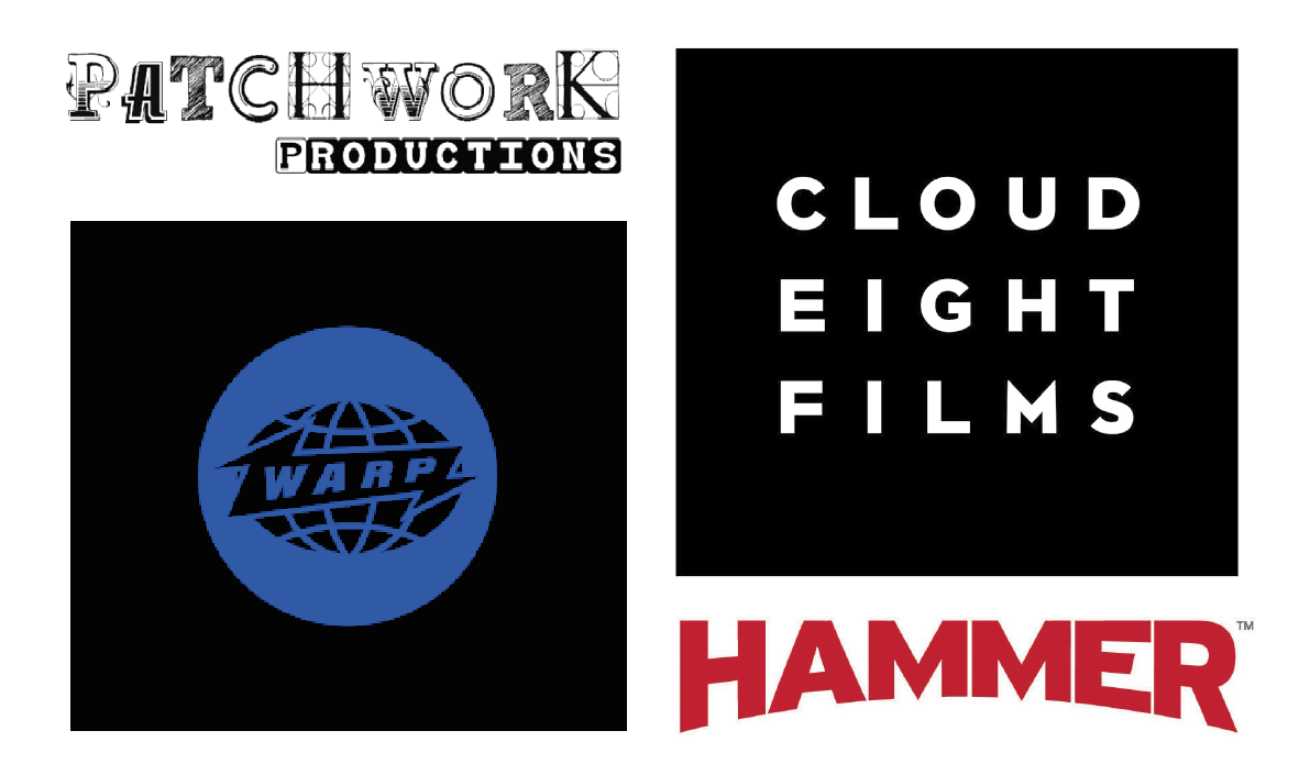
Once we had done the initial meeting with the client, clarified deliverables and restated the brief we began the research process. We wanted to gain a good understanding of the competitors and types of design that currently exists in the industry. As EVE is quite a niche film company, with the female leadership and strong emphasis on equality and diversity it was hard to find competitors that promote the same message. We therefore looked at both UK based independent and studio-backed film company logos. As a general it seemed the independent studios (seen on the left) had slightly more ‘designed’ logos, including illustration of detailed typography. Whereas the studio-backed companies had far simpler logos, using simple typography. Although there were exceptions to this rule we felt it was a good indication to the level of detail and design the logo should include. With EVE being independent, this research indicated that it would be appropriate to include illustration and detail to some degree.
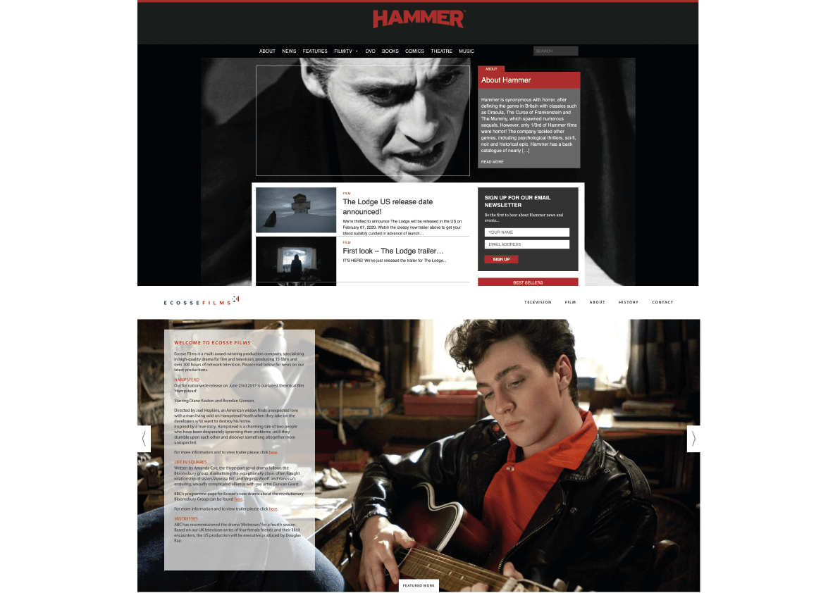
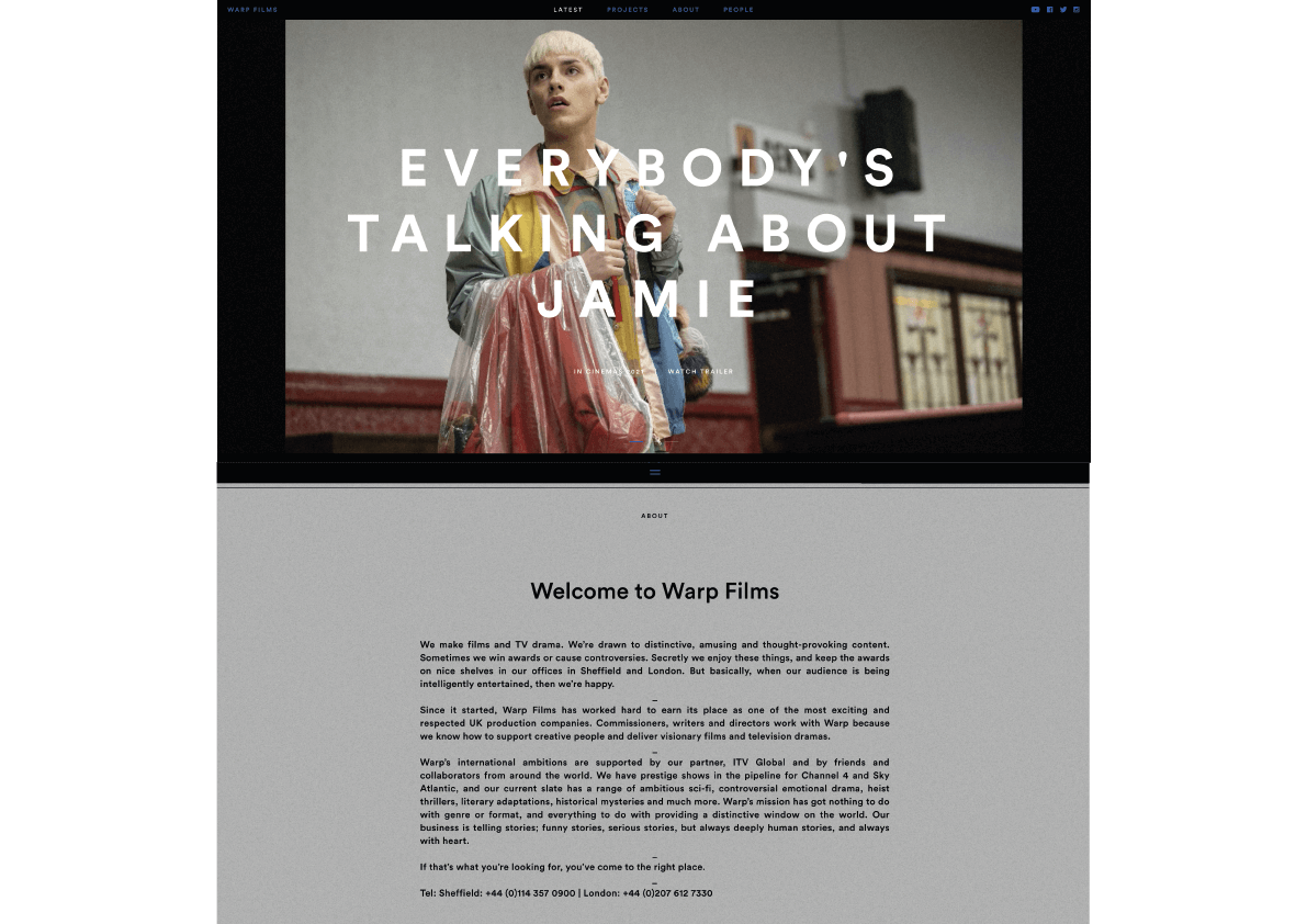
We also did some competitor research later in the project looking at existing websites. This was extremely useful in getting an idea of what should be included, particularly because our client backed out. During research we found the majority of film studio websites include images or videos of films they have produced. We also found they tend to include some kind of mission statement or small paragraph about the company’s aims, values and where they stand within the industry. They of course also include more obvious elements of web design such as a navigation bar or menu, logo, search bars etc. A common difference between independent and studio-backed film companies web design however is that the independent film websites have far more emphasis on aesthetics than usability. They tend to include large videos, and minimal amounts of large text. They are visually beautiful but as a user these sites are hard to navigate. This over-designed reliance on visuals is something we wanted to avoid in our project, and we were therefore pleased we researched and experienced these different types of design in order to come to this decision.
Users and target market
EVE’s users are generally clients, people who want to work with EVE to use their studios and services to create films and TV. However, the list of potential users could also include people who want to buy the rights to films or TV shows they have made, actors looking for work, people who want to find out the locations of cinemas where they can view the films, and many more. This means the potential user is relatively varied, in terms of design, in particular the website template this means creating a clear layout that allows each user to reach their goal.
In our meetings with the client, she also more specifically outlined who their target market is. The client explained how the film and TV industry is male dominated and there are not enough opportunities for people of all ethnicities and sexual orientation. This is where their name comes from and also who their services are targeted for. Having said this however the client explained that although this is their target market, they do not want to isolate men and obvious or cliché representations of equality should be avoided.
Logo design
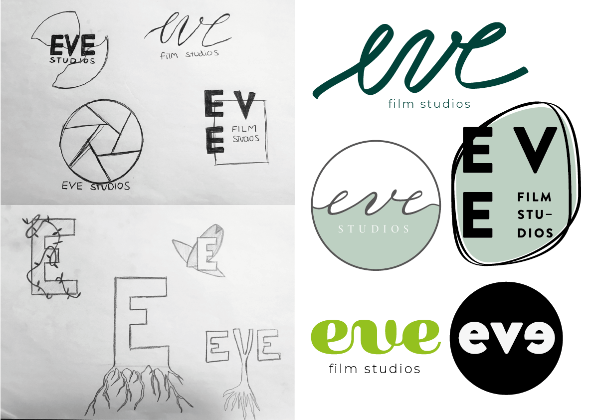
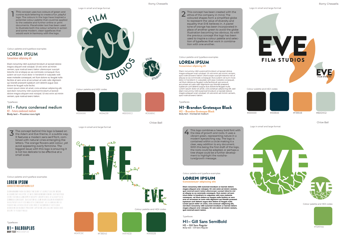
Once we felt we had a thorough understanding of our client’s ethos and values, primary users and existing competitors we felt confident enough to start developing potential logo designs. We started by making some basic sketches using paper before translating them into digital designs using adobe illustrator. Our initial designs focused on representing the various avenues we could have taken the concept. One such avenue was the idea of portraying the ‘Adam and Eve’ connotation that comes with the company name. As the company is run by women and Eve was ‘the first woman’ it seemed an interesting direction to explore. This concept was explored through developing logo designs that encompassed vines and nature which worked extremely well in adhering to the client’s request of using green and the company’s environmentally friendly standpoint. We also tried another direction focusing more on the company’s ethos of inclusivity and giving everyone an equal chance represented through a simplified illustration of the world. We also experimented with a logo created with a combination of different greens and a playful, cursive treatment of the name ‘EVE’. The typography aimed to represent the feminine influence of the company, balanced with the neutrality of green to lessen the ‘girliness’ of the design. We developed these logos individually but kept close communication with one another, sending pictures and updating one another with our ideas. This meant that once these draft logos were developed we felt confident we were providing the client with a variety in choice, so they would be aware of the various potential directions the logo could go in.
As these were the first drafts it was unsurprising the client asked us to keep pursuing a logo that better represents their company. Sending the first drafts also helped us identify some issues and requests the client had for further development. One of them being that ‘EVE’ must always be capitalised, also some issues with the logos not being designed obviously enough to be recognised, for example the world not looking enough like the world and the vines looking like cracks. She also felt vines that included flowers looked too feminine and this was something she wanted us to avoid. Additionally the client expressed a more general wish for the designs to not include any muted colours, for them to be stronger and cleaner. This criticism was very constructive and using her advice we developed some further designs.
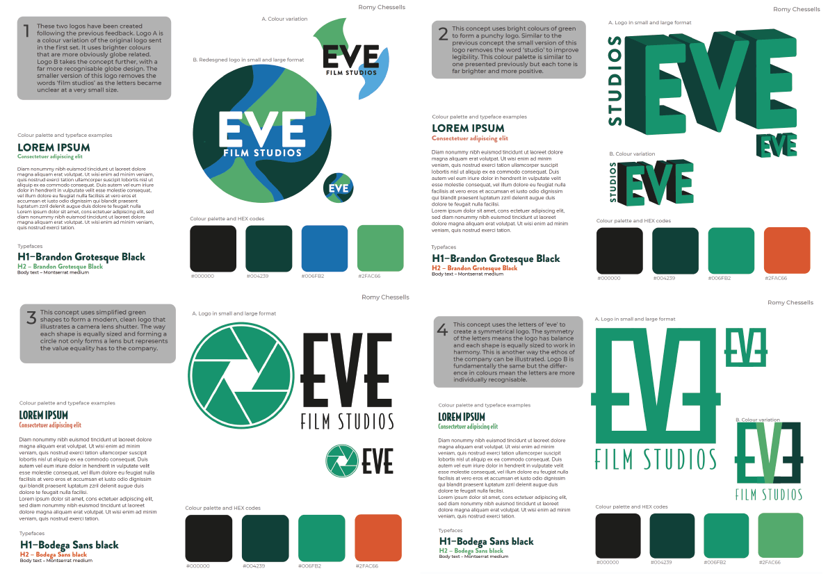
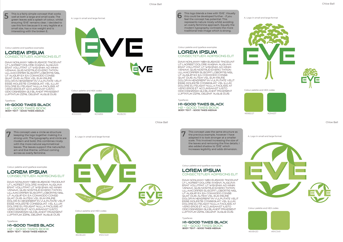
This time we aimed to better represent the characteristics of the company, in particular representing their modern values, utilizing the colour green in a variety of ways and creating an interesting, stylish design that is not overtly feminine. We created seven new designs and developed the previous world logo to be more obvious. Four of these designs still had elements of nature and employed bright shades of green. The font ‘good times’ has been used for all four of these designs. This is a very modern typeface and therefore aims to answer the clients request for more contemporary designs. That said the illustrations of nature used on two of the designs, the tree and the leaves embody a more traditional representation of nature, this creates a good contrast between traditional design and modern typography. This contrast adds a certain level of depth to the logos while still refraining from being too feminine. We also put these logos on an email template so the client could assess whether they work well at small sizes and on documents.
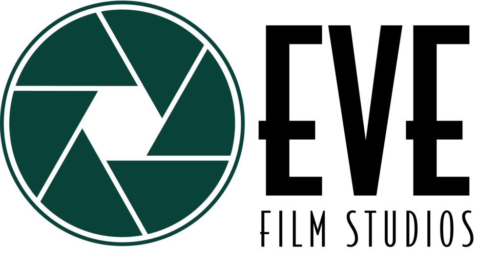
The client was very appreciative of the work we had put in to create all of the designs and felt although we had lots of good ideas the logo with the camera shutter most appealed to them. The client felt this ticked the required boxes of; representing a company run by a woman, about film and TV and environmentally friendly. This logo uses slightly elaborate, art deco style typography called bodega sans to give a sense of style and elegance, this carefully reflects the strong female influence the company has without being cliche. The camera shutter is created with uncomplicated shapes, meaning it is easy to replicate yet clearly illustrates what the company is about. Finally the use of colour has been carefully considered, green is used both because the client requested it and it helps to subtly illustrate their environmentally friendly values. The shade of green was initially relatively bright but was later changed to a dark green, similar to the classic British racing green. This adds a level of sophistication and elegance to the design.
Complications with our client
Unfortunately, our project began at the beginning of the Coronavirus pandemic. This caused a number of issues throughout the process, largely surrounding communications with our client. All of our meetings and communications had to be virtual, which made it difficult to have fluent conversations or present work in the most effective way. Despite this, we handled the situation well and managed to have regular Teams meetings with our client.
After working on the initial deliverables for a number of weeks, and having the initial logo signed off, unfortunately our client backed out of the project. She explained that due to a number of factors, including Coronavirus, the company needed to put the project on hold. She reassured us that she was very happy with our work, which can be seen in the signing off email in Trello.
We were both very disappointed that the project had stopped at this stage, and felt we had a lot more to offer. After some consideration and meetings with our supervisor, we decided to continue with the project, going on to produce a further four deliverables; a business card, email template, website template and set of brand guidelines/toolkit. The client had briefly mentioned a website template as a potential deliverable, and said that they would provide text and image, however this was circumstantial and never got confirmed. Therefore we had to go on to create it with no provided content.
Website template
When the client decided to end the project one of the hardest decisions we had to make was whether or not to continue on with the website template deliverable. As the original brief for this deliverable was reliant on the client supplying the text and images we were unsure whether we could create a template representative enough of the company. We decided however that through our meetings and communication with the client, particularly through the feedback we received about the logos we had developed a thorough enough understanding of their company and the style of brand identity they wanted to create. We therefore proceeded with the website template design client-less using images and placeholder text, elements that would be easily changeable if the client were to use the template. The overall layout, typography, arrangement of graphic elements were what needed to be created in order to develop a robust enough template that could realistically be used by a client.
The earliest version of this deliverable used a layout composed of diagonal lines and triangular shapes. This made an overall visually interesting website template but there were some serious issues with its design. These were highlighted to us during one of the meetings where peer and tutor feedback brought forward some key considerations. It was felt that using such a dynamic, geometric layout would prove difficult for a client to apply to later changes they would inevitably make to the website, in particular altering the content. This layout would only work for a specific orientation of image and a limited amount of text. It was also indicated that this design may have been slightly too harsh in appearance and although the shapes used had a strong correlation with the logo it did not portray the values of the company well enough, in particular the feminist and modern influences.
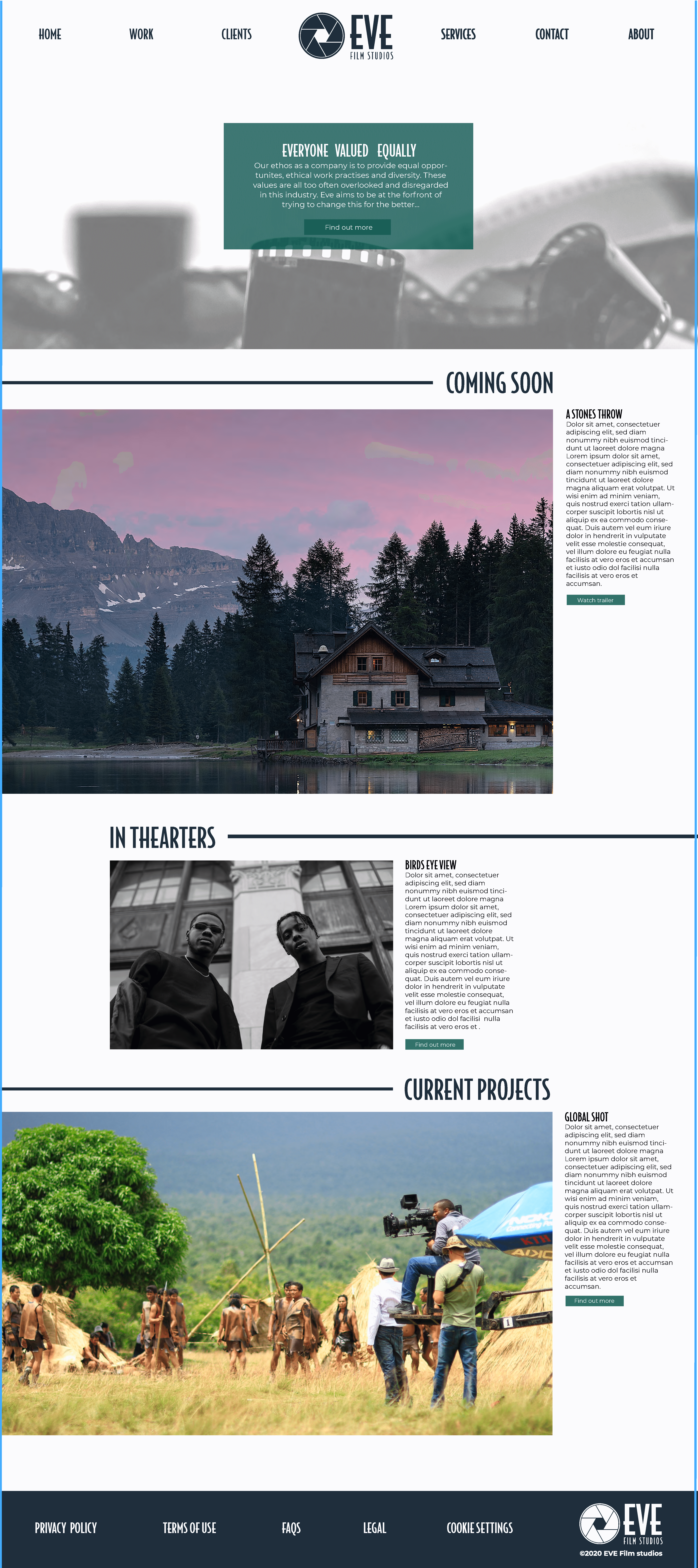
We decided it would be a good decision to completely redesign the website from here. The new design concept was far cleaner and aims to be simple enough for a client to use and edit in the future while still including elements and treatment of typography that keeps it visually appealing and adherent to brand values. The choice of camera film as the background image was due to us not having content from the client. We felt the next best solution would be to use images that would help make the actual purpose of the company as obvious as possible to a user that has not used the site or even heard of the company before. As we did not have any text provided to us we filled most text areas on the site with placeholder text. However on the top of the homepage we felt it important to write a small mission statement to make the site more realistic and meaningful. This statement outlines the ethos of the company and the value they hold for equality and diversity and how having these values sets them apart in the film industry. The placement of the logo and navigational elements on the top of the homepage was altered a number of times in order to identify the most suitable layout. Eventually we decided, along with the guidance from our supervisor, that having a central layout with the EVE logo in the middle of the navigation bar helped to nicely balance all of the elements.
We felt the concept of having a balanced design should be implemented throughout the whole design as it helps to create a clean, modern and easy to follow layout. It is also a nice reflection of the values of equality the company holds. The sections following from the top are therefore designed to be visually balanced, however we did not want to keep the central arrangement used at the top for the whole website as although the client likes clean design they do not like boring, predictive designs either. The different sections of the website represent areas where the client would be able to upload trailers and images of their most recent projects both finished and in the making, along with some text and buttons taking the client to more information. The layout allows for large images that are eye-catching for a user and allows these projects enough space to be properly promoted and advertised to users visiting the site. Each section alternates with the image either being positioned from the left or right, this creates a more interesting design for the user to follow as they scroll, in addition to it making the different sections more obvious. The font that is used for headings on the site is the same as the logo, bodega sans, combined with Monserrat for the body text. Bodega sans was chosen for the headings as it helps to enforce the brand identity through the site, meaning the logo, business card and website all work holistically as part of the brand identity. This font however only works for headings as at small sizes or in condensed blocks of text it would have serious issues with legibility. Monserrat however is a clean, modern sans serif that is highly legible and easy to follow for a user. This is also partly why Monserrat is used for the text inside the buttons, it is crucial buttons, in particular call to action buttons are legible to ensure a smooth user journey.
The rules used to divide up each section were an element we played around with. We briefly felt the ‘EVE’ notion could potentially be illustrated in the website by adapting these rules into illustrations of vines. Simply designed, using 2D shapes we added some intertwining vines. Our supervisor felt these were a bit inappropriate however as nowhere else in the brand guidelines uses vines anymore. We therefore decided to revert back to the simple rule. Although this idea was found to be un-cohesive with the rest of the brand visuals we felt it was still a creative avenue worth exploring, even just to make sure the simple rule was the correct decision.
Business card
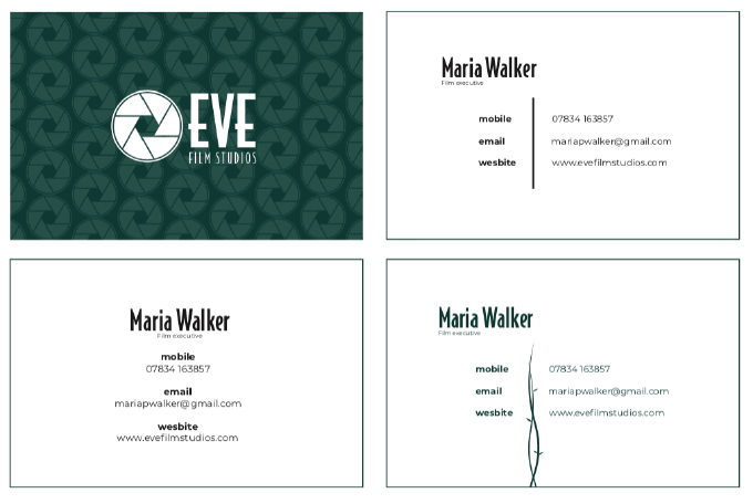
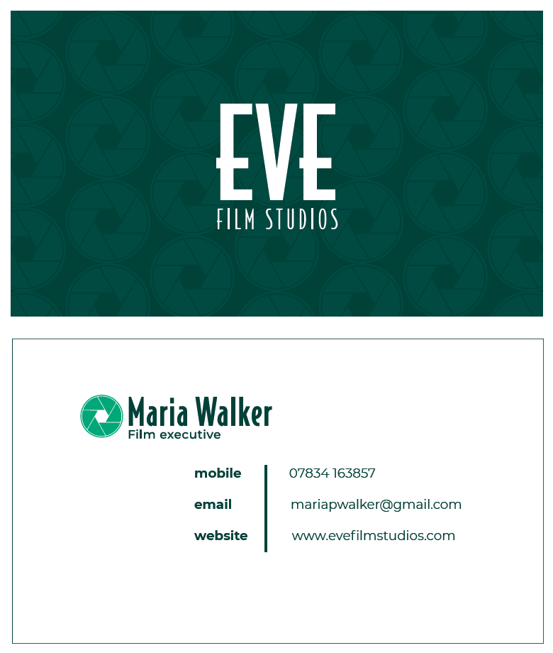
We decided to create a business card as an additional deliverable for EVE. This is a valuable deliverable for a new company, and a great source of advertising. Creating a business card was also an opportunity for us to demonstrate how our logo can be used in different ways, applying it as a pattern. We experimented with a number of designs and compositions for the business card, maintaining the brand guidelines.
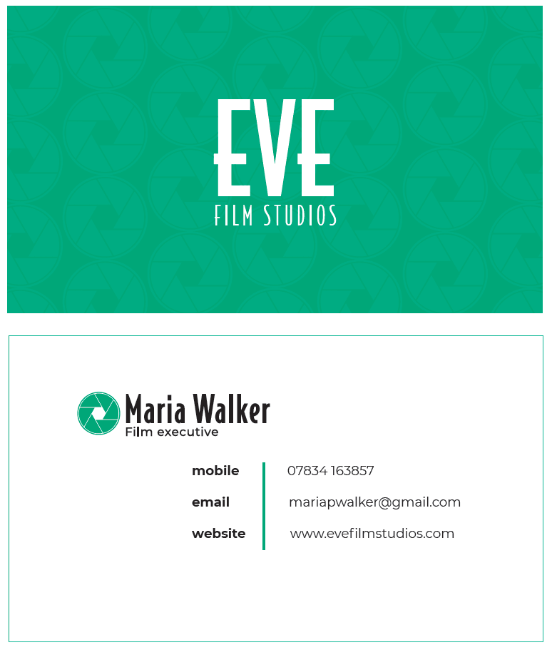
We emailed various versions of the business card to our supervisor for feedback, as well as showing it at real job meetings. We wanted one side of the card to be bold and eye catching, and the other to be more clear and simplistic carrying the important information. For the initial design we created a pattern that used the shutter image from the logo, this was received well. As the rest of our designs developed, our colour palette and usage changed to feature a darker green more centrally in the branding. We updated the business card to reflect this, and preferred the change.
Once the main design of the card was established, we began to fine tune the design. This was mainly focussed on the information side of the card, looking at the typographic detail and layout of the work. Some of our feedback sessions pushed us to consider the overall branding and how this can be implemented clearer on the business card. We experimented with adding vines to represent Adam and Eve as this was also explored in the website, however it was decided this was unclear and made the deliverables look messy. We spent time considering how we could add the logo and colour to the information side of the business card until we developed our final result.
Email template
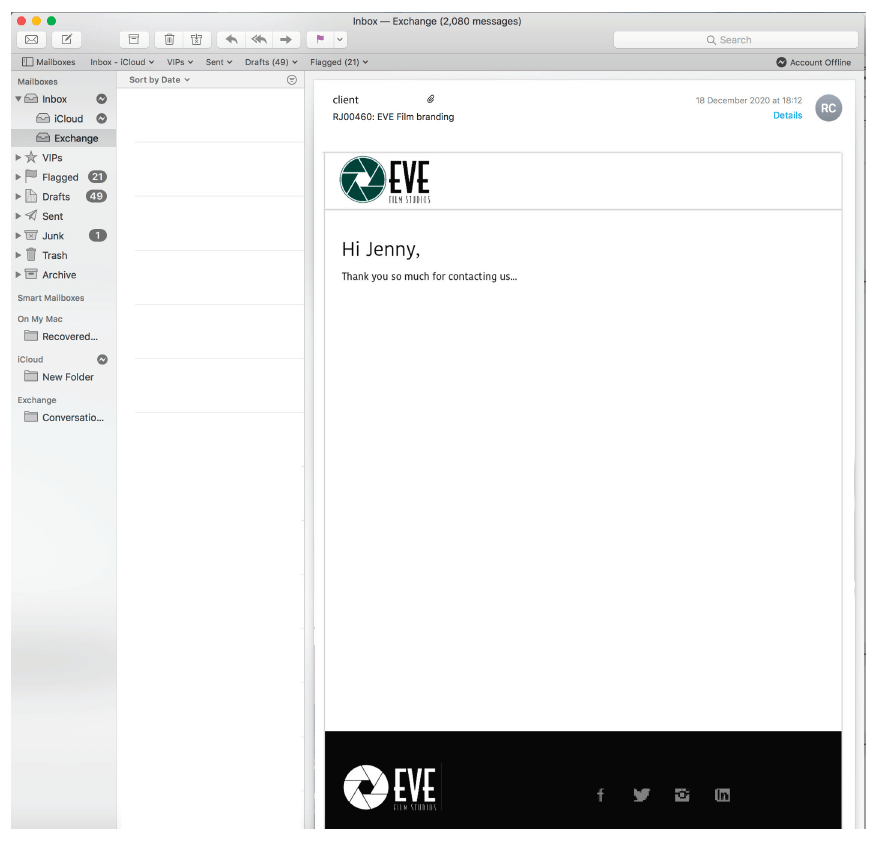
Our email template is one of the more simple deliverables on the project, but nonetheless important. This was an opportunity to demonstrate how our logo works at a small scale, and how the brand guidelines (colour etc) can be implemented across different formats. We are very happy with how these elements look combined, they are clear and professional.
Brand guidelines
After finalising our deliverables, we decided it was important to create a brand guidelines document. This presents all the brand guidelines and explains how and when the various elements should be used. This document also includes all of the deliverables, showing how the brand guidelines have been applied, and when or where they can be used. The aim for this was to create a foolproof document that has clear directions and answers to any of the clients questions. All of the design decisions have been made for them, making the process of implementing the various elements quick and easy.
Conclusion
Despite the challenges and setbacks faced, we continued to push forward and strived to complete a successful project. Coronavirus taught us how to run an entirely digital project, and we were pushed to explore new routes of communication. As a team we balanced work well, and maintained a consistent relationship with our supervisor, this was especially helpful when we stopped contact with our initial client. Our client was uncertain when discussing her brand ideas with us, she had various messages and themes she wanted to convey. We had to persevere with this and send over multiple versions. This was challenging, but hugely rewarding when we had the final logo signed off. If we were to face a similar situation like this in future projects, we would be quicker to get the project going again, making more set deadlines for ourselves.
As mentioned, we were disappointed when our project ended rather abruptly after the first three deliverables were completed. We overcame this by taking the project into our own hands, going on to make a further 4 deliverables under the guidance of our supervisors. We are very proud of this accomplishment, and have finished the project feeling like it has been completed to a level we are very happy with.

