Our task
For this project, we were given the brief of designing a book in relation to the story. I chose labyrinth as my theme.
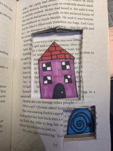
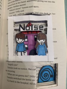
Labyrinth: a family moves into a house with unexpected spatial characteristics. The rooms keep shifting position every time a door is opened. The family members are trapped inside the house and start a journey to find the front door. While they keep moving from one room to the next, they discover that they are not the only ones lost in the impossibly infinite labyrinth of the house.
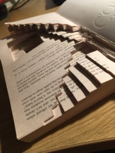
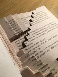
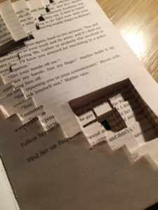
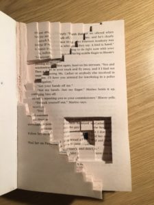
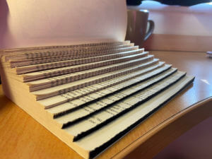
My initial idea was to cut each page into a different maze as a labyrinth is an elaborate, confusing structure designed to make a person lost as the character is in the brief. However, I realised that would be too time-consuming as we only had two hours and would also make the book loose its structure so I then simplified the maze, so that the maze is only on the front page but cut through multiple pages to make some parts of the pages very deep and others quite shallow to add depth and interest to the reader but also to relate to the trapped feeling the character would be feeling.
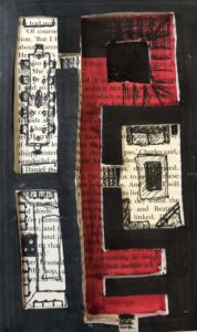
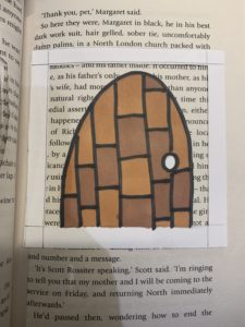
I also decided to cut the book into the shape of an arched door and painted the front cover as a front door as the character struggles to find the front door. The reason for the whole book being in the same arched door shape, is that the character keeps opening door and moving from one room to another so every-time the reader turns the page they will essentially be in a different room.
When I cut the maze, I attempted to cut it so that, the book would still be readable through the maze but would still confuse the reader. I wanted it like this because I wanted the content of the book to be confusing and lost to the reader as the character feels when the go through each room.
Finally, I added distress to the front page of the book with my nails to relate to traumatic experience the character would be going through.