Tag: conference

A very special ATypI

Jan Tschichold's corrections

As students were settling into their Halls for Welcome Week and the start of the new academic year, Sunday marked the return of several members of the Typography family from the annual ATypI conference, a highlight in the calendar of international type professionals. Held in Barcelona’s impressive new Museu del Diseny by MBM Arquitectes the conference was especially significant for Typography: to celebrate the award of the Sir Mischa Black Medal to Michael Twyman, the Association invited him to deliver the Keynote lecture on the topic of  “Typography as a university study”. (The image above, of visuals marked up by Tschichold for a facsimile edition of Vespasiano’s 1572 writing manual, is from Michael’s collections – and seen by postgraduates who join his seminars.)

Forty years after the foundation of the Department of Typography & Graphic Communication (and a few more since the inception of the original course, in the late 1960s), Michael’s integration of history, theory and practice continues to define typographic education. These ideas have proven not only resilient, but prescient: graphic communication education worldwide is moving towards these ideas, holding Reading as a model for both new courses and institutions realigning their design studies.

Fiona Ross and Michael Twyman

(Above: Fiona Ross and Michael Twyman in Barcelona. Photos by Elena Veguillas)

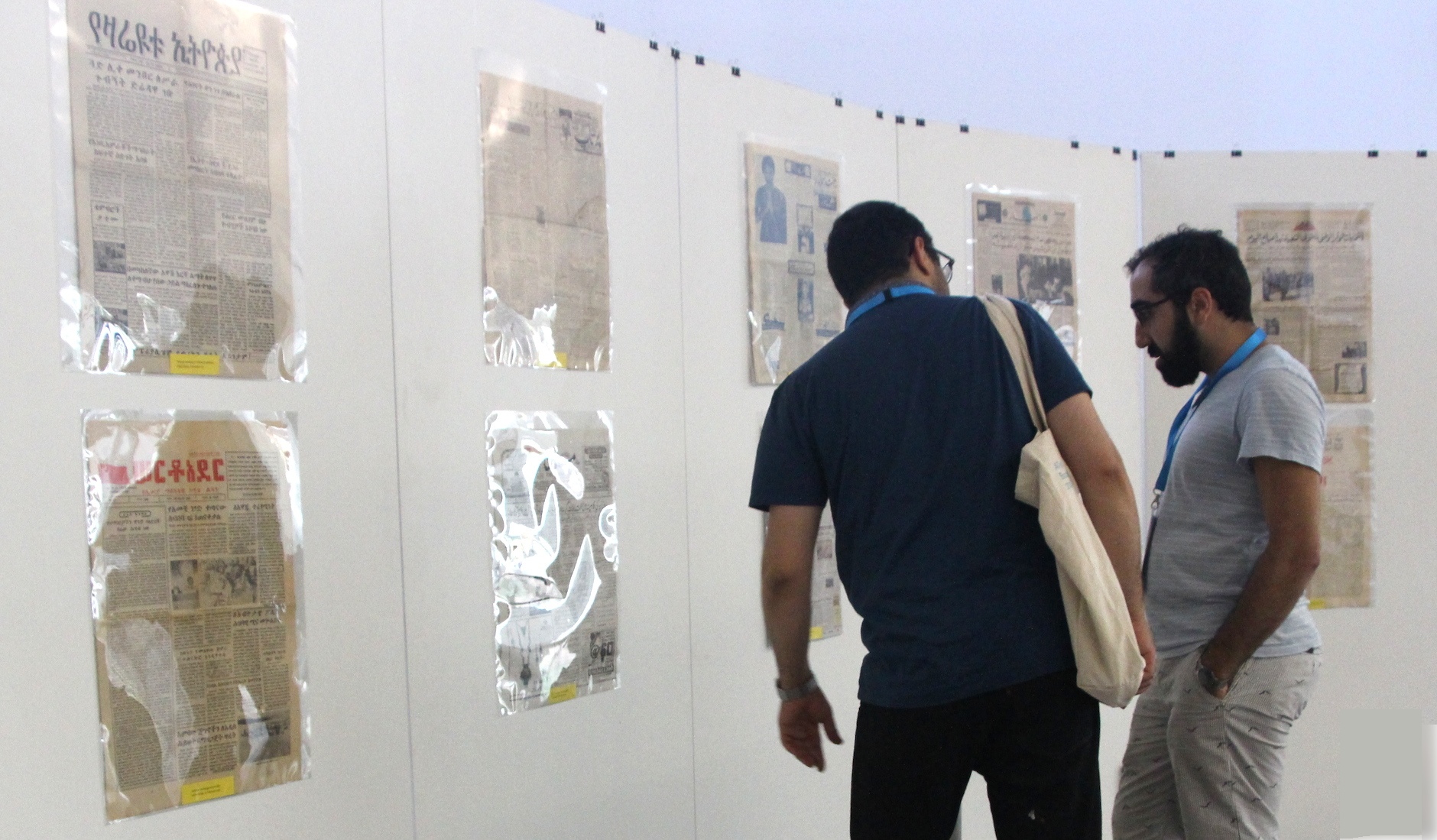
Reading’s presence at the conference was notable. Eric Kindel and Gerard Unger delivered presentations, as did no less than ten MATD alumni, with two more taking part in panel sessions (Azza Alameddine, Nathalie Dumont, Paul Hunt, William Montrose, Toshi Omagari, Michele Patane, Dan Reynolds, Dan Rhatigan, Alice Savoie, Liron Lavi Turkenich; and Veronika Burian and Nadine Chahine respectively). Fiona Ross co-curated (with the regrettably absent Vaibhav Singh) the exhibition “Making news: type technologies in transition in newspapers across the world”. The selection of items from the Department’s Collections & Archives are a source of fascination and discussion by type designers, and reflect the growth of interest in global scripts.

Making News exhibition
Borna Izadpanah and Behdad Esfahbod reviewing the Urdu section of the exhibition.

ATypI president (and Reading alumnus) José Scaglione’s announcement that ATypI 2015 will take place in São Paulo, the first South American location for the Association, which will bring the conference closer to the substantial community of Brazilian alumni.

Reading in Berlin

The annual TypoBerlin conference is a major fixture on the European design calendar, bringing together over 1,500 attendees in the Haus der Kulturen der Welt in Berlin. Erstwhile staff member Ken Garland opened this year’s conference with a talk on the theme of “touch”, taking the audience on a journey through senses and ideas, culminating with a very personal and touching – pun intended – story. Department  graduates Paul Barnes and Marian Misiak talked on making typefaces from Cornish vernacular lettering, and Polish type design heritage from the Communist era respectively. Gerry Leonidas spoke on the emergence of typeface design as α professional discipline with global reach. Slanted magazine have  been reporting on their blog on Ken, Paul, Marian, and Gerry.


Type design and inter-disciplinary innovation

Phototypesetting disk segment

The Musée de l’imprimerie in Lyons is hosting ‘La lettre à l’heure des révolutions technologiques’, an exhibition about typeface design and technological revolutions throughout the twentieth century curated by Alice Savoie, celebrated typeface designer and PhD researcher in the Department.

This exhibition, which runs to 14 October, illustrates the challenges faced by users and producers of typefaces during the three major technological shifts in the industry: from foundry type to hot-metal, to photo-composition, and to digital typesetting. The exhibition explores the considerable influence these changes have had on the design process, and the progressive disembodiment of type, which transformed the industry and redefined the roles of both designers and manufacturers.

The material presented draws on the typographical archives held by three major institutions: the Musée de l’imprimerie in Lyon, the Monotype archives held by Monotype Imaging in Salfords (UK), and the non-Latin collections in the Department.

The closing of the exhibition is marked by the Congress of the Association of European Printing Museums. The two-day event features an exceptional roster of speakers: Iris Kockelbergh (Director of the unique Plantin-Moretus Museum in Antwerp), Andrea De Pasquale (Director of the Braidense National Library in Milan, and the University Library in Turin), Charlotte Delannée, Johan Seivering, and Andréas Schweitzer (of the Association pour le patrimoine industriel, Suisse), Honourary Friend of the Department Mathieu Lommen (Curator of graphic collections, Amsterdam University Library), and our very own James Mosley, Richard Southall, and Alice Savoie.

Typecon Education Forum slides online

Opening the Education Forum in Typecon Milwaukee, Gerry offered a model for design education focused on typographically-rich environments on tablets, mostly. He talked about teaching the combination of paragraph-level typographic skills, information architecture, and interaction design required for designing complex documents like newspapers on small tablet screens. The slides (without commentary) are on SpeakerDeck.

Typography in Istanbul

ISType 2012

The second ISType conference is on today and for the next three days, in Istanbul. Reading is represented strongly: staff members Gerard Unger and Gerry Leonidas are giving talks, as are MATD graduates Veronika Burian & José Scaglione (a.k.a. Type-Together), Dave Crossland, and Eben Sorkin. Frequent visiting teacher and honorary friend of the Department John Hudson is also talking, as is MATD External Examiner Fred Smeijers. Veronika and José are jetting over from Brighton, where they presented today at the second Ampersand conference.

Typography in textbooks, in Warsaw

OdAlaMaKota logo

The International Conference Od „Ala Ma Kota” Do E-Matury in Warsaw will bring together typographers, designers, publishers, entrepreneurs, teachers, and policy makers from different European countries, to explore the correlation of the design of educational materials and efficiency in education.The rapid-fire event (TED-style condensed presentations of 16 minutes each) will review the current thinking on paper textbook design, and question how to design for new technologies entering the classrooms, from primary to higher education. Gerry Leonidas will link conventional typography with the interactive, expansive, and global typography emerging in text-intensive publications. Bringing things full circle, Gerry first spoke of these trends in Warsaw: nearly five years ago, in the 1st Book Design Lectures by the STGU (English report by the Book Institute here) on “Book design in transition: a threat or an opportunity for designers?”


MA student Joana da Silva at the Encontro Nacional de Tipografia

Joana da Silva, one of our MA Typeface Design students, will be a speaker at the  Encontro Nacional de Tipografia conference, hosted by the Universidade de Aveiro in Portugal, on 30 September. I can’t read Portuguese, but I can just about decipher the “Áreas de interesse”, and it made me think “I wish I could be there”. Good names are already on the speakers’ and organisers’ lists.

My first visit to Portugal (for ATypI 2006, in Lisbon) was an eye opener: there was strong community of designers and teachers in typography and typeface design, but they were not making their presence felt much outside the country. In the last five years this has started to change at an increasing pace. Events like the Encontro help develop a particularly regional take on typography.

The Encontro organisers are keeping the event modest in length, which has to be applauded. As larger typographic gatherings grow in numbers (ATypI, Typecon, TypoBerlin, the new TypoLondon, and others I forget) it is the smaller events, of one or two days at most, with modest registration fees, that become more rewarding to attend. Although the big typo-events are always appealing, it is the smaller events that fit better in a full typographic calendar. (I’m thinking of the many one-day events and one annual two-day conference at St Bride Library, the relatively new TypeTalks, the IDC in Katowice, amongst others.) Who knows? Maybe in a few years the big-ticket events will only be every two or three years, like the bi-annual CIT Valencia and Tipos Latinos, and the tri-annual ICTVC. (Or every ten, like the wonderfully far-sighted ATypI Letter2 event!)

But, hidden in the competition of the growing number of events for our time (and wallet) are two especially good developments: that most of the new events are based in countries that do not have a long tradition of typographic gatherings; and that there are many young speakers who are designers, teachers, and researchers. As typography and typeface design are getting established in ever more schools and universities, we can look forward to more events like the Encontro.

Encontro Nacional de Tipografia