Category: enterprise

Chinese publishing collaboration proceeds

Group photo of the speakers and organisers of the Creative Chinese Character Industry Symposium

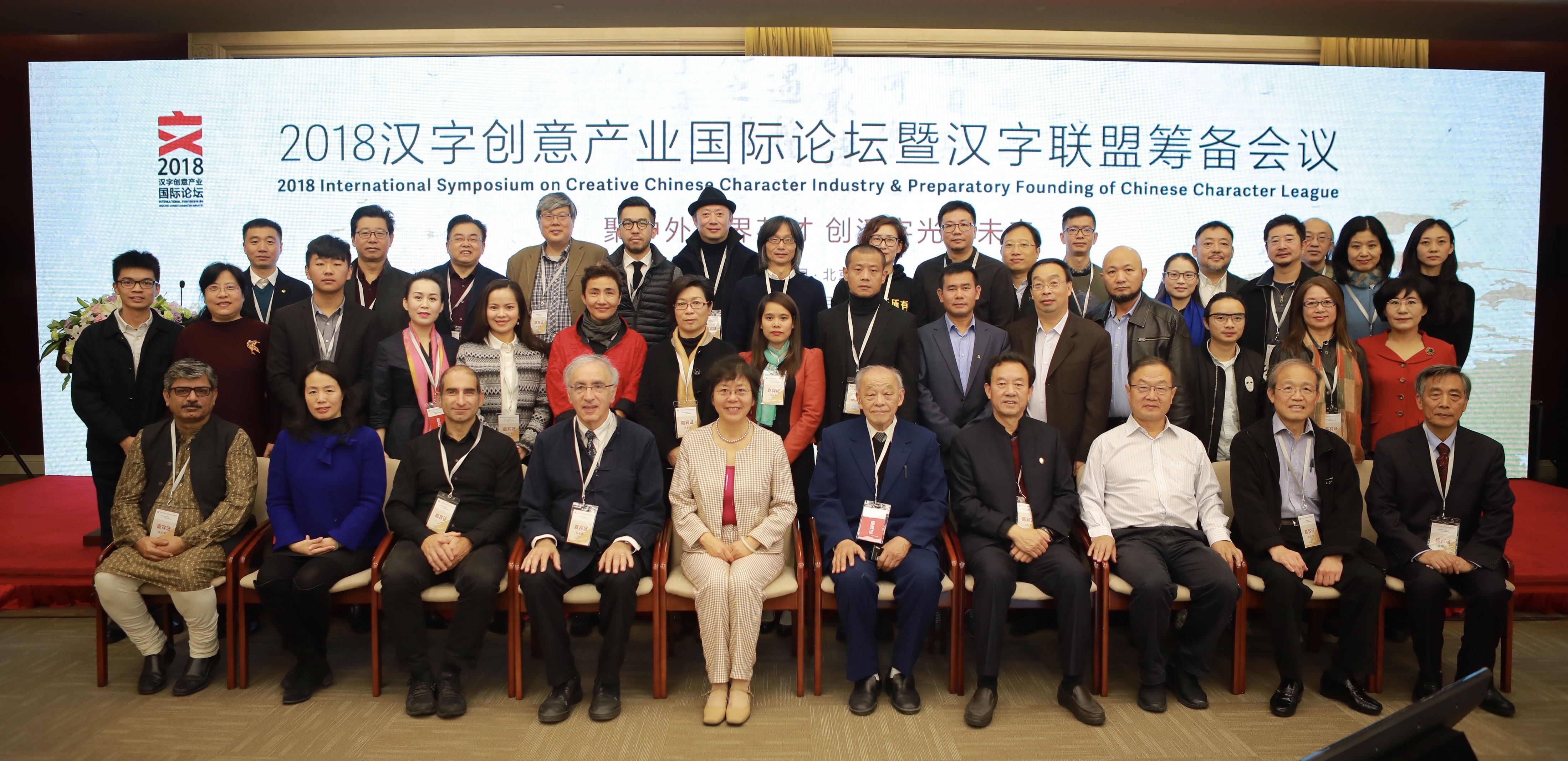
The inaugural symposium of the Creative Chinese Character Industry took place at the Beijing Convention Center on 3 and 4 November. The symposium brought together speakers from different areas of research and professional practice relating to the Chinese script: linguistics, Sinology, typeface design, publishing, and calligraphy. The symposium concluded with the preparatory work for the founding of the Chinese Character League, an interdisciplinary body bringing together organisations and agencies, including the Chinese Character Museum in Anyang.

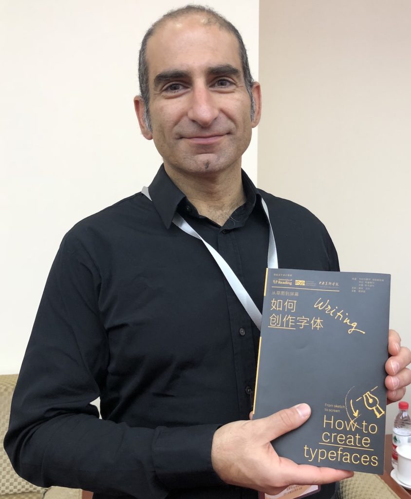
In addition to speaking at the Symposium and being invited to act as guide for the CCL, Gerry Leonidas had the opportunity to update plans for a project, supported by the University of Reading and ATypI, of publishing key typography texts in Chinese. The first title in the series, Jan Middendorp’s Shaping Text, is nearly out of print already; below, Gerry holds the proof edition of the second title, How to create typefaces by Cristobal Henestrosa, Laura Meseguer, and José Scaglione. The series extends to twelve titles, with a schedule of publishing two titles per year.

Gerry Leonidas holds the proof copy of How to create typefaces

Information design, architecture and pharmacy: combating AMR

Competition

Calling small design practices, architects, information designers and pharmacists

Are you interested in how the design of space and information impacts on behavior and consumer choice? Do you want to work in public health and wellbeing? Do you want to develop research in practice? Are you up for the challenge of interdisciplinary work in the community?  

About our research project

How can architectural and information design help in the fight against anti-microbial resistance (AMR)?

Using principles of user-centred design, we are working with pharmacists and pharmacy workers to consider how to ‘improve the knowledge and understanding of antimicrobial resistance’. The AHRC-funded project ‘Information Design and Architecture in Persuasive Pharmacy Space: combating AMR’ (IDAPPS) aims to stimulate ideas for an engaging, inspirational, didactic information space to raise awareness of the dangers of anti-microbial resistance in a community pharmacy.

One of our research outputs is a competition and this is where we’d like your help. Competition teams will begin designing in our Ideas Lab, supported by a team of academics from information design, architecture, pharmacy, and human factors, as well as design and pharmacy practitioners.

Our pharmacy partner is Day Lewis and the winning design will be installed in a Day Lewis pharmacy for evaluation. Interested?

Get more information and how to enter a team for the competition here.


Breaking down Barriers wins CIOB award for innovation

Typography students use simulation tools to appraise whether information in everyday contexts are presented in visually inclusive ways

Breaking down Barriers (BdB) – our multidisciplinary inclusive design project – has received a Highly Commended Award for Innovation in Education and Training in the 2016 Chartered Institute of Building (CIOB) International Innovation & Research Awards Scheme.

BdB champions a unique cross-disciplinary initiative to embed inclusive design across the University. Our BdB vision is to ensure Reading graduates across all disciplines advocate inclusion in their professional practices and bring real benefits to the everyday lives of all users, particularly people with conditions related to ageing and/or cognitive and physical disabilities. In Typography, we are engaging with inclusive design across a range of professional design contexts, including digital, packaging, print and wayfinding applications.

Typography students say that our BdB workshops have helped them “gain insight as to how thoughtful design can influence other industries and how we as designers must work together with these other industries in order to make the lives of the people that need a helping hand that little bit easier”.

CIOB Innovation and Research Awards highlight the importance of innovation and research in raising performance levels, enhancing best practice and improving the quality of the built environment. The CIOB judges said: “This innovation in education is a practical, engaging and demonstrable way to bring to life a real social challenge with widespread value and application. The innovation shows a genuine commitment to invest in the UK’s building stock and educate the next generation of professionals to ensure the needs of all users of a facility are firmly met.”

BdB began as an exciting collaboration between the School of Built Environment, the Henley Business School and the School of Arts and Communication Design in 2015. Since then we have been joined by staff within the School of Biological Sciences and collaborated with the Centre for Staff Development and, most recently, the School of Psychology and Clinical Language Sciences, as well as external partners.


Adobe publishes Bickham Script Pro 3

Bickham Script Pro 3

After several years of development, Adobe published the updated version of Bickham Script Pro, a connecting script based on the examples in George Bickham’s The Universal Penman. The typeface captures the complexity of the style perfected in the eighteenth century by writing masters, making use of a substantial set of alternate letterforms, ligatures, and swashes. Additionally, Bickham Script Pro 3 provides an extended character set that supports the Cyrillic and Greek scripts, as well as pan-European Latin. The typeface makes use of the rich variety of alternate forms in all three scripts, providing an innovative approach to display typography for Greek and Cyrillic.

In a series of blog posts by Sally Kerrigan, Adobe Type introduces  the project, the design and technical challenges, and the international team that contributed. Gerry Leonidas and alumna Irene Vlachou contributed to the project.


Apple’s new system fonts

Antonio Cavedoni at WWDC


There is a good community of Typography graduates working at Apple, and in recent days we got a peek at what they’ve been working on. During the annual World Wide Developers Conference held in San Franscisco MATD graduate Antonio Cavedoni took to the stage to introduce the new system fonts for the Apple platforms.

The talk is an excellent overview of the work that typeface designers do “behind the scenes” to ensure the texts we read on our devices are readable and well-structured – and a superb introduction to the level of detail that typeface designers work every day.

Google PlayBooks have new typeface by Reading graduates

literata typeface

Google’s PlayBooks application features a new typeface family by Type-Together, which was founded by Reading alumni Veronika Burian and José Scaglione. The brief for the new typeface demanded an outstanding reading experience across a wide range of devices and high resolution screens utilising different rendering technologies. Furthermore, the new typeface family was expected to avoid conventions for e-Readers that have roots in the lower resolutions of earlier devices, and demonstrate how e-Readers could provide a typographic environment comparable to printed pages.
The typeface, called Literata, not only had to define a distinct visual identity for Google’s native app, but achieve this across the three scripts required for pan-european coverage. Fellow MATD alumna Irene Vlachou worked on the Greek character set, with support from Gerry Leonidas. Images of the typeface are available on Flickr.