
Real Job: A team of designers created branding a social campaign for the latest 'drop' from a community interest fashion brand.
Author: KaijaHunter
CINEMA.LISTING
As part of this task, we were asked to recreate a cinema flyer using some information provided to enable us a better understanding about how it works in the professional world, when working with clients. We were given the opportunity to create our own categories according to what we felt was appropriate regarding our target audience. I split mine into three categories ensuring that the wording was fun and engaging just like it would be on a flyer. In these categories I put the films in order of the dates they were being aired to allow easy reading and navigation. I’ve used a san-serif typeface for similar reasons and to allow more of a modern feel.
I decided on black and white as a colour scheme to keep it relatively simple but I also felt like black was a colour commonly associated with cinemas and therefore fitted the criteria nicely. I’ve tried to create an order of hierarchy with the name of the theatre being the most important. The times of the movies are at the bottom of the criteria but i’ve done this because i thought the names of the movies were more important and if the consumer is interested in a movie they can easily see when and where it is below.
I’ve added the recognisable age certificates to not only add a pop of colour but too again, allow for easier navigation. One of the target audiences we were given was a family and so they would only be interested in the U or PG movies so they know where to look straight away. following on from this i wanted to create the same effect with the Audio Description and F-rated movies so I made sure to include to certificates for these.
Twilight
As part of this mini project, we were asked to, not only complete a copy of our own penguin book by creating an identical frame, but to also interpret this into our own concept through the inspirations of anything we can get our hands on. I decided to base my idea on The twilight saga. I wanted to use the colours red and black, as I felt these are the colours most associated with the movie series. As you can see, I also created the vampire fangs with dripping blood, hanging from ‘penguin books’, to really capture the vampire characteristics.
Stairs
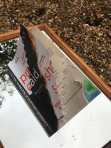
 For todays task we were given the freedom to let our creativity flow in this Broken narratives activity. We were given the choice of four themes. I chose the theme ‘stairs’. As stated in the brief a man has been hospitalised for an unnamed disease, the hospital has 7 floors for people like himself, the lower floors are for the more ill patients. He is moved the lower floors as the day goes by he moves further down along the way he reaches a state of hysteric and therefore begins to hallucinate. He eventually reaches the lowest level and therefore death.
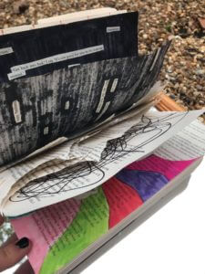
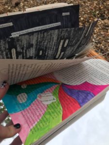
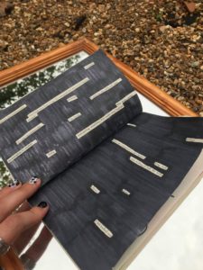
Throughout my work I wanted to portray images of illness, death and doubt. I think I did this pretty well and I really enjoyed this task. I wanted to tell the story through a series of different ways and techniques and feel like I achieved this relatively well considering the short time frame.
Some of my techniques failed but it was all about the creative experience. I tried to create stairs going deeper and deeper as every page turned but I couldn’t seem to get it. However i do think the stairs on the front cover are effective. I did the painting of the Earth because i wanted to try and make it as if he was moving further and further away from earth as mentioned in the brief but i didn’t end up finishing this. The black pages with the cut out lines is what i imagined the man would’ve been thinking in the dark times during the storyline because i wanted to make it more emotionally evoking.
Lettering in the environment
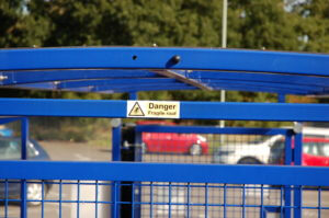
For this task we were sent away with the motive of finding lettering in the environment and capturing it in a photo to later analyse. Every day we look and read 100s of different typefaces that we may not even take a moment to think about normally, so it was nice to slow down and really question things like why did the creators of something chose to do it in this particular way?
I tried to capture a wide variety of different letter forms, techniques and materials but this began proving slightly difficult with being restricted to campus where they have a distinctive typeface to help brand the university. Over coming this set-back i looked for inspiration in more creative ways like car window stickers and stone drains.
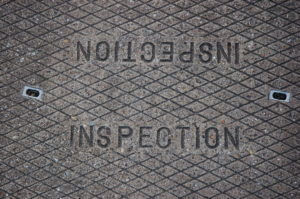
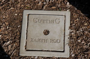
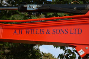
We were then asked to individually group out photos in-whatever way we please and it was really interesting to see the different and creative ways other people chose to group their work. i grouped mine into the different techniques and materials in which the letters were formed which included vinyl/stickers, stone casts, card/posters and carved metal. I feel i approached this challenge head on and to the best of my ability but if i was to do it again i would try harder to think outside the box and be more creative with my ideas.

KH
As part of our task today we had to combine our initials to create a transmogrify. We had the choice of two typefaces: Future (A sans serif typeface) and Garamond (a serif typeface) – I experimented with both.
I decided that my initials were better suited to the Futura typeface which created a strong and more angular look, much like my letters K&H. Where as Garamond would’ve created a more rounded, overall, feel which would’ve been better suited to letters like C and G.
I also experimented with different colours, textures and techniques but felt that the block black was better suited to my final piece and ran nicely with the strong, block theme.
Overall i’m happy with my final piece, I think I created something not only abstract but eligible also.