Opening the Education Forum in Typecon Milwaukee, Gerry offered a model for design education focused on typographically-rich environments on tablets, mostly. He talked about teaching the combination of paragraph-level typographic skills, information architecture, and interaction design required for designing complex documents like newspapers on small tablet screens. The slides (without commentary) are on SpeakerDeck.
Tag: typeface design
Collaborative type design in Adobe Creative Suite 6

The new Creative Suite 6 will ship with a Devanagari typeface in two weights, designed collaboratively by Tim Holloway, Fiona Ross and John Hudson. The new typeface, first released in 2011, had to be legible in both screen and print in text-intensive documents, while addressing the challenges of the heavier weight and offering a distinctive, modern interpretation of the script. The typeface takes a new approach to a traditional script, achieving a dynamic, fluid style with open counters, delicately flaring strokes, and a rounded treatment of distinguishing elements.
This design approach is intended to counter the effect of repetitive verticals and horizontals prevalent in earlier typefaces. OpenType features and a character set of around 800 characters are employed to achieve a more sophisticated typographic texture, utilising alternative contextual forms, and regional variants.
More details and images on the Adobe Typblography blog.
Reading types in Oxford English dictionaries
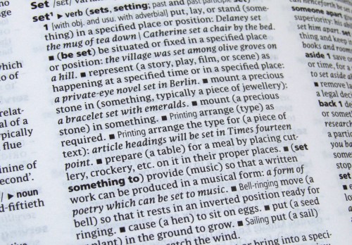
Many of the various printed editions of Oxford dictionaries are now typeset principally in Parable, a typeface designed by Christopher Burke, Research Fellow in the Department. These include the Concise, Compact, Paperback, Pocket, Little, and Colour Oxford Dictionary as well as the Oxford Paperback Thesaurus. Parable is also used effectively in the Oxford Dictionary of English (pictured) – a hefty hardback representing contemporary usage – for the entry texts, alongside Frutiger and Argo (designed by our Visiting Professor, Gerard Unger).
Christopher designed Parable between 1996 and 2002, specifically for use at small typesizes in books such as dictionaries and bibles. It was introduced into the Oxford dictionary range in 2004 by OUP designer Michael Johnson (also an alumnus of the department) when he was redesigning the Concise Oxford Dictionary. At Michael’s request, Christopher designed an alternative italic ampersand especially for the entry ‘ampersand’, because the dictionary’s editors were uncomfortable with Parable’s Granjonesque one. (See more about this here.)
Wednesday seminar: Rob McKaughan
Rob McKaughan is one of those people who can be trusted to come up with an interesting angle on things. Coming to the MATD from software engineering, he researched pattern languages (a methodology created by Christopher Alexander for architecture, which has spread to software and interaction design, amongst other fields) and their application to typeface design. Here’s a good explanation of pattern languages, from Rob’s introduction to his dissertation:
Each pattern in a pattern language is a rule of thumb abstracted from existing proven designs. More specifically, a pattern is a description of a problem and its solution in a particular context. These patterns are not recipes; they balance concrete physical descriptions while abstracting the pattern’s concepts for use in other designs. The patterns focus on the characteristics of the product, and not the process used by the designer.
Rob outlined the generation of pattern languages, and gave an illustration of how patterns can be used for typeface design (for his dissertation Rob focused on newspaper typefaces, with interesting observations on small size / low resolution text typefaces in general).
The lively discussion (including my immodest observation that some design courses follow a very similar approach to teaching, bar the nomenclature) touched on exciting topics, not least the relationship of pattern languages to innovation in design – much on the forefront of MA students at the beginning of their year…