Category: research

Type design and inter-disciplinary innovation

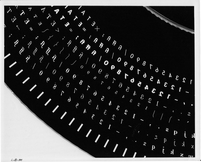
Phototypesetting disk segment

The Musée de l’imprimerie in Lyons is hosting ‘La lettre à l’heure des révolutions technologiques’, an exhibition about typeface design and technological revolutions throughout the twentieth century curated by Alice Savoie, celebrated typeface designer and PhD researcher in the Department.

This exhibition, which runs to 14 October, illustrates the challenges faced by users and producers of typefaces during the three major technological shifts in the industry: from foundry type to hot-metal, to photo-composition, and to digital typesetting. The exhibition explores the considerable influence these changes have had on the design process, and the progressive disembodiment of type, which transformed the industry and redefined the roles of both designers and manufacturers.

The material presented draws on the typographical archives held by three major institutions: the Musée de l’imprimerie in Lyon, the Monotype archives held by Monotype Imaging in Salfords (UK), and the non-Latin collections in the Department.

The closing of the exhibition is marked by the Congress of the Association of European Printing Museums. The two-day event features an exceptional roster of speakers: Iris Kockelbergh (Director of the unique Plantin-Moretus Museum in Antwerp), Andrea De Pasquale (Director of the Braidense National Library in Milan, and the University Library in Turin), Charlotte Delannée, Johan Seivering, and Andréas Schweitzer (of the Association pour le patrimoine industriel, Suisse), Honourary Friend of the Department Mathieu Lommen (Curator of graphic collections, Amsterdam University Library), and our very own James Mosley, Richard Southall, and Alice Savoie.

Type in Europe

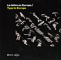
James Mosley and Alice Savoie are contributors to a new book published to coincide with the Congrès des Musées Européens de l’Imprimerie in Lyon. James Mosley contributes an inventory of ‘the materials of typefounding’, while Alice (who is an AHRC-funded research student) writes with Alan Marshall and Bernadette Moglia on ‘our typographic heritage’.

Copies are available from www.imprimerie.lyon.fr

La lettre en Europe

Collaborative type design in Adobe Creative Suite 6

The new Adobe Devanagari
Some lettering trials by Tim Holloway, and a screenshot from tests to establish the dimensions for the deepest combinations in the Bold weight.

The new Creative Suite 6 will ship with a Devanagari typeface in two weights, designed collaboratively by Tim Holloway, Fiona Ross and John Hudson. The new typeface, first released in 2011, had to be legible in both screen and print in text-intensive documents, while addressing the challenges of the heavier weight and offering a distinctive, modern interpretation of the script. The typeface takes a new approach to a traditional script, achieving a dynamic, fluid style with open counters, delicately flaring strokes, and a rounded treatment of distinguishing elements.

This design approach is intended to counter the effect of repetitive verticals and horizontals prevalent in earlier typefaces. OpenType features and a character set of around 800 characters are employed to achieve a more sophisticated typographic texture, utilising alternative contextual forms, and regional variants.

More details and images on the Adobe Typblography blog.