Background
The British American Security Information Council (BASIC) is an independent think-tank and charity that truly believes that nuclear disarmament is possible. Their work is aimed at developing international dialogue to help states reduce dependency on the ‘doctrine of nuclear deterrence’. This dependency adversely causes nuclear proliferation and hinders nuclear disarmament. BASIC helps to encourage conversation and mutual understanding across different nations and does this by being ‘non-partisan’ and ‘non-judgmental’.
I began involvement with this project at a unique stage of their brand refresh. I was informed that BASIC had already engaged a firm, AesopStu.dio, to revamp and relaunch their website. This firm had formulated a colour palette to be used for all the touchpoints of the brand. A consistent photographic and imagery style was also established, and this can be seen on the new website, currently live. This ‘Brand Book’ would be consulted by BASIC for future branding purposes.
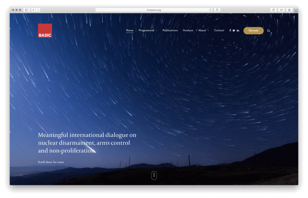
BASIC was seeking to refine and refocus their messaging and core mission to be able to attract more funding opportunities. A refined visual style encompassing typographic sensitivity and use of colour and imagery will help to communicate BASIC’s message and mission more clearly to potential stakeholders.
Restating the brief
The Brand Book from AesopStud.io was at an early stage of development when it was shown to me in early 2018. After discussions during Real Job and supervisor meetings, it was decided that while I am unable to decide the overall graphic style of the eventual branding and identity BASIC would adopt, I have the knowledge to be able to contribute in the areas of the branding and identity where typographic styling is concerned. Essentially, I would help BASIC create a house style of sorts for any brand application that included written language.
In restating the brief, I split the project into three main phases:
-
- ‘prep’ phase – for quick completion of small deliverables,
- phase 1 – for deliverables with high priority,
- phase 2 – for deliverables with low priority.
This structure allowed both myself and the client to be more flexible in deciding as the project moves along what deliverables could be completed first. BASIC did not map out a clear list of items they required nor did they have a clear timeline to place these items against, and this structure allowed us to work together and evolve the work to be done in future meetings. My supervisor Gerry suggested the inclusion of the prep phase to start with so that I could work to formulate designs for and deliver minor variables crucial to the day-to-day operations of BASIC, like a letterhead, business cards and a donation form.
Design process
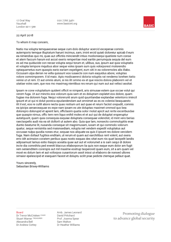
What was very clear from the start was that BASIC wanted me to design business cards for them to use for upcoming conferences and events where the cards would help facilitate networking. A natural companion to the business cards was the letterhead that BASIC would use for both internal and external circulation. Before I could begin work on the business cards and letterhead, we had to confirm typeface choices and the logo.
The existing logo for BASIC was functional and appropriate. The use of red communicated the urgency of nuclear disarmament, and commanded attention. BASIC chose to retain red as their brand colour. The ‘BASIC’ word mark in the existing logo seemed to be in Akzidenz Grotesk, set in uppercase and with poor spacing. I suggested that we change the typeface to one that was free to use and available from Google Fonts. This would facilitate typographic consistency throughout all of BASIC’s internally and externally circulated materials as the office was working with the Google Docs suite of applications, and incorporating a typeface from Google Fonts into existing documents was seamless. In addition to this new sans serif, I chose a serif typeface to pair with the sans serif typeface. After discussion, we chose Capitolium 2 and Roboto Sans. The new logo was created with ‘BASIC’ set in small caps in the Roboto Sans typeface, and the word mark is now centred in the bounding red square to make up the new logo.
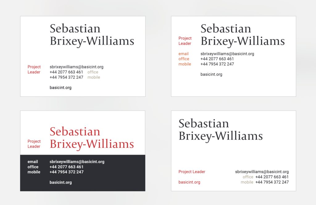
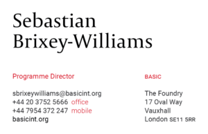

After a few iterations, we finalised the design of the letterhead and business cards. Because the team’s work was integrated in the Google Docs suite, I created graphics for the top and bottom margins of the letterhead, and placed them into a Google Doc for the team to use freely as a letterhead template. This meant that they did not have to bulk-print stationery to use, and also facilitated consistency with digital communication. Early iterations of the business cards showed more varied use of colour, but the final design we arrived at was much simpler and clean in feel, helped by the 2-colour palette of red and grey.
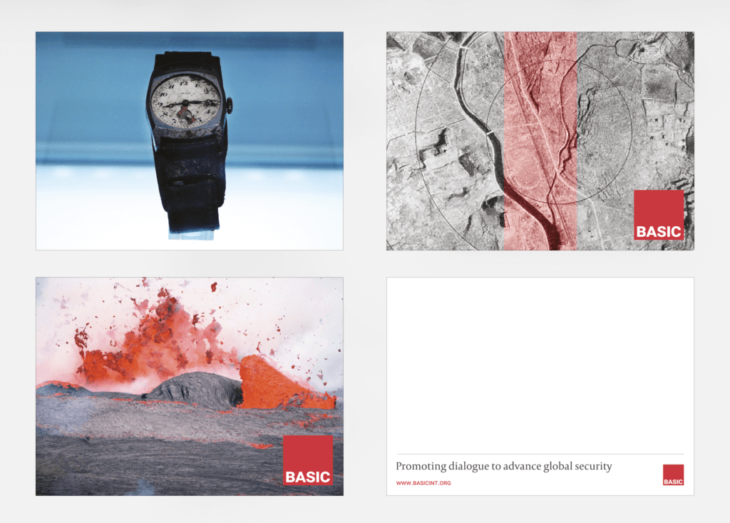
Beyond these early deliverables, I worked on some postcards for BASIC. These postcards were to be used at events and conferences where BASIC would share the research and work they are doing. The work up to this point constitutes the prep phase.
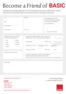
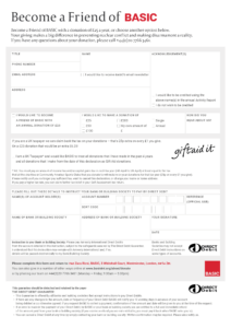
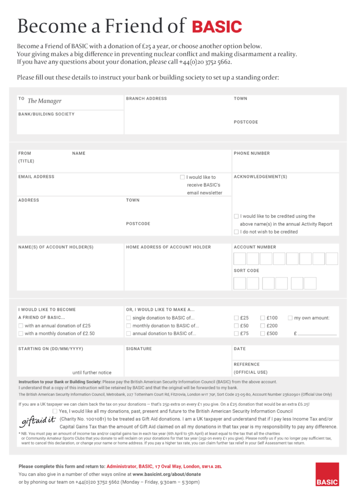
BASIC asked for a donation form to be designed for them to use at events to explore potential funding opportunities and receive donations from people signing up to become ‘Friends of BASIC’. Most of the work I did for BASIC after the prep phase was centred around the creation and fine-tuning of this donation form to a usable standard. I sought to create a form that was user-friendly. This meant the reduction of rules and lines where they would add visual clutter. I made use of a light tint of grey as the background to make fields in the form easier to distinguish. I employed a baseline grid to segment fields into groups of fields to make it clearer to the user of this form the information they needed to provide. I suppressed the division between fields belonging to the same subgroup of information, and this allowed the form to be less visually cluttered.
Learning points
One issue with working with BASIC was that because the exact scope of the job was not decided on from the point we agreed on the restated brief, the scope changed as the job progressed. This suited the client well, and the client was also appreciative of the fact that I had other work to focus on and was happy to work around my schedule as we progressed. I was comfortable with this, but this resulted in a few deliverables ending up not being worked on. As we reached the end of 2018, it was decided that we would conclude this phase of the project with the above deliverables, with a leaflet being the only deliverable to be worked on after. This leaflet is still being worked on now.
Lapses in communication on my part resulted in the work of this leaflet being dragged on longer than it should have. This helped me realise that even though I am comfortable as a designer with a loose timeline, this might not suit the way different types of clients operate. In the long run, it is also detrimental to the designer, as you have no clear idea of exactly when a job will be concluded. A definite timeline will be crucial to my day-to-day operations if I should take on freelance work in the future.
BASIC was pleased with my decisions surrounding the typographic style of their brand refresh, and the work I did to refresh their logo has gone down well with the whole team. BASIC was also grateful that I was available to make numerous small changes to wording and positioning of elements in the form. This would not have been possible if we stuck to a strict timeline and delivery method. We both recognise that communication through email became patchy in the summer of 2018, which led to the work on the leaflet being dragged on. I should have managed this better on my end.
I enjoyed the opportunity to have meetings with BASIC in their office at Whitehall in London before they moved to Oval. The first meeting with them in early 2018 gave me a better understanding of the organisation, and helped in my formulation of designs for them. This taught me the value of meeting clients face-to-face, and I learnt a lot from being able to go for these meetings. BASIC was a unique client to work with, and I am grateful that I was given this opportunity to contribute in some small way to BASIC’s tireless work in making this world a little bit safer for everyone.