
Brief
The brief was to design a set of branding deliverables for two groups of environmental science students for a consultancy that they’ll be setting up in two months.
Soon as I was given this project I was given the opportunity to go and meet with my clients for the first time, this meeting was set up by my supervisor and the student’s lecturer making me think that this is something that happens every year and is set up by the two departments. My first meeting with the clients was very brisk as I spoke to each of them one by one, and we didn’t have much time, however I took the opportunity to ask and get as much information from them as possible including contact information (for direct contact and in case anything was missed).
The students weren’t able to answer all of my questions, such as “who will you be presenting to” as they have just been given this brief probably the same as I have, therefore I cut them some slack and asked if they could find out the information and send it to me later so that I could begin to write my brief.
The students also seemed very opened to the idea of me designing just a logo for them and were more than happy to do the powerpoint presentation and word doc by themselves, they were respectful of my time since we’re fellow students however I assured them that I would work with them on the branding and do as much as I could.
Research & concept
Whilst waiting for the brief to be signed off by my supervisor, I went ahead and organised a meeting with both groups to discuss possible concepts and directions to help each other in realising what kind of logo they wanted. To elaborate, we looked at already existing logos and discussed what elements could be taken forward, no sketching was done at this stage as this was primarily a verbal meeting with on screen visuals containing logos of similar concepts to basically make sure that both groups and I were on the same page (I saw each group at different times again).
The on screen visuals shown on screen were literally some quick google searches for logos with key words such as “water” and “leaf” which were concepts that the groups were thinking of going with. This meeting was certainly helpful as this was in a way helpful to again get on the same page, for example one group has a rough idea of doing a very complex illustration styled logo whereas I had to explain why something so detailed would not work on screen or on documents where it would be scaled to be small so this certainly saved some headaches along the way.
Design Development & Deliverables
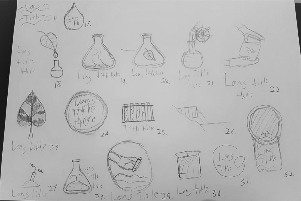
Once the brief was signed off, I began sketching a number of rough logo drafts to show the students. The intention would be to show these to them, make sure that they are happy with the overall look and direction of the logo, and if not then the concepts will be reviewed and new sketches produced, rinse and repeat until they were happy with them so that I could then move on to digital illustrations.
My supervisor was overall happy with the pace in which I was going at, however concerns were raised with the first set of B&W illustration, the main concern being that because I used various levels of grey that some of the logos were looking a little bit too busy and also potentially losing the focus of the illustration (especially when viewed smaller).
Another thing that I admit didn’t go as planned was when I showed the first set of sketches to the groups, one group were very happy and voting on the best logo was a very smooth process, however with the other group it was quite clear that they weren’t too convinced with them yet as they were set on a concept which I ultimately wanted to avoid (especially since it tends to be overused in these styles of logos). I quickly mended the situation by producing a few digital illustrations that were not sketched out at first but rather I took the concepts that DID work which produced a better reaction from the students.
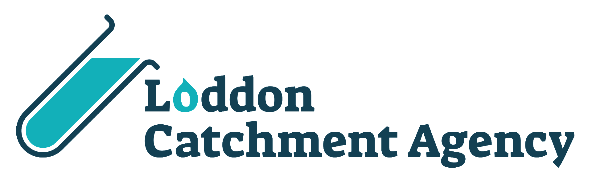
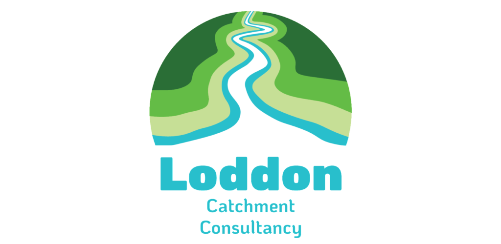
The stages that followed for the logos were mainly establishing branding colours, which fun and simple to do, and a lot of back and forth iterations and positive feedback from clients and supervisor. With the logos nearing completion I was confident to start creating the powerpoint presentation for them.
This was a first for me and admittedly I wasn’t too proud of the final design for either, it had a similar concept to InDesign as PowerPoint used master pages that acted as “templates” for the entire presentation. What this meant for this scenario was that each group were going to show pages with images, graphs, and tables therefore my responsibility was to create templates that were compatible for what the students wanted to use them for and once the file was sent to them I in a way supervised how they would design it to make sure that the pages were remained consistently well designed with the branding and pages. I didn’t have to do much as the pages mostly did their job, there was just one page that they created themselves which used a different typeface and such therefore I helped them fix that. However, as can sometimes be expected when working with students, there was only radio silence from the other group despite my efforts to contact them, this led me to believe that they were busy at the time as they did indeed reply back to me after their presentation.
Both groups were extremely happy with how the presentation went, there was also some good feedback from other groups particularly with regards to how professional the logo looked, there was no way that I could have been there at the presentation to access how well the deliverable worked but that feedback certainly told me that it did.
Reflection
It was a shame that I was unable to produce a word template for them as time drew closer to the deadline, the priority for them were the logo and presentation slides as the students let me know how they would only need the word document until way after the presentation. However I did offer to stay in contact with the groups with regards to any questions or suggestions they might have for when they did design the documents themselves.
My supervisor was very happy with my designs, particularly with my logos which I tend to be good at, however I would’ve like to spend a little bit more time learning about making templates on PowerPoint as this was the first time that I made a template and felt like it could have been designed better to at least meet the standard of the logo.