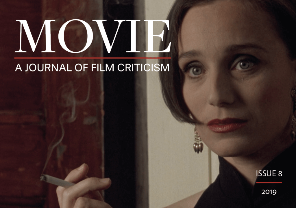
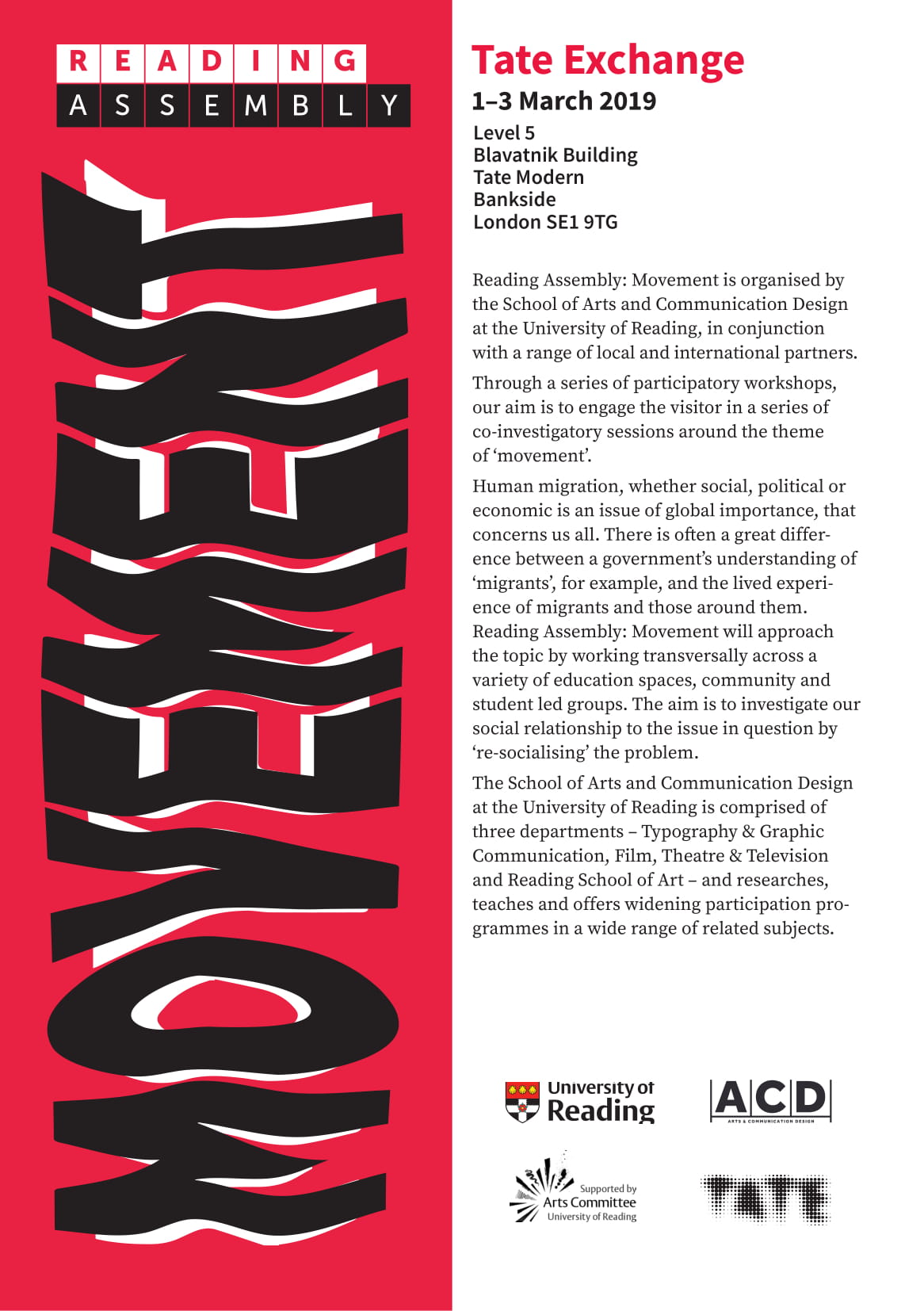
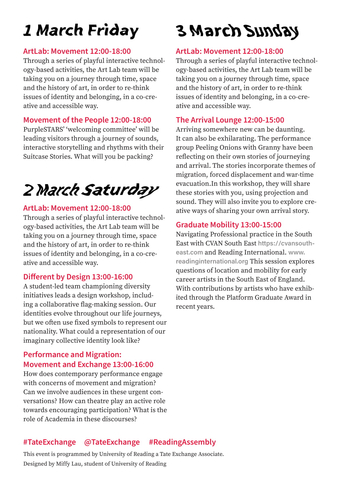
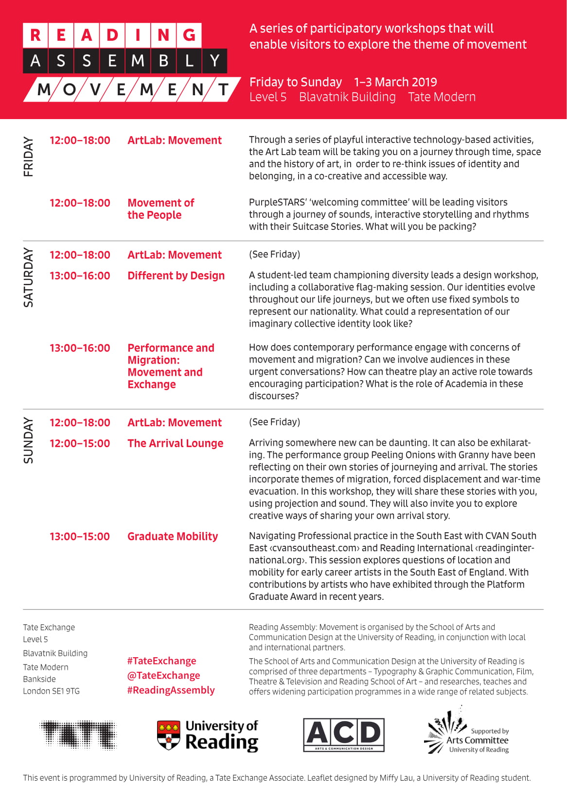
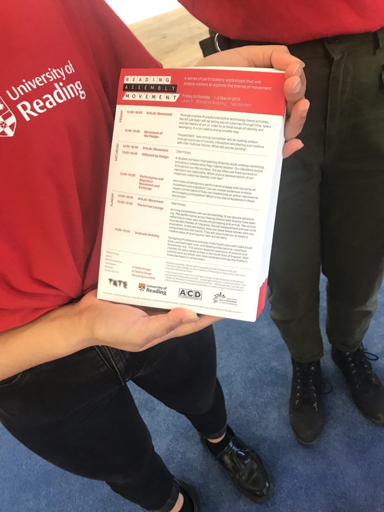
Movie: a journal of film criticism. Issue 8
Background
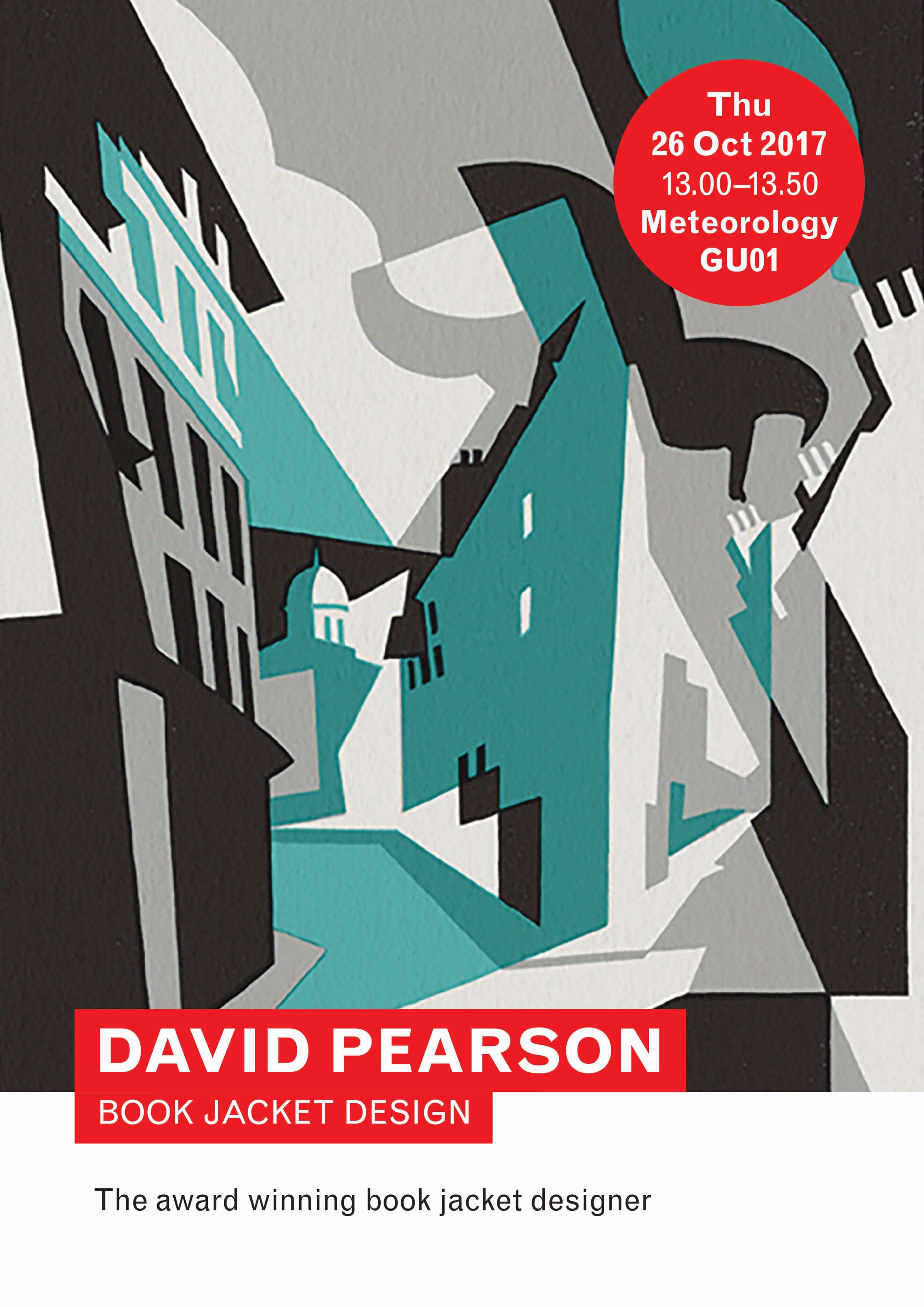
Professor John Gibbs, head of the School of Arts & Communication Design at the University of Reading was in need of a new design for Movie: A Journal of Film Criticismissue 8. Movie: A Journal of Film Criticism is the successor of Movie the print journal which was published from 1962 to 2000. Currently it has been digitally designed for online reading. The scholarly journal is a rolling publication meaning articles are published throughout the year. The purpose of this journal is to publish work that is concerned with the aesthetics of film and television style, analysis, theory and practice of evaluating film and television. Movieissue 8 not only includes written articles but audio-visual essays and interviews. John Gibbs aspired a new layout for issue 8 that complexly integrated film frames and text more than the previous issue; it was felt that editorial decisions of the previous issue lost the traditional design and feel of Movie.
I have always imagined myself working in editorial, hence why taking on this opportunity dealing with text, images, layout and attention to typographic detail was of interest to me. Being able to explore a detailed relationship between film grabs and the text was just one of my interests within this project.
Restated brief
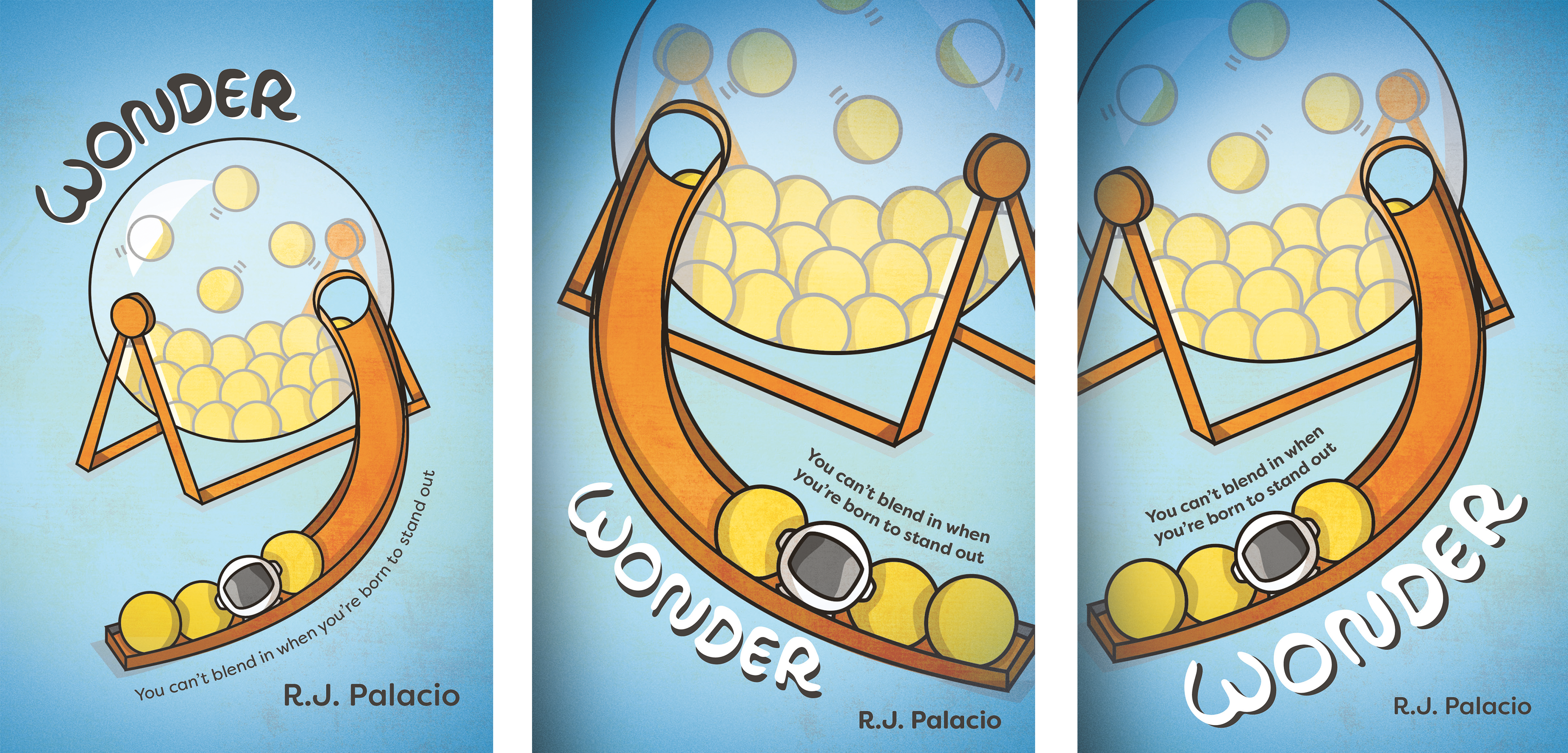
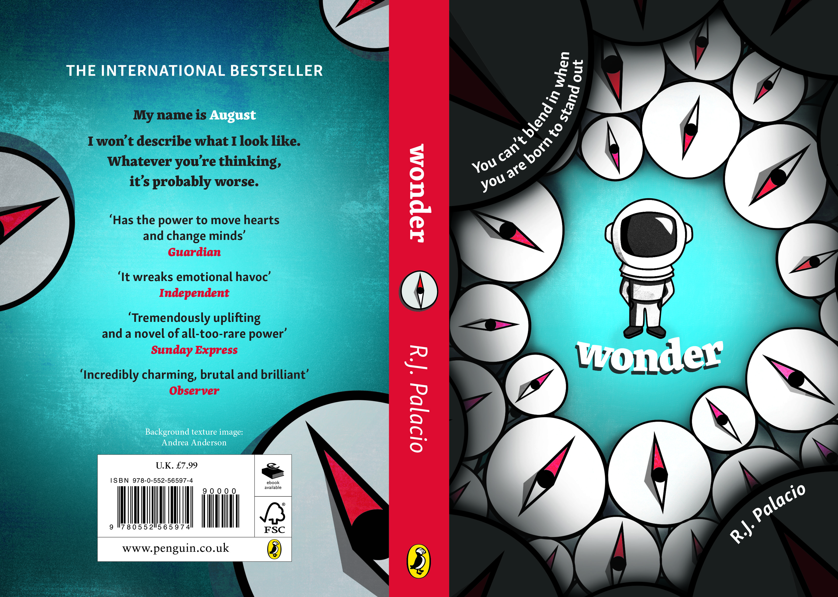
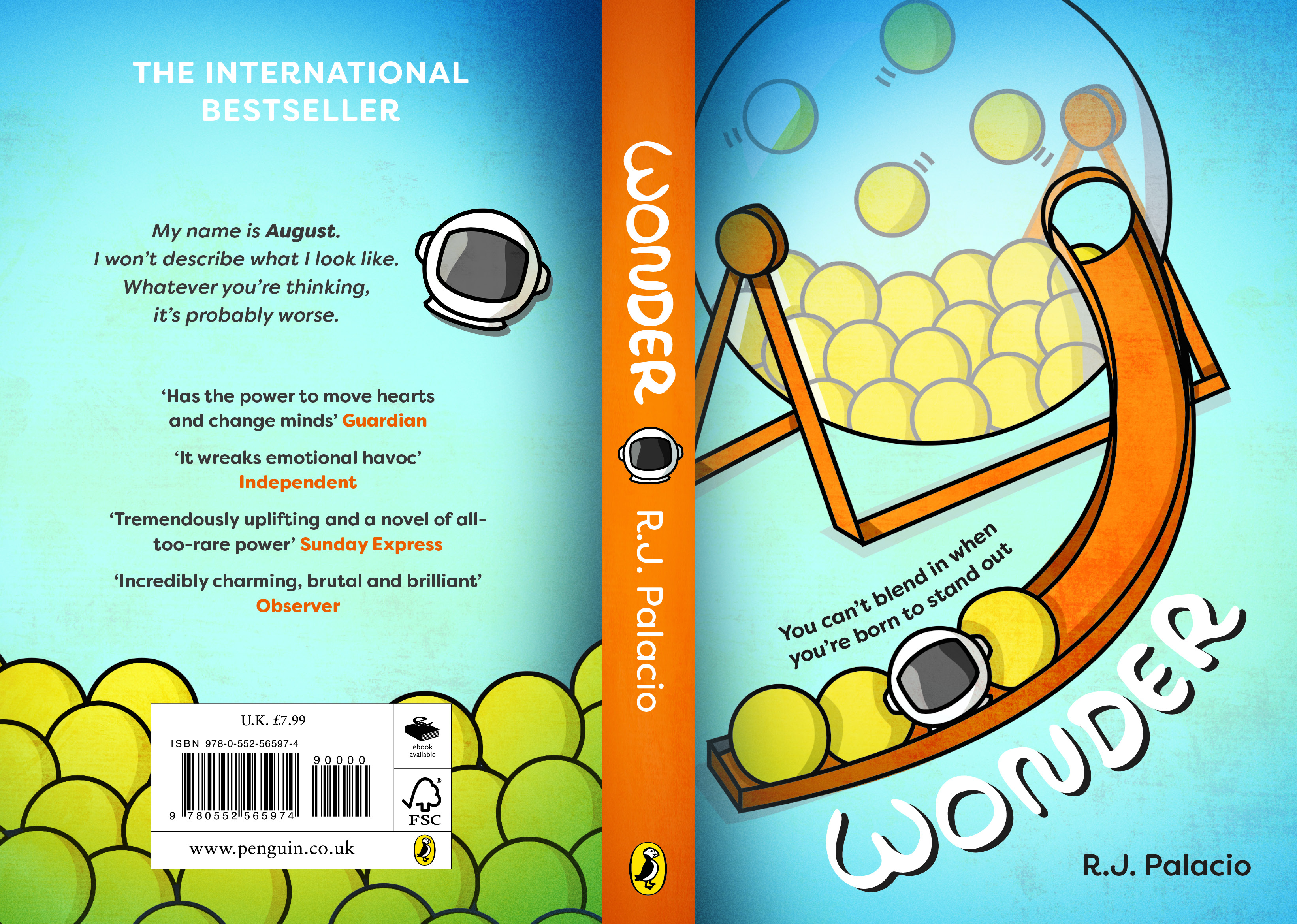
The restated brief for this job was to complexly integrate the film grabs within the text effectively. This was to provide an experience for the reader with integrating the film grabs in the moments analysed within the text, which is what made the layouts of the traditional issues so great and pleasant to read.
A designer prior to me created the previous issue in 2017, this meant that I had to adapt my design skills into an existing template which I was critical of. Being critical of the existing files was not only important to improve the design but to also gain a sense of control over the work. Appropriate files and design guidelines were provided on aspects such as page layout, grid, typesetting, images and cover design. This gave me an insight into the justifications from the previous designer as to why certain editorial decisions were followed the way they were. However, it was necessary to analyse and critique the files in order to make improvements on the design and integration of images to fit in consistently with the traditional issues.
The initial meeting with my client gave me the opportunity to clarify things, making sure we were both on the same page of thoughts. At this point in time there wasn’t a confirmed deadline as it was unsure whether or not the journal was going to become a rolling publication. As the process depended on the authors confirming they were happy with the layout design, it was quite a lengthy development of anticipating responses and keeping up to date with emails and communicating regularly.
Research
I began my research by analysing the old Movie print journals for inspiration. My client had advised that they wanted to achieve the integrations of images and text that was accomplished in the print journals. I viewed a range of journals to gain an understanding of the desired style my client wanted. Overall, the print journals had a consistent, memorable style throughout its layouts and typesetting, creating a type of brand identity for the well-known journal.
Features that stood out were:
- prominent opening articles
- boarders
- outlined type
- varied scales of images depending on their importance
- insignificant white space
- columns
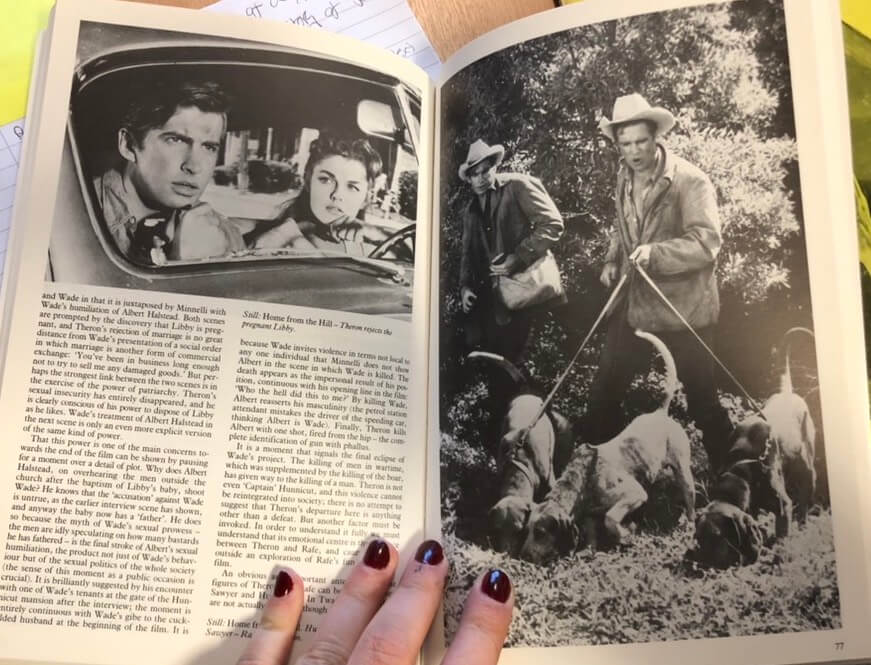
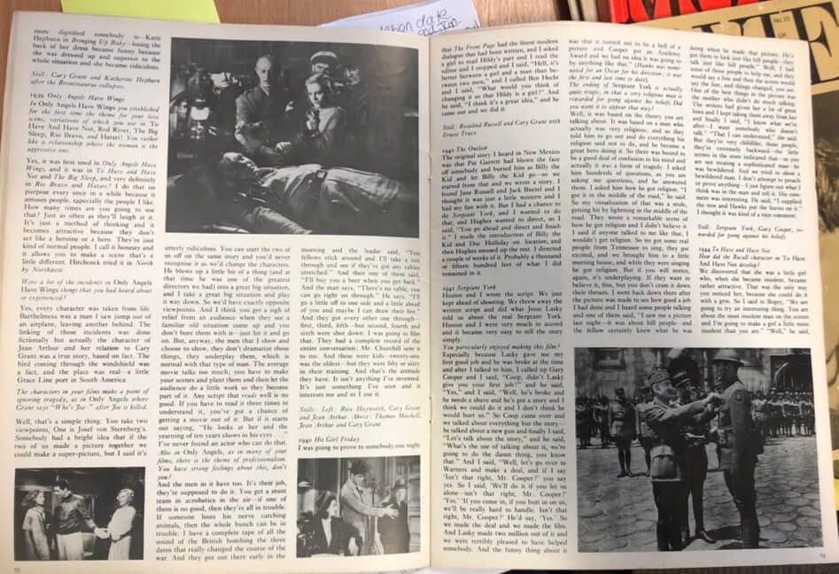
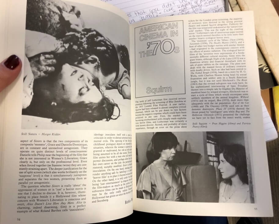
My client mentioned that a lot of the feedback for issue 7 involved conflicting opinions about the use of white space across the issue. I had suggested to my client that white space isn’t always negative space and it can actually be quite an effective element if used fittingly. Although, from observing existing print journals it was evident that white space wasn’t particularly considered throughout the designs. Nonetheless, I had advised my client about exploring ways in which white space could be used effectively within the forthcoming issue. After suggesting my thoughts, my client clarified the editorial board wanted a different approach to the previous issue in order to meet my client’s needs. It’s important as a designer to suggest your own creative thinking as this develops your flow of thinking. The purpose of this issue was to achieve a well-integrated relationship between images and text across the spreads, therefore, to meet my client’s needs this had to strongly be thought through with reading each article to appropriately place the images.
Design development
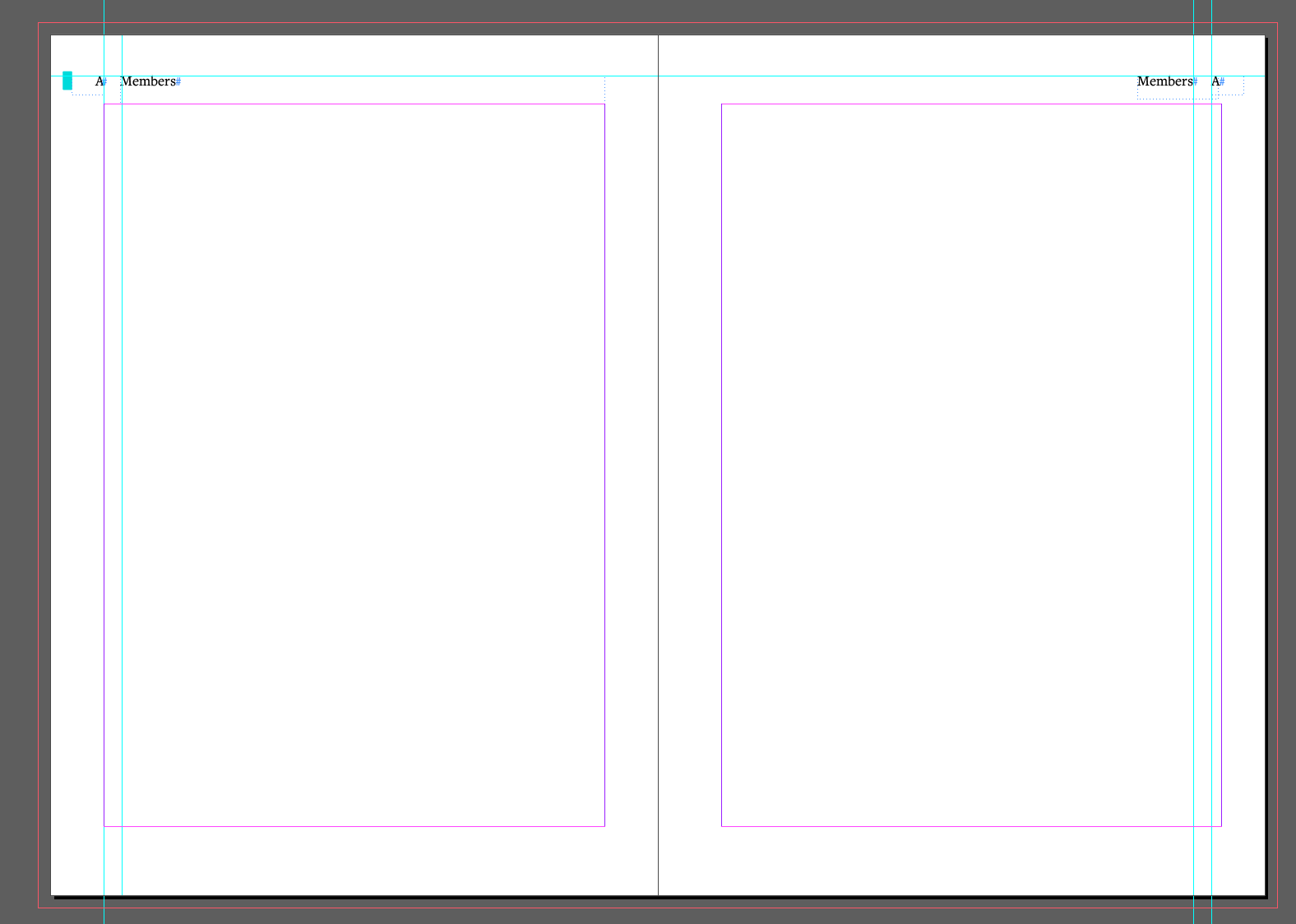
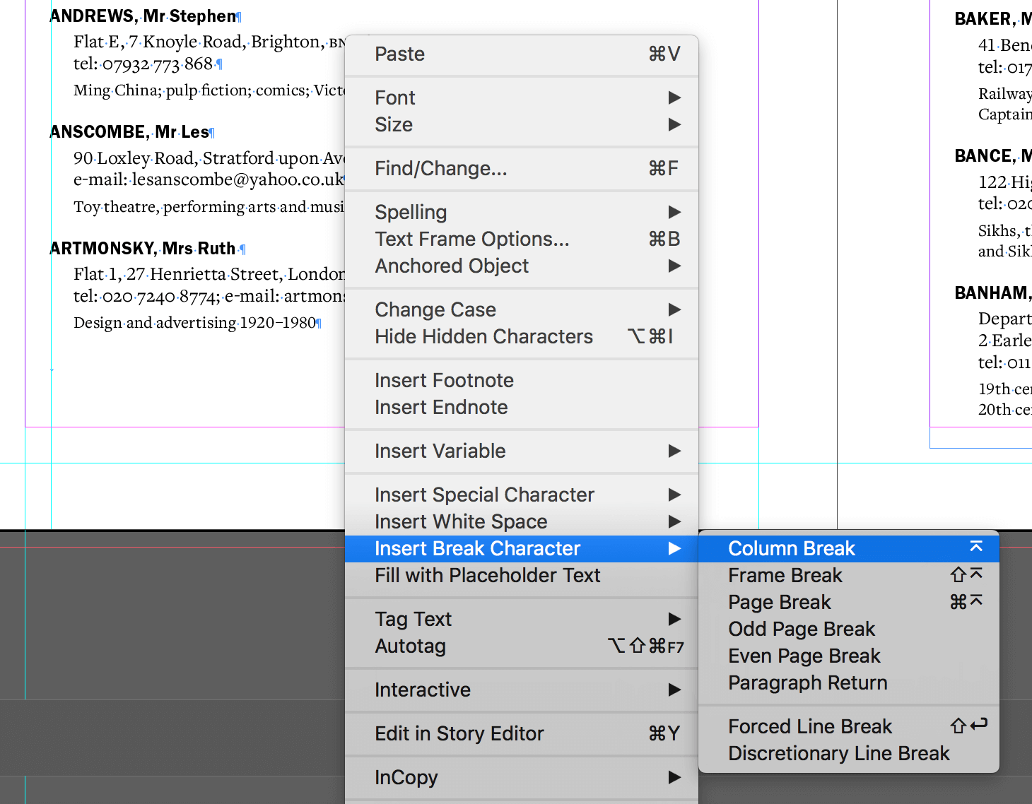
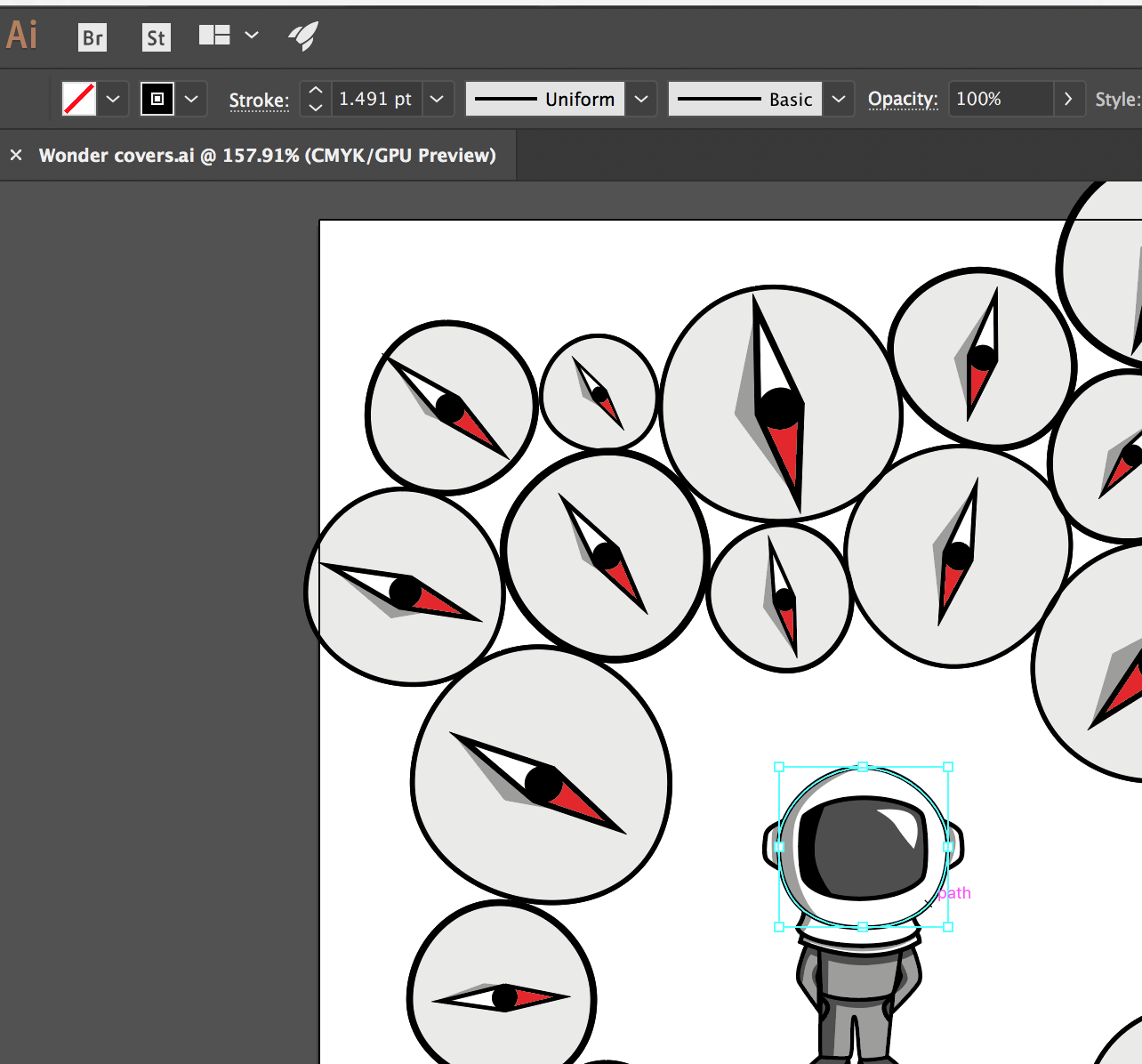
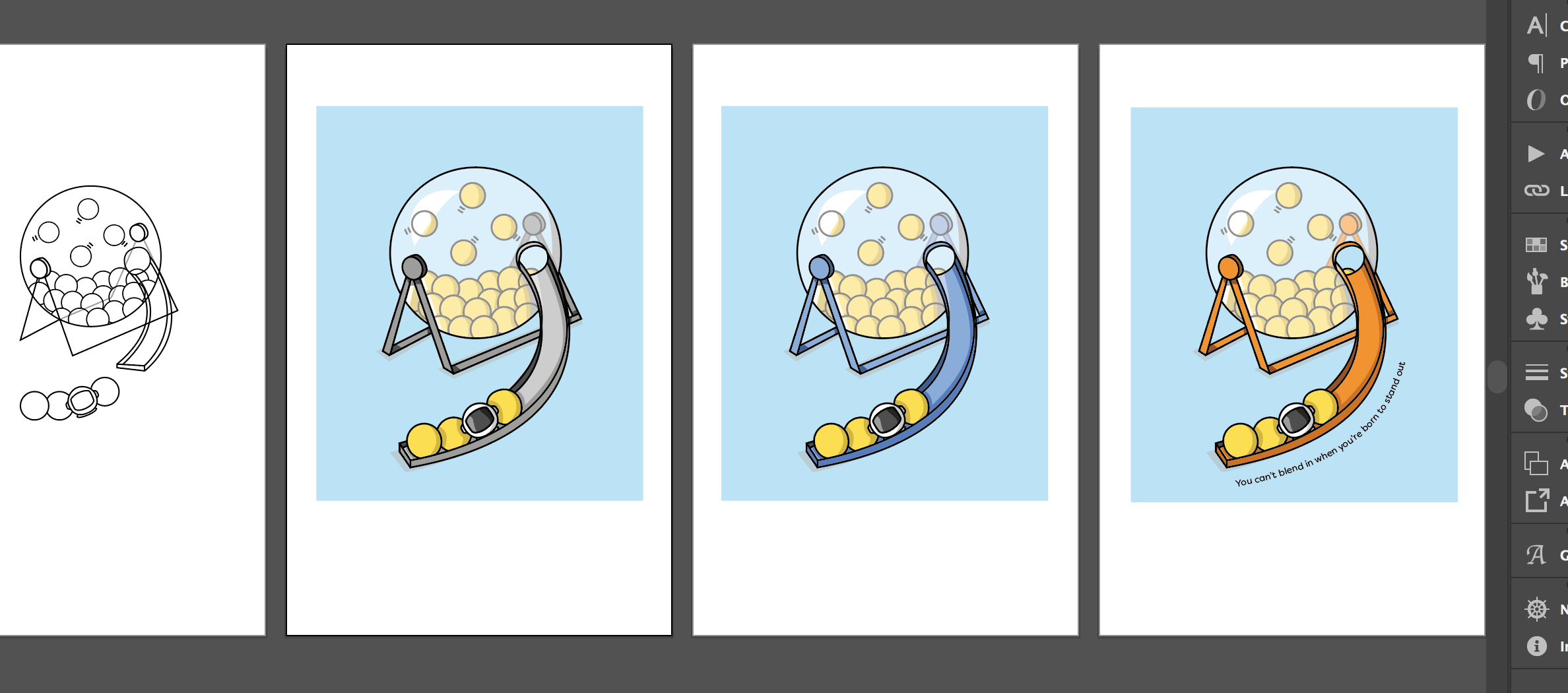
The design aspect to this project was quite straight forward because of the existing template. This project was heavily reliant on the research, communication with the client and organised files in order to be a success. The design development process involved working within InDesign. It was important to appropriately name and group styles together to avoid confusion as publications consist of many different articles and pages.
Along the way there were some broken elements within styles that had to be altered, while ways of working had to be adapted as using someone else’s files was a new skill to develop. Once I had read through the articles, I judged where would be best suited for the provided frame grabs to be integrated. Once I completed my first draft, I sent it to my client for feedback. Considering my client was happy with the layout, this would be sent for further feedback to the authors of the articles who would then get back into contact with my client.
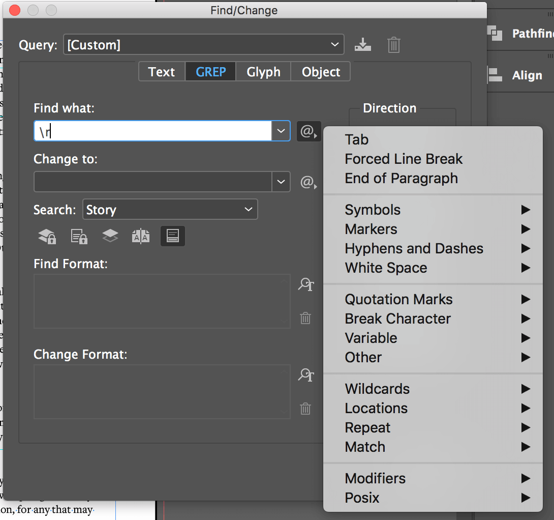
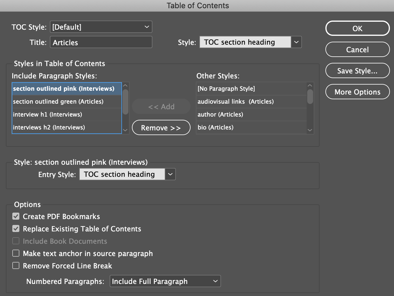
From taking on this project, it most definitely taught me how to use features I wouldn’t have considered to use before. The table of contents (TOC) feature in InDesign can automatically list the contents of publications, magazines and books. For this to be a success it consisted of creating, applying and formatting styles for the TOC. Generating a working TOC creates a chain like system for the next designer to use straightforwardly. Whether or not I would use features as such again, it was beneficial in learning how to use the TOC feature as another client in the future may choose this way of presenting the contents.
Movie issue 8 received loads of positive feedback. This was quite a rewarding feeling as loads of effort was put into this project in order to make my client happy and I am delighted this was achieved.
Feedback from members of theeditorial board said:
‘it looks fabulous’, ‘it all looks very good’, ‘the integration of the images with the text is excellent, and captures something important about Movie’s traditions of close reading’.
Comments from the authors were also positive as they said:
‘Thanks very much for this – looks terrific!’, ‘this looks really good. Please convey my thanks to Martha’.
Communication
A respectful and professional relationship between my client and I was developed. Regular contact via email and face to face meetings were conducted when necessary. My client was easy to reach which made communicating flow easily. My client had always informed me of editorial board meetings and deadlines in order for me to leave plenty of time to have everything prepared and ready for these important meetings. The communication skills developed through this project have made me more confident in approaching my clients and improved my articulation and tone of voice. This will be beneficial in developing professional relationships within industry and with clients.
Reflection
This project had its challenges. One of the main challenges was to produce the TOC as the template files didn’t include a completed plan. On the other hand, this forced me to learn and improve with the feature instead of just dropping it into a template. The other challenge was developing the skill of working within someone else’s files and gaining insights as to why they may have done certain things differently. However, having the skill to adapt will be useful for the future working in industry.
I felt as though I had met my client’s needs in achieving what they were looking for. The overall project took much longer than expected, however this was due to making it a rolling publication which meant more authors were submitting their articles towards the end of the year. Although, I was happy to continue working on this project, solely because I really enjoyed it. From this project I have truly learnt a number of things. From professionally communicating and maintaining contact with clients, to realising how important and useful it is to have organised files, ending with reading interesting film criticism articles as well. To have a read of the full journal click here.