Author: Naomi Yu

Snow White and the Seven Dwarfs

The Original Version
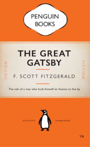
For this task, we were asked to copy exactly how the book cover from Penguin Books looks like by using InDesign. I have heard about adobe before but never really use it at all. This was my very first time trying this software, and I found it is quite difficult to understand how it functions at the beginning, it took me about an hour to figure out its basic controls.


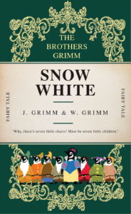
My Version of the Book Cover
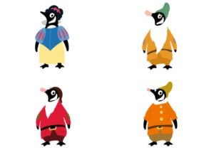
 

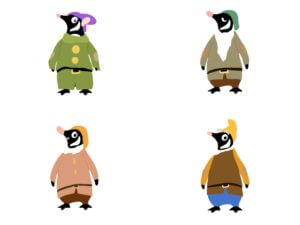
The drawing process of each character IMG_2542

I used the penguin logo as the body of each character, including snow white and those seven dwarfs. I drew out their representative clothes to make them look more identical to readers. I found out that many fairy tale book covers are generally in dark colours, I believe it is probably because this colour scheme can create a mystical sensation. Therefore, I chose to use dark green as the background colour and added the pale yellow frame as a decorative purpose.
Self-reflection

I really enjoyed doing this task, because it gave me a chance to create or design whatever I wanted. It was indeed a cool working experience with InDesign, it is not easy to use and it takes time to learn. When I was using the software, it felt much more professional compared to any apps that I have used before. I cannot wait to try other software from adobe later the term and create works from it.

Eyes on the Little Things

Taking Picture from the Surrounding

The Best 3 Images

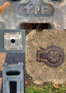
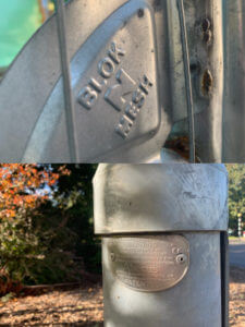
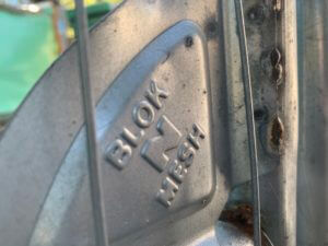
  1. A tiny corner from a mental fence

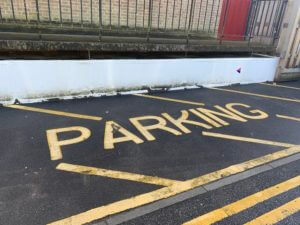
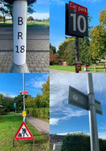
2. The parking label on the floor


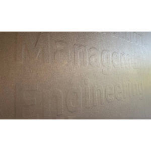
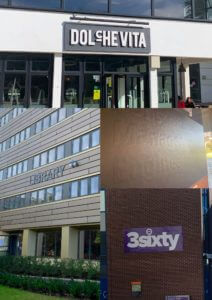
3. The building name of Contraction Management and Engineering

When I was searching around the campus, instead of taking pictures of large scale objects, I chose to look at some converted places. I took the above image from an undertaking area where they fenced up the whole building. I started looking closely at any objects and I found that so interesting I would never see those fonts on the fence if I was not standing in front of it at a certain distance. Not only did the distance matter, the angle of how you observe the thing also affect the look of the font. For example, I took the first picture and the third one in a side approach, rather than facing in front of the object. This way can show the depth of the font and create a three-dimensional effect. I liked how these fonts are carefully and neatly done for the second image. It was also interesting to see which strokes got written first, as the texture of its paint shows the layer of brushstrokes.


Grouping those Pictures in Different Category Orders

1. Angle (Looking downwards)

2. Material (Mental)

3. Colour scheme

4. Object (Building’s names)

Classifying is an action to grouping up things that share some same characteristics. I tried to find their obvious similarities between each other, such as the first one, all of those pictures are taken in a downwards angle, from top to down, overlooking at those objects. This in fact shows no depth but only plainness. Another example, some images share the same colour palette, the blue sky, the redness from those signs and the green grass.

Self-reflection

This one-day project was really a fun time to experience around the campus. In fact, we seldom have time to hang around and observe things in detail, but today I finally got a chance to have a closer look at anything else in the surrounding. Moreover, I learnt about how letterings corporate with the environment. Some of them with only the intention of decorating purpose, some of them being particularly legible to readers, all letterings have their own function. Overall, it was such an interesting project to do individually or with classmates.

The Hardship of Being a Woman

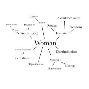
Woman

mind map

Process

My word for this task is woman and I wanted to show how the society criticises women in general. Not only do women experience in gender inequality, women also always get objectified by others. Therefore, I decided to put on frame to it, just to make it look like a displaying item of an exhibition.

Moreover, people usually describe women as beautiful, pretty or elegant, so I think it will be a great idea to use a goddess to represent the image of a female. As the sky symbolises freedom and the residence of the gods, I used a picture of the sky that i took before as the background.

For my final, I did different hand gestures and took a few pictures of them, I then outlined and coloured them on my ipad. Those hands represented people in the society, all gestures mean their own way of rudeness and criticism. Also, I painted some blood near the intimate part of the statue, to portray the situation of woman being shamed on their period.

The animated version IMG_2409

Self-reflection

As this is not my first time doing this kind of task, I have my past experience to help me avoiding some unnecessary mistakes. However, it has been a while since the last time I made a graphic design, so I feel like this is a nice chance to warm myself up before my real classes start. Overall, the task was fun to do, I enjoyed spending the whole day on editing images and drawing on my ipad.