Autumn term Feedback Jam, hosted in Week 7 of term with tutors Sara Chapman, Josefina Bravo and Geoff Wyeth was put in place to assist students with upcoming deadlines towards the end of term. A valuable Baseline Shift to obtain extra advice along with tips and tricks on how to improve before final submissions!
Part 3 Students
The session kicked off with Part 3 student, Mia, showing her Publishing Platform module work of her magazine spreads and covers for the chosen topic of surfing for women. This brief was to create spreads for three different articles, as well as interview, contents, and full sleeve cover – for a self-chosen topic. Tutors appreciated the handcrafted typography used for quotes however suggested the width of the stroke may not fit the overall aesthetic a surfing magazine might aim for. Linking to this, Mia was advised to ‘have more fun’ with layout and placements so that it doesn’t appear as linear and is more fit for surfing itself.
Mia’s main article opening spread, featuring hand-lettering.
Mia’s photography article text spread.
‘Experiment, rough it up a bit more!’
‘Be bold!’
Similarly, Part 3 student Ben presented his magazine spreads for the same project with his topic of graphic novels. Based on the layouts of graphic novels themselves, Ben’s cover incorporates this idea of how image is split to create a more interesting visual element. Both students and staff praised the connection between type and imagery, however felt the grid to feel quite forced and looking like something wanted to fill in every gap. Peers also noticed how the same character was shown in three spreads and and questioned if this was necessary. Geoff enforced the importance of production concerns when placing graphic elements over the centre of spreads which could be lost due to the binding and therefore lead to misalignment, perhaps even causing issues with how information is communicated.
Ben’s ‘Watchmen’ spread.
Ben’s Magazine cover
‘White space is so important!’
‘You want it to be serious but not the same.’
Part 2 Students
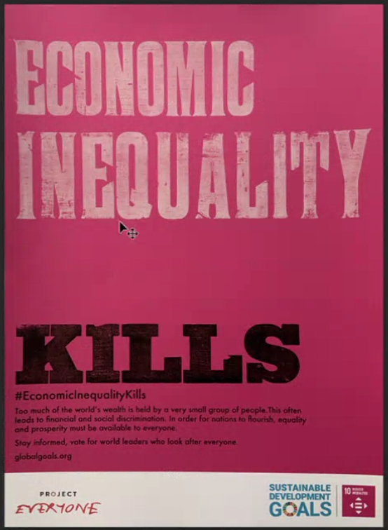
Second year student, Finn presented his posters for feedback working on a campaign project for sustainable development goals. Using wood type lettering, Finn was advised to consider the spacing between words, as the sentence was read differently than he intended. It showed the importance of hierarchy when placing text on a page.
Finn’s poster design which features wood-lettering , printed with the help of Geoff.
‘Create a link between concept and message’.
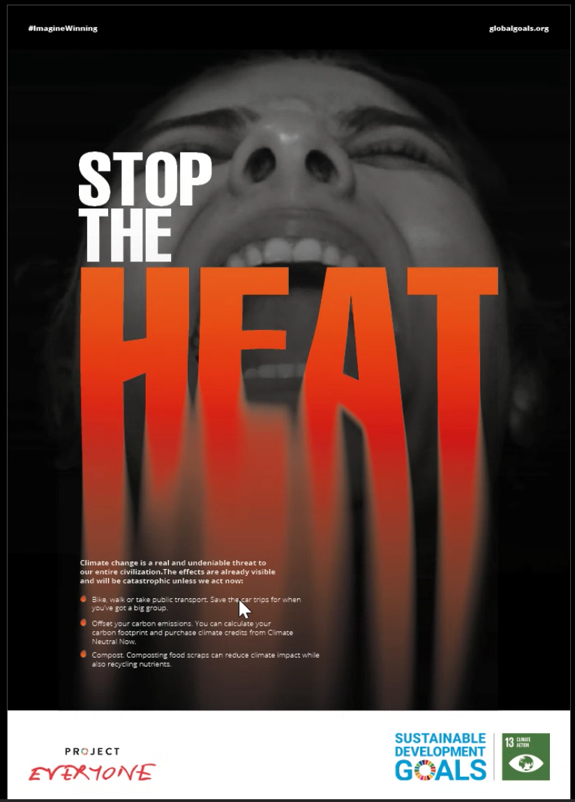
Matthew also presented his work for the same project and received feedback on his image and how effective it is in communicating the message – It risked overpowering or competing with the type. Tutors also suggested the call for action could be amended to exploit the space more, and to visually match the content and what it communicates.
Matthew’s poster design.
Part 1 Students
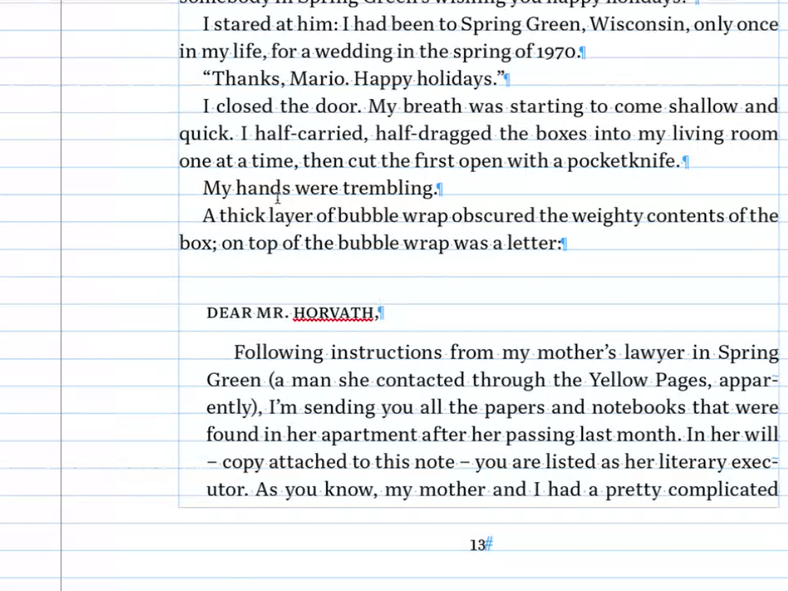
Finally, first year Ethan showed his work for a book design project where the brief was to format text in either a modern or traditional style and compliment this with a foreword, table of contents and end matter. Discussing indents and spacing, Ethan learned about italics and how this can be used to differentiate between hierarchy of text, for example a letter in which he was presenting within the main body of text.
Ethan’s book design, looking at formatting a letter within the book text.
Conclusion
It is so important to gain insight into your work from a different perspective outside the regular classes. Sometimes we can be biased towards our own design or be too hard on ourselves. Fresh insights go a long way. As a designer, we should always be willing to receive new opinions and advice to enhance our current and future projects.
’The session is so helpful!’
‘Even though I didn’t show my work, it’s always great seeing my peers and using similar advice for my own work.’
In Week 8 of Autumn Term, we were joined by Greg Bunbury a Graphic designer and consultant, as well as a sessional lecturer here at Reading. In this session, Greg spoke of real-life experiences, gave the students interactive elements throughout his presentation and really engaged with why ethical design is so crucial to today’s industry.
What is ethical design?
Greg began by approaching the students with the trolley problem. This warmed them into understanding the most drastic form of moral principle. Greg states that as designers we do not always see the consequences of our ethical choices. Things get complex, and that is why Ethical design is so important.
Ethical design is all about respect – using a broad approach to design products/services or experiences that priorities moral principles/values. Ethical design is not just about something looking good or doing its job– it must also contributes positively to society. Ethics is considered a route to advocacy and activism but in itself it is a different construct. Ethics can lead to advocacy and activism but that isn’t what ethics is. Most humans have a moral compass allowing them to be respectful and honest. However, this doesn’t stop them from being ignorant when it comes to understanding world issues to allow for ethical progression.
‘Design is about intention not delivery’ – Greg Bunbury
A good guide to follow is the ethical pyramid which represents respect beginning with human rights, leading to human efforts, and onto human experiences. Greg says that ‘ethics is not politics. It is moral human behaviour, a study of right and wrong.’
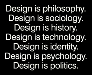
A screenshot from Greg’s presentation explaining what design is.
Why is Ethical design Important?
Unethical design causes harm. Unethical design affects people in many different ways: physically, through financial strain, sleep deprivation, or the taking of personal data. People can feel betrayed by design, and can be affected emotionally and financially. Exclusion by design can be extremely debilitating for some people. For example, making a building inaccessible to wheelchair users by excluding ramps and lifts and disabled toilets is cruel. Design can also be ageist, biased, racist, employee greenwashing, or generally conceal rather than reveal truths.
Dark patterns are a seriously unethical way of mistreating humans basic rights, issues such as hidden costs, opting into handing over data to use their sites, roach motel, forced continuity and covert spam. Design should be clear and ethical and this is the key to great design.
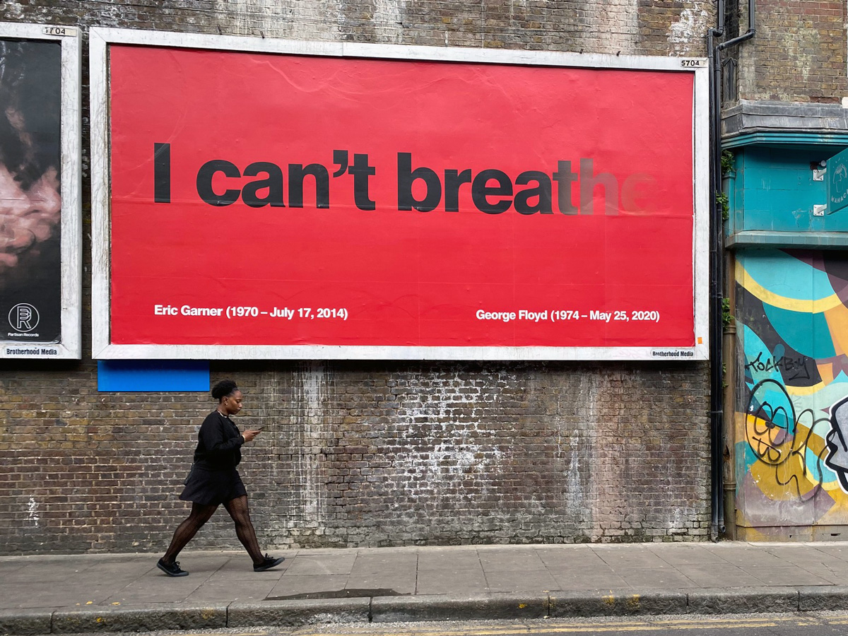
‘ I can’t breathe’ billboard designed by Greg Bunbury.
How can you bring ethics into your design work?
Learn what you think – there’s nothing worse than having an opinion but no understanding of why you hold this opinion. People challenge and question you in life and you need to be prepared with why you think what you think.
2. Learn to ask powerful questions – question the suppliers you chose, the printers, your advisors, the images that you choose.
3. Learn to say ‘no’ – If something isn’t right or ethical say ‘no’, avoid dark patterns and choose a better path.
‘WHY?’ is such a strong question to ask yourself and others it challenges us to understand our choices and the choices of others. So next time you go to say ‘yes’ to something think about why your saying yes in a deeper perspective.
Never lose sight of your purpose and values in design.
Conclusion
Greg offered an extremely insightful talk that every student learned from. He made it clear how important being ethical in your design work is and the success to being more ethical. He covered a wide range of topics within his presentation such as the trolley problem is unrealistic and you will not necessarily see the effect that your design has on people but questioning why will be key to being as moral as you can be. Design is so much more than being creative it is about portraying a message, being inclusive and making it user friendly. Greg’s work and words are truly empowering and his passion and honesty in his journey and experience is inspiring to young designers searching for their place in design.
‘ I really liked how Greg highlighted and warned people of the potential mistreatment of freelance designers so that students can be more wary when handling clients should they choose to be freelancers, issues such as no credit of the work or even denying the work you created and not paying etc.’ – Part 2 student
‘Seeing the emotional side of design and also seeing Greg’s work was amazing’ – Part 2 student
‘Greg’s insight into ethical design should be mentioned much more along this course’ – Part 3 Student