Background
The Cowrie Scholarship Foundation was set up to allow economically disadvantaged black students to attend UK universities and with the foundation being very new our client needed a brand that looked youthful and energetic but professional and as a continuation from the branding project the website for the foundation needed to be upgraded to match the brand. The website needed to appeal to students and stakeholders alike therefore we needed to create a striking balance between the two to attract scholars and investors which is our client’s main goal.
Brief
The brief was to develop a website on an easily workable and adaptable platform. The client would be adding more universities and business they would need a website that they can easily add on to whilst still maintaining a good user experience. The secondary deliverable was to design social media posts for his Instagram and LinkedIn. The brief stated that the success of this project would be measured by the ease of use by the client to add on to and edit. This was essential to make sure there was consistency within the quality of the design and making a website that the client can use and work with without affecting the design quality. So far since the launch of the website the client has had no problems with adding unto and editing the website.
Communication
Throughout the design process, we had regular meetings with our client. This allowed us to keep our client up to date making progress by having weekly feedback session to creating a website the client was happy with. On the other hand, our contact with our supervisor was not as frequent as we would have wanted it to be although, in the sessions, we had our supervisor was happy with the progress we were making.
Schedule
The deadline for the website completion was met following the guide of the restated brief. During the second week, there were fears that the website would not be completed on time before the submission deadline due to complications of which programme we would be using to develop the website. During the real jobs meeting, we spoke to Geoff about the possible programmes we could use to develop the website and our choices were narrowed down to Squarespace and WordPress and we, therefore, needed to propose both options to our client. This process delayed the schedule by a week however once the client responded with Squarespace, we were then able to begin the design process and get back on track. After this, we had weekly feedback where we were able to progress weekly to provide the website that the client would be happy with which enabled us to hand over the website on the deadline.
Design process
The problem
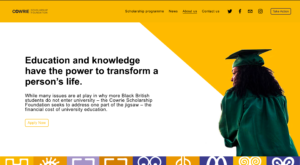
- 5% of British students from black Caribbean families gained places in “high tariff” universities, compared with more than 10% of all students. While many issues are at play in why more Black British students do not enter university – the Cowrie Scholarship Foundation seeks to address one part of the jigsaw – the financial cost of university education.
- Richard set up the Cowrie Foundation because of the murder of George Floyd in May 2020. Richard was inspired to create this foundation after being influenced to create change following the death of George Floyd. Cowrie is a very fresh organisation therefore there is an opportunity to bring something exciting and distinguishable as a brand. Cowrie Scholarship Foundation was set up to allow economically disadvantaged black students to get a university education at a Russell Group university.
The users
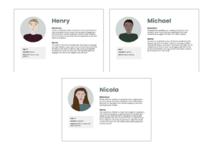
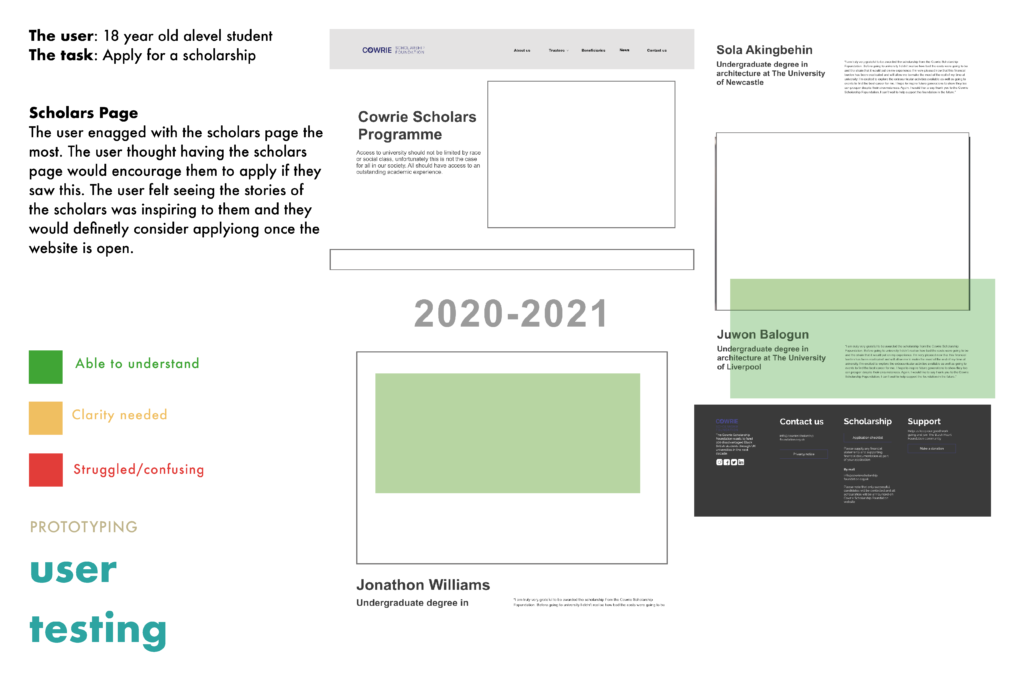
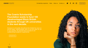
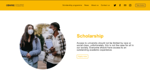
We identified three user groups: The student, the parent, and the shareholder. Each user group would have specific goals within the website. The student’s main aim is to apply to the scholarship through the website. The website needed to make this process as easy to understand as possible as one of the client’s aims is to get scholars into the scholarship. Secondly, the parent main aim is to provide opportunities for their children therefore the parent would be looking to the foundation values but also on past scholars to see if the foundation would be the right fit for their child. Lastly, the shareholder’s main purpose on the website would be to donate to the foundation however the process before that would be important. The shareholders would need to understand what the foundation is and how their money could help change lives.
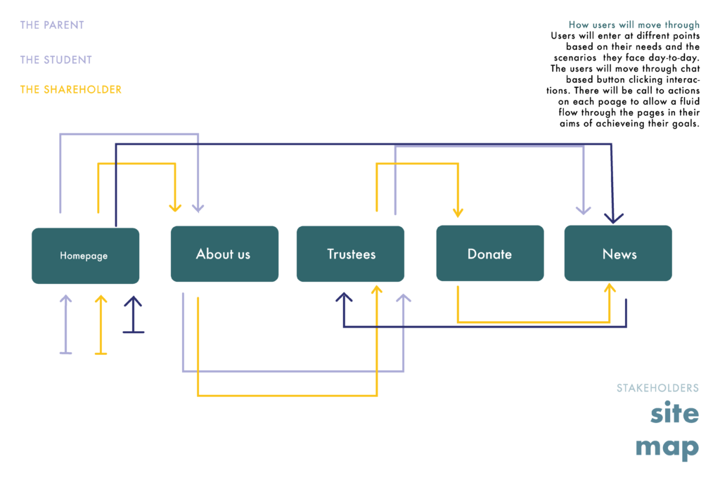
Wireframes
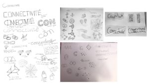
Initial sketches

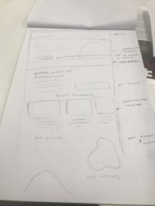
Developing the website based on the specific needs of the user was important and the layout for each specific sector was the most important. The hardest part was making the website more concise with a lot of relative information it would be easier to have multiple pages however, this makes the website look unappealing therefore we decided having drop-down menus would make the website look less cramped together and more spacious. We decided on having a scholarship programme, about us, contact us and news.
Lo-fi wireframes
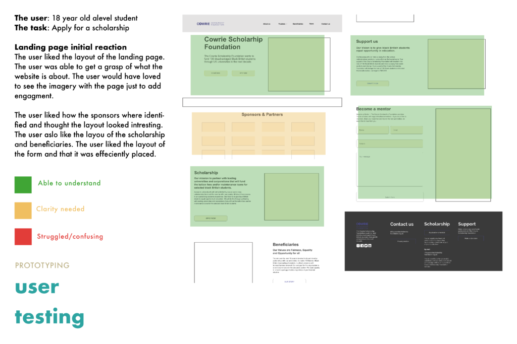
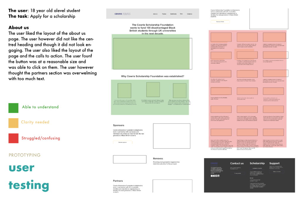
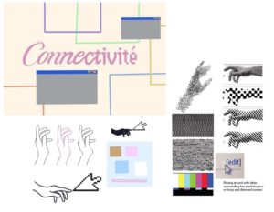
Now that we had a plan with the initial sketches, we decided to create lo-fi wireframes via XD to test the user experience of our proposed design layout. Following the user testing we able to identify what needs improvement and what was good to create a workable website that the users can use easily. With this information, we decided to start designing the high-fidelity website on Squarespace. The process of testing the prototype was a little bit tedious because we struggled to find a user that was similar to the target audience, but we eventually found someone.
The brand
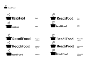
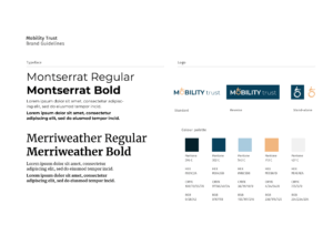
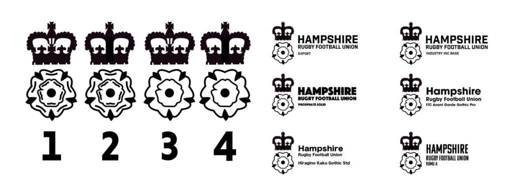
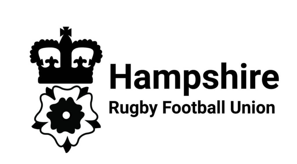
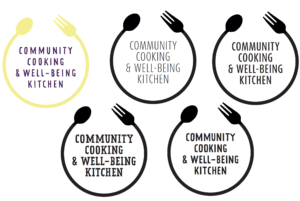
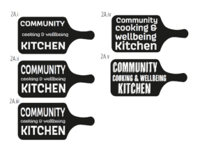
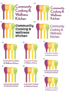
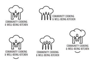
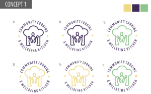
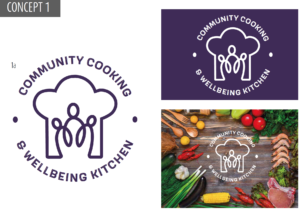
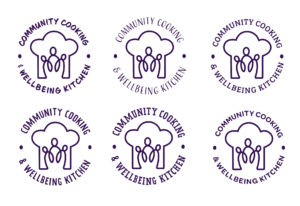
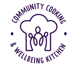
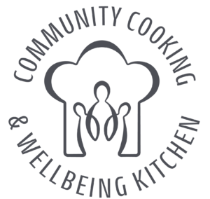
During the branding project, we produced new logos for the client however the client decided to keep their current logos that we had to use.
![]()
The typeface that the client wanted us to use was Arial for the website. We selected a few weigh and size variants to differentiate headings, body and captions. Arial is a very legible sans-serif typeface and allows the users to easily gain and digest the information provided by the website.
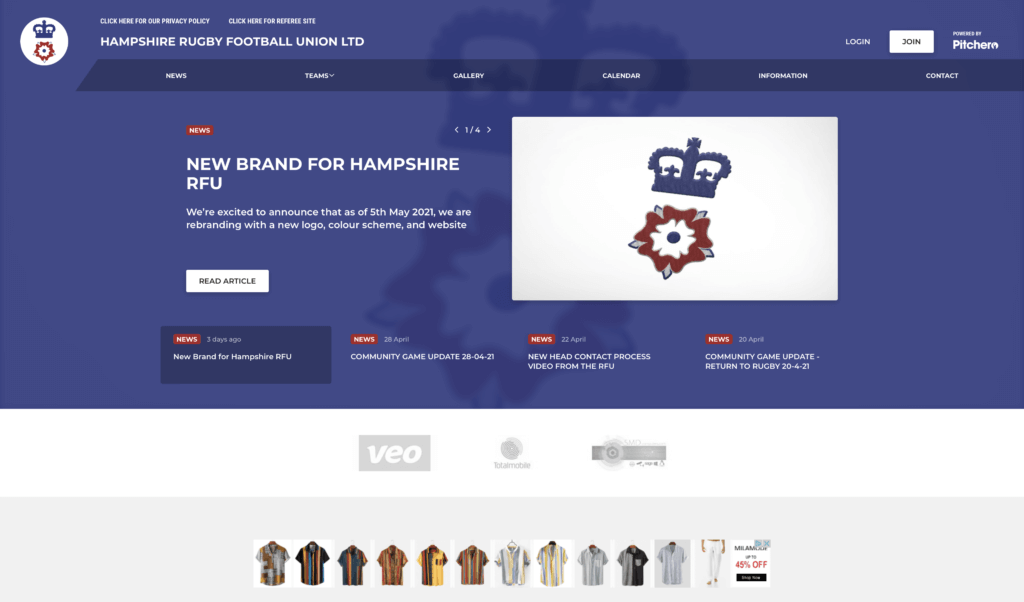
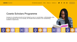
The client requested us to make heavy use of the black and yellow colour scheme used for the initial website. After we utilised some of our colour schemes to help differentiate web-page’ sections or to help the overall design being more engaging. As previously mentioned black and yellow were the defining colour of the branding. Other colours such “Blue Magenta” or “Harvest Gold” were used respectively for clickable links or illustrations and elements throughout the website. Squarespace offers the possibility to choose a colour palette as one of its tools made of 5 colours and allowed us to create different colour themes to chose depending on what page or section we were working on.
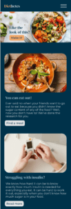
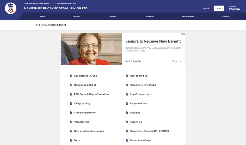
The process of image selection started with us using license-free pictures mainly depicting black students revising, working or at university. All the images were then shown to the client for feedback and approval. This happened a few times as the images had to be appropriate for the website, not too corporate but the pictures also had to be relevant in the context of education, achieving and hardworking which are some of the core values of the foundation. The illustrations present on the website are the tiles and one illustration designed from the previous version of the website we developed for TY3BP that the client liked and wanted us to keep it. The tiles were made on Illustrator and they are part of a larger group of traditional Ghanian symbols called Adinkra symbols that represent concepts and aphorisms. The tiles are used to divide the first elements of each page from the rest of the content underneath.
Final design
The design of the final website was clear and accessible for the client and the user. The overall design was successful as the client was happy with it. We had an initial plan an idea that we felt could have enhanced the outcome however we were limited by the software and our ability to recreate the XD prototype. The design decisions were moderately made by us however the client had the final say in the majority of the final design decisions. This led to elements of the website that we did not particular felt met the quality that we felt was needed however we found ourselves having to put the client’s needs first which we felt we could have been more critical and outspoken for our own design decisions however, overall, we were mostly happy with the outcome.
Feedback
The feedback we received was mostly positive with the client writing; “It has been a pleasure to work with you both. The level of work, attention to detail and willingness to incorporate requested changes was greatly appreciated.” We have not yet received official feedback from our supervisor yet although from the last feedback session she advised us to take more control of the project as the designers which I believe we did towards the final week of the project.
Conclusion
The feedback shows that the website is effective and easy to use. This implies that we have been able to achieve the aims listed in our brief and seeing the website go live was a proud moment for both of us. We believe our client is happy with the outcome and we have seen that he has comfortably been able to make changes to the website which was his main aim for the brief. Overall creating the website has taught us important skills within UX design and development that we can both use in the future.
The website link: https://www.cowriescholarshipfoundation.org/
– Peter Rosanwo, Edoardo Sarli