Background
The Reading School of Art annually hosts a private and public degree show to display the final art pieces of each graduating Art student. The degree show has a new theme each year, chosen to encompass the range of work and to represent the graduating cohort. The project was a collaboration with students in the Art Degree Show Committee, involving them in the design process of each deliverable to better adhere the designs to represent them.
Restating the Brief
The purpose of this Real Job was to create a visual brand for the degree show for the Undergraduate students of the Art Department at the University of Reading. The School of Art hosts a private degree show at the end of each year to display the work of the graduating art students. Our job was to work closely with the art students to produce a visual identity that they were happy with and believe reflected the vision they had.
The Art Degree Show committee had an estimated budget, dependent on grants and fundraising, which aimed to cover the cost of all deliverables.
- Printed publication: showcasing a selection of students’ works that attendees of the event will receive upon arrival. The publication size, stock and quantity is to be decided and confirmed by the Art Degree Show Committee & client.
- Website: showcases every graduating student’s final art piece that can be easily shared around the web on social media. This website will also serve as a public showcase of the degree show to people that cannot attend in-person.
- Other promotional materials: including physical and digital, such as posters, degree show invitations and advertising on the digital screen outside the Carrington building on campus. Further details of sizing, stock and quantity is to be decided and confirmed by the Art Degree Show Committee & client.
COVID-19
Unfortunately, due to the outbreak of COVID-19, there were quite a few obstacles that came our way, meaning we had to change our approach, deliverables and mode of contact with the client. The physical event of the degree show was moved online, as was the promotion of it, with physical invites and posters becoming the design of banners, icons and post templates for social media platforms. Meetings with the client were held weekly online on Zoom instead of face-to-face, with several of the art students in attendance each time, where we shared screens to show our progress. Overall, although the Covid outbreak altered the final delivery of the event, the client still requested a printed publication and full website, alongside the additional promotional pieces and a GIF-like animation to be shown between videos of student work. Therefore, although our deliverables and contact changed slightly, our approach remained the same, as our designs continued to develop.
Developing the Visual Identity
We had a number of design aims that needed to be achieved in order to fulfill the brief and produce a suitable outcome for the client:
- To create a visual brand for the degree show which reflects the chosen theme.
- To create promotional material for the degree show for both people within the university and visitors.
- To showcase a selection of work by the final year students to attendees through a printed publication.
- To provide a directory of final art pieces for each graduating student to be shown online to the public.
- To create a coherent branded social media presence that worked across different platforms, including Instagram, Facebook and Youtube.
Design Process
After agreeing on the restated brief, we were then involved in discussions with the Art students and their publication committee on working around their chosen theme: “Asbestos.” This name was chosen as a way of paying homage to the university’s Art building, due to be demolished next year due to the high levels of asbestos found from when it was originally constructed in the Second World War. As this was potentially the last exhibition to be held in this building, the art students, having spent four years studying there, wanted to use the space as the theme, with ideas of visuals around the concept of “construction and work in progress.”
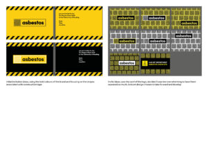
Two approaches were originally discussed, one using the bold black and yellow colour combination associated with warning symbols, the other focusing on using architectural blueprints. It was decided that the black and yellow would be more effective, paired with the style of sans-serif typeface used on official asbestos warning stickers. Feedback from the art students continuously informed the development of our designs.
Fig 1: The brand development
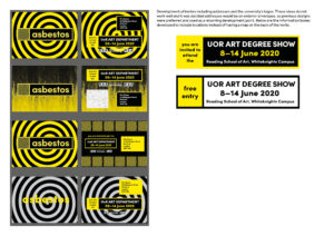
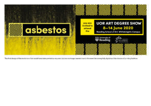
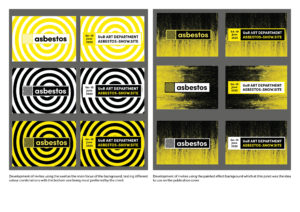
The printed invitations were the deliverables required to be finished first. Iterations of these designs were produced and displayed to the clients at each meeting, where regular feedback and polls affected their development. Using the chosen logo as a starting point, the arrangement of the ‘swirl’ differed on each version, alongside various colour combinations within the scheme of black, yellow and white. Eventually, as the situation changed, there was no need for printed invites, and any digital invites were to be sent out over a Facebook event (which are automatically created and therefore cannot be designed). Although this was slightly disheartening, the process of designing the invites allowed us to fully explore the potential of the brand and to gain a better sense of what the students were looking for across the other deliverables.
Fig 2: Initial event invite development
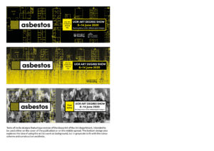
Similar to the invites, posters were created intended to be printed and placed around campus and local residential areas to advertise the event. In the centre of campus, a short animation advert was designed to be played on the large screen at the side of the Carrington building. These were designed to emphasise the bold contrasting colours, whilst also drawing attention to the student work that would be showcased at the exhibition. The moving ‘swirl’ and flashing bar of information was intended to catch the attention of passers by, who often pass the Carrington advert without paying much notice, due to the static nature and softer colours often used in other adverts placed there.
Fig 3: An initial idea for the Carrington Building
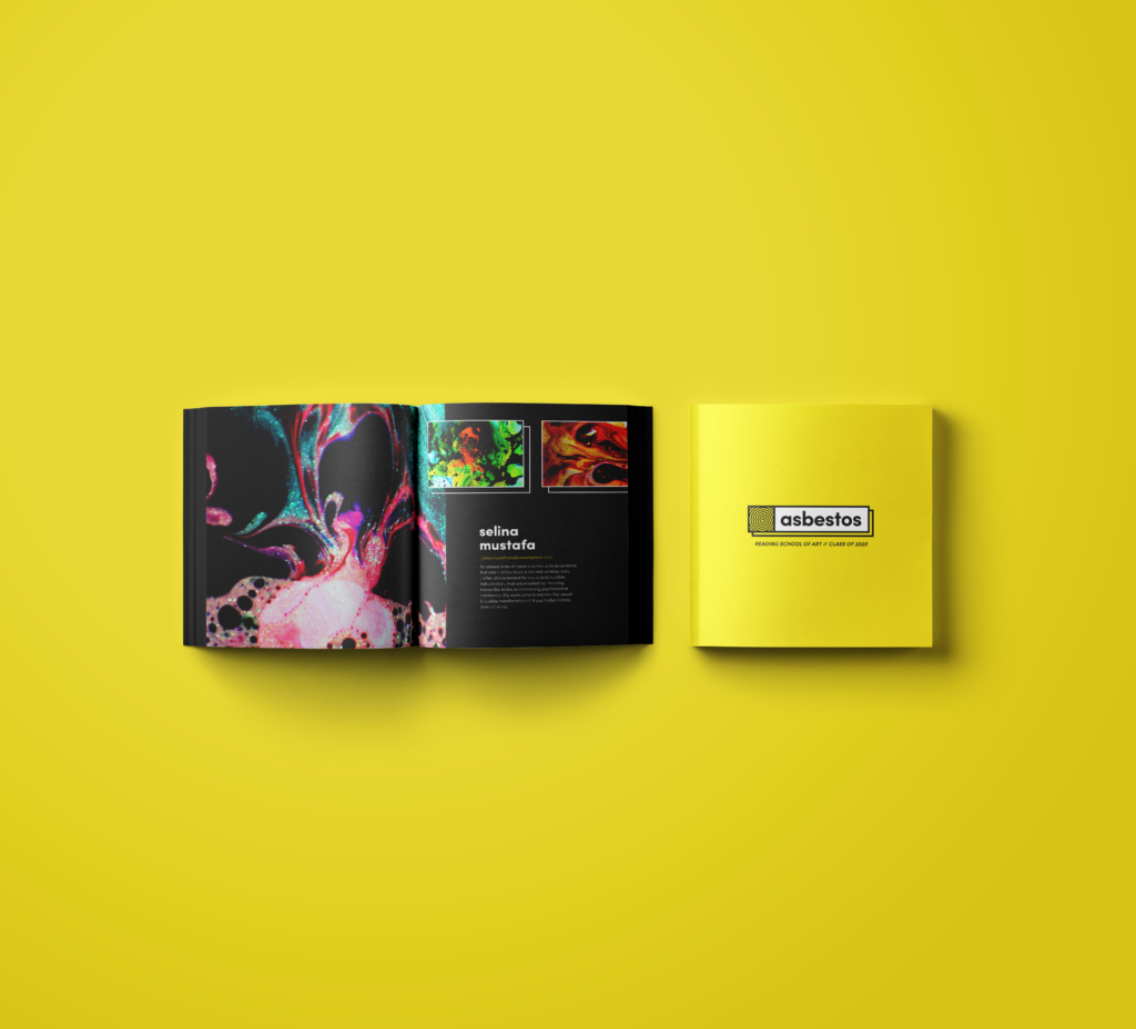
The publication was developed following the creation of the brand guidelines. Beginning with a series of spread ideations in an A5 format, the design followed an ‘in progress’ / rough aesthetic, relating to the theme of construction the name conveys. The photographs of the artwork were edited into grayscale in an attempt to compliment the bright yellow used within the branding, and to allow for the design to incorporate streaks of yellow in the type or decorative elements. Some photographs were also image traced in Adobe Illustrator to further emulate the roughened aesthetic of the publication. Additional iterations included bright yellow typography which brought attention to itself and overlapped the artwork and a yellow block of colour, which scraped down on top of the image to the bottom of the page to give a layered effect. However, further developing the publication in that style, it was brought to our attention by our peers and supervisor that the typography overwhelmed the page and took away from the focal point of the publication — the art.
Thus, a new approach was formed; toning down the typography, increasing the size of the images and enhancing the effect of the photographs. The type (artist’s name, social media link and their descriptions) was arranged on the same area of the page to improve the reading experience when flicking through the publication — in this approach, we stressed that the images of the artwork spoke for themselves and the type remained secondary if readers needed additional information. The size of the publication also changed into a square in order to relate to the box shape of the logo.
Fig 4: The development of the publication
The website also developed quickly, following the creation of the brand guidelines. Starting out as a coded site, the design relied heavily on the use of strong imagery and aimed to highlight the exceptional artwork of the graduating class.
Fig 5: Development of the initial site
However, before publishing the site, user testing was undertaken with two participants in order to analyse the usability for the site in relation to three key factors:
- Readability
- Visual interest
- Ease of use
A woman in the 40–50 bracket and a man in the 50–60 bracket were tested, on a MacBook Pro 15 inch. The usability tests were completed at 50% screen brightness in order to reduce potential contamination of data.
Fig 6: User testing findings
Unfortunately, our site was insufficient for purpose, and needed to focus more on prioritising information and individual students. This feedback was taken into consideration, and a new prototype was created.
Fig 7: Final site prototype, created in adobe xd
User testing of this new prototype site was successful, with users reporting that the new site communicated far better what the degree show was really about, as well as showcasing student work effectively. From here, we translated our site into a WordPress format, making the design a reality.
As the situation changed, and the event was moved online, social media promotional materials became even more important. After several discussions between the design team and the client, several solutions were agreed upon. A template and posting schedule would be created for Instagram, along with a branded profile picture and Instagram stories takeover GIF. A branded banner and profile picture would be created for the Youtube channel, created to stream the students work during and after the live event, as well as a short GIF-like animation to be played as a separating trailer between the videos of students work. It was now crucial that all of the deliverables were visually consistent to produce a coherent online presence, whilst also showcasing the artwork at their best.
Fig 8: development of social media presence
Reflection
Overall, our team was in regular contact with each other, with good communication allowing us to be inspired by one another and to share ideas and receive feedback quickly. We were also in regular contact with the client and a number of the art students, who relayed our developments to the rest of their year. Although we faced some challenges due to COVID-19, such as lack of access to printing facilities, face-to-face discussions for feedback and technical difficulties with getting the website up and running, we managed to work together to overcome these challenges and produce outcomes that both we and the client are happy with. Through these challenges, as a team we developed a strong set of transferable skills and strengthened our teamwork, communication and flexibility to adhere to a change in brief which can be applied to future jobs throughout our career. We were even asked to complete future work for the same client based on this project, which is an encouraging indicator of our success in fulfilling the brief.
– Eden Sinclair, Angie Bacallan and Ruth Bartley.

