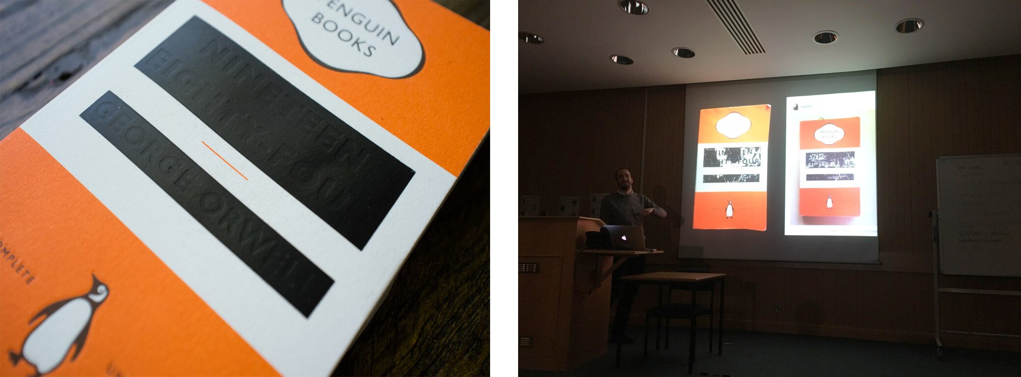
David Pearson began his talk to Typography students at the University of Reading citing three things that sum up what really interest him – the first and last having a direct impact on his work as a prolific, award-winning book cover designer. The second he admits, possibly less so…
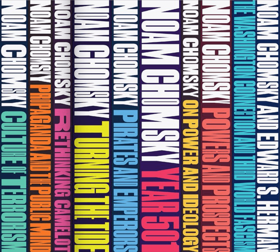
Pearson recalled his time as a student – the intimidation he felt from who he described as the “gatekeepers” of typography and this impenetrable discipline he initially struggled to work within. Grasping the differing personalities of typefaces was what helped him to understand how they could be best used; the other details seemed to simply “fall away”. The essence and character of type forms is a core tenet of Pearson’s work and is a huge part of why he has been so successful in capturing just the right tone for hundreds of different classic book titles.
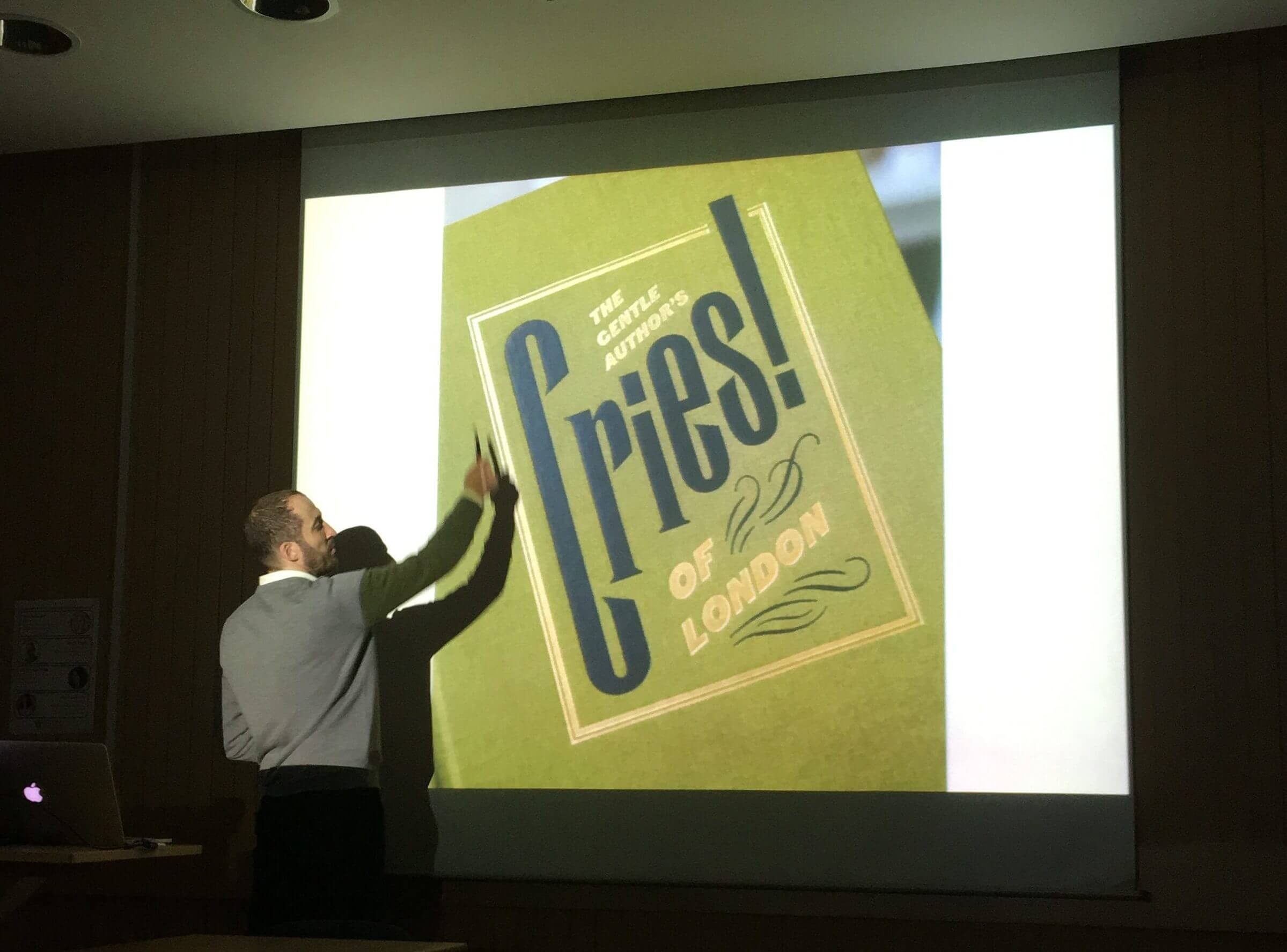
Pearson places emphasis on using type as the main image of a design, hence his company name Type as Image. To give an example, one design he enthusiastically cited was his cover for The Gentle Author’s, Cries of London. The ‘C’ is personified as if literally crying out, and the punctuation bursts through the decorative border, bringing a joyful exuberance to the composition.

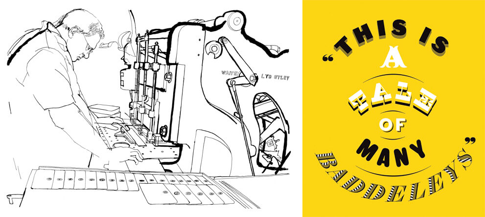
Throughout his talk, it was clear David wanted to highlight the need to not shy away from collaboration in any facet of design. He described with fondness the “dignity” that the illustrations by Lucinda Rogers gave to Baddeley Brothers, highlighting how valuable the uniqueness of her style was. He then went on to speak about his long-standing partnership with Paul Barnes, a well-regarded type designer (and Reading alumnus) and co-founder of Commercial Type. David’s work often involves manipulating type in extravagant ways, and it was revealing that he often asks for Paul’s ‘permission’ for his more extreme morphing of letterforms.

As designers, there is a risk that we stop sharing our skills and become inwardly focused, quickly becoming disillusioned and frustrated with the work we are creating. By collaborating and sharing our knowledge and skills, we can avoid the common and insidious pitfalls of tropism that David himself confessed to sometimes succumbing to.

The best design, Pearson believes, often comes from an open and honest dialogue not just between designers but also with clients. It came as a surprise when David told us that many of the books he is commissioned to design covers for haven’t even been written yet, thus a dialogue with the author is crucial to understanding what message the book has. This healthy relationship Pearson has built with authors and type designers over the years has given him a greater artistic licence to “bastardise” many existing typefaces and to give them a more appropriate voice.
The biggest takeaway that students had was David’s naked enthusiasm and excitement about the work he is doing. It was extremely refreshing to hear someone talk with such glee about their practice. When you see David’s work and hear him speak about it, it is evident he is a perfect example of someone who is passionate about their career and loves the work they do.

