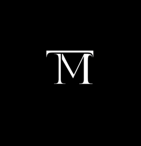
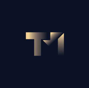
This design takes inspiration from luxury brand monograms. I chose a serifed font, and through disconnected strokes, combined my initials ‘TM’. The simplicity and clarity makes this design very effective as a sophisticated logo.
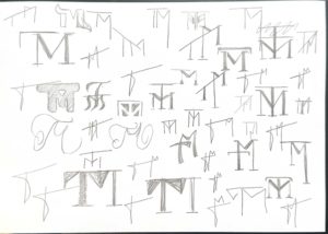
I began by sketching several variations of ‘TM’ monograms on paper, I find that using pencil and paper for this initial idea generation process allows for numerous quick generated designs that do not worry about being neat or technically perfect and instead focus on depicting the way in which the letters interact with one another or the feeling that they convey.
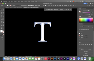
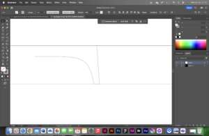
Taking it into Illustrator, I started by typing a capital ‘T’ with the text tool in Illustrator. I used ‘create outlines’ to convert this type into an editable vector image.
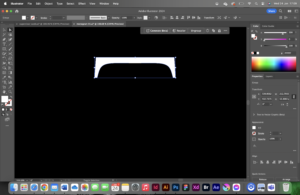
I edited the-now-vector letter by deleting anchor points with the direct selection tool.
I then shifted into wireframe mode and created guides to stick to, which is frequently used in logo design to create a uniform, clean, alignment.
Finally, I looked at the finer details; to reflect the curve of the terminal on the ‘T’, I edited the control handles for the anchor points on the top of the ‘M’.
Design idea 2
This design idea takes a much more playful approach than the first. It pushes the boundaries of the concept of a monogram logo with its inflated 3D form, however, it still combines the letters ‘T’ and ‘M’. This type of design would be great for social media posts, possibly incorporating a short animation of the logo itself inflating.
Design idea 3
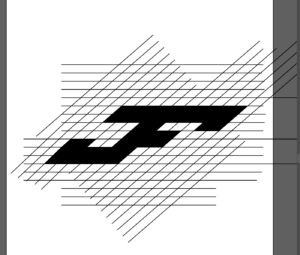
This design took a more corporate, industrial approach, and captures a completely different feeling to the previous two. It relies on heavy geometric shapes, slightly softened by an applied transparency gradient .
Software tutorials
Throughout this project, I watched several video tutorials to assist in my illustrator learning.
I used this youtube video on the latest generative fill tips and tricks for illustrator, to help me gain a greater general understanding of current illustrator tools. This is where I thought of using generative fill to generate a pattern to apply over the monogram: Generative fill
Another tutorial that I relied on when creating the inflated monogram, was a tutorial on how to inflate shapes and objects in Illustrator, as I was keen to experiment with some sort of 3D elements within the module this term: 3D inflate tool
One of the software tutorials linked at the bottom of the brief that I used when creating my Monograms in Illustrator is how to outline fonts. This is a key step in editing type as a vector and this tutorial reminded me on how to use the shortcut “cmd+shift+o”: Outline type
Design resources and articles.
I suffer from relatively strong colour blindness, and therefore often rely on taking existing colour palettes from existing designs, or those that can be found in the real world. A resource that assists me in choosing colour combinations, is ‘Adobe Color’, which allows you to copy colours by their hex codes: Adobe Color
To inspire me with my design ideation process, I created a moodboard of existing monograms on Pinterest as advised in previous feedback from TY1SK1: Pinterest board
Learning throughout the module.
This module taught me many valuable software skills through the numerous tutorials that I read/watched and through pushing me out of my comfort zone and encouraging me to explore previously unused tools within the software. My biggest learning moment of the module was getting to grips with After Effects. I used in-depth design tutorials sourced from the website Skillshare which gave me a great understanding for the basics of the software. As Illustrator is the Adobe software that I feel most comfortable with, learning After Effects complimented this perfectly, as it builds on the vector images created in Illustrator.
I have always found illustrator to be one of the areas of design that is most difficult. This is not only because I find the tools quite complicated to use sometimes, but also because I am not very confident in my drawing skills. This is why I want to focus more on my illustrator task and talk about how I have been able to improve my skills over this task.
Design 1
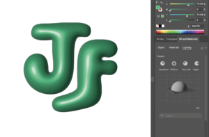
Figure 1: My original final first design, balloon inspired
When beginning this task, my original approach was to use the inflate tool to create a metallic balloon like logo (figure 1). Which I ultimately ended up scrapping because I could not figure out how to not have the effect be pixelated. This was a positive though as I then took a step back and made the design less complicated, I took a more vintage style approach to the design through the extreme curves and the smooth style of the typeface.
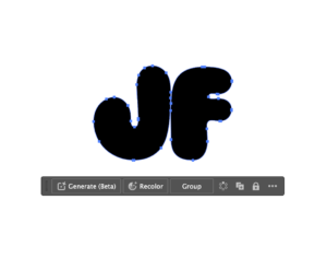
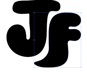
First of all, I found an appropriate balloon-like font on adobe fonts, which was Ziclets, and selected the type tool to place my initials onto the page. I then used this tutorial to outline the letters to make them editable (figure 2), this brings up anchor points which we will use to extent the letters. Afterwards this tutorial helped me figure out how to use the pencil tool to alter my type. This was done through selecting the pencil tool, clicking on the anchor point where I wanted to start the extension and then dragging it to the anchor point to where it should end (figure 3). I lowered the F down slightly so there was space on the right side of the J at the top and at the bottom of the F. Consequently, I used the pencil tool again to extend the ends of each letter so they are slightly wrapped around each other, and to make it more aesthetically pleasing I changed the colour to green, duplicated the layer and changed the colour to a lighter green on top to make a shadow effect (figure 4).
Figure 2: Outlined text to make letters editable
Figure 3: Extended letters using pencil tool
Figure 4: Final first design
Design 2
Figure 5: Highlighted grid and pathfinder tool used to connect boxes
For the second design, I followed this tutorial on making an initial logo using a grid and the pathfinder tool. I first drew a vertical line on the page, used the option key (⌥) and dragged to the right, then I pressed command ⌘ and D to duplicate the line across the page. I highlighted the lines used the option key (⌥) and dragged again, rotating until it made a diamond pattern, making sure that it is not rotated too far that the logo will appear too slanted in the end. Afterwards, I selected the pathfinder tool, and dragged across the boxes I wanted to use to make my letters (figure 5), adjusting the letterform and extending the grid wherever I need to (figure 6). Finally, I selected the extra lines outside of the filled boxes and deleted them leaving the logo, and to separate the letters, I found the line dividing the letters and changes the fill colour on each side to different colours.
Figure 6: Adjusted letterform and gridFigure 7: Final second design
The software tutorials were the most important part here because I would not have known that using the pathfinder tool on a grid was a technique that I could use. The inspiration behind this design was sports logos, specifically adidas and the way that the logo is slanted towards one side which can be seen here, which is what I wanted to imitate in my design. I am not sure why I assumed that logos like this were done without a grid, but it makes much more sense after watching the tutorial. The final design is shown above (figure 7).
Design 3
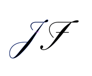
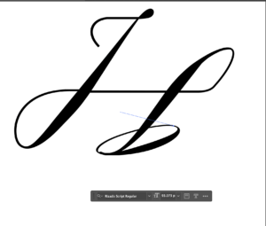
For my final design, which is the one I feel is most effective, I went for a traditional calligraphic style logo where the serifs were altered and connected. Firstly I looked at my original sketches and found the one that I thought would be interesting to execute on illustrator.
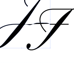
Figure 8: Outlined initials
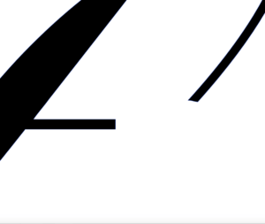
We start off with the letters being placed on the page, and here I used the typeface Rizado Script. Next, the text needed to be outlined which was done the same way it was in the first design, this is by selecting the text and right-clicking to bring up the menu, then selecting create outlines to make the text editable (figure 8). I then connected lines using the pen tool (figure 9), and used other letters from the typeface, applying the rubber tool to create the parts which I would employ to help connect the lines and the serifs together to make a fluid logo. I had not thought to use other aspects of other letters to enhance my logo if it were not for this tutorial which explains how you can use that technique as a feature of the design. As a result of this, I inserted the letter O into the file and used the curves from half of an O to falsify having looped serifs (figure 10 & 11).
Figure 9: Pencil tool to connect lettersFigure 10: Connecting extension to create new shapeFigure 11: Using character O to create new serif
The linked tutorial above really helped me for this logo, it also covers parts of illustrator which was provided through multiple links on the brief just in one video. Going into this task I thought that I would be using the pen tool for everything because that is what I have always done. I surprised myself though, specifically in this final design as pretty much only used tools which I did not know existed before I started this task. The final design is shown below (figure 12).
Figure 12: Final overall design
Software tutorials
Most of the tutorials I used were ones that I found on my own through YouTube, I did review the tutorials that were recommended on the brief, but I found that lots of the YouTube tutorials covered lots of the same things. I was able to find out about approaches that I had not considered before through video tutorials, such as using a grid and connecting the sections together to fill them.
Although some of the software tutorials such as the bubble text tutorial were just consolidating skills I already had, the ones that had completely new tools I feel have increased my confidence in Illustrator by a considerable amount. The tutorials I used for my task are linked in the walkthrough for each design.
I definitely still feel like there are more skills that I need to learn and develop on this software, like most people would as software is constantly changing and developing. Something specific which I would like to learn further is using the pen tool, as although I used it extensively in this task, it took me quite a lot of time to get used to it and make my work smooth and even. There are still gaps in my knowledge which I can improve by finding more tutorials.
Design resources and articles
The first thing I did after reading he brief was create a Pinterest board and started adding logos which I found to be effective and aesthetically pleasing (figure 16). I personally like Pinterest as it shows me what is trending in my own age range.
I also did what most people probably did for this task, which was just search up ‘initial logos’ to see what comes up. Through this I managed to find some images which were useful displaying different letterforms and styles, like (figure 17). Additionally, I browsed this website which includes different logos for a range of companies, which was one of the things that I think most people would think of when they hear the word logo. I liked these ones specifically because it just shows a list of a wide range of logos from clean sharp lines to elaborate, intense designs.
Learning throughout the module
Despite my scepticism in this module being self-directed, it has allowed me to work at my own pace and solidify my knowledge in software that I (naively) thought I knew well.
I began with previous knowledge of a few pieces of software, that being Photoshop and Illustrator, but through this module I have been able to learn about InDesign and After Effects which I did not know existed! Finding out about, and learning how to use these new software’s has been what I believe to be the most important part of my year. I now know the purpose for each of these individual software’s and what part of design they are mainly used in. Such as Illustrator being for logo design and InDesign for setting out any text.
Skills that I have improved while doing this module include cutting out hair in photoshop, especially curly hair which I found to be very challenging, but most importantly I have been able to improve my time management skills. Although last term my time management skills were not too bad, I definitely improved this skill during this half of the module. I was completing each task on a set day every week which has been a highlight for me because it has relieved some stress.
I saw this task as a fantastic opportunity to build my very own logo for my art Instagram page. I have experimented and learned how to the different tools on Illustrator; some which were completely new to me like the scissor tool. The design you see above is actually a continuation from the first experiment I did in this task.
After I had completed the task, I went ahead and explored the composition further and came up with a logo for my own social media design page. I added a square to the continuous line/path which acted like a border/bearer shape for the letters to sit in. I then took the brush tool and experimented with different styles until I found the perfect one which completed the logo design. I finished the logo by stating my social media handle at the bottom using a clear capitalised san-serif.
…
DESIGN 1
Design 1
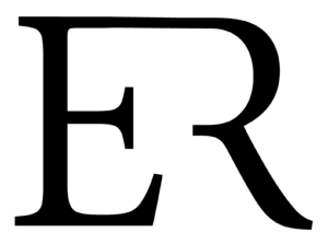
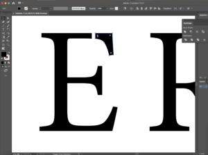
Firstly, I began with creating 2 separate text boxes and typing each letter in each of the text box. I chose to use Minion Pro as my typeface as a serif is the perfect example to do it on due to having well defined descenders and serifs at the end which can easily be cut off. To manipulate and distort the actual letters, we need to make a path around the letterforms. To do this, I expanded both the letters by going onto the object menu which gave me a path around the letterforms.
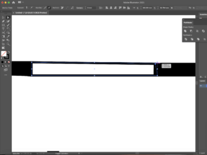
Now that both text boxes were essentially converted to a smart object (due to the paths around them), I was able to use the scissor and line segment tool to draw out the lines where I wanted to break the letter in order for the 2 letters to connect in the end. After I was happy of where I wanted to create these marks, I divided the object using the pathfinder tool – this sliced where I had originally made the marks and to make sure they had separated I edited the object by ungrouping all that was selected. Screenshot 1 shows the top end part of the ‘E’ been cut off. This is where I planned to join the ‘R’ to after extending the line so that there was a reasonable amount of space between both the letterforms. I then did the same thing to the ‘R’ making sure I cut the correct areas out.
I joined both of the objects by using the shape tool and drew a rectangle which connected the two letters together (screenshot 2) By using the cutting method I learned from the tutorial I watched and using the direct selection tool also, I cleaned up the edges where the lines overlapped. The before and after stages of this action is shown in. To finish the edit, I rasterised the 2 elements as a whole which converted it into one single object rather than 2 separate ones.
Screenshot 1: pathfinder, divide and then ungroup from the objectScreenshot 2: joining the letters together
…
Software tutorials and inspiration
My inspiration for this design is the logo for Louis Vuitton. I like the way they have combined both of the letterforms as a whole. However, I wanted to put my own spin on this, therefore I removed parts which I thought were not essential, but kept the parts which were needed to ensure the letter did in fact look like it was meant to be. To do this, I used 2 video tutorials which helped me. I understood that I needed to outline the text and the video provided in the brief helped me to do so. In terms of cutting parts of the letter out, I found a tutorial on YouTube which helped me remove the parts I did not need. I learned how the scissor tool can be used together with the line segment tool to cut out parts of an object and how the direct selection tool can come in handy to line up the corners of the object and deleting points if necessary.
Helpful tutorial: https://www.youtube.com/watch?v=0LMqhHkI76I&ab_channel=JanisDougherty (cutting shapes in Illustrator) Helpful tutorial: https://www.youtube.com/watch?v=dz6P94HoZnc&ab_channel=StickerGiant (outlining shapes)
Inspiration for design 1: https://www.gallerymonkey.com/LV-Logo-Black-White-Wall-Art
…
DESIGN 2
Design 2
I started off this design by choosing the typeface. I wanted to make my second design more abstract which is why I picked sans-serif typefaces like Baloo Bhaina and Chalkboard; I chose Chalkboard to be part of my final outcome. The thick strokes of the letter forms is perfect for the effect I was going for as it does not hold back. It stands out and it’s out there and fun. I then drew out the first shape I was going to experiment with – an ellipse. I then created an outline for the text box which essentially converted it into a smart object (with a path)
For the text to warp into the shape, with both elements chosen, I applied the ‘Envelope Distort’ option and I made it with the top option. This gave me the finish I was looking for (screenshot 3) I was not a massive fan of this though, so I went ahead and experimented with a different typeface and shape – this time a rectangle. After adding 2 more points onto the rectangle using the pen tool, I grabbed the direct selection arrow and distorted the rectangle to the shape. Like I previously did, I warped the text using the same technique, however this time remembering to group the rectangle before I did so as I added 2 additional points to the rectangle which had broken the single path. To stylise the warped text, I added a shape around the text as well changing up the colours using different layers to get the final outcome (screenshot 4)
Screenshot 3: using ellipse as the shape for the text to warp intoScreenshot 4: adding colour
…
Software tutorials and inspiration
Through this design, I have learned a new technique. I was always intrigued to know how people do this and now I finally got around to finding out as well as making my own thanks to this task. It’s quite simple too. Not only do the tools do amazing things but after exploring a couple of the options on the top menu bars allowed me to see that most of the interesting stuff lives up there. I used my previous knowledge on manipulating shapes to change and enhance the background to make the logo the best it can be.
Helpful tutorial and inspiration: https://www.youtube.com/watch?v=zDWcrCzzwxw&ab_channel=DesignTuts (warp text into the custom shape)
…
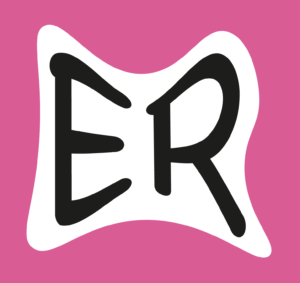
DESIGN 3
Design 3
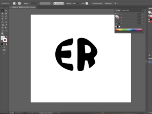
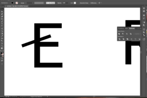
To begin this design, I decided that I was going to use a sans-serif as I hadn’t played around with them as much (like I did in my first design) I realised that creating them as outlines was always the first step to do as it makes a path along the actual letter forms making it easier for us to manipulate the letters. So, after I had done this, I remembered to ungroup the whole letter and began to add lines using the pen tool to see where I would have the cut outs (screenshot 5) After I was happy where I wanted to place these, I used the pathfinder tool and divided the shape so that it make a cut in the letter where I had drawn (screenshot 6)
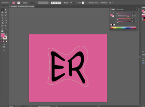
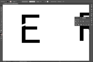
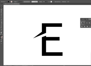
Now, it was time to wing the ends out – I did this by adding a couple more anchor points and using the direct selection tool to expand these where appropriate to create the desired effect (screenshot 7) I then manipulated the ends of the E to make sure the style was consistent throughout as it looked odd without doing so I then did the same to the R, as well as beginning to experiment with colour. I made the cut in the R even more distinctive compared to the E, to use the new technique I had learned. I felt as though by adding more drama to the R would bring the logo together. Lastly, I positioned them so that they created sort of a journey from one letter to the other (starting at the top and slowly changing direction as you move your eye down to the R) I experimented with the line width of the framing of the circle as well as switching up the colours to create an altered ending finish.
Screenshot 5: pen tool + “create outlines” functionScreenshot 6: pathfinder tool to divide the letterScreenshot 7: using the anchor point and the direct selection tool/white arrow to extend the ends of the paths
…
Software tutorials and inspiration
I found a very useful tutorial to help me with changing up the letter form differently. Although the video showed tools and elements I already was aware of, it showed me how to do things differently. I can now use the pen tool better to by knowing where to add different anchor points which I can then pull out or draw in to curve the edges or extend the corners out. I was inspired by the Nespresso logo, more specifically the ‘N’ in it. It follows the same idea I have dealt with through this design. I think by adding this to the starting letter like the brand has done adds an excellent degree of style, whilst also being legible to users.
Helpful tutorial: https://www.youtube.com/watch?v=-NJojxyLM2c&ab_channel=RifkanCreation (letter logo in Illustrator)
Inspiration for design 3: https://en.logodownload.org/nespresso-logo/
…
Reflection
Throughout this task, I gained a better understanding on how the pathfinder tool works – how I am able to use it to divide sections, overlay, combine as well as group together too. The ‘create outline’ function is extremely useful as it converts the text box into letters which have paths around themsleves. Working with this is easier, as you can take any point on the letter/shape and change it to whatever you feel suits the design and style. Doing this has improved my practice using the pen tool. I am now able to know where to put additional anchor points if I need them and where to remove them to get a softer curve.
An area to improve is to explore the materiality of the letterforms (e.g. adding texture within the letterforms for a greater impact) I think experimenting with different letters of the alphabet can also be useful as by pairing different letters together you can use the shapes of them differently and intertwine them with one another.
