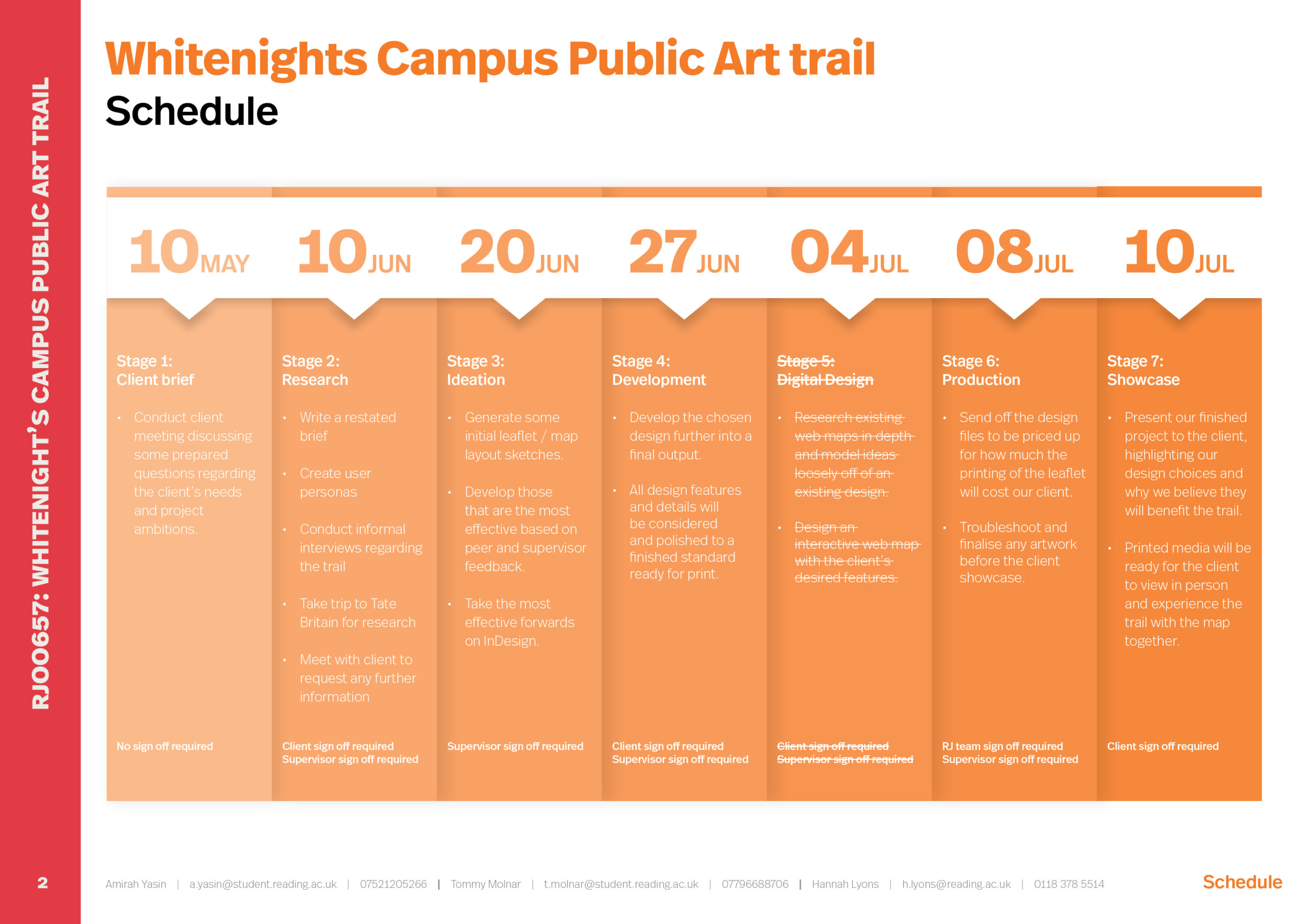
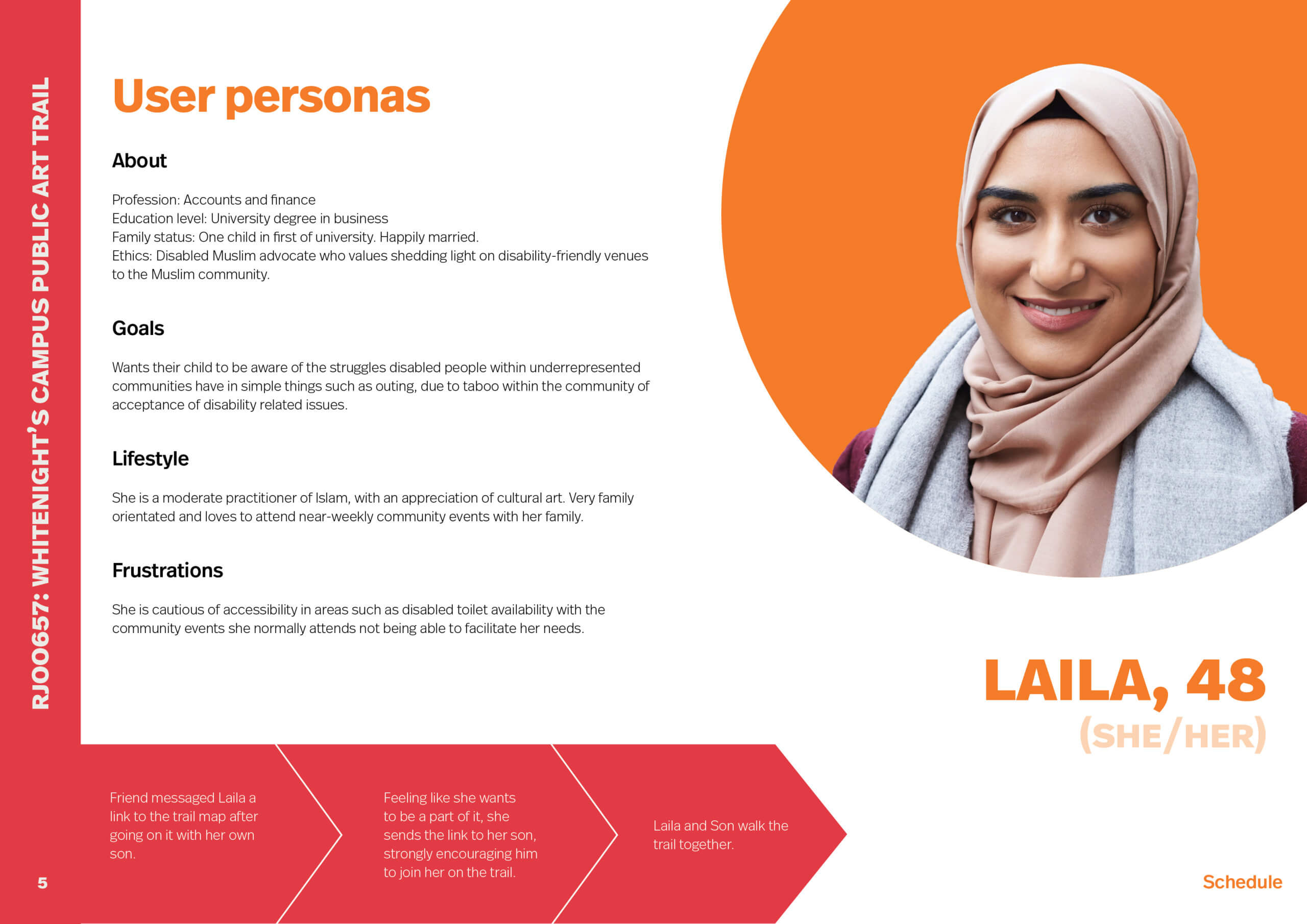
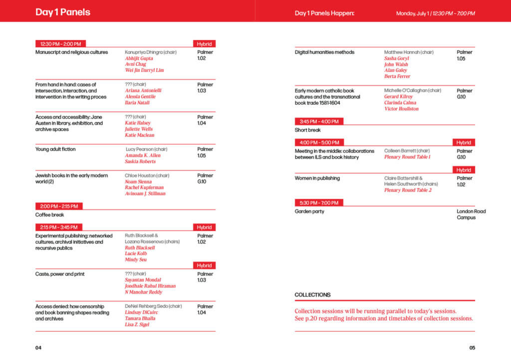
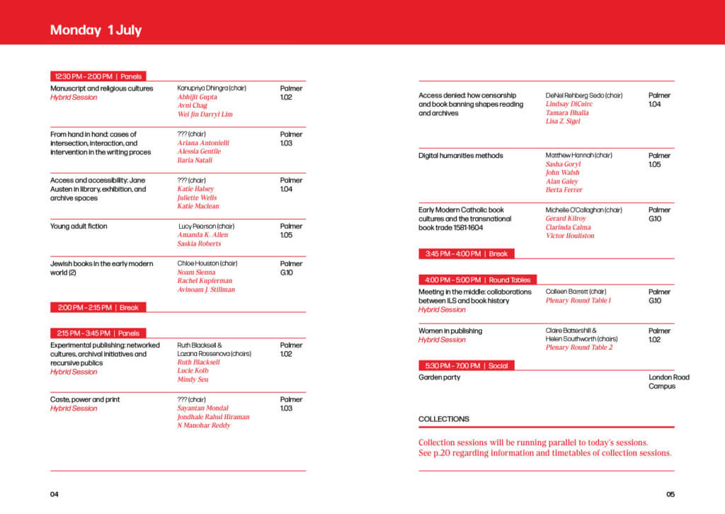
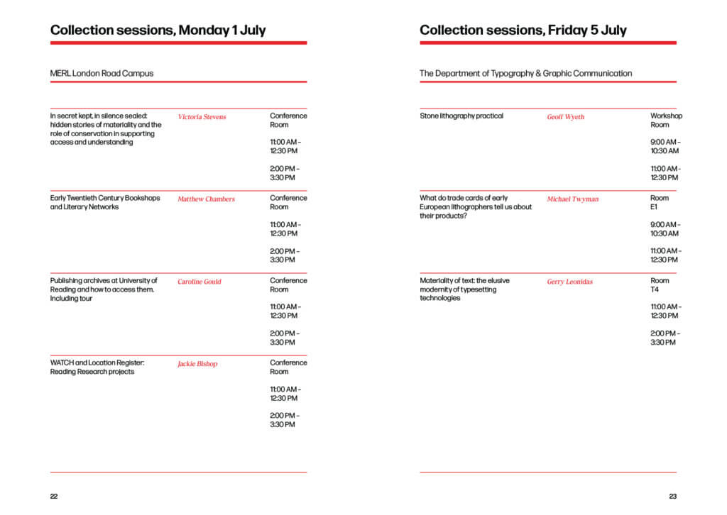
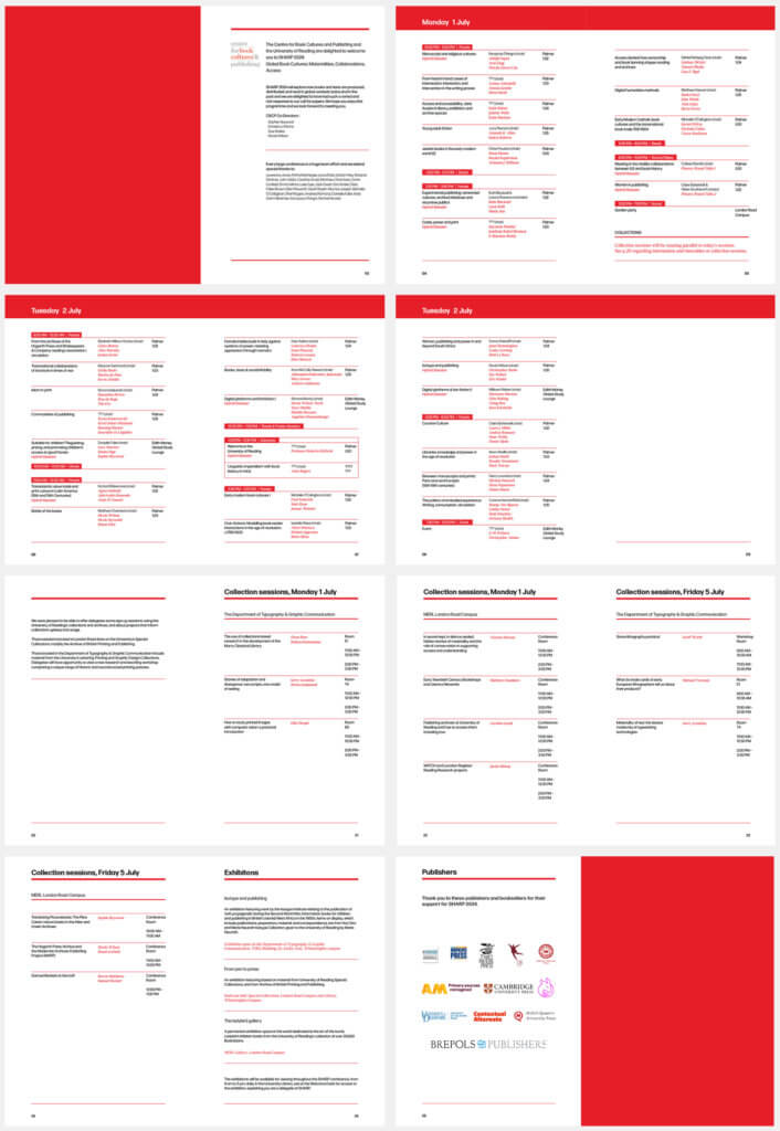
Background on the project
KateMustSew is a self-made quilting business based in Reading, specialising in workshops, trunk shows and quilted artwork. Kate required a profile-raising rebrand and website design to elevate her business and reputation as an artist from a hobby quilter to a more professional level.
Restated brief
In our initial meeting with the client, it was clear that she wanted a rebrand but was unsure of what deliverables to ask for. Together we ran through her business model, noting the platforms she primarily operated on and the ways in which she communicates with her customers. This offered us insight into her business and allowed us to suggest deliverables which would suit her specific business style. Our main aim with this process is to ensure our deliverables help Kate to achieve her goals through the rebrand.
The agreed deliverables were:
-
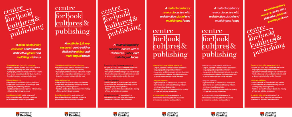
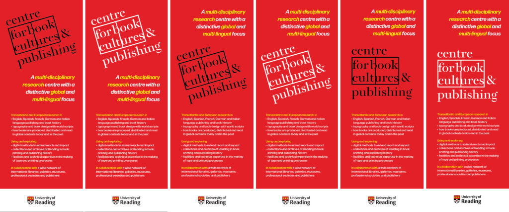
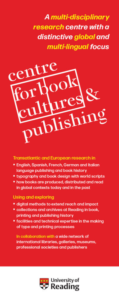
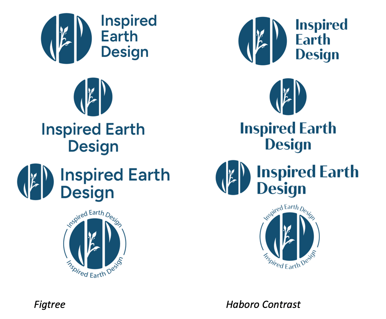
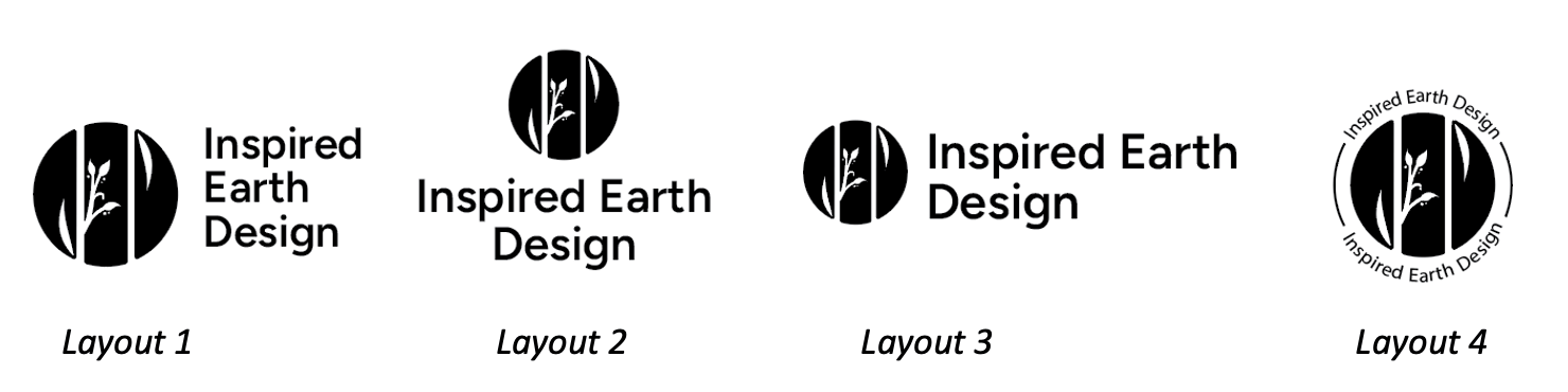
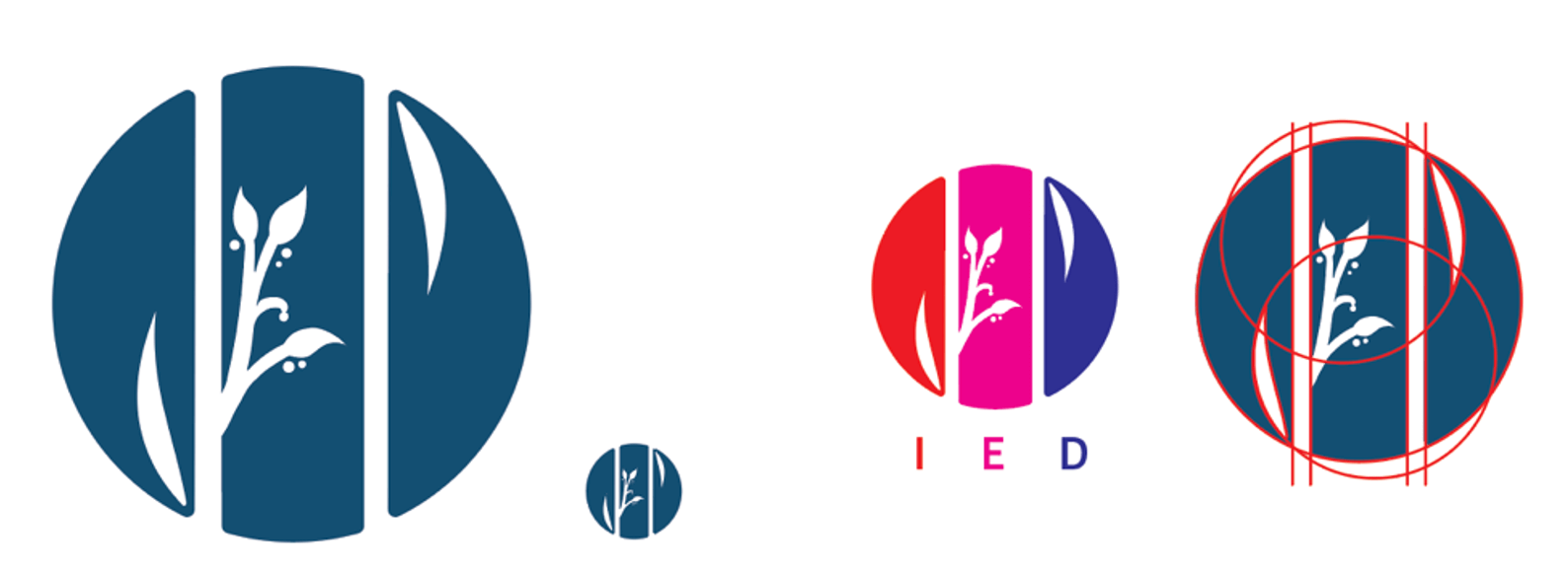
- Three logo designs (One portrait, one landscape and one circular)
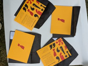
The range of logo options offers the client flexibility across platforms whilst maintaining the house style. - Business cards
Designed for the client to hand out at open houses, workshops, trunk shows. - Introduction sequence for her videos
Visually aesthetic introduction sequence to be used on YouTube tutorials and online workshops. - Website pages (gallery, home page and contact page)
Simplistic and clean website pages to emphasise Kate’s professionality to potential galleries and trunk show bookers, as well as customers looking to book classes.
- Three logo designs (One portrait, one landscape and one circular)
Research
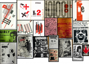
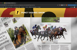
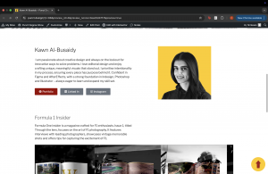
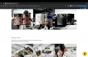
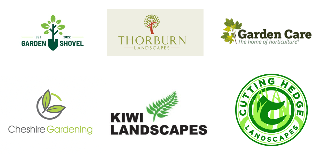
Before we began the ideation process, we spent time researching Kate’s business and competitors to ensure we could fully understand her user’s needs and how we could support these through the deliverables. We were particularly interested in how similar individual artists presented their brands, especially on their websites. We analysed how these artists chose to present themselves; looking at the website styles, colour schemes and imagery/ illustrations used across the brand. Through this process, we discovered that many artists within the same field as Kate chose sleek and clean website layouts. We also noticed that a lot of quilting artists logos felt cliche and passive.
Some of the examples we analysed include:
After looking through these online presences, I compiled a list of features that we found appealing and believe to enhance the presentation of these businesses.
- White backgrounds and simple layouts – these help draw the user’s focus to the artwork which is the artist’s primary goal.
- Large images and scrolling image carousels on the home page – show a range of the artists different works and styles with minimal user effort.
- Well lit images shot from above with white / removed backgrounds – high quality images ensure the detail is maintained and white backgrounds make the product the main focus.
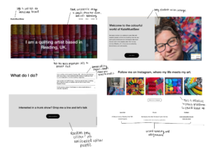
- Personal ‘About’ pages – this offers artists a way to add a personal touch and convey their motivations and passion for their work. This also creates a parasocial relationship between the customer and the artist in which they understand their passion, likely encouraging customers to purchase more to support the artist.
Audience
The client’s audience is primarily over 50s and with the inclusion of a professional website, it will broaden to art galleries and exhibitions that wish to include her work. It is important that Kate’s work also appeals to a younger target audience as Kate hopes to expand her audience and recognition as an artist through this rebrand.
Design Development
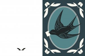
Logo
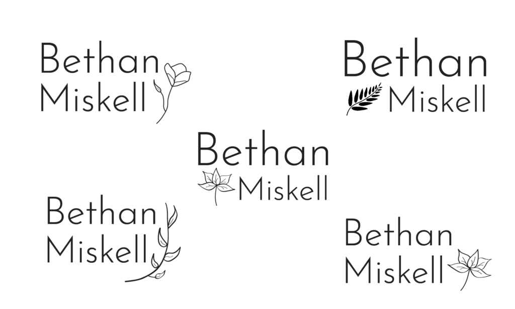
For Kate’s logo, our aim was to create a visually impactful design which represented her quilting work in a simple yet sophisticated manner.
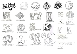
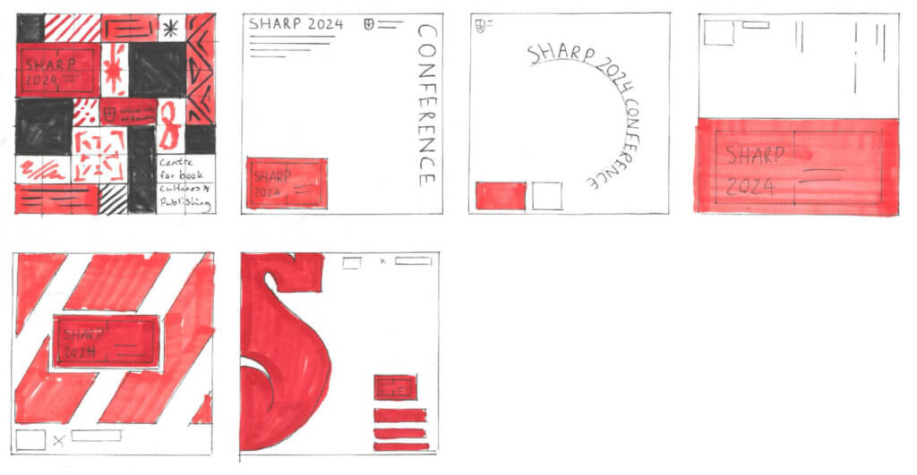
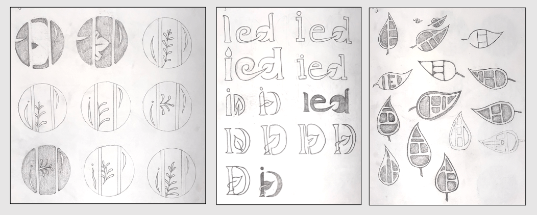
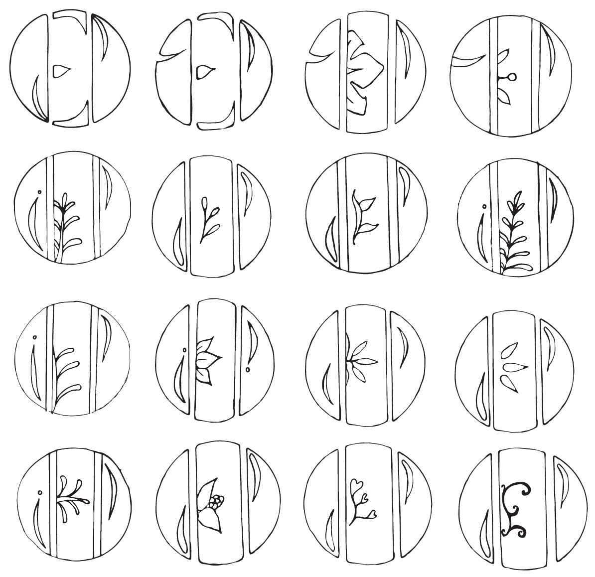
With our initial sketches, we explored a range of different approaches with some typographic and others more shape and pattern focussed. The client’s response made our next steps clear; she liked bright, bold colours with a playful edge—but not too much—as she wants her business to appear serious. She also emphasised that she dislikes the abbreviation ‘KMS’, cursive/ threadlike typefaces and sewing iconography (such as thread spools). Furthermore, it felt important to capture the client’s love for 70’s typography and the colour hot pink in my future developments.
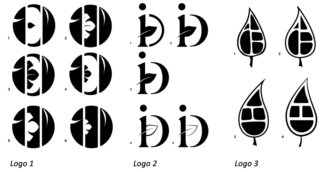
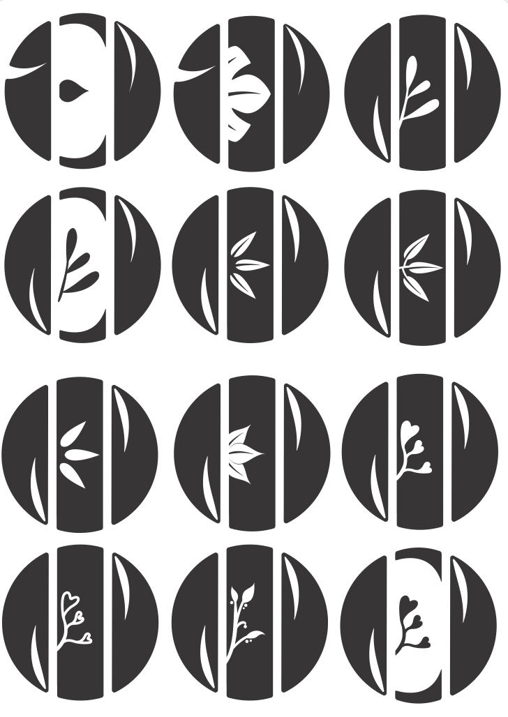
Our supervisor helped us to narrow down and alter the logos above before presenting ideas to our client. For my designs, our supervisor suggested to focus on executing the typography better which I agreed with. She saw potential in C2, however commented that the overlapping type became too much with the organic shapes of the lettering. C4 was a favourite amongst us and the idea of adding ‘stitching’ to link to the business was suggested, however I was unsure whether the client would see it as too considering her previous comment.
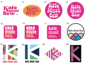
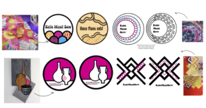
The client rejected Ben’s geometric ideas as she felt they looked too corporate and therefore not representative of her values and business. However, she was very keen on my square ideas (C5–7). As I predicted, she disliked the stitching around the edge but liked the large block of pink and the organic feel of the rounded corners and slightly wonky text, which are representative of the handmade nature of her work. We agreed that the next steps would be to experiment further with typefaces and colours, using C5 as the base design.
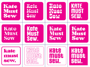
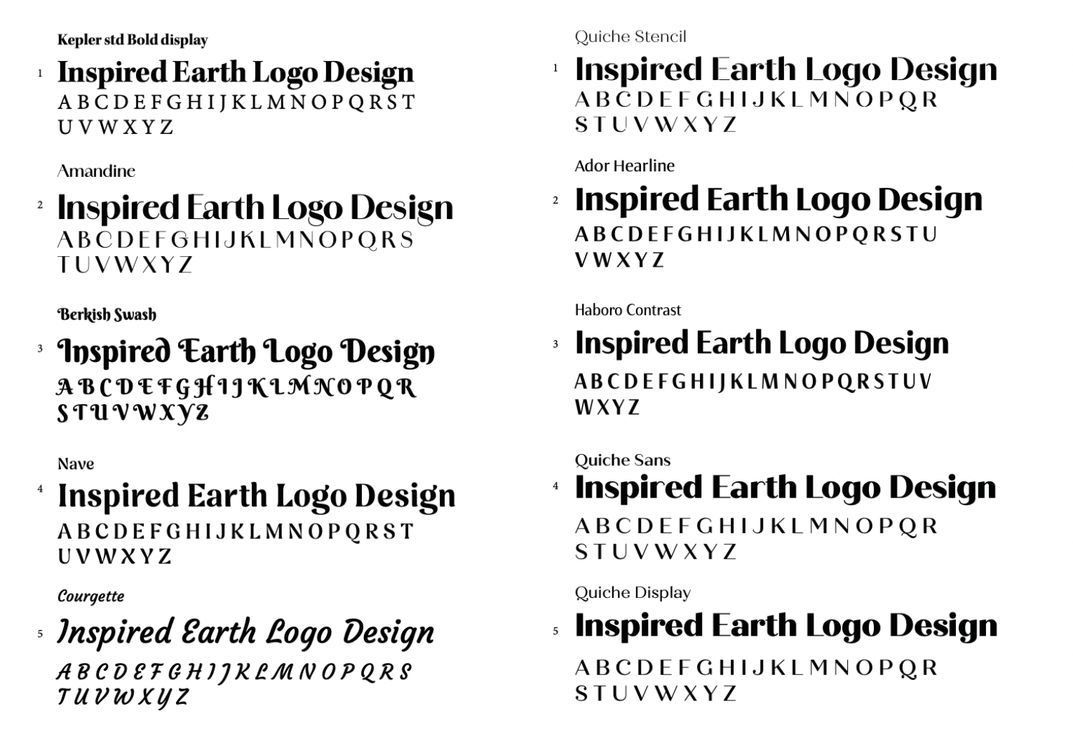
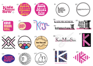
I offered the client a variety of typefaces inspired by 70s typography which she mentioned in our initial meeting, however after deliberation she selected the original typeface, in its original form. Although this resulted in no change, the process was insightful as it allowed comparison and highlighted how effective my original design was.
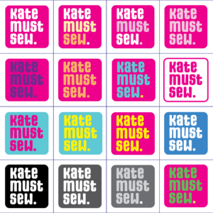
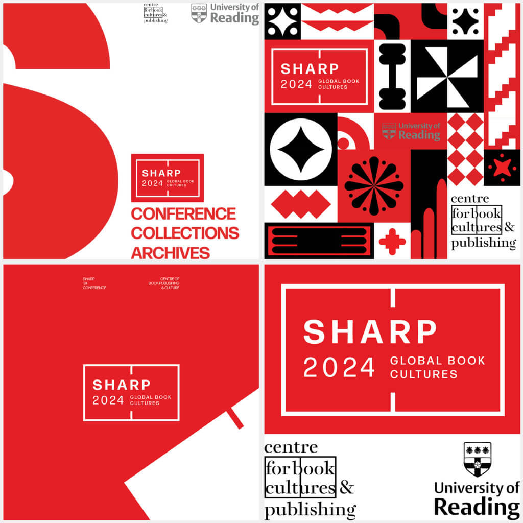
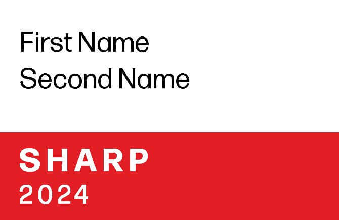
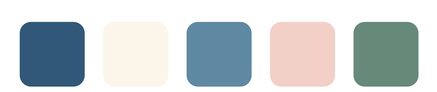
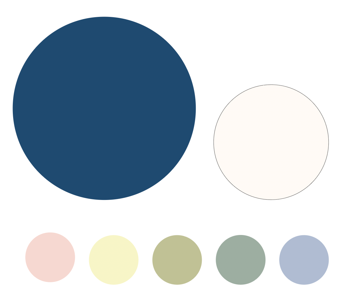
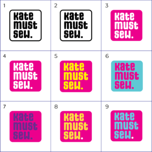
Of the colour options I offered the client, she was most keen on those including the original hot pink colour that she favoured. We discussed creating an additional black and white version of the logo for monochrome print-outs, however since the majority of Kate’s branding appears digitally, she decided that there was no need, especially as the bright colour is part of what makes the logo so appealing. Kate liked the colours on the top row and asked for white text with a coloured full stop, to emphasise the imperative ‘Kate must sew.’
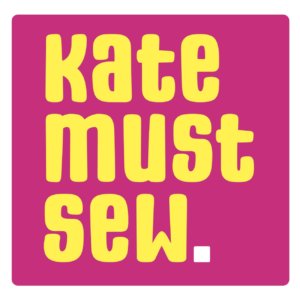
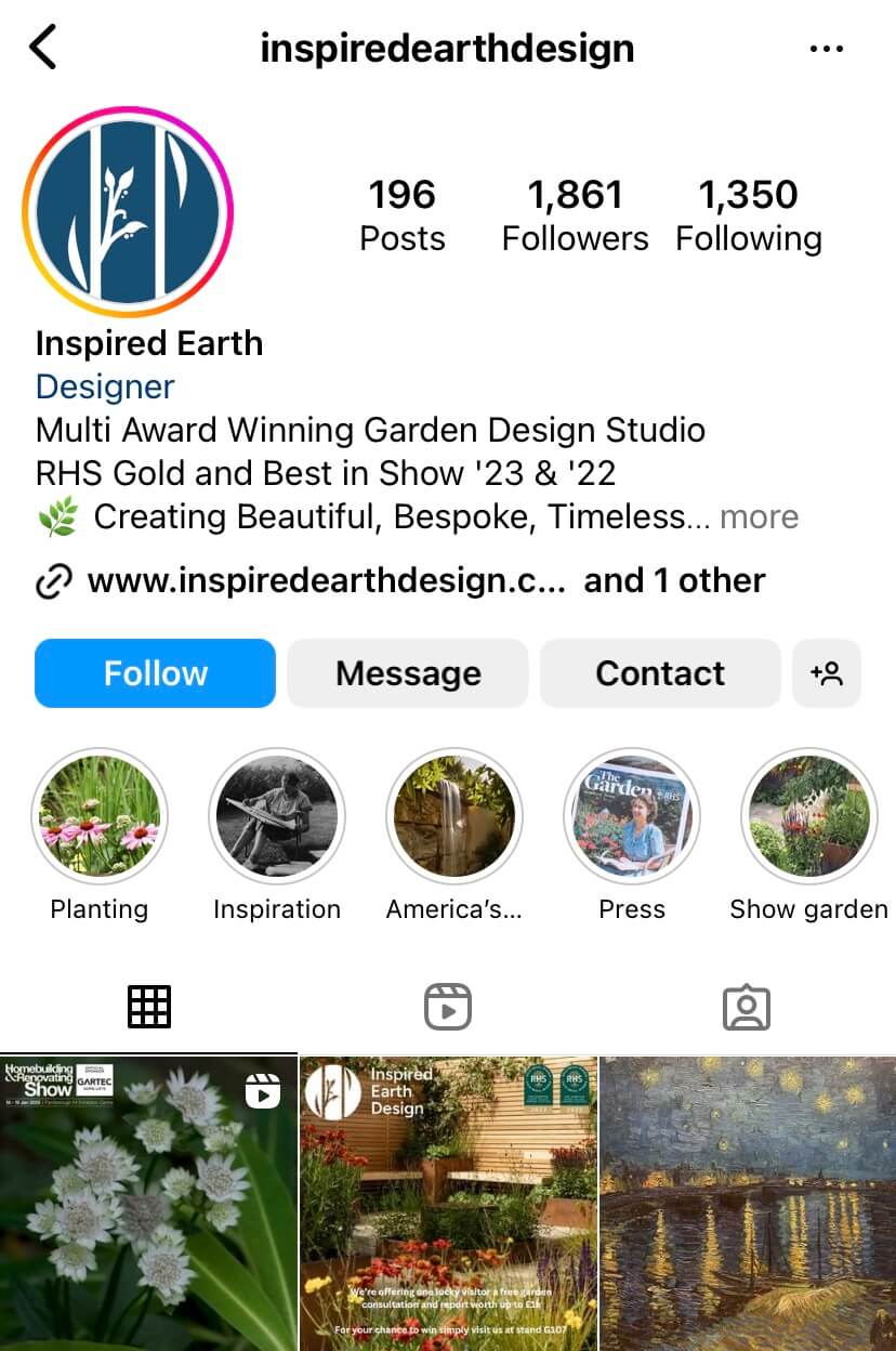
Both the client and I am really happy with the final logo and variations. I feel that the typeface represents the quirky and handmade nature of small businesses and the colours capture the brightness and energy of her quilts. The chosen colours have helped to identify Kate’s brand colours which are continued across the business cards, website and video. Kate posted a sneak peak of her new logo to her Instagram account where she recieved an overwhelmingly positive response.
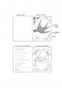
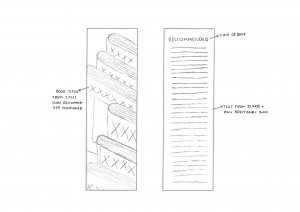
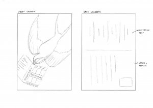
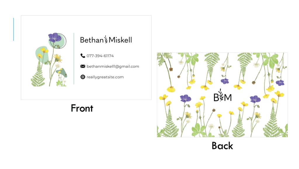
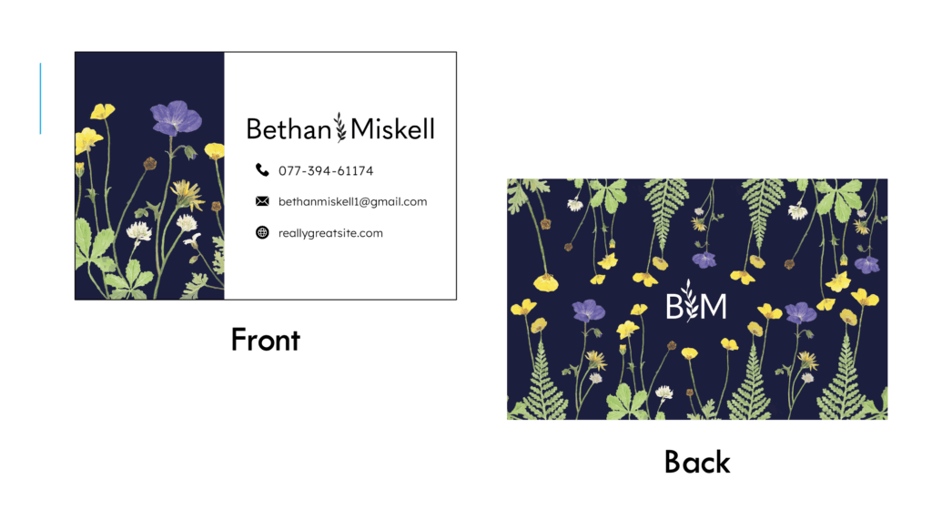
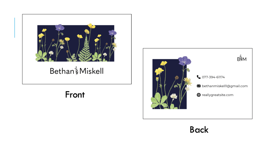
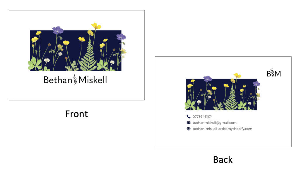
Business Card
My original business card designs were lacking, which I understood through supervisor feedback and personal reflection. Through discussion with our supervisor, my next steps were clear;
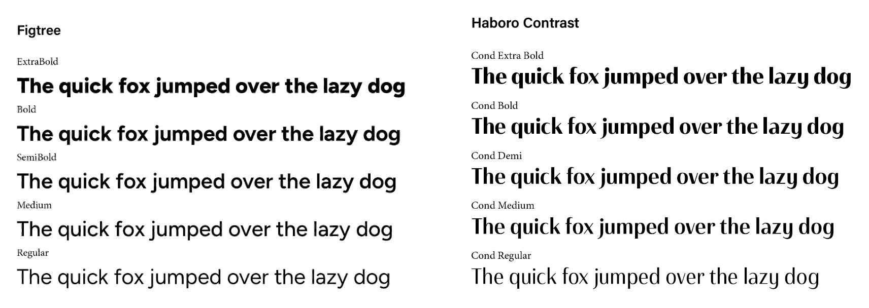
- work on the typography, try Sweet Sans (classy)
- work on alignment of elements across the front and back
- try to avoid mixing imagery and the logo
- find less clunky social icons
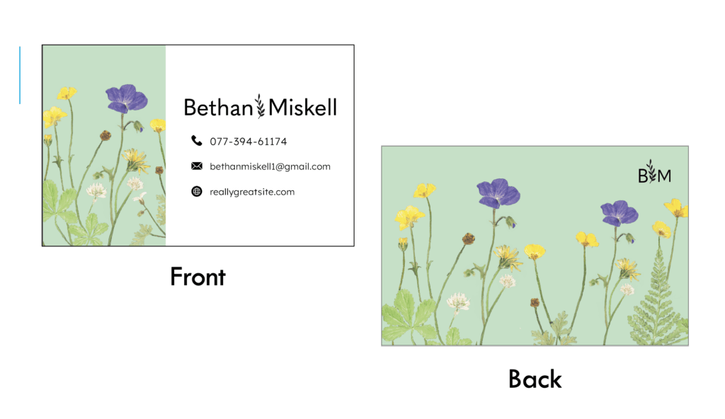
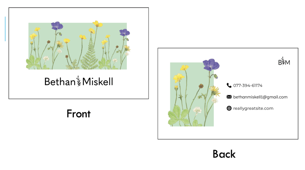
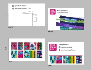
The concept of idea 1 however was popular with both our supervisor and the client. During the research stage of the process, I was inspired by one Kate’s Instagram stories where she had embroidered on a card. I thought this would be a great way for Kate to promote her business if this was something she was prepared to do. Being able to offer potential customers a hand-sewn business card would almost definitely ensure that people kept the mini artworks and remembered her, boosting her artist awareness and customer base. Kate loved the idea, however decided that a design which she could sew on, but could also stand alone was the best option.
My solution to this was to ensure that my future designs had enough negative space which she could embroider over, but were still visually effective alone.
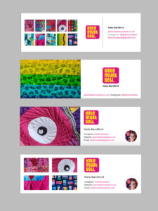
For my developed designs I experimented with the recommended typeface Sweet Sans. Although I agree that the clean shapes of the letters works well to create a balanced design, I was not sold on this specific typeface and neither was the client. The client was happy with the size of the logo but did not want her face on the front as it felt unnecessary and cluttered. She also asked me to bring the icons back for social links. She liked the idea of having 10 images to highlight her varied works, however my supervisor usefully pointed out that the size of these would likely be too small when printed.
To resolve this issue, I suggested printing the business cards with a set of different background images allowing potential customers to pick their favourite and browse the other designs while doing so. The client was keen on this idea, and my supervisor recommended the website Moo.com which specialised in this process, which I passed on to Kate.
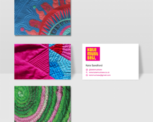
As the client had expressed she liked the stacked style of social links, we chose that for the final design. I also hand-drew the icons to represent the handmade nature of Kate’s business and to create visual interest against the clean and simple sans serif typography. The client selected 8 different images which she plans to print using Moo.com for different backgrounds and may sew over some in the future.
Although I struggled along the process of designing my business cards, this was largely due to it being my first time making one. The hardest part for me was working out how to balance the card when there is so little information to go on it. To resolve this I researched other business cards throughout the process for reference.
As a result of this process I now feel a lot more confident in my ability to design business cards as I’m really happy with the final design and my unique ideas and I know the client is too.
Video Introduction
To understand the clients wants and needs for the video intro, we booked a meeting to discuss.
My notes include:
- Transferrable, can be used for YouTube videos and Online workshops
- Just needs logo and her name
- Visually quick and punchy, not ‘floaty’ or ‘lazy’
Creating the video introduction was a surprisingly straightforward process, considering we had previously been worried about how difficult and time-consuming AfterEffects can be. Of the 4 initial ideas we presented to the client, she was instantly sold on my second concept. The animation features a pink square sliding in, with the text scrolling across from the left. At the end the full stop shrinks in, creating the punchy effect Kate desired. The whole animation occurs within 6 seconds, ensuring it is quick and straight to the point.
As our client was clear on the concept she wanted, our next steps were to develop the animation. Our supervisor suggested subtly bringing in the theme of sewing and my partner Ben came up with the idea of adding a sewing machine sound behind. The client was very happy with this idea and helped us to select a specific sound.
The final video:
Our final video satisfies all of the clients needs for it; it is suitable for a range of uses, straight to the point, punchy and quick. It is also visually coherent with the rest of Kate’s branding, meaning that when customers click on a video they will instantly recognise Kate’s brand and know they are in the right place.
Website
Since the client has never had her own website before, and operates her business primarily on Instagram and through Crafty Monkies, she was initially unsure of what to ask us for. My research for the website process included re-visiting the websites we had intially identified as effective and reviewing our user personas, noting down their different needs. As the website is hosted on Squarespace, I also played around with the tools, identifying some of the limitations and advantages of this platform.
Limitations:
- Non-customisable fonts
- Limited nav bar customisation
Advantages:
- Elements such as buttons are customisable (padding etc)
- Can design pages differently for mobile and desktop (Logo can be different)
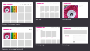
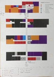
We then designed wireframes on Figma, so the client had a chance to visualise the pages and layouts we were suggesting. My designs feature image heavy pages to show off the client’s work. I chose to use the landscape logo to maximise page space and went with mainly left-alignment. I also used a restrained colour scheme of the client’s recognisable pink colour and simple black and white to draw customer’s attention to her work.
I also explained to Kate how my design plans to satisfy the needs of the personas I created. For example;
Persona 1: Barry, 53, UK, Works on the hiring team at a trunk show.
Goals
- Find a quilting artist open to presenting at a trunk show
- Learn more about Kate and her work
- Find how to book and contact Kate
Frustrations
- It can be hard to find artists websites from their other socials
- It is not always easy to find how to contact artists
- Instagram DMs often go unnoticed or not seen as serious enquiries
Technology
- Confident on websites and email
- Partially confident on Instagram
How our design work / deliverables could aid Barry
Website pages-
About me with interesting and engaging information about Kate to help people get to know her and her personality
Gallery page highlighting her favourite and recent quilts
Easily findable contact page linked from homepage to save Barry time
Link to website in Instagram bio and on business cards to ensure potential employers can locate Kate’s website easily. Website offers multiple ways to contact, email and phone (for quicker contact)
Persona 2: Lily, 21, Los Angeles, Student.
Goals
- To find an artist who offers online/ remote craft classes
- To get inspiration on her Instagram timeline
- To expand her skill and creativity
Frustrations
- Not many in person craft classes where she lives
- She doesn’t have friends with similar interests
Technology
- Digitally confident
- Primary social media is Instagram and TikTok
How our design work / deliverables could aid Lily
Logo and clean website design, creates a continuous style between platforms as she goes to book a class. Obvious that she is on the right website. Builds confidence and trust for customers, encouraging them to purchase services.
Youtube intro- maintained style, when she browses to look for craft tips and inspiration she will recognise the branding. Seeing videos on her suggested, she’s more likely to click them if she recognises and already trusts the brand.
Business card – N/A she is accessing Kate’s business remotely
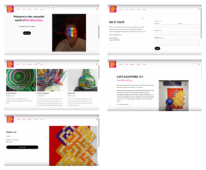
Overall, the final website satisfies the needs of Kate’s customers through the easy navigation, shortcuts to the contact page, shared house style and simple, straight to the point design. Having user personas made this process a lot easier as I could frequently reference their needs and explain to the client my thoughts behind the design. Although the client was initially unsure about what to feature on her website and what pages she wanted, her feedback suggests that she feels a lot more confident now. However, the client still remains unsure of whether she wants a shop page on the site or not as she is not currently selling quilts. To resolve this we designed the page but hid it so it is not published and she has no pressure to use it until she wants to.
A video run-through of the final website design can be accessed here.
Evaluation
When approaching this Real Job, the client’s main aims were to increase her profile as an artist and grow her audience, to help her turn her side hustle hobby into a career. We sucessfully helped her to achieve this through professional and eye-catching branding which is coherent across assets and platforms. We worked alongside Kate and with her help thought strategically about her user’s needs, creating personas and allowing us to create visually appealing and advantageous deliverables. I feel that the final deliverables are very sucessful and will aid the client’s business and I look forward to checking back in a few months to see the effect of our work.
Although initially challenging, learning how to communicate professionally with clients and recieve constructive feedback was the most valuable part of this process for me. I look forward to using these skills in my future professional roles and am grateful for the lessons this project taught me, which can’t be taught without firsthand experience.
The main lesson I am taking away from this project is the importance of time managment and keeping to schedule. We had to push the inital deadline back twice and although the client had no issue with it as she wasn’t working to a deadline, it resulted in the project dragging on and us losing motivation at points. The main issue came from our initial misunderstanding of how long the process of contacting our supervisor and client would take and we soon learnt that it was imperative to allow more time to fit with everyone’s schedules (especially as our client has young children). In future projects I will bear this in mind and try to get a better understanding of the client’s weekly schedule before creating a project schedule.
This project also forced me to take a group leader role which pushed me out of my comfort zone as I usually would avoid this role. Although I found this challenging, as a result I now feel a lot more confident in my ability and hope to develop this skill further in the future.


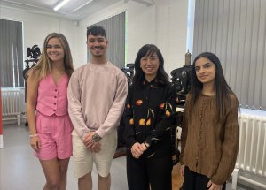
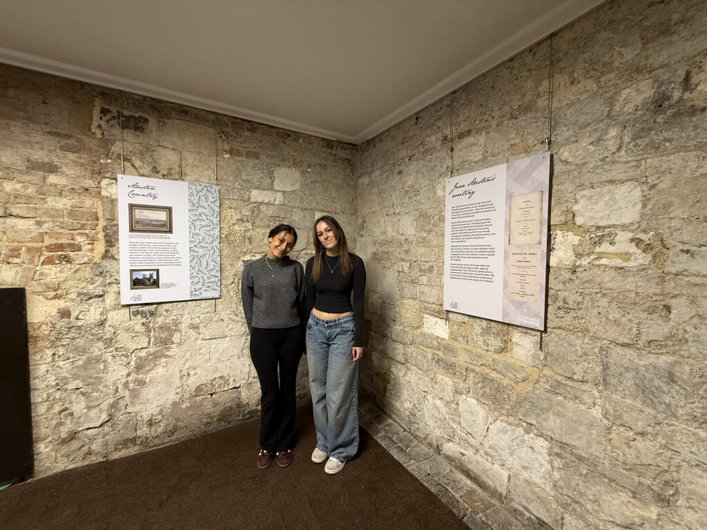 Picture of us reviewing our work at the Abbey Quarter