Richard Bird (1948–1993) worked under Ken Briggs at the National Theatre 1972 to 1975. In 1975 Bird became resident head of graphics at the theatre’s new South Bank location. Some of these posters were also worked on by Michael Mayhew, who took over from Bird in 1986.
Further reading: Rick Poynor National Theatre Posters: A Design History, which can be found in the Reading Room
We’re pleased to announce the continuation of our exhibition, ‘Letterpress: possibilities & practice’, until Friday 20 July 2018. Stop by to see a range of innovative letterpress practices and possibilities. To tempt you, two practices in the exhibition are featured below. Read on!
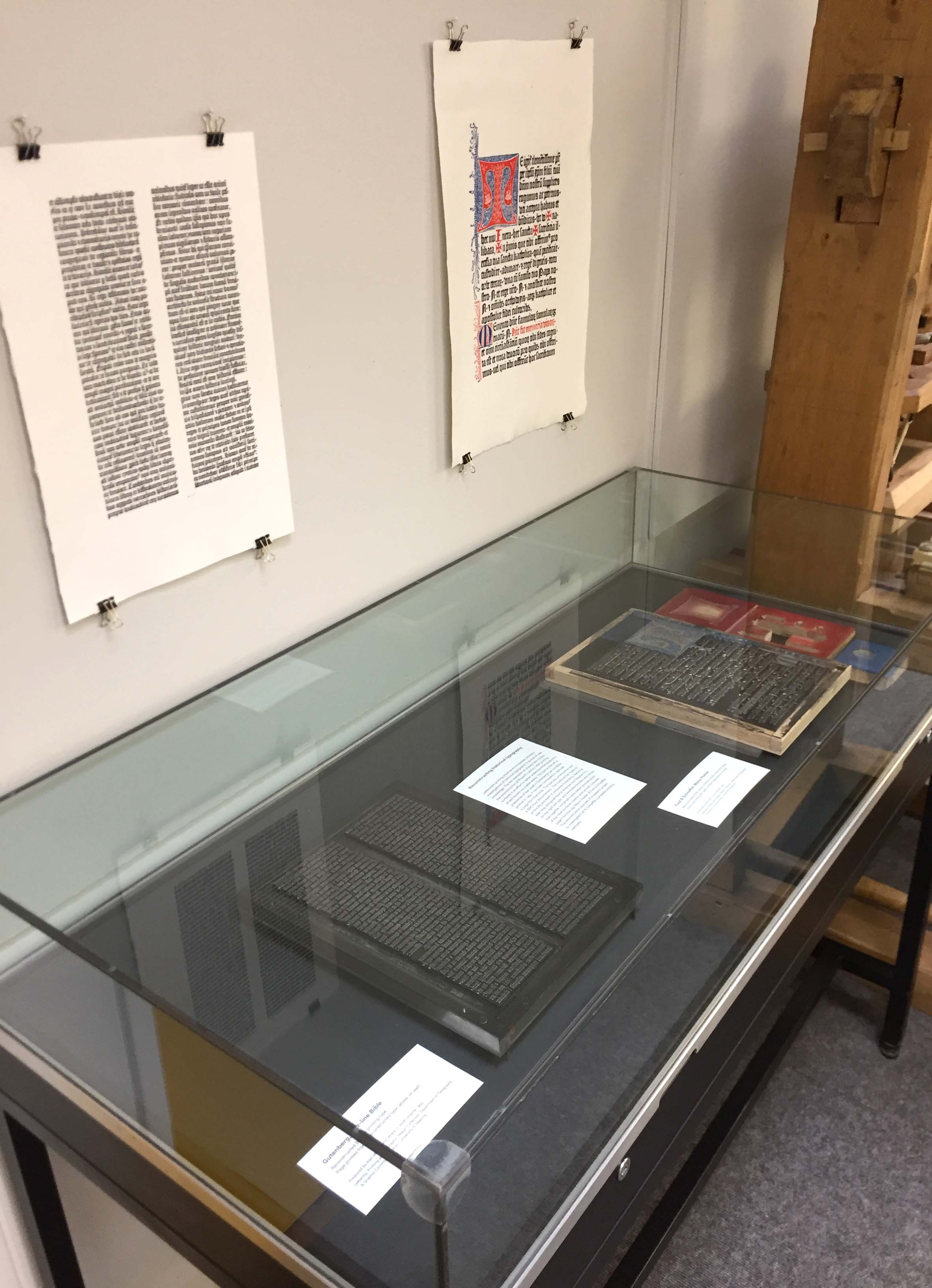
Reconstructing historical typography
Letterpress printing practice encompasses scholarly investigations of historical typography in pursuit of new knowledge. The two examples on display here involve the reconstruction of fifteenth-century relief printing surfaces in an effort to better understand the production of well known incunable works. The type on the left (in the image, below) is a facsimile of that used in Gutenberg’s 42-line Bible, printed in 1455. It has been composed to replicate a page from that book. The type was produced as part a BBC Four documentary, ‘The machine that made us’, on the life and work of Johannes Gutenberg, featuring Alan May alongside Martin Andrews and Stephen Fry. On the right are type and decorated borders and initials that together comprise a speculative reconstruction of the relief surfaces used to print a multi-coloured page from the 1457 Mainz Psalter of Fust & Schoeffer. The reconstruction was part of a research project to investigate Fust & Schoeffer’s probable working methods.
Reconstructing historical typography. Gutenberg, 42-line Bible. Reconstructed B-42 printing type (in vitrine, at left); page printed from reconstructed type (on wall, at left). Produced by Alan May and others, c. 2008 (original: 1455). Fust & Schoeffer, Mainz Psalter. Reconstructed three-colour printing surface; blocks for single-colour pre-inking (in vitrine, at right); printed page (on wall, at right). Produced by Alan May, c. 2013 (original: 1457).Gutenberg, 42-line Bible. Reconstructed B-42 printing type (detail).Fust & Schoeffer, Mainz Psalter. Reconstructed three-colour printing surface; blocks for single-colour pre-inking (at right).Fust & Schoeffer, Mainz Psalter. Reconstructed three-colour printing surface (detail).
Re-invention of historical technique
This work has been created by the Leipzig designer, Pierre Pané-Farré. It takes its inspiration from compound-plate printing, a nineteenth-century technique that exploited multiple interlocking printing surfaces. Inked separately (in different colours) and then combined, a single impression would be taken from the interlocking surfaces, resulting in precisely aligned multicolour printed images. Pané-Farré has revisited the technique using laser-cut MDF printing surfaces, which produced the various sets of interlocking components displayed here. Ink was applied to each component in the set, either as ‘flat’ colour or in graduated hues. The set was then printed in a single impression to produce the polychromatic prints. The project was accompanied by the publication of Die polychrome Druckerei (Leipzig: Institut für Buchkunst, 2014), which reproduces the prints in four-colour offset lithography. Pané-Farré cites Michael Twyman’s book, Printing 1770–1970 (1970), and Maureen Greenland’s doctoral thesis, ‘Compound-plate printing: a study of a nineteenth-century colour printing process’ (University of Reading, 1996), as starting points for his work.
Re-invention of historical technique. Polychromatic prints (on wall, 2013–14); Die polychrome Drukerei (book in vitrine, at left, 2014); sets of printing surfaces (in vitrine, 2011–13). All items conceived, designed/written, and produced by Pierre Pané-Farré, Leipzig.Detail of sets of printing surfaces (laser-cut MDF). Surfaces show the residue of their last-printed colour(s).
We’re pleased to announce the continuation of our exhibition, ‘Letterpress: possibilities & practice’, until Friday 20 July 2018. Stop by to see a range of innovative letterpress practices and possibilities. To tempt you, two practices in the exhibition are featured below. Read on!
Reconstructing historical typography
Letterpress printing practice encompasses scholarly investigations of historical typography in pursuit of new knowledge. The two examples on display here involve the reconstruction of fifteenth-century relief printing surfaces in an effort to better understand the production of well known incunable works. The type on the left (in the image, below) is a facsimile of that used in Gutenberg’s 42-line Bible, printed in 1455. It has been composed to replicate a page from that book. The type was produced as part a BBC Four documentary, ‘The machine that made us’, on the life and work of Johannes Gutenberg, featuring Alan May alongside Martin Andrews and Stephen Fry. On the right are type and decorated borders and initials that together comprise a speculative reconstruction of the relief surfaces used to print a multi-coloured page from the 1457 Mainz Psalter of Fust & Schoeffer. The reconstruction was part of a research project to investigate Fust & Schoeffer’s probable working methods.
Reconstructing historical typography. Gutenberg, 42-line Bible. Reconstructed B-42 printing type (in vitrine, at left); page printed from reconstructed type (on wall, at left). Produced by Alan May and others, c. 2008 (original: 1455). Fust & Schoeffer, Mainz Psalter. Reconstructed three-colour printing surface; blocks for single-colour pre-inking (in vitrine, at right); printed page (on wall, at right). Produced by Alan May, c. 2013 (original: 1457).Gutenberg, 42-line Bible. Reconstructed B-42 printing type (detail).Fust & Schoeffer, Mainz Psalter. Reconstructed three-colour printing surface; blocks for single-colour pre-inking (at right).Fust & Schoeffer, Mainz Psalter. Reconstructed three-colour printing surface (detail).
Re-invention of historical technique
This work has been created by the Leipzig designer, Pierre Pané-Farré. It takes its inspiration from compound-plate printing, a nineteenth-century technique that exploited multiple interlocking printing surfaces. Inked separately (in different colours) and then combined, a single impression would be taken from the interlocking surfaces, resulting in precisely aligned multicolour printed images. Pané-Farré has revisited the technique using laser-cut MDF printing surfaces, which produced the various sets of interlocking components displayed here. Ink was applied to each component in the set, either as ‘flat’ colour or in graduated hues. The set was then printed in a single impression to produce the polychromatic prints. The project was accompanied by the publication of Die polychrome Druckerei (Leipzig: Institut für Buchkunst, 2014), which reproduces the prints in four-colour offset lithography. Pané-Farré cites Michael Twyman’s book, Printing 1770–1970 (1970), and Maureen Greenland’s doctoral thesis, ‘Compound-plate printing: a study of a nineteenth-century colour printing process’ (University of Reading, 1996), as starting points for his work.
Re-invention of historical technique. Polychromatic prints (on wall, 2013–14); Die polychrome Drukerei (book in vitrine, at left, 2014); sets of printing surfaces (in vitrine, 2011–13). All items conceived, designed/written, and produced by Pierre Pané-Farré, Leipzig.Detail of sets of printing surfaces (laser-cut MDF). Surfaces show the residue of their last-printed colour(s).
An exhibition in the Department
Until 28 April 2018
Letterpress printing has never lacked dedicated practitioners since its decline as a mainstream commercial printing process. But its conspicuous use in recent years – in the UK, Germany, Italy, USA, Brazil and many other places – is evidence of a resurgent interest in letterpress as an engine for research, design and making. Driving this interest is in part a renewed valuation of the materiality of print as a counterweight to the disembodied digital form of much present-day typography and graphic communication.
Recent letterpress practices are renovating and expanding the process. This exhibition presents some of these practices, alongside complementary examples from the 1980s and 90s. They involve the exploration of print effects, the visual formation of language, the reconstruction or reinvention of historical technique, the reconfiguration of letterpress in ‘post-digital’ form, and more. Taken together, the work on display suggests that letterpress printing continues to offer many possibilities for scholarly, speculative and commercial endeavour.
Practices on display:
Reconstruction of historical typography: Gutenberg, Fust & Schoeffer
(Martin Andrews, Alan May)
Impressions of historical types: Louis John Pouchée
(Ian Mortimer, James Mosley)
Re-invention of historical technique: compound-plate printing
(Pierre Pané-Farré)
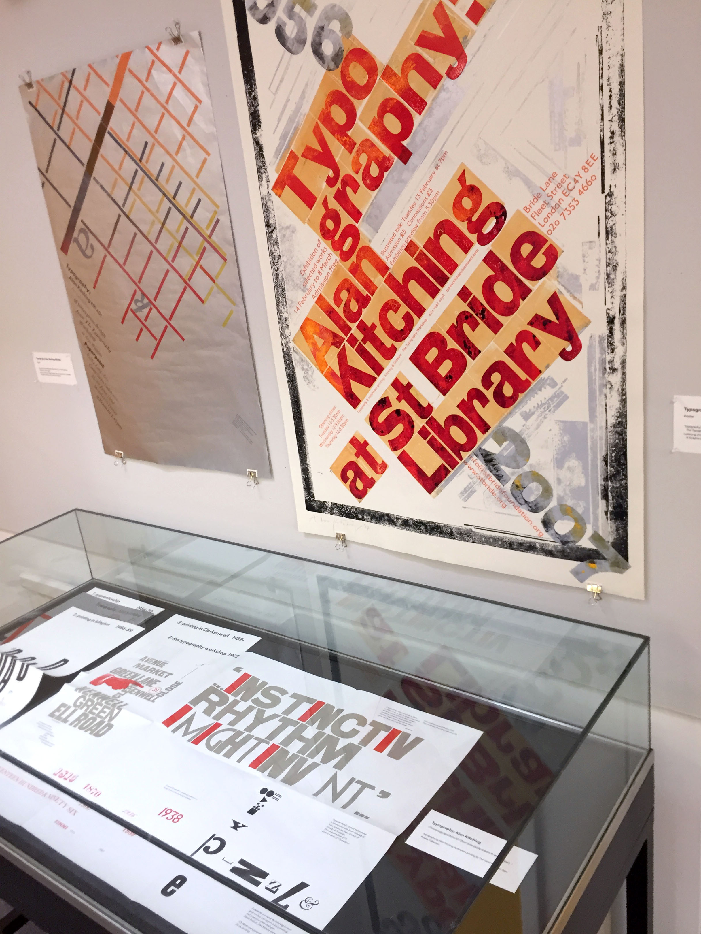
Independent workshop practice
(Alan Kitching / The Typography Workshop, London; p98a, Berlin)
Independent book production
(Juliet Shen, Bram de Does, Giulia Garbin and Stefano Riba)
Thanks to those individuals who have kindly loaned items for exhibition: Simon Esterson, Gerry Leonidas, Pierre Pané-Farré, Erik Spiekermann, Ferdinand Ulrich, Susann Vatnedal.
An exhibition in the Department
Until 28 April 2018
Letterpress printing has never lacked dedicated practitioners since its decline as a mainstream commercial printing process. But its conspicuous use in recent years – in the UK, Germany, Italy, USA, Brazil and many other places – is evidence of a resurgent interest in letterpress as an engine for research, design and making. Driving this interest is in part a renewed valuation of the materiality of print as a counterweight to the disembodied digital form of much present-day typography and graphic communication.
Recent letterpress practices are renovating and expanding the process. This exhibition presents some of these practices, alongside complementary examples from the 1980s and 90s. They involve the exploration of print effects, the visual formation of language, the reconstruction or reinvention of historical technique, the reconfiguration of letterpress in ‘post-digital’ form, and more. Taken together, the work on display suggests that letterpress printing continues to offer many possibilities for scholarly, speculative and commercial endeavour.
Practices on display:
Reconstruction of historical typography: Gutenberg, Fust & Schoeffer
(Martin Andrews, Alan May)
Impressions of historical types: Louis John Pouchée
(Ian Mortimer, James Mosley)
Re-invention of historical technique: compound-plate printing
(Pierre Pané-Farré)
Independent workshop practice
(Alan Kitching / The Typography Workshop, London; p98a, Berlin)
Independent book production
(Juliet Shen, Bram de Does, Giulia Garbin and Stefano Riba)
Thanks to those individuals who have kindly loaned items for exhibition: Simon Esterson, Gerry Leonidas, Pierre Pané-Farré, Erik Spiekermann, Ferdinand Ulrich, Susann Vatnedal.
‘Cassandre’s “Étoile du Nord” railway poster has become a paradigm of the Good Design to which we all aspire. But do we ever really look at this poster? If designing is about deciding, and good design about good decisions, then critical history can illuminate its exemplary character: the concentrated intelligence in its expression of the north star in word and image; in its mathematical structure; in its use of colour and the construction of its lettering. It is also a work of its time: demonstrably pre-photographic in its cubistic technique, its tonal gradation achieved by splatter and its colour by selected, not process colours.’
Richard Hollis, ‘Have you ever really looked at this poster?’ Eye magazine, vol. 4, no. 13, 1994
The ‘Étoile du Nord’ poster (shown above in a postcard version) is an opportunity to really look at the work of A. M. Cassandre (Adolphe Jean-Marie Mouron, 1901–1968), as Hollis encourages us to do. Cassandre’s work repays close study because of its great design intelligence. Really looking at the artefacts themselves, whenever possible, is also important because they demonstrate just how thoroughly Cassandre’s work unifies concept and technical execution. The results have a powerful visual, physical, and imaginative presence.
(Upper) ‘Étoile du Nord’, postcard, no date, published by Hachard et Cie (Paris), printed by L. Danel (Lille), gravure in 6 colours. (Lower) Nord magazine, 1930 (May) and 1931 (July), published under the patronage of the Compagnie du Chemin de Fer du Nord, printed by L. Danel (Lille), offset lithography in 2 colours.
Étoile du Nord
This postcard is based on a 1927 poster of the same design. The reverse gives details of the luxury high-speed ‘Étoile du Nord’ Pullman service between Paris, Brussels, and Amsterdam. The postcard was printed by L. Danel, which also produced the original poster; it is a good quality rendition of a poster that now sells for tens of thousands of pounds.
Nord magazine
Nord magazine was issued monthly by the Compagnie du Chemin de Fer du Nord and distributed in the first class compartments of its trains. The cover design, created in 1927 and signed ‘A. Mouron-Cassandre’, was used for many years. Each issue was printed in black and a variable second colour, including yellow, orange, light green, light blue, pink, lavender, grey, and buff.
Press advertisements by Cassandre sometimes featured inside the magazine. The example shown here, for ‘Dr. Charpy’ health and beauty products, was based on a 1930 poster of the same design. The image makes reference to a study of human facial proportions by the French artist Jean Cousin the younger, illustrated in his book Livre de pourtraicture (c. 1595).
(Upper) Acier, 1936, published by the Office Technique pour l’Utilisation de l’Acier, printed by E. Desfossés-Néogravure (Paris), gravure in 3 colours, overprinted by letterpress in 1 colour. (Lower) ‘Triplex’, postcard, no date, published by Alliance Graphique Loupot-Cassandre (Paris), offset lithography in 3 colours.
Triplex
This postcard is based on a 1930 poster of the same design, advertising Triplex laminated (i.e. safety) glass for automobile windscreens and other uses. The rectangular plate of glass, an analogue for a windscreen, offers both clarity of vision and protection. The text of the poster, ‘Le verre Triplex s’étoile mais ne fait pas d’éclats’, reads approximately ‘Triplex glass cracks but does not shatter’. The text has added meaning since ‘étoile’ indicates cracking in a star-like pattern, while ‘éclats’ refers to bursts or fragments (of glass) and sparkles (of a star).
Acier (Steel)
The cover design of this quarterly journal was created in 1932 and thereafter used throughout the 1930s. The metallic surfaces suggested by the graduated tints are superbly conveyed by the luxurious gravure printing. Covers were customised with variable overprinted text.
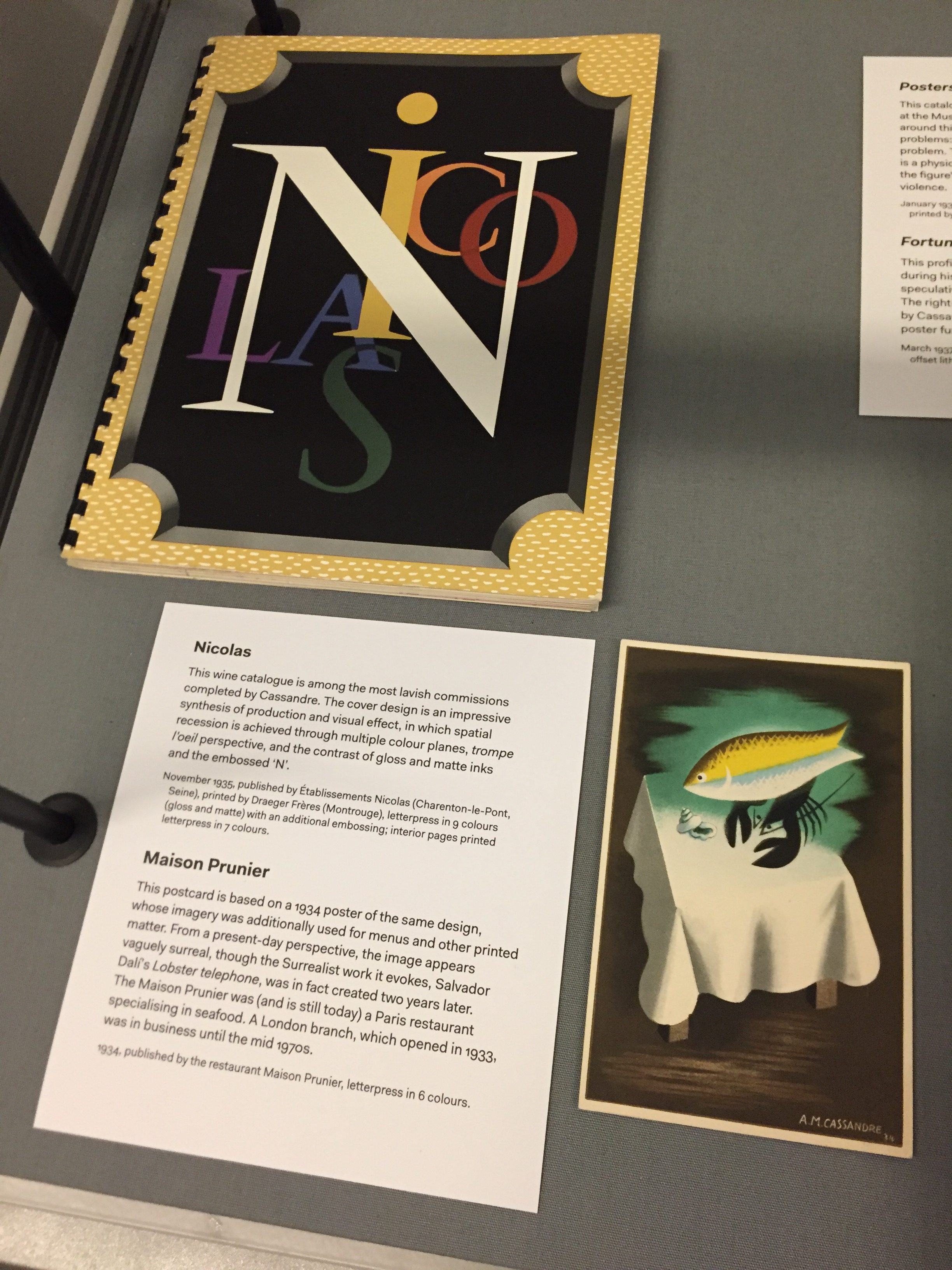
(Upper) Nicolas wine catalogue, November 1935, published by Établissements Nicolas (Charenton-le-Pont, Seine), printed by Draeger Frères (Montrouge), letterpress in 9 colours (gloss and matte) with an additional embossing; interior pages printed letterpress in 7 colours. (Lower) ‘Maison Prunier’, postcard, 1934, published by the restaurant Maison Prunier, letterpress in 6 colours.
Nicolas
This wine catalogue is among the most lavish commissions completed by Cassandre. The cover design is an impressive synthesis of production and visual effect, in which spatial recession is achieved through multiple colour planes, trompe l’oeil perspective, and the contrast of gloss and matte inks and the embossed ‘N’.
Maison Prunier
This postcard is based on a 1934 poster of the same design, whose imagery was additionally used for menus and other printed matter. From a present-day perspective, the image appears vaguely surreal, though the Surrealist work it evokes, Salvador Dalí’s Lobster telephone, was in fact created two years later. The Maison Prunier was (and is still today) a Paris restaurant specialising in seafood. A London branch, which opened in 1933, was in business until the mid 1970s.
(Upper) ‘Projects for four posters: a portfolio by A. M. Cassandre’, Fortune magazine, March 1937, published by Time, Inc., letterpress (text) and 4-colour process offset lithography. (Lower) Posters by Cassandre, exhibition catalogue, January 1936, published by the Museum of Modern Art (New York), printed by The Spiral Press (New York), letterpress in 2 colours.
Fortune profile
This profile of Cassandre was published in Fortune magazine during his first visit to the USA in 1936–37, and includes four speculative poster projects commissioned by the magazine. The right-hand column of the text includes a lengthy quotation by Cassandre describing his understanding of how a successful poster functions.
Posters by Cassandre
This catalogue was for a 1936 exhibition of Cassandre’s posters held at the Museum of Modern Art in New York. Cassandre wrote at around this time that a poster should contain the solution to three problems: an optical problem, a graphic problem, and a poetic problem. The optical clash of the cover’s complementary colours is a physiological equivalent to the arrow’s graphic piercing of the figure’s eye/vision. The poetic effect is a compelling, gripping violence.
—
The display ‘Have you ever really looked at …? A. M. Cassandre’ was assembled by Eric Kindel, to mark the arrival of two new vitrines in the Department, courtesy of the Museum of English Rural Life, University of Reading. With thanks to Darryl Lim, James Lloyd, and Alice Savoie.
‘Cassandre’s “Étoile du Nord” railway poster has become a paradigm of the Good Design to which we all aspire. But do we ever really look at this poster? If designing is about deciding, and good design about good decisions, then critical history can illuminate its exemplary character: the concentrated intelligence in its expression of the north star in word and image; in its mathematical structure; in its use of colour and the construction of its lettering. It is also a work of its time: demonstrably pre-photographic in its cubistic technique, its tonal gradation achieved by splatter and its colour by selected, not process colours.’
Richard Hollis, ‘Have you ever really looked at this poster?’ Eye magazine, vol. 4, no. 13, 1994
The ‘Étoile du Nord’ poster (shown above in a postcard version) is an opportunity to really look at the work of A. M. Cassandre (Adolphe Jean-Marie Mouron, 1901–1968), as Hollis encourages us to do. Cassandre’s work repays close study because of its great design intelligence. Really looking at the artefacts themselves, whenever possible, is also important because they demonstrate just how thoroughly Cassandre’s work unifies concept and technical execution. The results have a powerful visual, physical, and imaginative presence.
(Upper) ‘Étoile du Nord’, postcard, no date, published by Hachard et Cie (Paris), printed by L. Danel (Lille), gravure in 6 colours. (Lower) Nord magazine, 1930 (May) and 1931 (July), published under the patronage of the Compagnie du Chemin de Fer du Nord, printed by L. Danel (Lille), offset lithography in 2 colours.
Étoile du Nord
This postcard is based on a 1927 poster of the same design. The reverse gives details of the luxury high-speed ‘Étoile du Nord’ Pullman service between Paris, Brussels, and Amsterdam. The postcard was printed by L. Danel, which also produced the original poster; it is a good quality rendition of a poster that now sells for tens of thousands of pounds.
Nord magazine
Nord magazine was issued monthly by the Compagnie du Chemin de Fer du Nord and distributed in the first class compartments of its trains. The cover design, created in 1927 and signed ‘A. Mouron-Cassandre’, was used for many years. Each issue was printed in black and a variable second colour, including yellow, orange, light green, light blue, pink, lavender, grey, and buff.
Press advertisements by Cassandre sometimes featured inside the magazine. The example shown here, for ‘Dr. Charpy’ health and beauty products, was based on a 1930 poster of the same design. The image makes reference to a study of human facial proportions by the French artist Jean Cousin the younger, illustrated in his book Livre de pourtraicture (c. 1595).
(Upper) Acier, 1936, published by the Office Technique pour l’Utilisation de l’Acier, printed by E. Desfossés-Néogravure (Paris), gravure in 3 colours, overprinted by letterpress in 1 colour. (Lower) ‘Triplex’, postcard, no date, published by Alliance Graphique Loupot-Cassandre (Paris), offset lithography in 3 colours.
Triplex
This postcard is based on a 1930 poster of the same design, advertising Triplex laminated (i.e. safety) glass for automobile windscreens and other uses. The rectangular plate of glass, an analogue for a windscreen, offers both clarity of vision and protection. The text of the poster, ‘Le verre Triplex s’étoile mais ne fait pas d’éclats’, reads approximately ‘Triplex glass cracks but does not shatter’. The text has added meaning since ‘étoile’ indicates cracking in a star-like pattern, while ‘éclats’ refers to bursts or fragments (of glass) and sparkles (of a star).
Acier (Steel)
The cover design of this quarterly journal was created in 1932 and thereafter used throughout the 1930s. The metallic surfaces suggested by the graduated tints are superbly conveyed by the luxurious gravure printing. Covers were customised with variable overprinted text.
(Upper) Nicolas wine catalogue, November 1935, published by Établissements Nicolas (Charenton-le-Pont, Seine), printed by Draeger Frères (Montrouge), letterpress in 9 colours (gloss and matte) with an additional embossing; interior pages printed letterpress in 7 colours. (Lower) ‘Maison Prunier’, postcard, 1934, published by the restaurant Maison Prunier, letterpress in 6 colours.
Nicolas
This wine catalogue is among the most lavish commissions completed by Cassandre. The cover design is an impressive synthesis of production and visual effect, in which spatial recession is achieved through multiple colour planes, trompe l’oeil perspective, and the contrast of gloss and matte inks and the embossed ‘N’.
Maison Prunier
This postcard is based on a 1934 poster of the same design, whose imagery was additionally used for menus and other printed matter. From a present-day perspective, the image appears vaguely surreal, though the Surrealist work it evokes, Salvador Dalí’s Lobster telephone, was in fact created two years later. The Maison Prunier was (and is still today) a Paris restaurant specialising in seafood. A London branch, which opened in 1933, was in business until the mid 1970s.
(Upper) ‘Projects for four posters: a portfolio by A. M. Cassandre’, Fortune magazine, March 1937, published by Time, Inc., letterpress (text) and 4-colour process offset lithography. (Lower) Posters by Cassandre, exhibition catalogue, January 1936, published by the Museum of Modern Art (New York), printed by The Spiral Press (New York), letterpress in 2 colours.
Fortune profile
This profile of Cassandre was published in Fortune magazine during his first visit to the USA in 1936–37, and includes four speculative poster projects commissioned by the magazine. The right-hand column of the text includes a lengthy quotation by Cassandre describing his understanding of how a successful poster functions.
Posters by Cassandre
This catalogue was for a 1936 exhibition of Cassandre’s posters held at the Museum of Modern Art in New York. Cassandre wrote at around this time that a poster should contain the solution to three problems: an optical problem, a graphic problem, and a poetic problem. The optical clash of the cover’s complementary colours is a physiological equivalent to the arrow’s graphic piercing of the figure’s eye/vision. The poetic effect is a compelling, gripping violence.
—
The display ‘Have you ever really looked at …? A. M. Cassandre’ was assembled by Eric Kindel, to mark the arrival of two new vitrines in the Department, courtesy of the Museum of English Rural Life, University of Reading. With thanks to Darryl Lim, James Lloyd, and Alice Savoie.
Loans from the Isotype Collection on display in the new Mathematics gallery at the Science Museum, London. From left: chart from the British Council Study Box on the National Health Service (‘Estimated cost and personnel, 1949–50’); Women and a new society (1946), opened to chart 9, ‘Literacy in England and Wales’; original exhibition chart, ‘Infant death rate and income’ (1933).
The Department has made a long-term loan of Isotype work to the Science Museum, London. The loans are featured in the museum’s new Mathematics gallery, designed by Zaha Hadid Architects, which opened to the public today (8 December). Following a visit to the Isotype Collection, Science Museum curator David Rooney chose examples of Isotype that convey simply and directly the underlying application of mathematics to the production of pictorial statistics. Captions written for the items note Marie Neurath’s early training as a mathematician.
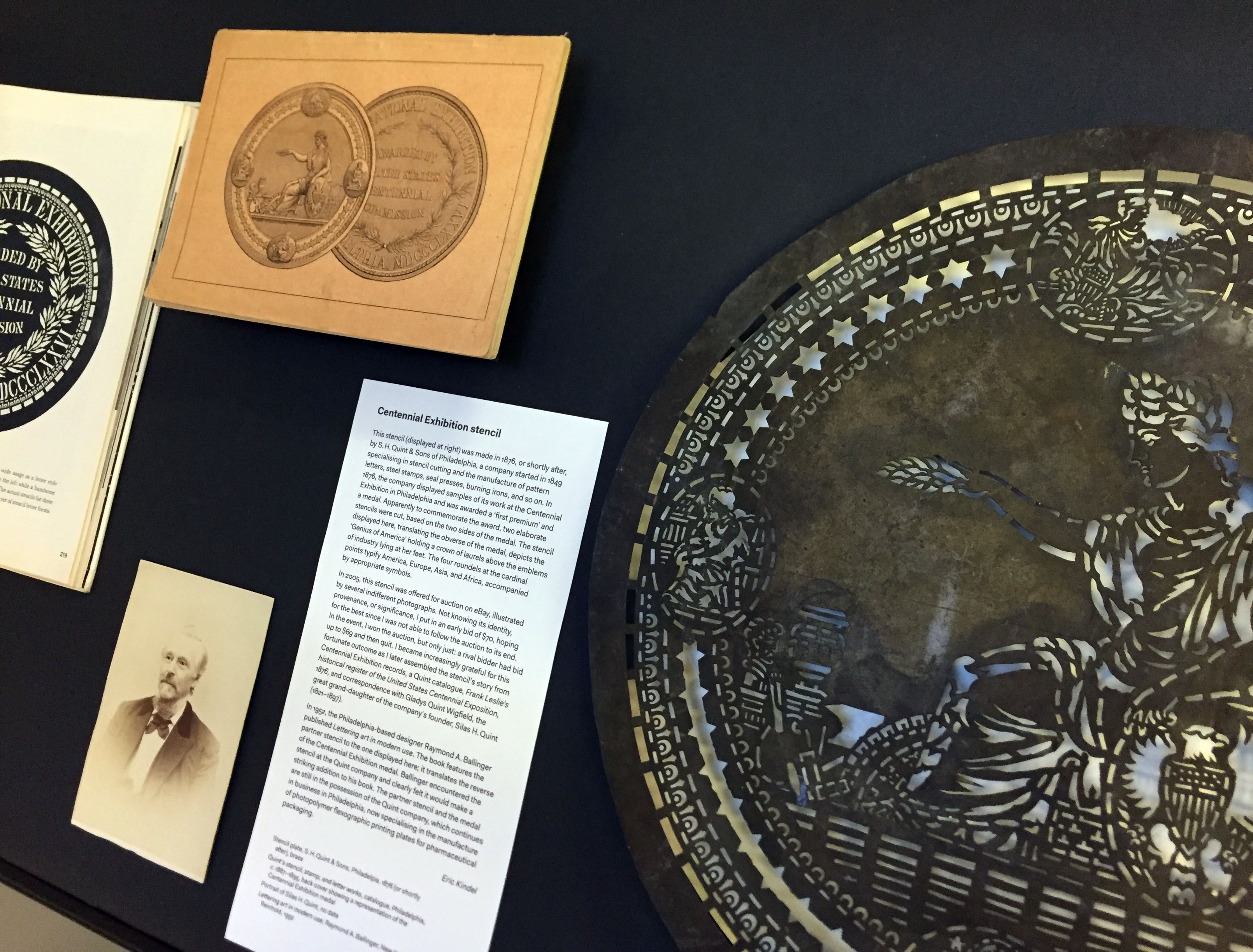
In the last in a series of posts about artefacts in the exhibition ‘Material histories’ (now on in the Department), Eric Kindel tells the story of a stencil cut to commemorate the 1876 Centennial Exhibition in Philadelphia.
Centennial Exhibition stencil (at right), alongside (from left) Lettering art in modern use (1952) by Raymond A. Ballinger; portrait of Silas H. Quint (no date); and back cover of the catalogue Quint’s stencil, stamp, and letter works (c. 1887–1895) showing a representation of the Centennial Exhibition medal.
Centennial Exhibition stencil
This stencil (shown above, at right) was made in 1876, or shortly after, by S. H. Quint & Sons of Philadelphia, a company started in 1849 specialising in stencil cutting and the manufacture of pattern letters, steel stamps, seal presses, burning irons, and so on. In 1876, the company displayed samples of its work at the Centennial Exhibition in Philadelphia and was awarded a ‘first premium’ and a medal. Apparently to commemorate the award, two elaborate stencils were cut, based on the two sides of the medal. The stencil displayed here, translating the obverse of the medal, depicts the ‘Genius of America’ holding a crown of laurels above the emblems of industry lying at her feet. The four roundels at the cardinal points typify America, Europe, Asia, and Africa, accompanied by appropriate symbols.
In 2005, this stencil was offered for auction on eBay, illustrated by several indifferent photographs. Not knowing its identity, provenance, or significance, I put in an early bid of $70, hoping for the best since I was not able to follow the auction to its end. In the event, I won the auction, but only just: a rival bidder had bid up to $69 and then quit. I became increasingly grateful for this fortunate outcome as I later assembled the stencil’s story from Centennial Exhibition records, a Quint catalogue, Frank Leslie’s historical register of the United States Centennial Exposition, 1876, and correspondence with Gladys Quint Wigfield, the great grand-daughter of the company’s founder, Silas H. Quint (1821–1897).
In 1952, the Philadelphia-based designer Raymond A. Ballinger published Lettering art in modern use. The book features the partner stencil to the one displayed here; it translates the reverse of the Centennial Exhibition medal. Ballinger encountered the stencil at the Quint company and clearly felt it would make a striking addition to his book. The partner stencil and the medal are still in the possession of the Quint company, which continues in business in Philadelphia, now specialising in the manufacture of photopolymer flexographic printing plates for pharmaceutical packaging.
On display
Stencil plate, S. H. Quint & Sons, Philadelpia, 1876 (or shortly after), brass Quint’s stencil, stamp, and letter works, catalogue, Philadelphia, c. 1887–1895, back cover showing a representation of the Centennial Exhibition medal
Portrait of Silas H. Quint, no date Lettering art in modern use, Raymond A. Ballinger, New York: Reinhold, 1952
‘Material histories’ presents graphic communication artefacts with a story to tell. The stories – the material histories – describe the artefacts in particular: what they are about, where they came from, their material qualities, their circumstances of production, how they were acquired, and crucially how they link to other artefacts, narratives and representations.