The brief
In the second term, Part 1 students are required to design a website, however, they are given the guidelines and logos in advance. The brief of this job was to design the brand guidelines for a minimum of two local businesses, which will then be used by the Part 1s. The guidelines must include logos (colour, black and white), fonts and colours. The local businesses that can be designed for include: The washbox, Reading garage, Trilogy Reading, The Village Florist and The museum of Berkshire aviation. The brand guidelines must be different to what already exists. The main goal of this real job is to create a high quality and memorable set of logos and guidelines that can be used on screen in both a desktop and mobile environment.
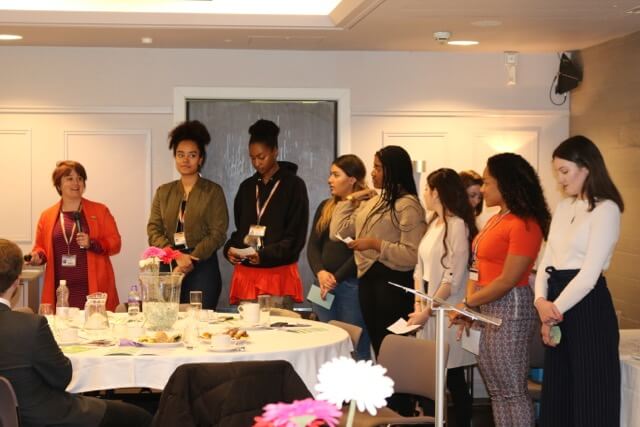
In the initial briefing meeting, the main considerations, final deliverables, and schedule were discussed.
The main considerations when designing the guidelines are that:
- The logos need to be scalable as they will be used primarily in a mobile environment
- The logos should be shown in different colour variations including black and white, reversed, and versions that work on both a dark background and light background.
- The guidelines should use Google fonts so that they can be easily accessed by all students
The final deliverables include:
- A minimum of two logos for local businesses, including black and white, reversed and colour
- Accompanying brand guidelines including typefaces and colour scheme
As these guidelines were needed in time for the beginning of the Part 1 project, the turnaround was very fast. The first client meeting was on the 7th of January, and the final deliverables were required by the 28th of January. The scheduled allowed for two feedback meetings in-between the initial briefing and final deadline.
Research and ideation
The research process began by identifying three key areas to explore:
- Research into each local business to learn more about what services or products are offered, in order to create a unique logo concept
- Research into the audience of each business, so that the logo is representative of this group
- Search for logos used in mobile environments, to identify which elements make the logos successfully scalable
The research process allowed an insight into the key to making successful logos for mobile applications. This included: avoiding using light strokes, small text, and overcomplicated designs. It also reminded the importance of testing the logos at an appropriate size to ensure that they are sufficiently scalable. Furthermore, it became apparent that the logos should be instantly recognizable, and therefore summarise the services or products offered by the business.
As a result of the research, as well as the fast turnaround, I initially decided to design guidelines for two businesses: The washbox and The village florist. However, after initial submission, I was asked to design a further set of guidelines for Trilogy.
Design development
The businesses that I designed guidelines for are:
- The village florist, a local florists that creates bespoke bouquets
- The washbox, a laundrette and dry cleaning service
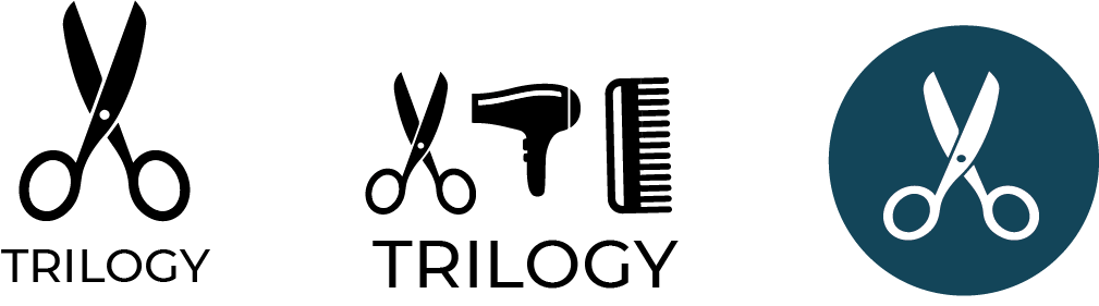
- Trilogy Reading, a unisex hair salon
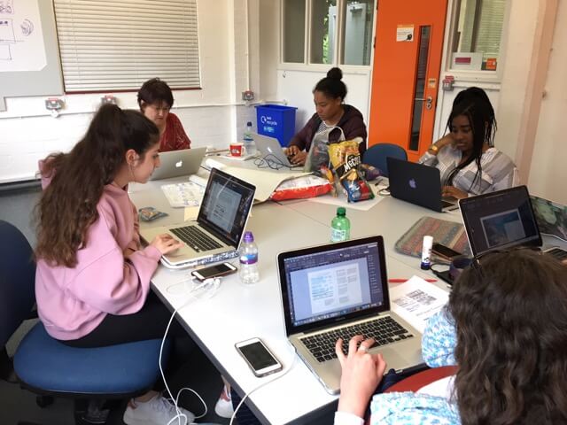
Before designing the logos in Adobe Illustrator, I began by hand-sketching some initial ideas for each business. However, due to the short turnaround, I very quickly moved to work digitally. The village florist creates bespoke hand-made bouquets, and so the concept for this logo was based around a hand-drawn style. Therefore, I scanned in my initial sketches, as well as illustrations found online, and created vectors using the image trace tool. From here, I was able to see which illustration worked best when scaled down to a size appropriate for mobile. For The Washbox logo, the concept was to combine the various services offered to create a clean logo. During the first feedback session, I presented a variety of options for these two businesses and gained guidance on which to pursue further.
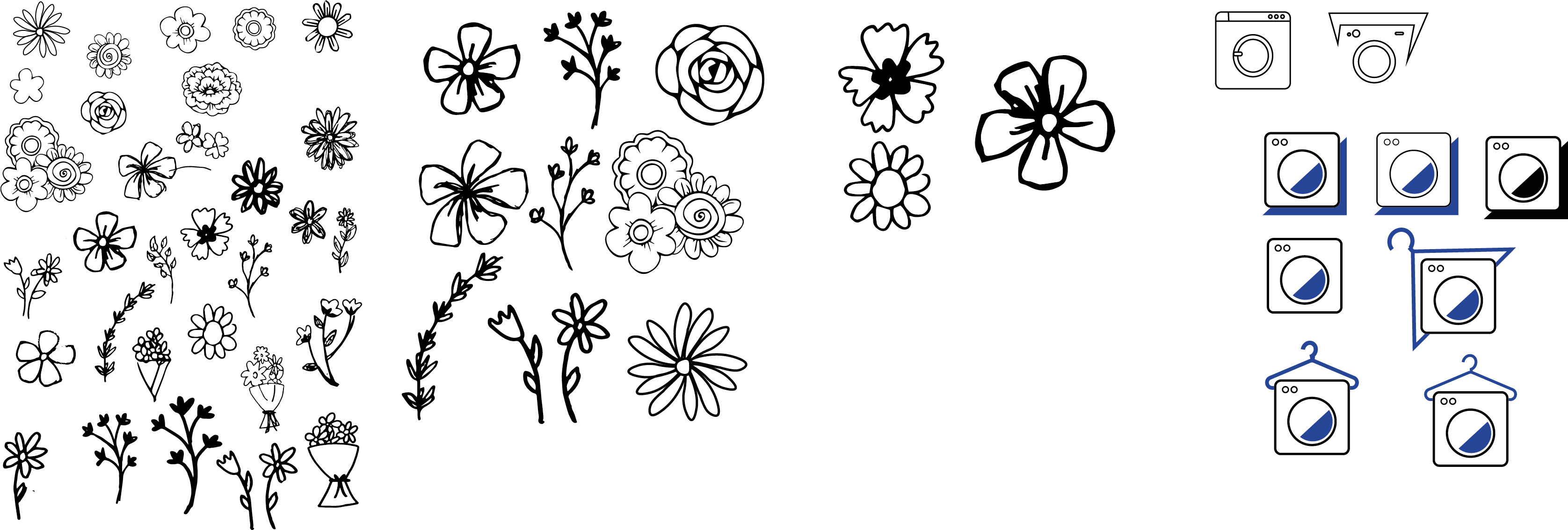
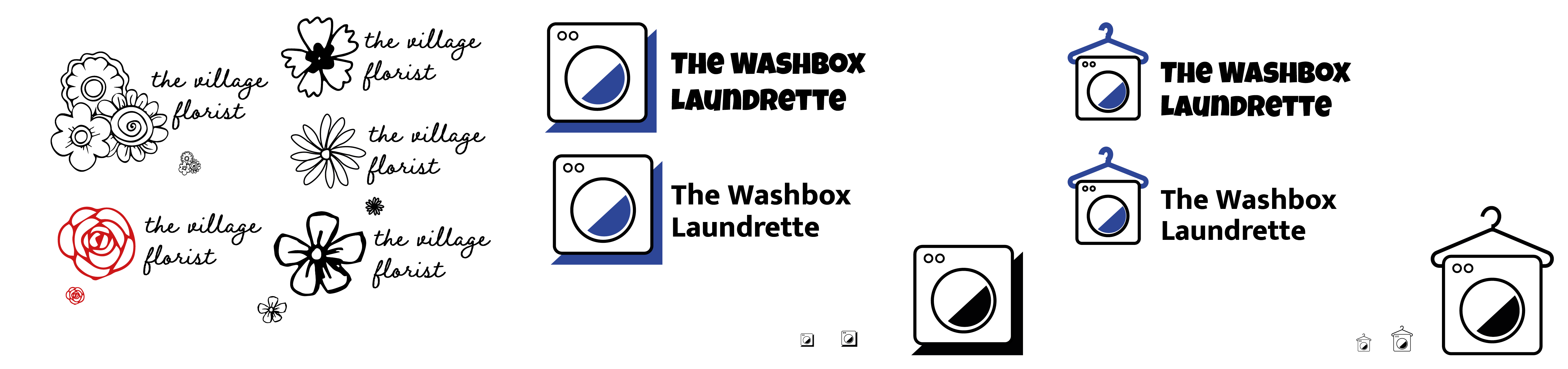
Once making a decision on the final logos, the next stage was to choose appropriate typefaces and colour schemes. The typefaces chosen for The Village Florist, aimed to be sophisticated and delicate, representing the services and products offered by the business. Similarly, the chosen colours had the same aims, as well as avoiding being too powerful and overbearing. The aims for typeface and colour schemes for The Washbox, was to create fresh and clean branding.
As I was asked to design for Trilogy after the initial submission, the turnaround time for these guidelines was even more limited than the previous set. Similarly, there were no dedicated feedback sessions scheduled for these guidelines. Therefore, I began to work in Illustrator straight away. I began by image tracing images found on royalty free websites, as well as creating my own icons. The initial concept was based around the name trilogy, and so I created three icons representing the business and combined them into a logo. After creating this initial concept on illustrator, I emailed the client requesting feedback on this particular concept and whether to go ahead with this design, from here I was able to begin creating the rest of the guidelines. When researching other salon logos, it was apparent that the branding of many were arguably stereotypically feminine, especially with the use of colours. Therefore, as Trilogy is a unisex salon, I aimed to create a neutral colour palette that was not perceived to be branded towards a particular gender.
Overall, I believe I was successful in my aims when creating these logos and guidelines. However, If I had more time I would have liked to explore further concepts, as well as experiment with different typefaces that I am not familiar with.
Guidelines in use
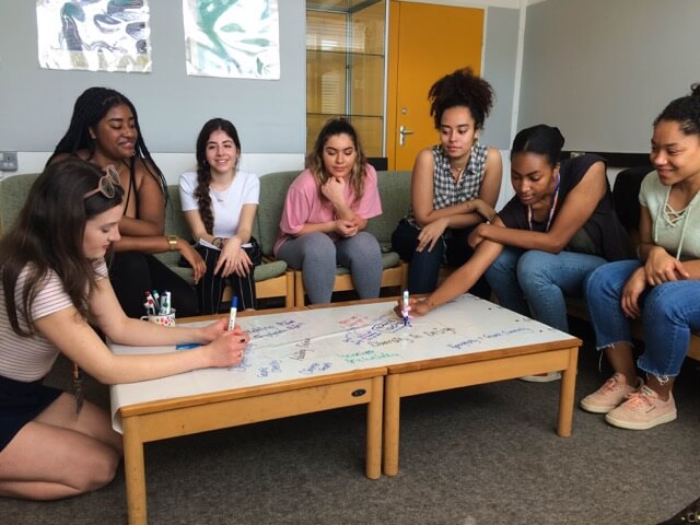
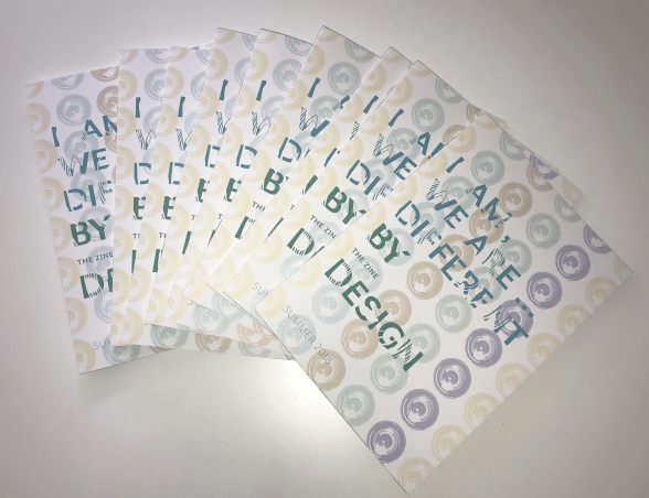
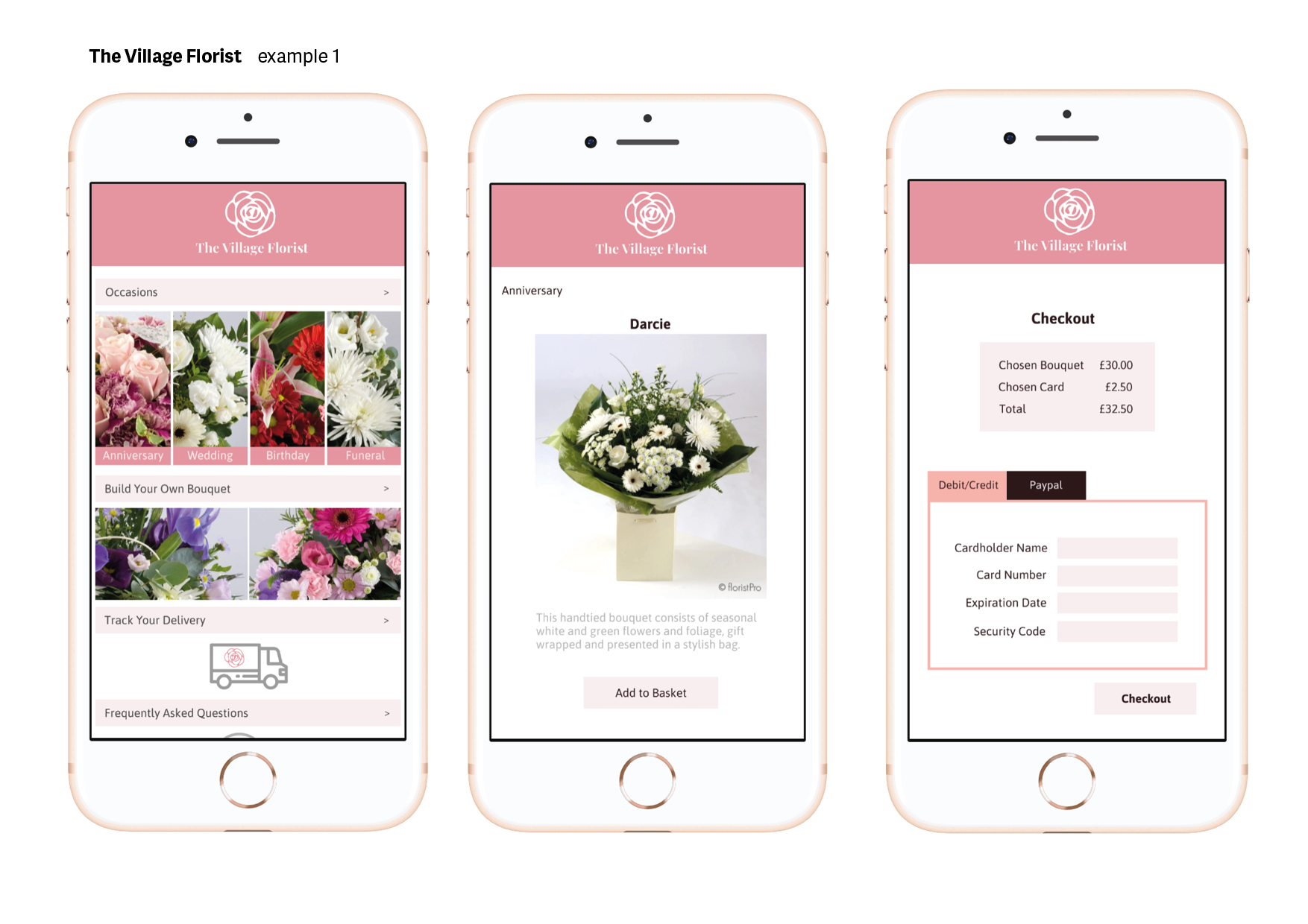
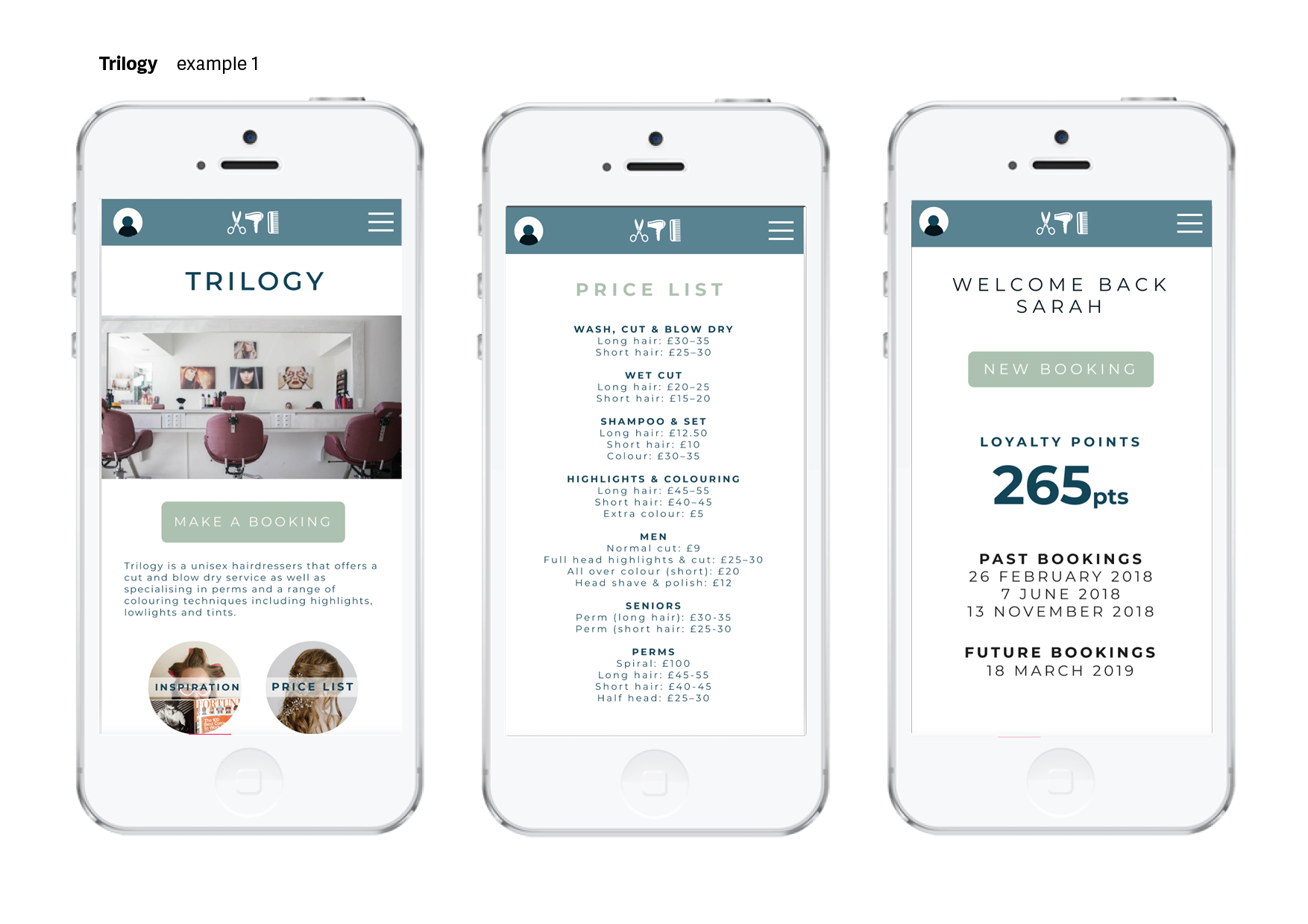
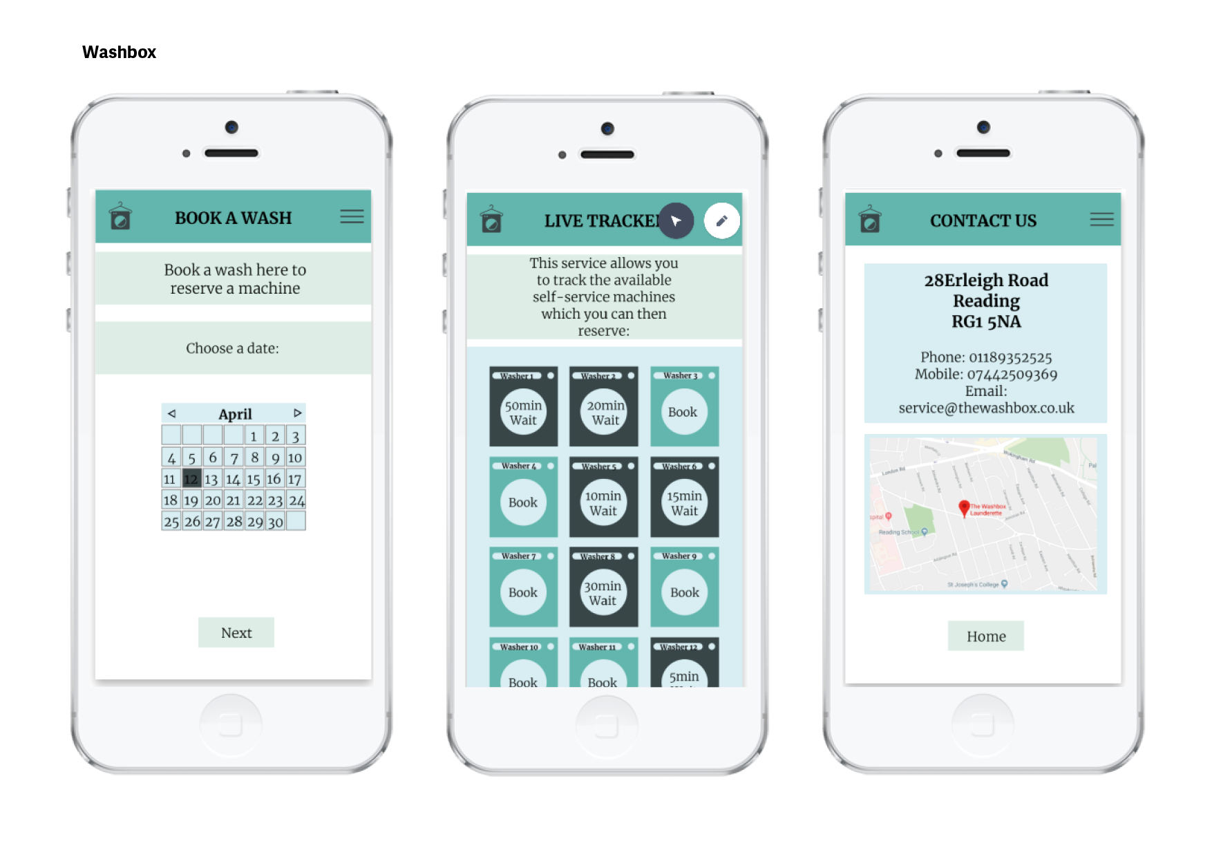
Below shows a selection of screenshots of my guidelines being used in a variation of Part 1 web projects.
Feedback
After the guidelines had been distributed to the Part 1 students, a meeting took place in which they shared their feedback, both positive and negative.
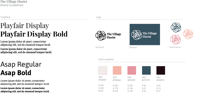
The village florist
Overall the main criticism was surrounding the colour scheme, as there is a big contrast between the dark and light colours. The students stated that they would have liked a colour in between this range, as the paler colours were deemed difficult to use. However, overall the feedback about these guidelines was generally positive, especially with regards to the typefaces.
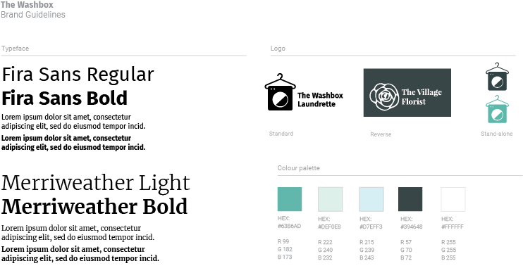
The washbox
Some students found that the logo was not very ‘clean,’ for example the hanger line does not line up properly when the logo is enlarged. Likewise, when the logo is made into a vector, the hanger goes very thin, but the other elements do not. The feedback with regards to the colour scheme was mostly positive, however, some believed that the lighter colours were too light to use, and also that there was not much differentiation between the available colours. The typeface choices were well received.
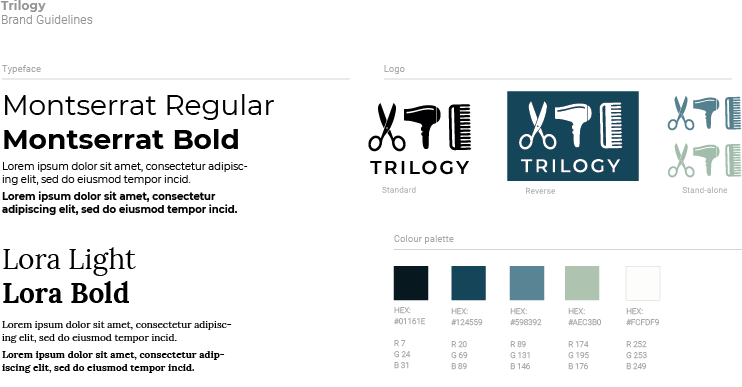
Trilogy
The feedback for these guidelines was mixed; for example, some students liked the typeface choice, others did not. This feedback could be argued as subjective, as they did not report any issues with using the typefaces, only that they did not like them. Other feedback included that the colour scheme appears ‘masculine,’ and is very muted.
Reflection
Upon reflection, it is apparent that in the future colour schemes choice need to be considered more carefully, as the majority of negative feedback related to this element. This is especially the case with ensuring a large range of colours are available, and minimising the contrast between the options. Similarly, it is important to remember the intended use of these projects is for mobile, and ensure that this impacts the design decisions. This job has also allowed me to improve upon my Adobe Illustrator skills, as prior to this job they were fairly limited. However, this being said, the logos could be improved by being crafted in a neater manner, without any minor errors or misaligned elements.
Furthermore, the feedback from the Part 1s allowed me to gain insight into elements of this project that I can improve upon in the future, for example choice of colour schemes, and typefaces. Likewise, the feedback taught me to carefully consider how the guidelines and logo will be used, and in what environment, which in this case was within a mobile application. Overall, the main skill that I have taken away from this job was the ability to create high quality guidelines whilst working towards a tight deadline.