Author: RioWare

Creative Images – Photoshop

This term, we have undertaken various tasks that have allowed me to improve my skills in Photoshop, Illustrator, InDesign, and AfterEffects. The task that I enjoyed the most during this term was the Photoshop Creative Images task. I created three images that I am happy with.

DESIGN IDEAS AND DESIGN PROCESS

DESIGN 1 – FLOATING THROUGH SPACE

For my first idea, I wanted to create an image that altered reality so I chose to manipulate an image of a man floating through space. To start to design process, I browsed for stock images on Pixabey and found one of a man that looked like he is ‘floating’, and one of the stars that I could use as the background. I removed the man from the background of the original image by using the pen tool to create an outline around the figure. By selecting a new layer via cut, I removed him from the background and deleted the layer that i didn’t need. I then brought the images of the stars into photoshop and placed this layer underneath the figure. I then adjusted the brightness, contrast, and saturation of the images to make them look more authentic, and work in harmony with each other.


DESIGN 2 – FLOWER MASK

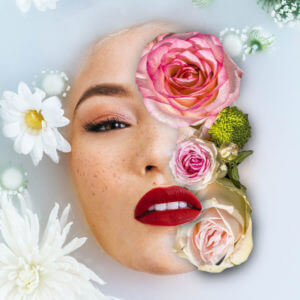
The second image I chose was of a woman’s face submerged by water and flowers. The effect that I wanted to achieve was flowers covering one-half of her face. To achieve this effect, I used layer masks and the brush tool to make a ‘shadow’. Firstly, I created a new layer mask and selected the part of her face that I wanted to remove. I then imported a picture of flowers and placed it underneath the existing layer so that you could see the flowers through her face. I used the selection tool to scale and position the flowers to fit the image and adjusted the existing layer mask, using the black and white brushes. I wanted to manipulate the image to make it look like the flowers were on top of the water and her lips were overlapping the flowers. I found it difficult at first but managed to get the hang of it after some time (and some tutorials). When I got to a point where I was happy with the mask, I tried to make the flowers look more realistic by adding a shadow. To achieve this,  I used the black brush tool at a large size and 0% hardness to recreate a shadow around the flowers.
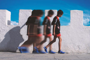


DESIGN 3

This design was my favourite that I created during the task. My idea for this image was to create a feeling of movement within an image. This was heavily influenced by Şakir Yildirim’s image called ‘crawler’. However, I did not follow the exact technique he uses to create his images. To make this image, I found a picture of a boy walking from a side-on perspective and imported it into photoshop. I then used the direct selection tool to copy his figure into a new layer and duplicate this layer many times and positioned them in such a way to look like the boy is walking from one position to the other. I kept one of these separate and placed it in the middle, and grouped the rest of them together. I merged these layers together and used the ‘motion blur’ filter to blur the figures, and did the same thing with the figure in the middle but made him less blurred to make it look like he was coming ‘back to life’, or transforming from one figure to another. the final figure on the far left and right I kept as normal but used the blur tool to blur the edges. This made the figure blend in more with the background ensuring that it didn’t look cut out of the image.


SOFTWARE TUTORIALS

I found the tutorials provided to us helpful to get started with this task. They refreshed my memory and I found it useful to focus on layer masks and using nondestructive techniques in my work.  Using these techniques made it so much easier to go back on my design choices, and saved me from having to start all over again if I changed my mind. I often find that watching tutorials before taking on a task actually helps with my idea generation itself, and inspires me to get started.

I found the following tutorials particularly useful when working in Photoshop for this task. When using the tutorials, I tried not to follow them exactly but used them to get a rough idea of how to achieve an effect, and tried to find my own way of working. Each of these tutorials provided me with a better understanding of how tools within Photoshop work and inspired me to use Photoshop in different ways.

CREATING SHADOWS IN PHOTOSHOP

This tutorial on creating shadows in Photoshop came in helpful for my second design with the flowers to replicate the effect of a shadow. I used this in an attempt to make my image look more ‘real’ so  I tried to follow the way light would naturally behave in real life. This tutorial inspired me to think about the perspective of light, and the depth of the image while I was editing. The tutorial covers how to create shadows on different surfaces. he uses the brush tool at 0 hardness, which is the technique is the technique I used in my own work. He also goes over how to create shadows for a curved surface, and more complex objects, which I didn’t need for this task in particular but will come in helpful in the future.

PHOTOSHOP TUTORIAL – FLOWER FACE EFFECTS

This tutorial helped me to grasp a better understanding of layer masks in photoshop and how to work with two images, one on top of the other. During the tutorial, she used the pen tool to create a stroke to select the parts of the original image that she wanted to remove, and uses the bevel and emboss layer style to make the cut outs look more 3D. she uses a layer mask to remove parts of the existing image to make the flowers appear on top of the face, giving a realistic effect. This tutorial was helpful to figure out how to make the flowers in my own design overlap with the face of the image.

MOTION BLUR EFFECT IN PHOTOSHOP


This tutorial introduced me to the motion blur effect in photoshop, one that I wasn’t already familiar with. I found that it was a really simple and easy way to introduce a sense of speed/ movement in my own image which was precisely the effect that I wanted to achieve. It also helped me with using layer masks, cutting out objects with the quick selection tool.

SOURCES OF INSPIRATION

The second image that I worked on for this task was inspired by the album art for Shawn Mendes’ album cover. I really love this album cover and wanted to create an image with the same sort of feeling. I wanted to edit an image that inspired by, but not a direct copy of the original. I used an image of a woman rather than a man, and only including half of her face instead of placing one half on top of the flowers.

There is a collage artist called Marcelo Monreal who also creates similar portraits, of people and flowers which also heavily influenced this design. I find that his work very appealing aesthetically but also in the way it makes me feel. His portrait creates this feeling of contentedness that implies the subject is at one with nature, which is how I would like to think my image would create too.  You can find some of Monreal’s work here https://www.instagram.com/marcelomonreal/

My third design was inspired by the work of Şakir Yildirim. In particular, the portraits created using the liquify tool in Photoshop. Looking at his work inspired me to introduce a sense of movement, or duplication into my design. Yildirim’s work, specifically in ‘crawler’, creates a sense of motion, or almost a sense of transformation depending on how you interpret it. I find it fascinating that you can capture, or manipulate this very real sensation within a 2D image, which is the idea behind my third and final design for this task. You can have a look at Yildirim’s work here https://uk.gestalten.com/blogs/journal/new-perspectives-with-sakir-yildirim and find out how he uses Photoshop to achieve his portraits here https://helpx.adobe.com/uk/photoshop/how-to/liquify-filter-motion-effects.html

Overall, I really enjoyed this task. I have been able to improve both my skills and confidence with using Photoshop while creating some fun images that I am quite proud of.


Let’s Talk About Typography

Our first task for this module was a Photoshop task, with the aim being to create a Podcast cover for a new podcast about typography and graphic communication. I decided to call mine  ‘Let’s Talk About Typography’ to create an inviting feel that encourages the idea of discussion and represents the content of the podcast.

Design Ideas and Design Process

I began my design process by researching existing podcast covers, including podcasts that focused on the topic of graphic design. Looking at these existing covers helped me to grasp that the ones that stood out the most to me were the ones with brightly coloured backgrounds, a relatively simple design and typography that stood out. Personally, I begin the design process by mind mapping my own ideas so I created a mind map of words relating to typography and graphics. I then went on to use these as a guide to search for images on free stock image sites. For this task, I mainly used Pixabey as recommended in the provided guidance, but I also looked at images on unsplash.com. The keywords I was searching for were mainly: metal type, woodblocks, warped grid, laptops, and desk.

After downloading my chosen images, I began working on them in photoshop.

FINAL IDEA 1 – LETTERING BACKGROUND
I began by cropping the original image and used the camera raw filter to adjust the exposure, contrast, highlights and shadows etc. My aim was to go for a brighter, higher-contrast image to make it ‘pop’. I feel I did this successfully and found the camera raw filter a very easy tool to use as you can see the adjustments you are making as you are changing the values. I also wanted to add a ‘grainy’ sort of effect to the image, almost making it appear faded and older to represent how metal type and woodblocks were used for bookmaking back in the 15th century. I played around with various different filters to give this effect such as: adding noise, grain and despeckling. I finally settled on adding noise as I felt it gave my most desired effect. I thought that the image still looked a bit dull therefore I went to image > selective colour and chose red to give the image warmth and make the red colours pop.

I used the image of woodblock type as I was inspired by our print and printmaking module where we have learned about the history of printing and how books were printed from the before and after the 15th century. I thought it would be interesting to use an image that had a historical context in the topic of the podcast cover, which my audience could connect with

FINAL IDEA 2 – OFFICE BACKGROUND

I used two images to create this podcast cover. After importing the first image of the laptop and coffee and phone into photoshop, I used the direct selection tool to cut out the objects I wanted to use from the image and copied them into separate layers. I deleted the background from the image and imported an image of pieces of paper to create the background. Underneath this layer, I created a pink square and used the layer blend options to merge them together to create a textured background that made the design pop. After then watching a tutorial about how to blend out the edges of the cutout objects to make the concept look more well put together, I used layer masks and adjusted the feather, contrast, and shift edge in Global Refinements to give a blurred effect around the layers. For the text, I used two different fonts. Although in our integrated design module, we have learned to rarely use more than two typefaces at once, I felt it was appropriate to create emphasis on the topic of discussion. We have also been taught in integrated design to always track all caps, which I did for my capital letters. I changed by type to white and then placed it in the top left corner of the design.

FINAL IDEA 3

For this design, I used an image from Pixabey and created a gradient map, and experimented with different gradients to change the color to give a duotone color effect. I tried to do this by creating an 8 bit grayscale of the image and then using photoshops duotone effect but I found that the results didn’t look how I wanted them to so looked at a tutorial online and learned how to achieve the effect using a gradient map.

Software Tutorials 

We were provided with a list of Photoshop tutorials that I found helpful to refresh my memory on how to use the basics such as importing photos and using layers and effects, as I hadn’t really used the software since GCSE/ AS level. I had rarely used layer masks before, so it was interesting to learn how to use them.

From this online tutorial, I learned how to soften edges of cut out objects which I found helpful in my first concept where I cut objects out of one image and placed them on top of another.
https://www.youtube.com/watch?v=7lDtw99bM3w&ab_channel=Dansky

This tutorial was on how to create a duotone image in photoshop – I found this helpful in my last design and I’m glad I had the opportunity to learn how to do this as i find duotone images really interesting and have seen them gain popularity recently.
https://www.youtube.com/watch?v=wyuXdD_v4f8&ab_channel=PhotoshopTrainingChannel

I also watched this tutorial on using the selective colour tool as I planned on making the red colours in my first design pop out.
https://youtube.com/watch?v=crslYuiU1V0&ab_channel=PhotosInColor

All of these tutorials helped me with the technical side of creating my podcast covers, and aided me in my making. It was useful to watch the full videos even if I had already picked up what I felt I needed to learn, to explore the tools more.

I also watched this video on shortcuts in photoshop as I think it will help me in the future to make my workflow quicker and easier.
https://www.youtube.com/watch?v=1732S1rlHOM&ab_channel=PhotoshopTrainingChannel


Resources for Research and Information 

https://design.tutsplus.com/articles/26-best-podcast-cover-art-designs-using-a-podcast-cover-art-maker–cms-34411

https://dribbble.com/stories/2019/08/06/30-creative-examples-of-podcast-cover-art-and-branding

Looking at existing podcast covers helped me to grasp which stood out to me more, such as covers with an effective, bright but simple colour schemes. I was particularly inspired by looking at graphic design podcasts for inspiration as to which typography to use. I thought that the covers that used a script typeface for emphasis were effective, and appealing to my eye. Hence why I used this typography throughout my designs. Although most of the podcast covers that I looked at were vector or illustration based, I still wanted to focus my covers on the use of the image to improve my skills in photoshop,  as I knew that we would have time to develop other skills later on in the upcoming weeks in the module.

We were also provided with sources of inspiration which encouraged me to think about the audience of my podcast cover and the style that I wanted my designs to fit into. When thinking of my audience, I wanted the covers to appeal to people interested in design and typography therefore i feel like my image choices were appropriate. I think I could have made the style of my designs more consistent but I used the same typography in all of them to tie them all together, which got me thinking about the identity of the podcast which I have also been thinking about throughout the other tasks from this module.


command, return

Last week in TY1INT we were given a mini week project to design a cinema leaflet of film listings. The project prompted us to think about the reader and how we could make the experience of reading a cinema leaflet easiest for a range of different users.

By the time I began the project I had already forgotten the shortcut for applying a paragraph style to text in InDesign. And now I’ve finished, I doubt I’ll ever forget it.

This project really helped me get a feel of using InDesign for my own work, outside of technical sessions where help is always at hand. I find that learning this way helps me remember shortcuts and learn handy things about the toolset provided in Indesign and how to use it to create interesting yet useful things.

I didn’t focus on the aesthetics of the leaflet as I wanted to get to grips with using a hierarchy of text in an applied manner. To start off with I found Reading film theatres logo to give the leaflet more of an identity and give myself a guide as to what colours to use. It was fun to see the variation of style you can achieve with a limited colour guide and using only one (or two) typefaces.

After today’s feedback session, I am aware of some errors made in my design that I will look out for in future work, including correct hyphenation, and being aware of separating info on line breaks.  Overall I am quite happy with my outcome and maybe next time would focus on adding more visual identity to the leaflet.

cinema listing v04


Emily In Paris

On Friday’s TY1INT practical session, we copied the design of a classic penguin book in InDesign. I found this task reasonably simple to follow and it helped me get to grips with using InDesign for the first time.  I found making the shape at the top of the book most challenging, however, once we went through it a couple more times I managed to get the hang of it. We were then briefed to change some parts of the design and to create a new book cover for a book or film we have enjoyed recently.

Here was my first attempt at the task to change our existing book cover into a different penguin book. – TY1INT PENGUIN03

I have been watching Emily in Paris, a series on Netflix, at the moment and decided to recreate that in the form of a traditional penguin book cover for the task.

My initial idea was to have a silhouette of the Eifel tower as an ‘A’ in the word ‘Paris’. However, as I experimented more with the text alignment, I noticed that the top of the Eifel tower PNG formed the ‘I’ in ‘Emily’ as well. I thought this was a fun way to bring the cover together and tried to make it look as visually pleasing as possible. I also changed the colours in the book to the colours of the French flag.

Overall, I found this task fun and very helpful to get started on InDesign. If I were to do it again, I’d like to break the traditional structure of the book a bit more. However, I do enjoy the subtle differences I have made to encapsulate the essence of the series.

RW

In today’s session with Kim, our task was to create a process of transmogrifying our initials. We had the choice of two fonts: Futura or Garamond.

I began with Futura as I felt it would be easier to practise sketching out my initial ideas. However, I found that with the letters “R” and “W”, the characteristic of the R got lost in the ‘W’, and ended up looking like a ‘P’ – see examples below.

rough sketches and ideas

I then began experimenting with Garamond and found that the serif’s made it easier for the individual letters to be identified when merged together. I focused on creating stencils of my initials to replicate the font before experimenting with them and tracing them on layout paper in different ways.

I found this task interesting yet challenging mainly due to the letters I was working with. I struggled to find a way to find a process of transmogrifying my initials due to the curve of the capital ‘R’ and the angles of the ‘W’.

I did, however, create a series of initials layed out in different ways. I then took my favourite outcome into Adobe Illustrator digitalised it in there.

final outcomes

If I were to do this task again, I’d like to play around with different letters and different fonts. However it has taught me to look at things from a different perspective and pay more attention to detail.


“above”, “below” and “straight on”

During Eric’s session on Monday, we were asked to venture outside and photograph examples of typography in the environment that caught our eye. I found the task interesting as it encouraged me to look at typography in a different way. I found myself paying more attention to the use of typography in the environment, how it was positioned, and the material it was made from.

We were given a couple of hours to take our photos before we went back to present three of our favourite outcomes, and discussed them with the group. It was interesting to see how all of our images differed from one another and who photographed similar examples.

We were then asked to edit and organise our images in a method of our choice. I found editing the photos an enjoyable task and decided to organise them based on perspective. I had three folders labelled “above”, “below” and “straight on” and organised them depending on how I had to capture the object.

Here are some of my favourite outcomes from the session.