
Initial Process
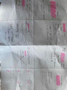
My first quick mock-ups of the cinema listing were all different however we can see that the first for examples very much focused on the title of the the movie (shown with the pink block). This was because my initial thought was that this is what was most important when designing the cinema listings and therefore was at the top of the hierarchy.
As my ideas developed we notice that this becomes the less prominent feature as I wanted to play around with putting the film title in different type fonts and sizes.
I carried this forward when designing my final two listings as I focused on the type of user which would therefor change the hierarchy in the text. I based my designs on the premise that the user would be university students visiting the Reading Film Theatre. Because of this, I believed the date would be the most important aspect following the film title as they would plan going to see a film around their schedule. Furthermore, with there being only 1 film showing a day, I did not want to follow the usual conventions, for example a popular cinema website, whereby they would first list the film title and then the dates and times of the showings and this would not have been practical with only one showing.
My second design shown above, I wanted to play around with the typeface sizing of the dates to make it more eye-catching. At first I just included the large numbers however after receiving feedback from my peers that this was hard to understand, I chose to do this alongside the large months shown above to indicate that these were in fact dates. The use of putting these in the same colour also helped me achieve this idea.