
In today’s class we were provided with two fonts, Garamond and Futura. Using one of these fonts, we had to use our initials to create a monogram.
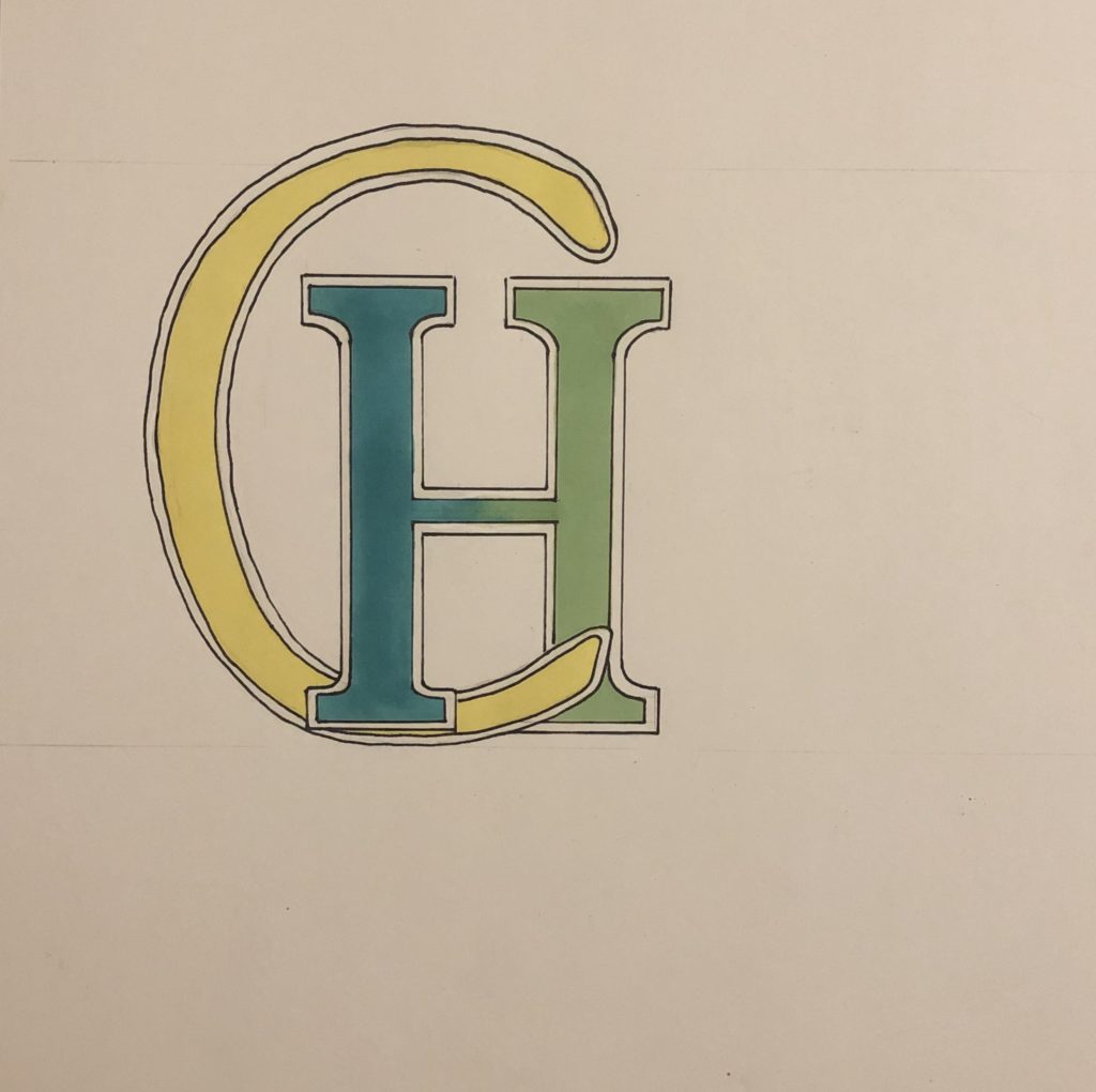
I sketched out my initials, CH, and then photocopied them at different sizes, playing around with the scale. I mixed the two initials to see which shapes I could create with them. I found that I was getting lost in my own ideas, making the initials blend in such way that I could not tell they were a C & H anymore. I wanted my monogram to be a clean and clear presentation of my initials, and that is why I chose the final design that can be seen below (the last three drawings on the page).

I thought it would be fun to add some colour to my design. I chose green because it is a calm colour that is associated with nature and good-luck. It is fresh and cool, and to me it holds the idea of hope and new life.
Yellow is a happy colour. It is fun and youthful, and adds energy, just like the sun .