Introduction
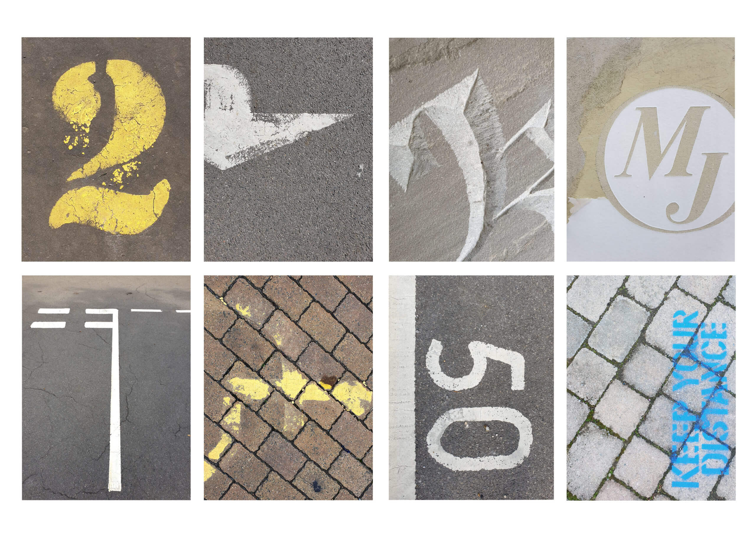
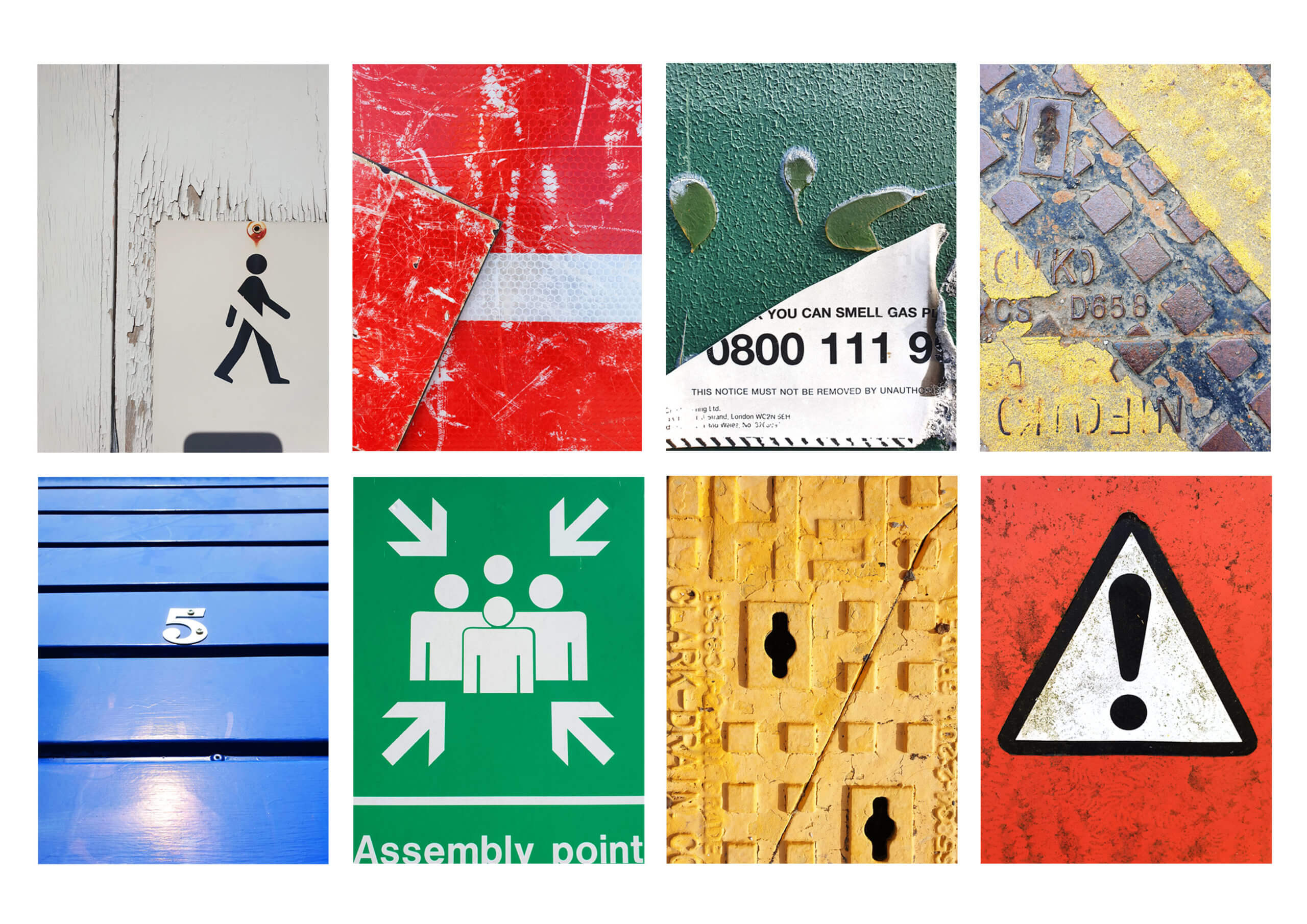
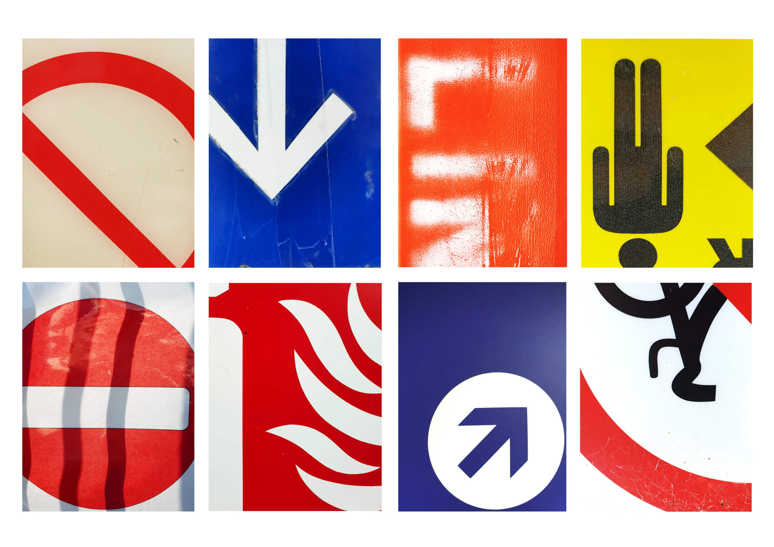
Today I responded to ‘lettering in the environment’. The brief required me to explore the campus and the surrounding environment, whilst photographing as many types of typographic sources as possible. I personally decided to avoid taking pictures in the Typography building as I felt it was too easy to document. Instead I wanted to force myself to explore the surrounding environment. The University contains a range of newly implicated signage, giving the environment a clean and contemporary feel. I wanted to try and look for the forgotten and unloved pieces of typography, to find something to juxtapose the clean reformed style in the updated areas of campus.

I started by circulating around the old Typography building, finding disregarded engravings made by students from years past. The engravings weren’t perfect and had flaws in consistency and quality. This resulted in the type forms becoming distorted and containing characteristics that varied from its base inspiration, giving it its own personality. I found myself slightly put off by the type forms until I started getting closer and observing the minute details engraved by the student, something not as visible from a distance. From a closer perspective I realised that the form didn’t have to be perfect or a near replica. Instead I tried photographing the source from up-close, getting tight framing to only capture elements. It remined me that the form didn’t have to be as aesthetically pleasing as its inspiration but could be in its own right. Instead of relying on the entire form to be carved well, I could take advantage of close framing and enjoy specific elements, freeing it from being type and allowing it to just be a form. These engravings can be described as bad type by some, but the fact that the form would never logically be recreated for use made it even more unique. I continued to look for letter forms that had been abused and unloved to find the same unique qualities.

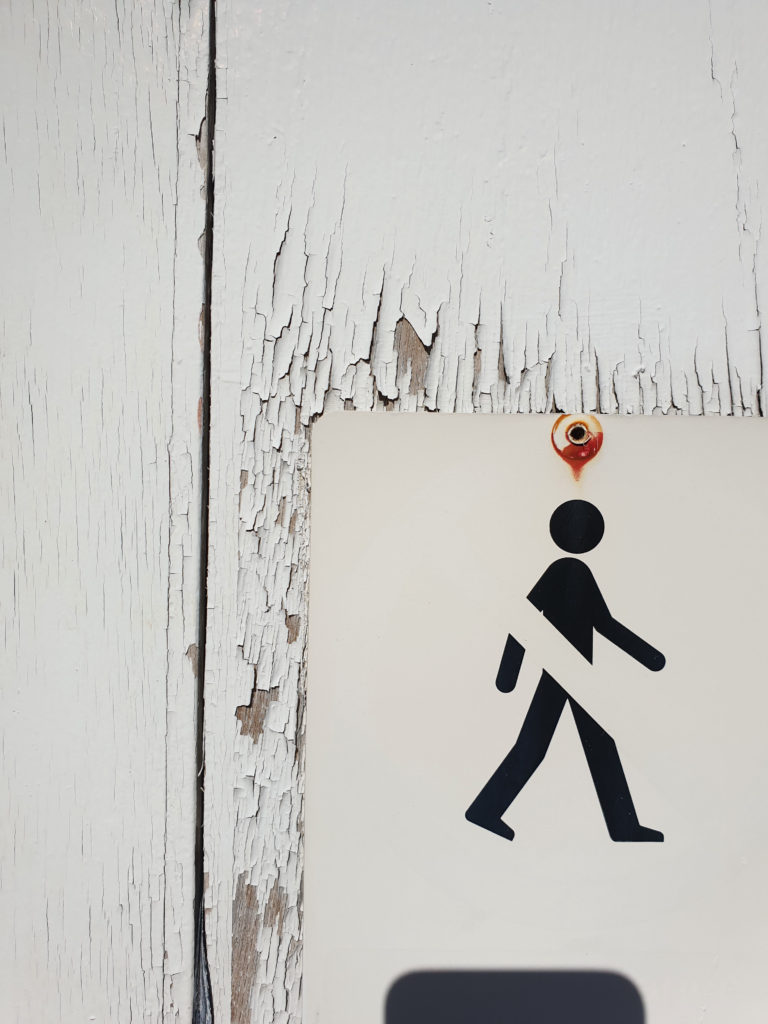
I found that some of the most inspiring sources were of metal signage. The signs are made from metal to endure the weather but over the years it can become dirty and the paint can chip and peal, generating unique markings and creating an overall texture to the sign. I think these elements, as well as close framing, allow the type to interact differently in comparison when it was originally displayed. The changes can result in type becoming less legible, becoming more of a form than a type form as well as creating contrasts in colour and tone from paint chipping. This can also be seen in a lot of signage painted on the roads. I found they offered a different style of texture due to concreate being more porus and tyre friction wearing away less aggressively. It resulted in a more organic and natural texture, leaving behind minimal speckle to big silhouettes.

I think these sources are a great source of inspiration and it would be useful to digitally scan them in and use them as textures in the future. After photographing all of the type I encountered, I grouped some of my favourite shots into three categories that I found were the most consistent in my research (Concrete, Metal and Plastic). I chose to group them via their matirial they were printed onto (or out of) as they shared similar characteristics of texture that I found interesting.
Conclusion
After completing the brief I realised how common these degrading sources of type are. It also confirmed a sad theory in that it takes a certain ignorance for these forms to still be present. This is because they need to be neglected and forgotten to gain their textures which give them personality. I think If I could respond differently, I would have photographed similar sources in the town centre and compare how the foot traffic and location could create variation in textures.

