Intro
Todays brief required us to experiment with creating a monogram from our own Initials. I was given the option to base my response on the typefaces Futura or Garamond. I chose Futura because it is a Geometric Sans-Serif. This means that it has more consistency in its weight, suggesting that the monogram will be more uniform in its design. The lack of serifs also make it more practical to connect forms which is ideal for the brief. In addition I feel that Futura is a personal favourite of mine, due to its uniformity in geometric design but slight changes in weight, adding variation and personality, instead of being perfectly boring. To get an idea of how to connect my Initials, I started to source some inspiration of existing sans-serif type monograms.
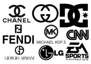
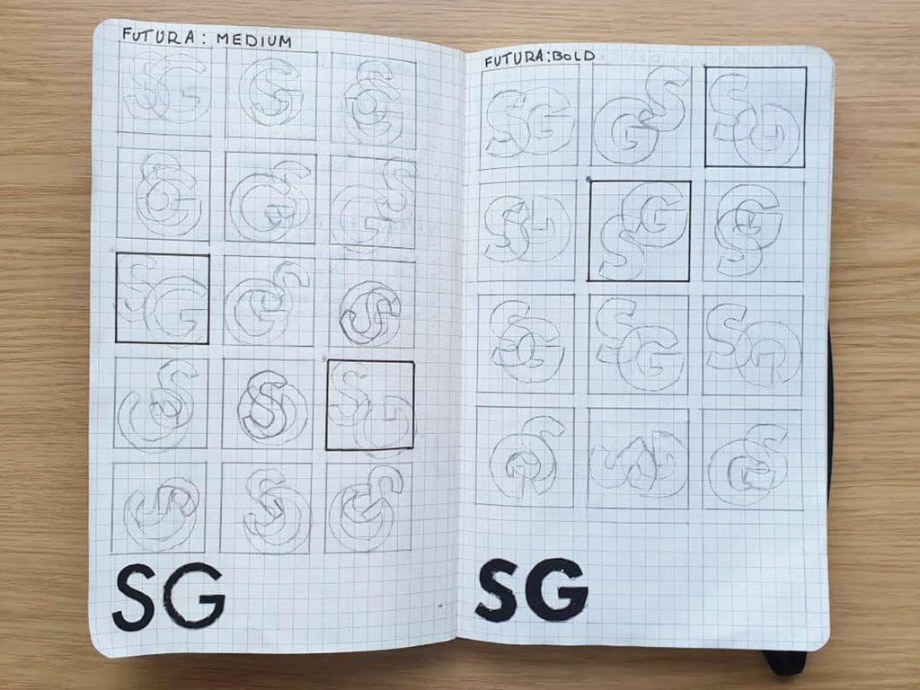
I found that a common way to join the forms are through overlapping them, often creating something not initially legible, thus becoming an odd form for a logo. The monograms also utilise common characteristics found in the typeface. For example the DC logo can utilise the ‘C’ by vertically flipping it to suggest its also a ‘D’. Having this in mind I decided to sketch out some initial ideas in Futura. I printed out my initials in the same size but in ‘Medium’, ‘Bold’ and ‘Condensed medium’ and cut them out. This was to give me a range of weights to experiment with as well as allow me to stencil them for accuracy. I found this was a good way to generate ideas as I could physically manipulate the type, often causing accidents leading to new ideas to try. It also helped me get a fairly close resemblance to the typeface which was helpful for alignment in my sketches. After several sketches I redrew some of my favourites to get a sense of which ones looked legible and suitable when filled in, as sketch outlines give a fall sense of space.
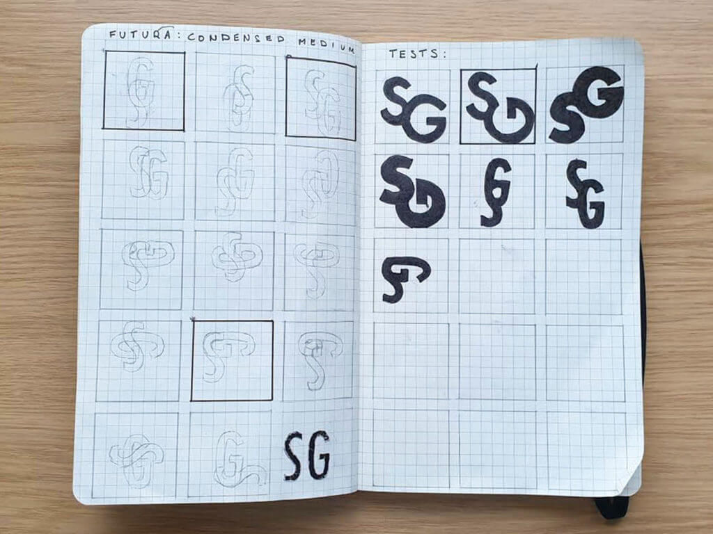
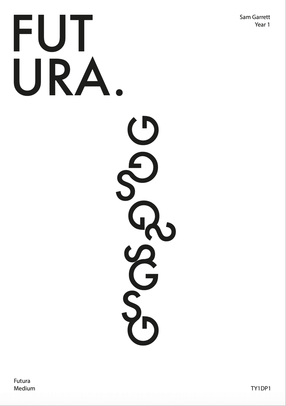
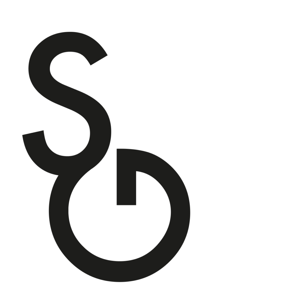
I chose the second Test sketch (see second image above) to develop into a monogram. this was because the ‘S’ and ‘G’ fit together so that they share a satisfying elongated curve. The distance between the two forms also generates a lot of negative space above the ‘G’ in addition to its open style counter, making it look spacious. I also liked how the ‘G’ is rotated at 90 degrees, making it look similar to an arrow. I decided to experiment on Illustrator by recreating the sketch to try and overlap the forms to test if the forms poke through at all. I found that the spine of the ‘S’ wouldn’t align with the ‘G’ so I decided to increase the point size by 2 for the S. This gave it a slight increase in weight to hide the blemish and I think it subtly draws the eye to it more easily, making it recognisable as an ‘S’ and not an odd ornament for the ‘G’. i think started playing around with the idea that the ‘G’ looks like an arrow and made a series of forms. each one included the ‘G’ but at a different angle, as if in order it looks like its rotating. I then experimented with adding the ‘S’ onto the ‘G’ using my sketches as inspiration. I found that I created a bunch of new forms, as if they were trying to morph into my chosen monogram. I tried to place each form side by side but the ornamental style of the ‘S’ didn’t conform to any baseline. I thought that I could use the reoccurring ‘G’ as a point of alignment and started to align them vertically. I treated the forms as if they were real letters and tried to manually kern them. They all interact with one another differently so it was interesting to see how much negative space I could leave between them to make the overall ‘sentence’ seem balanced. The ‘sentence’ looked good in vertical alignment, but required a lot of negative space around it. Because of this I only added ‘Futura’ in the corner and other details in much smaller point size so the form wouldn’t be overcrowded. The final piece can be found below.
overall I’m happy with my outcome and was surprised at how versatile Futura could be considering both my initials are heavily curvaceous. It’s odd to see my initials as the base of a project inspired by a lot of fashion designer logos, but goes to show how a good typeface can make anything look important and ‘put well together’.