8×8, a day of arcade game typography with Toshi Omagari
Baseline Shift in Week 1 was a full-day event, focusing on pixel typography from arcade games. It began with a talk by Toshi Omagari, followed by 8×8 pixel type workshops and a fantastic games evening!
About Toshi Omagari
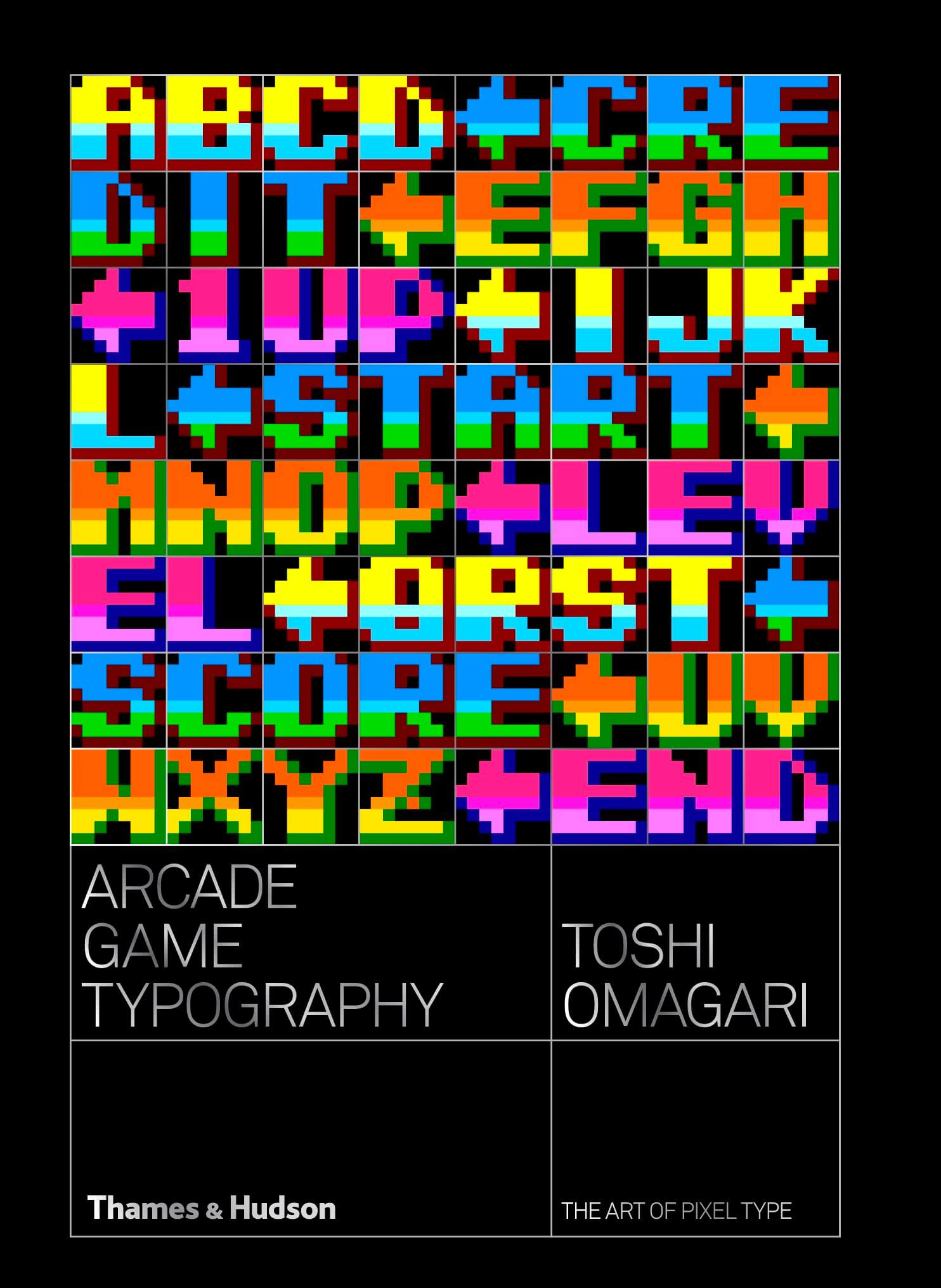
Toshi is a senior type designer at Monotype UK and initiate designer at Tabular Type Foundry. He graduated from Musashino Art University in Tokyo, before studying typeface design here at the University of Reading. He is a passionate gamer, using this passion to drive his work and has recently completed work on the book Arcade Game Typography, a specimen of (and love letter to) the pixel fonts used in arcade games from the mid ’70s to the mid ’90s.
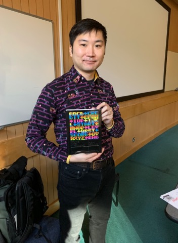
Toshi Omagari and his book, Arcade Game TypograpyArcade Game Typography by Toshi Omagari
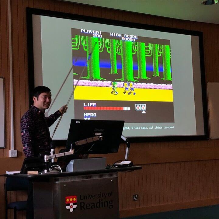
Toshi’s talk
Toshi presented a wide variety of arcade game typefaces from his research, all using the constraints of an 8×8 pixel area. It was interesting to see how these developed – particularly in colour range – over time. While early games were just black and white (though sometimes used overlays on the screen to add colour), the colour palette and complexity began to accelerate in the late ’80s. This eventually led to single glyphs that used perhaps a dozen colours to create embossing, drop shadows, colour inlays, gradients and anti-aliasing – sometime all at once! He was keen to address the quirks of pixel type and how these introduce a range of issues that are a little different to those raised by the design of type using vectors, as is now the norm. An early portion of the presentation was devoted to showing how attempting to ‘vectorise’ these tiny fonts to create smoothed out equivalents is not really possible. Something is lost. Eric Gill famously noted that ‘Letters are things, not pictures of things’. Toshi’s point seemed to be that pixel fonts at this small scale are things in themselves, not merely lo-res pictures of ‘better’ things.
Toshi Omagari presenting game typography
‘Really intriguing to see a different side of typeface design compared to the usual serifs and san serifs. Seeing the changes in different pixel typefaces and how they have developed was really interesting.’ Joanne, Part 2
Pac-Man
Diamond Run
Dance Dance Revolution 3rd Mix. Toshi noted that the ‘6’ had a change of the position of weight (from top to middle) compared with the other figures. While this creates disharmony, perhaps it’s part of the compromise needed to ensure disambiguation at this small scale. With the weight in the ‘correct’ place, might it be mistaken for a ‘5’?
‘Interesting to see the variety of pixel font that can be achieved in such a small canvas.’ Michaela, MA Student
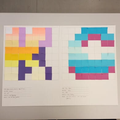
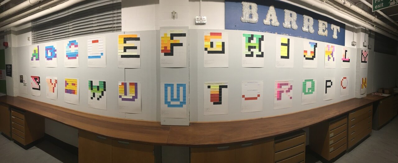
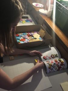
Pixel post-it note workshop
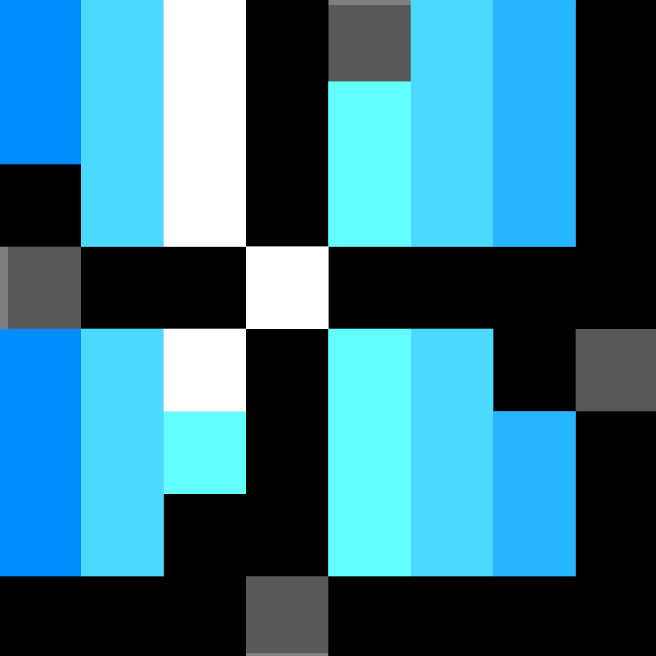
We had the opportunity to replicate typefaces from games such as Pac-Man, Ray Force and Panic Gals 2 on 8×8 grids, using Toshi’s book as a reference. Although we had a range of coloured post it notes in around 50 colours, this still felt like a limitation. We were able to create a full alphabet from these pixel typefaces, but it gave us a better indication of the constraints arcade game typographers worked with in the early 80s.
Post-it note workshop close up
Pixel alphabet created by students
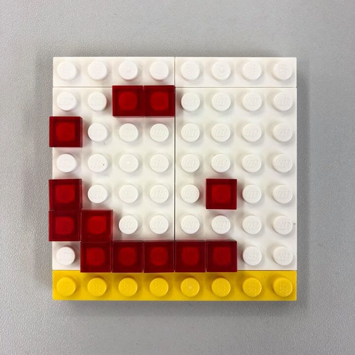
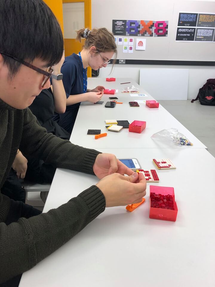
Lego letterpress workshop
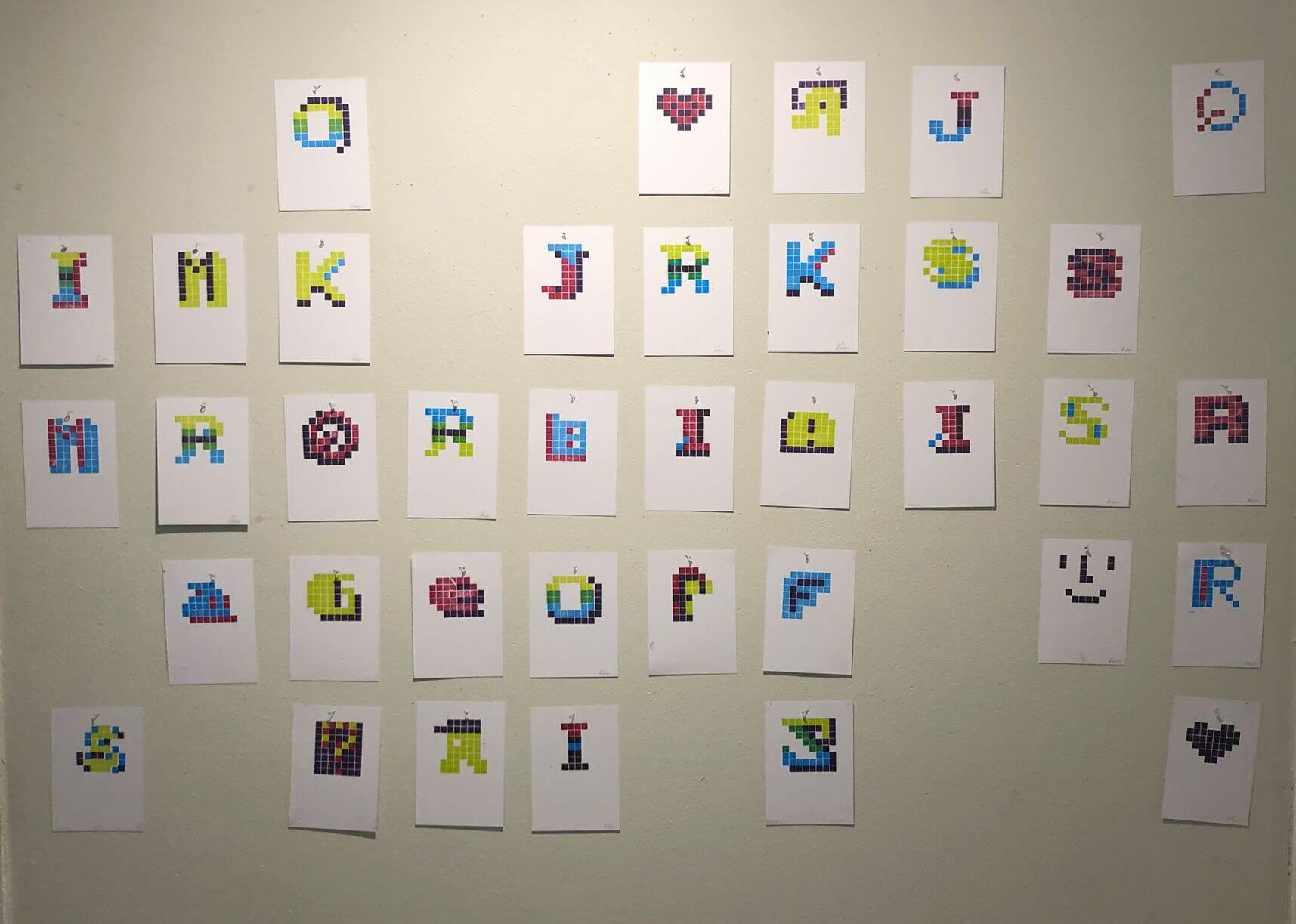
At the letterpress workshop, students were invited to select their favourite pixel letters from Toshi’s book and recreate them on 8×8 Lego tiles to print on the press. This was easier said than done. For multi-coloured type, multiple tiles were necessary so that each colour could be printed; letters also had to be made in reverse so that they would print as desired. Once we completed our tiles, we could ink them up in their chosen colours, and then print them one by one to form letters. Only four colours were available – green, blue, purple, and pink – once again pushing students’ creativity through constraint. Some took advantage of overprinting two colours to create a third. The thought and effort required to get these right proved inspiring, and we saw a lot of freestyling once the facsimiles were complete. On display on the Department walls, they highlight the diversity that pixel type has to offer. While it may at first seem limiting, it is challenging and extremely satisfying.
Lego letterpress workshop close upStudents in the lego letterpress workshop
Letters printed in the lego workshop
Arcade evening
The evening games party featured classics such as Dance Dance Revolution, Tetris and Street Fighter. As well as being a heap of fun for the department, it gave us the chance to see the typefaces Toshi discussed in their context, with Toshi moving through the crowd to point our the peculiarities of specific fonts in action. There were even prizes for students selected by Toshi for their work in both the letterpress and post it note workshops, as well as a bonus prize for the high scorer of Taito’s Bubble Bobble!
Events that involve staff and students across all year groups, working and playing together, help build the sense of community that our department is known for. We’re really grateful to Toshi for inspiring us with the thousands of hour he put into his book, and the day he spent with us to share his passion.