Background
R. U. Hacking? (Reading University Hacking Society) is a Reading University Students Union approved society run by and for students who seek to get more involved in the tech industry with a heavy focus on professional networking. The society aims to organise events such as Hackathons throughout the year that enable students to interact with industry professionals from both inside and outside Reading University. These Hackathons allow students to create their own projects and develop their skills in the field, be it learning new programming languages, or simply gaining knowledge of cutting-edge technologies.
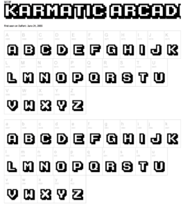
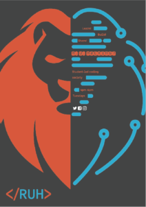
The society’s previous branding used three main colours. Red, which was used for backgrounds and was based on the colour used in most University of Reading branding. White, which was used for logos and texts and black, used for shadows. The font was Karmatic Arcade by VicFieger. The logo was an 8-bit / pixelated render of the University of Reading shield. All of these guidelines were used to create various posters, banners and other printed and online media. The overall branding was very good and well thought through, however the society wasn’t getting enough attention from young students and professionals who don’t really know a lot about coding but were willing to learn. The society was becoming a rather closed group of Computer Science students who wanted to code. However, the idea of the president was to make it more open and inviting. The new branding had to communicate that the society and events organised by it are open for everyone, not only people with the ability to code. The Hackathons organised are not only 24 hour coding events but also provide workshops for people interested in different sides of computer science and coding and there are networking opportunities provided with all the sponsors and big names in the industry attending the events.
The deliverables they wanted included a society logo and brand kit as well as poster templates, leaflet templates and a banner, all to be used for different events the society attended and organised.
Initial meeting
In the initial meeting we spoke to our clients about what their ideas and visions for the project were and how they wanted it done. The president of the society as well as the committee had a general idea of what they wanted and how they wanted it done. Almost everything was straightforward and we got all the information we needed to write the restated brief. Probably the only challenging part was that they gave us full freedom in the beginning and that was quite hard as we had lots of ideas and faced the challenge of narrowing them down to a few in order not to overwhelm our clients with choices and combinations and lead them to a stage where both parties felt comfortable and confident.
Briefing
The brief was very interesting and I think that is why we both decided to apply for this Real Job in the first place. Branding is something very important in the world of Graphic Design and to redesign an already existing brand is a very challenging task which can ruin or rebuild the client. This is why restating the brief was arguably the most important step in the initial briefing process. Not only does it give you, the designer, a better understanding of the clients’ wants and needs – it also reassures the client that you understand their vision. Restating this particular brief, however, was quite a challenge, since the clients seemed quite happy to leave their deliverables open to interpretation and mainly gave us their thoughts on their required intent. They wanted to reach a wider audience and draw in a more diverse crowd through our designs – not just the ‘computer science’ public.
Research
Finding out who the intended audience is was not very hard. As a university society, their main exposure happens here on campus and on the Reading University Students Union website, which meant that our user personas could be put into three categories – university students, university staff and university visitors. Appealing to the intended audience was simultaneously easy and difficult. It was easy when finding people to interview and ask for feedback from, because we could talk to everyone we see on campus, since the society wanted people from all walks of life to join. However, it was due to this that it was so hard, as catering to such a wide audience can be difficult to achieve in one design. It was clear from the society’s previous branding that they were also trying very hard to cater to all, as their designs were very simple – however, this also made them quite boring.
This meant that choosing an appropriate genre, graphic style and typography treatment, was challenging and we had to go through a lot of visual examples to clarify and stimulate discussion in the society as well as with the interviewees. We could not really be certain about the approaches that would align or disrupt the image of the society, and what benefits each possible option could bring since we got a lot of opinions and most of them were quite different. However, after looking into our research we found a common theme in all the groups and decided to stick with it – engaging, complex but easy to understand.
Branding
The previous branding of the society was actually quite solid, but it relied too heavily on the university branding. The colour scheme was red, black and white, and the heading typeface was Karmatic Arcade, an all-caps, 8-bit font. They didn’t have a set paragraph text typeface, so it was quite inconsistent in their documents. Their old logo was an 8-bit version of the university logo.
The text typeface we chose was Clone Rounded; we wanted to choose a mono typeface, since it’s what most coding programs use. However, whilst they work as headings, in long text they are quite difficult to read due to the wide characters. Clone Rounded is the most legible of these fonts we could find, and looks a lot more friendly than the other, usually harsher, mono typefaces.
Initially, we also chose a heading font to use in the brand kit, however, we decided that Clone Rounded worked well at both small and large scale, and adding a new font didn’t look right.
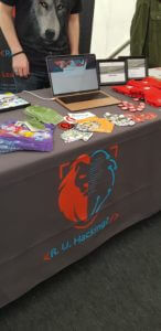
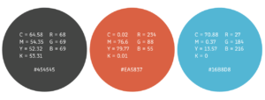
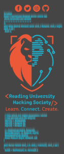
At first the society’s board still didn’t want to stray too far from the university branding, however, we managed to convince them that a more individual brand would help to further the development of the society, since they take part in non-university events. To compromise with them, we chose a reddish-orange as a main colour, with a bright blue to contrast, and a dark grey for the base.
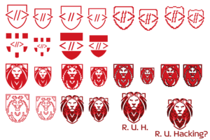
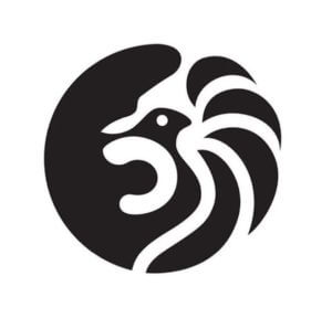
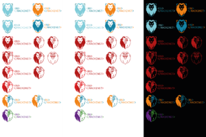
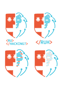
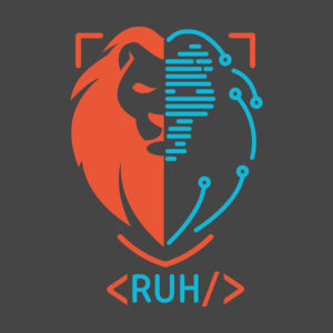
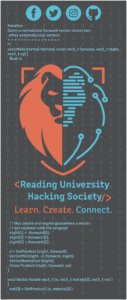
The client chose to have a lion as their logo, because it relates back to Reading. The logo is split in two: one side normal and one side tech, to get across to the audience that beginners can join as well. We did quite a few versions of the logo and it came a long way from what we originally suggested. It was originally quite over-complicated, but we simplified it down to the final design. We had thought about having just the lion, but they still wanted more of a connection to the university, so we added the corners of the shield around it.
Design
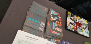
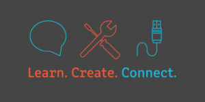
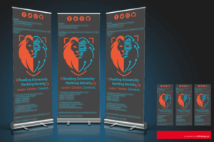
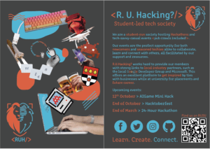
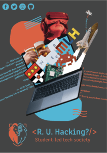
Anna designed the poster, prospectus and flyer, and Dimitar designed the Fresher’s Fayre banner stand and the social media imagery. We created most of the content of the documents. The clients couldn’t come up with what to put on their flyers so we invented their new slogan, ‘Learn, Create, Connect’, and Anna compiled the information section – later, we also came up with their new website’s tabs. We sourced all the images used from licence free websites.
We had weekly meetings in person, with some over video calls where we discussed the progress of the designs and what changes needed to be made. When the clients made a suggestion we knew wouldn’t work, instead of refusing to do it, we would create their idea then tell them why it wasn’t right for them. We reported back to Gerry, our supervisor, whenever we started a new concept to show him our initial ideas and to receive his approval of them.
In the beginning, their proposals were a bit vague and they told us the design is up to us – they wanted to see what we could come up with. This was risky because we could have wasted our time working on ideas they would not like, however, because we had a general direction given, the designs we came up with were approved.
When first pitching ideas for the poster and flyer to the client, they didn’t have anything in mind, so Anna designed a range of concepts for them to choose which direction to go forward with. They weren’t confident in any of them, but liked certain aspects, e.g. something bursting out of the laptop screen, code in the background.
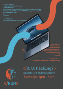

To get a better idea of what they wanted, Anna gathered together posters with different styles to use as examples, e.g. minimalism, typographical (no images), but they chose photomontage – below is the poster they wanted to draw inspiration from. She had the idea to have related items coming out of a laptop, and they thought it would be a good way to bring in a wider audience by including a wide variety of images.
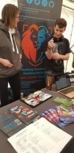
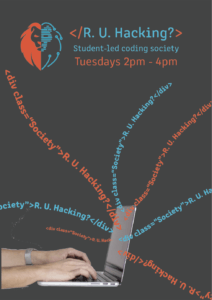
Dimitar worked on the banner which went through a lot of changes – from icons in the background, to binary and code. However, even though he wasn’t really sure some of the clients’ suggestions would work out, he ended up designing them in order to explain to the clients why they would not work or look good. When reworking the banner a couple of times and receiving feedback from the client, he came up with an engaging, highly visible from a distance design which the clients as well as the supervisor liked. Seeing it in person on the Freshers’ Fayre felt good since he very much liked the design.


Production
After getting our designs approved, we sent the print ready files to the clients, however, we don’t have much to say about the production aspect of this RealJob, because our client chose an outside printer which they had used in the past and already had a relationship with. Because of this after we sent off our print PDFs, we didn’t hear much about the progress of the printing, other than a few minor changes. We did consider requesting a print estimate from the department to compare prices with their company, but they seemed quite set in their ways and wouldn’t consider changing.
Unfortunately, the client edited our design after we sent them the InDesign file for their later use, meaning there were spelling mistakes in the final product. In the future, we should wait before sending our clients the original files or lock the layers. Overall, the project and all the processes involved were very interesting and engaging, however in the next one we will definitely try and get more involved with production.
Final Designs
We both really enjoyed this job; we were given free reign to express our ideas in the deliverables and the clients were happy with what we ended up producing. They haven’t printed any posters yet, but hopefully they will soon, as we don’t want the design to go to waste. At the end of this Real Job, we were offered the positions of joint Lead Designers of the society, so we will continue to design documents for them and uphold the branding we have created.