Tag: typeface design

Visit from Mushashino Art University

MAU UoR group photo
MAU visitors and Reading hosts, from left Ms Aki Amitani, Professor Yoshiro Goto, Gerry Leonidas, Toshi Omagari, Professor Gerard Unger, Yui Yoshitomi, Julian Moncada, Mari Kitamura, Akiko Maeda, Yukiko Aoshima.

Marking  the University’s new connection with the Mushashino Art University of Tokyo, two staff members and four students visited the Department of Typography & Graphic Communication for an intensive week of typeface design. The group, led by Reading alumnus Professor Yoshiro Goto of the Visual Communication Design Department, used their time in Reading to conclude a collaborative project devised by Prof. Goto and Gerry Leonidas, and delve deeper into the Department’s research-informed approach to typographic practice. Their schedule combined dedicated sessions, as well as shared tutorials and seminars with current BA students. The group also took part in sessions of particular interest by Professors Michael Twyman and Gerard Unger. Assisting generously throughout the week were fellow alumni Julian Moncada and Toshi Omagari (also a MAU alumnus).

2013 Monotype Studentship goes to Slovenian student

This year’s Monotype Studentship, awarded to an incoming MA student through the generosity of Monotype Imaging Ltd, has been awarded to Slovenian student Teja Smrekar, who will study Typeface Design. Teja receieved her first degree in Fine Arts from the University of Maribor, where her dissertation topic was ‘The socially engaged poster’. Teja has developed an interest in typeface design and attended workshops run by Gerry Leonidas and Reading alumna Veronika Burian. In her professional practice she has designed poetry books, an identity for the Association of Slovenian Artists, and has exhibited her work at EDUZGRAF in Zagreb, Croatia.

Dan Rhatigan, Type Director at Monotype, said ‘We selected Teja because of her overall enthusiasm and particularly her research interests in the Cambodian Khmer script. It’s always our hope that the Monotype Studentship will encourage the student who benefits from the opportunity and enable them to contribute to the wider body of typographic knowledge.’

Paul Luna, Head of Department, said ‘The support of industry partners is vital to allowing students from all over the world to study at Reading, and we are very grateful to Monotype for this continuing generous contribution to design education.’

Photo of Teja Smrekar
Teja Smrekar

Non-Latin festival in Bangkok

Granshan 2013

The University of Reading is a partner in the 2013 Granshan: Design and Identity conference in Bangkok, currently under way. The  Department is contributing with a special version of the “From hot-metal to OpenType” exhibition, which opened to the public yesterday in the library of Chulalongkorn University.

Speakers include Typography staff Gerard Unger and Gerry Leonidas, and graduates Paul Hunt and Ben Mitchell.


Reading at ICTVC 5, Nicosia

Reading at ICTVC 5, Nicosia

ICTVC 5

Reading staff and graduates have returned from the fifth International Conference on Typography & Visual Communication, hosted by the University of Nicosia. ICTVC is the brainchild of Dr Klimis Mastoridis (a Reading alumnus) who, since the first event in 2002, has given the conference a distinct character that sets it apart from most such events. Amongst typography-orientated events, ICTVC is probably the most diverse in the range of academics and practitioners it brings together. And, even in this smallest of its iterations, it attracted speakers and delegates from four continents.

The combination of research and practice makes ICTVC a very good fit for Typography, and it was no surprise to see the Department represented well. The speaker lineup included staff members Mary Dyson, Gerry Leonidas, and Sue Walker, and current PhD candidates Sallie Morris and Niki Sioki. PhD alumni Petra Cerne Oven, Sue Perks, Karel van der Waarde, and MA alumni Julián Moncada, Elena Papassissa, Vaibhav Singh, and Adi Stern also presented papers.

For a general report on the conference, head over to Mark Barratt’s post on the Eye magazine blog.

Monotype Recorder online

Monotype Recorder online

Monotype’s lauded Pencil to Pixel exhibition (in Wapping last November, and New York earlier this month) included a relaunched Monotype Recorder, after a hiatus of fifteen years (the previous issue had been published to mark the Centenary of the company, on the occasion of the 1997 ATypI conference, in Reading). The new issue celebrates Robin Nicholas’ long career and contribution to the company, as well as to typeface design in general. A few days ago Monotype posted the bulk of the issue as an online magazine, including Robin’s interview to Eye magazine, and Gerry’s comment on Robin’s work.

Reading in Berlin

The annual TypoBerlin conference is a major fixture on the European design calendar, bringing together over 1,500 attendees in the Haus der Kulturen der Welt in Berlin. Erstwhile staff member Ken Garland opened this year’s conference with a talk on the theme of “touch”, taking the audience on a journey through senses and ideas, culminating with a very personal and touching – pun intended – story. Department  graduates Paul Barnes and Marian Misiak talked on making typefaces from Cornish vernacular lettering, and Polish type design heritage from the Communist era respectively. Gerry Leonidas spoke on the emergence of typeface design as α professional discipline with global reach. Slanted magazine have  been reporting on their blog on Ken, Paul, Marian, and Gerry.


Fabula – a typeface for children

abenteuer-schule-ABC

Fabula is gaining popularity for use in resources for children, both on paper and on screen.

The typeface was designed under Sue Walker’s direction by a team of staff and students at Reading, including Vincent Connare, José Scaglione and Gerry Leonidas, as part of an EU-funded project producing bilingual story books for children. Since then it has been available for free, along with advice if required, from the Typographic design for children web site.

Some examples of how Fabula has been used:

Jashanjit Kaur, a designer based in Hyderabad, India used Fabula for Amigo, described as ‘a socialising platform for school children that provides a medium for sharing their ideas and pursuing interests in a safe and secure environment’.

Cecelia Erlich used the letterforms in a Spanish television programme, La cucaracha.

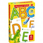
Dietmar Brühmüller used the font for the whole range of four young children’s games, including the one illustrated above.

Pencil to Pixel travels to NYC

PtPNYC

When the Pencil to Pixel exhibition opened in Wapping last November, visitors were treated to a rare selection of typeface design and type-making objects from the Monotype Archive. The inspiring exhibition was accompanied by a special issue of the Monotype Recorder celebrating the work of Robin Nicholas, and an exceptional special issue of Eye magazine.

Today the exhibition announced the dates and location for its New York City run, in May. The exhibition is supported by the Department (which also claims amongst its alumni the curators of the exhibition).

Non-Latin scripts: from metal to digital type

Available from the St Bride shop, Non-Latin scripts: from metal to digital type reproduces previously unpublished items for the Department’s Non-Latin Type Collection. Collection curator Fiona Rosscontributes a major essay on the type design process for non-Latin scripts and describes the exhibits, Graham Shaw discusses the relationship between these scripts and print technology, and John D. Berry’s afterword discusses the need for global resources in typography. An introduction by Paul Luna draws attention to the research possibilities of the Reading collection.


The publication records the ground-breaking exhibition this autumn at ATypI Hong Kong, hosted at the Hong Kong Polytechnic University Library, which displayed over 150 items from the collection, many of which are illustrated in the book. Exhibition co-curators Ross and Vaibhav Singh selected documents and artefacts to tell the story of type production across technologies in Amharic, Arabic, Bengali, Burmese, Devanagari, Gurmukhi, Kannada, Malayalam, Oriya, Sinhala, Tamil, Telugu, and Thai. A supporting display of newspapers in these scripts showed many of the fonts in use.

The 3-week long exhibition was launched by a keynote presentation by Paul Luna, who discussed the research possibilities of the Reading collection and laid stress on the need for the more immaterial evidence of contemporary font production to be preserved in the same way as physical evidence from the past, the survival of which helps us understand the processes involved and provides an evidence base for current font design. With an audience drawn from China and the East Asia region, India, Europe and the Americas, this was global exposure for one of Reading’s key research collections, with appreciation being expressed both at the conference and subsequently on social media.

For more images from the book and the exhibition, follow this link.