Tag: team work

‘Different by design’ zine issue 6

Context

The ‘I am, we are… Different by design’ is a zine created by students, published by the Department of Typography & Graphic Communication. The project aims to represent a diverse set of perspectives and experiences within the School of Arts and Communication Design.

Project overview

This year’s ‘Different by design’ brief challenged us to change the format of previous years. From an early stage we knew we wanted a range of deliverables that encapsulated the current student experience. Discussing our options, we decided to leave the format flexible until after our research and content collection phase. Which we would do through a student survey sent out to students in the  School of Art and Communication Design. Understanding their struggles and showcasing them in our zines was important to connect the audience to their experiences. Zines are a great format for this because they feel close and personal. Handmade qualities, imperfections really tell a powerful story to its audience. Expanding on the previous issues, we have also promoted our issue on Instagram and have a digital copy of the issue hosted on Github, allowing further reach.

We started this project by understanding what previous years had done, the A5 booklet format needed refreshing. As a group we visited The Wellcome Collection’s ‘Zine’s Forever’ exhibition during the summer break. We were inspired by the variety and creativity showcased in the zines that we saw and wanted to change the format that previous years had used. While staying true to the fundamental principles of ‘Different by design’.
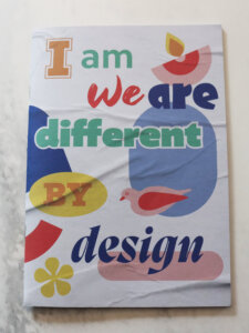
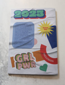
Figure 1: previous year zines booklet example.
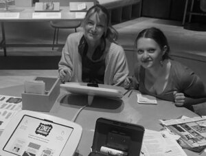
Figure 2: London visit to the Wellcome collection Zines forever! Exhibition.

Timeline

We worked on this project for nearly a year: we had a rough schedule for what we would be doing and when with key dates like:

      • Group sessions
      • Client meetings
      • Print deadlines.

This outline serves as a way of showing how we broke down the work into stages in such a long time-frame, so that future issues have a rough sense of what the timelines look like.

June – September:

      • London trip, Ethics approval, Preliminary research, Student survey, Branding development

September – October:

      • Review responses & supplement with research
      • Begin exploring fold options for zines

October – December:

      • First drafts of each zine
      • Branding finalised
      • Pricing estimates

December – January:

      • Zines developed for feedback on return after Christmas

January – February:

      • Design iteration-feedback cycles
      • Paper stock explorations

February – March:

      • Paper sponsor finalised
      • Continued zine refinements
      • Copy-editing

March – April:

      • Last adjustments before sent to print

April – May:

      • Animation development
      • Zine folding
      • Distribution

Project direction development

We had a series of meetings over summer discussing our individual aspirations for the project using FigJam to collaborate live and discuss mood-boards together.
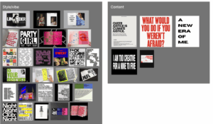
Figure 3: Figjam moodboards .

Student survey & themes

We split our survey into four main themes. Probing experiences related to; Mental health, Women’s health, Community & inclusion and Student finances. We felt we covered, at large, the student experience with relevant topics for different audiences.
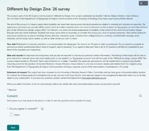
Figure 4: Student survey.

Branding

It was important that while we had a collection of items they all felt like a part of the same set. Here is our development of brand logos.
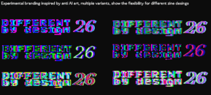
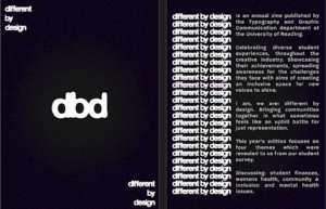
Figures 5-6: Initial direction was for anti-ai style, we removed colour because we felt like it was too distracting, and also optimised the logo for simplicity and printing. Conceptually the outlines give a sense of ‘container’ for the zines.

Zine Packet – CMYK

C – Mental health zine

The mental health zine’s objective was to create a space where students could share their thoughts and feelings regarding their mental health and mental health services at the University. The data was then taken and created into something thought-provoking but also eye-catching for the reader. Mental health is typically spoken about in a more medicinal sense, and we really wanted this zine to feel full of creative expression and freedom. This juxtaposing approach took some experimentation to get right, with many stages of refinements.
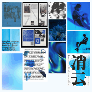
 

Figure 7: Mental health zine moodboard. Image sources: Cosmos.

The mental health zine started looking very modular at the beginning stages. Lots of harsh shapes and each page felt quite isolated. We re-explored how we could work with this and decided to incorporate more of a flowing design system. This meant the spreads flowed seamlessly together, like a journey.
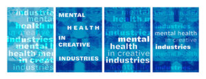
Figure 8-11: Iterations of mental health zine cover design.
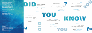
Figure 12: Final spread of mental health zine. Side 1.
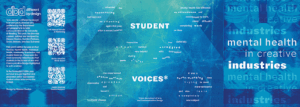
Figure 13: Final spread of mental health zine. Side 2.

M – Menstrual health zine

The purpose of this zine is to highlight the significant challenges that over half of the students at the University of Reading are encountering. According to Ucas.com (2026), 53% of the students at the University of Reading are female. Despite this substantial majority, there are no systems in place to provide assistance and support to individuals who menstruate.

This critical issue was highlighted in the survey that our team conducted, which revealed that many of the students studying here felt under supported and were expected to “suck it up” and cope with extreme stress and workloads while suffering from debilitating pain and fatigue, along with a combination of other symptoms making it impossible to keep up. The objective of this zine is to bring attention and recognition to the invisible pain and struggles being dealt with by menstruating students. To achieve this effectively, I chose a comic book theme to illustrate the complex story of menstrual health in an engaging and accessible way.
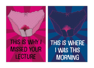
Figures 14 & 15 :Zine front cover and navy cover.
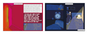
Figures 16 & 17: Spread one magenta and navy versions.
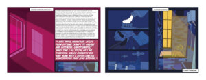
Figures 18 & 19: Spread two magenta and navy versions.
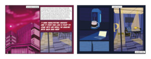
Figures 20 & 21: Spread three magenta and navy versions.

The fold divides this zine into two booklets. The first half, on the magenta side, shares facts and personal stories of university students. It uses peekaboo windows to subtly hint at the full illustrated dark blue comic side. Each spread corresponds to its opposite. Spread 1 shows a bedroom door leading to a woman suffering in her bedroom, unable to resume her normal activities. Spread 2 shows a bathroom window correlating to a woman attempting to get ready and care for herself. Spread 3 displays the University of Reading library, with its opposite showing a person in the library suffering through their pain.
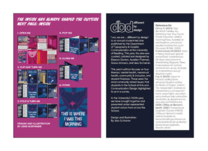
Figures 22 & 23: Back cover magenta and navy versions.

This zine is not a fictional narrative, it represents the lived experiences and challenges faced by every menstruating individual within the educational system. The primary aim of this zine is to inspire meaningful conversation and ignite a movement for change within our university community.

Y – Community & inclusion zine
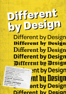
Figure 24 & 25: Zine front and back unfolded.

The community and inclusion zine aimed to highlight issues within the University of Reading in the School of Arts and Communication Design. However, the zine also celebrates the inclusion in courses and showcases work of previous students through a poster design. Working as the front cover of the zine, allowing for more engagement when viewing and opening, teasing the design as it is unfolded.
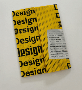
Figure 26: Poster folded.

The chosen typefaces featured in the zine, and on the poster, were designed by previous MA students of the department – who have multi-cultural backgrounds. Using this with the survey results shows both positive and negative experiences.

To keep cohesiveness throughout the zines, halftone was used in the background with the same blurb repeated on all 4 zines. This allowed for more flexibility with other elements such as type, folds and layout.

K – Finance zine

The finance zine showcases the difficulties of working while studying; inspired by the unfolding of a receipt. Supported by national statistics and observations of how student loans have changed over the last 10 years. Validating their experiences.

The receipt concept was good but I found it difficult to interweave the results of our survey into that style at such a small scale. Deciding that it could take away impact from the personal stories. Adapting this into a poster felt more natural and would give the potential for an interactive leaflet. Content on one side and the large poster on the other.
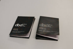
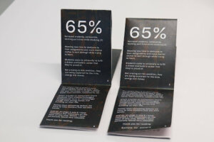
Figure 27: Early print tests.

After some feedback, we strayed away from all using Halyard as a cohesive typeface, which we had picked up from previous years. As it allowed for more creative expression, which opened up new options for the receipt concept.
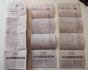
Figure 28: Receipt development.

The fold of this zine went through many different iterations in consideration for how the end-user would interact with it. Through many observations of people struggling to open it which was getting in the way of the experience.
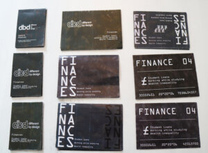
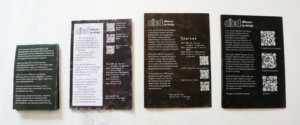
Figure 29 & 30: Developments after feedback and back panel refinements.

Packet Band

When creating the band, we experimented with what content it would include. In one of our first ideas, we considered adding a blurb however, as the back of the finance zine can be seen, we felt this was redundant. Keeping it simple helped the colours of the zines to pop.
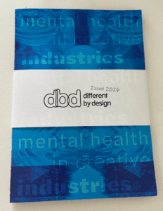
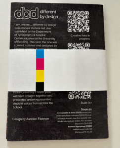
Figure 31 & 32: Packet band front and back.

Production

We knew that hand folding the zines would take a considerable amount of time with (150 copies) we liked that it brought a handmade quality into the final packet.
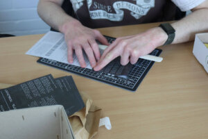
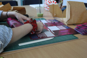
Figure 33-35: Folding day photos.

Animation

Wanting to promote the collection online, we decided to create a simple animation. At first it was just the After Effects animation but we wanted to tie it back into the physical product more so we had the idea to film it in a ‘sea of zines’ (see cover image). Sound designing the entire audio, writing a simple beep intro using an online sequencer. Listen to the original here.
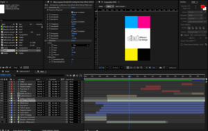
Figure 36: After effects screenshot.

Final zine packet

Bringing everything together we released the zines to the department and posted our Instagram reel! Hosting our zines as e-friendly versions on Github.
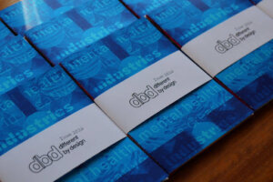
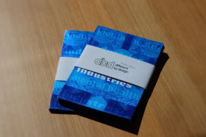
Figures 37-38: Final zine distribution.

Reflections

Eleanor:

On reflection, this project has been a great opportunity to work as part of a team to represent a community of students in the creative industry. With the combination of topics that were of most importance to the student body, being able to represent those who have struggled with their mental health and create something for them was really inspiring, as someone who has used the University’s services myself. I enjoyed the collaborative aspect of this Real Job and really enjoyed working with this team to curate a little pack of creative representation.

Grace: 

Overall, this project has been an amazing experience with understanding how meaningful design can be created in a fun and conceptual way. Through challenging the traditional A5 format, we were able to push beyond something plain. Being experimental throughout the process helped me build confidence in taking creative risks throughout other projects. This project has helped me to understand the importance of the power of design, especially through hearing the stories of peers and sharing them through our work to try and create a more inclusive environment. Collaborating with the team was also a rewarding aspect of the project as I learned a great deal from working with my teammates and listening to their ideas. This helped me to see different perspectives and how they strengthened the overall outcome.

Jess:

Executing this project has provided me with the opportunity to create an activist feminist zine that has the potential to bring about change within our university. It has been a unique chance to develop something entirely self-directed, free from any limitations. This project has allowed me to delve deeply into a topic I am personally passionate about and to craft a piece of work that is exceptionally complex, which I have created from beginning to end. The experience gained from this project has been invaluable, as it has taught me how to work effectively within my own time-frame, establish my own brief, and tackle a complex project centered around creativity. Additionally, it has enabled me to collaborate very successfully in a group setting while still maintaining my independence.

Aurelien:

Working on this project has been an incredibly gratifying experience, at times it has been challenging but I really feel like we ‘pushed the envelope’ forward for future years to be inspired from and iterate on top of. I also think the depth of the work is quite significant, sharing these incredibly vulnerable but important stories does a lot in building solidarity for those with similar experiences. When we started this project, I think we all had a lot of high expectations and I think that, quite remarkably, we met them! Many thanks to Rachel, our supervisor, with continual guidance and for having the ambition to do something radically different this year and Rob, our client, for always offering helpful feedback.
Undergraduate recruitment

Overview

Third year students Ruth and Maya and second year students Lucy and Grace were selected to form the ‘Undergraduate Recruitment team’ to increase applications to the BA Graphic Communication course throughout the 2020/21 yearly cycle. The deliverables for the project were to be determined by ‘blue-sky thinking’ and the innovative ideas that were generated, with a variety of possible outcomes, including social media posts, digital or physical brochures/leaflets, presentations and the organisation of online portfolio days. The success of deliverables was measured by the number of applications that the course and department received for the academic year, aiming for a greatly increased number than that of last year.

Aims

  • To increase undergraduate applications for the BA Graphic Communication course
  • To raise awareness of the course to students who may not think of it as a viable option for their career or university experience i.e. those not currently studying art or design
  • To generate innovative and creative long-term methods of promoting the department across the UK
  • To effectively encourage prospective students to apply through the emphasis of key statistics and facts about the unique academic and creative aspects of the course
  • To ensure portfolio days are run in the most effective way despite COVID-19 and so that they are run as similar as they would be if they were in person
  • To increase the use of student-fronted promotion of the course 

Target market

  • Students in their last two years of schools who are preparing for open days and beginning to think about their UCAS application
  • Schools who hold career/university days to help their students explore many different degree paths and specific universities
  • Not just art students but also the academic students who may not have even considered Graphic Communication because they do not yet understand what the course is really about
  • Three specific target groups; prospective students, applicants and offer holders. These groups will all be at different stages of the applicant journey, so it is important that our approach is appropriate for each one
  • Additional considerations for parents, who are interested in the application process for their child

Roles and responsibilities

The roles and responsibilities of the design team varied per deliverable and each team member was heavily involved in the idea and design generation process throughout the project. Additionally, each team member had a specific role that allowed for better team organisation and understanding of individual responsibilities. Ruth was project manager, being the point of communication between the design team and the client, Maya was finance manager investigating the realistic costs of implementing ideas, whilst Lucy was creative director supported by designer Grace. 

Lucy and Grace will continue the project into their third year with new team members in the next academic year, carrying our ideas forward for the next recruitment cycle.

User research

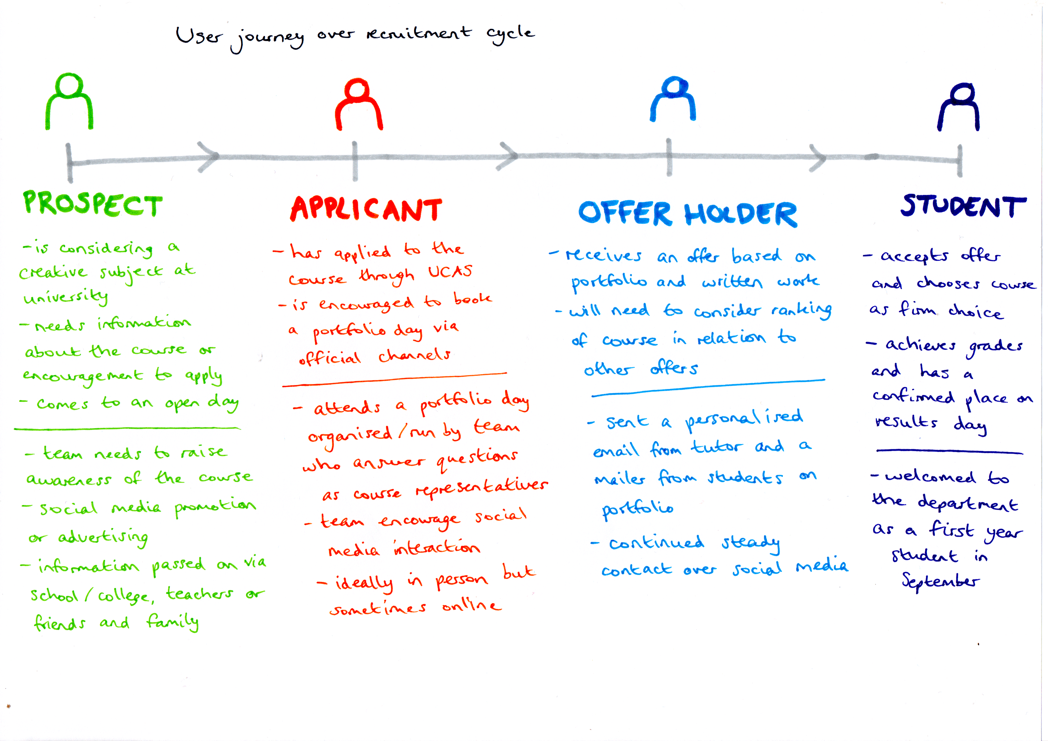
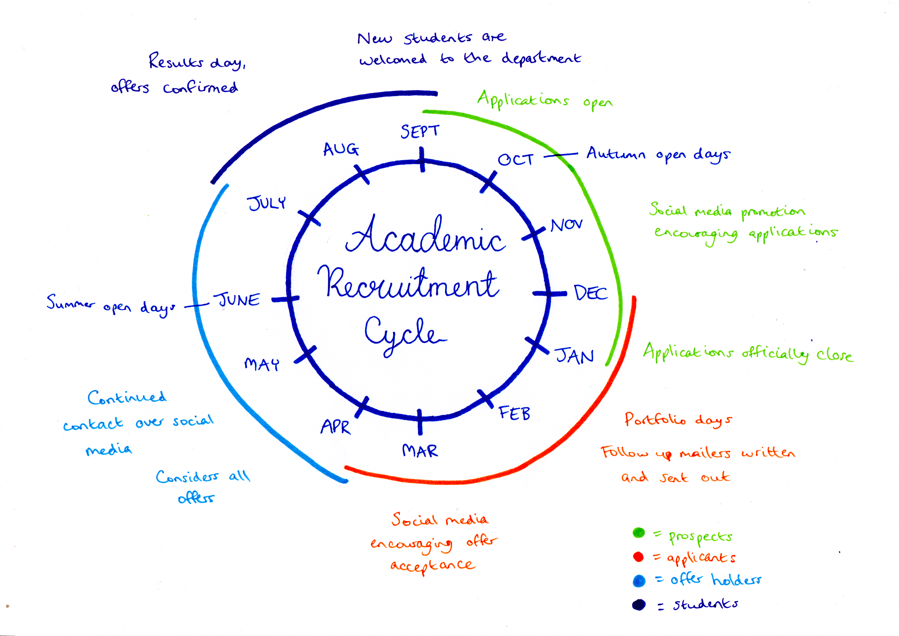
In order to fully understand the deliverables that were required at each point of the applicant cycle, a user journey was developed, mapping the various points at which we could interact with potential applicants and the language that would be used to target them. Figure 1 demonstrates how target users move from being prospects to applicants to offer holders throughout the year and the outcomes involved at each stage to promote the department. Figure 2 explains how this journey fits into the academic recruitment cycle, which is repeated each year, starting in September.

Undergraduate recruitment user journey flow
Figure 1: the user journey undertaken by prospective students over the course of the recruitment cycle and the corresponding actions of the recruitment team to meet their behaviour


Academic Recruitment cycle diagram
Figure 2: how the applicant journey fits into the annual academic recruitment cycle

Outcomes

As the project progressed, a number of outcomes were developed and explored. As a team we were involved in the development of a Facebook group that was aimed at applicants. The purpose of this Facebook group was to create a platform for applicants to ask questions and to engage with the content that we posted. The Facebook group also enabled applicants to link with other students on the course and begin to recognise names from portfolio mornings and applicant sessions. Additionally, we helped to create posts for the department Instagram to promote the course, examples of which are shown in figure 3.

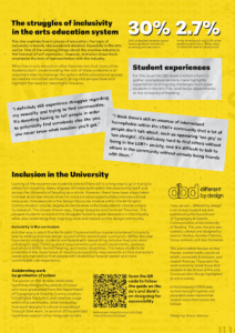
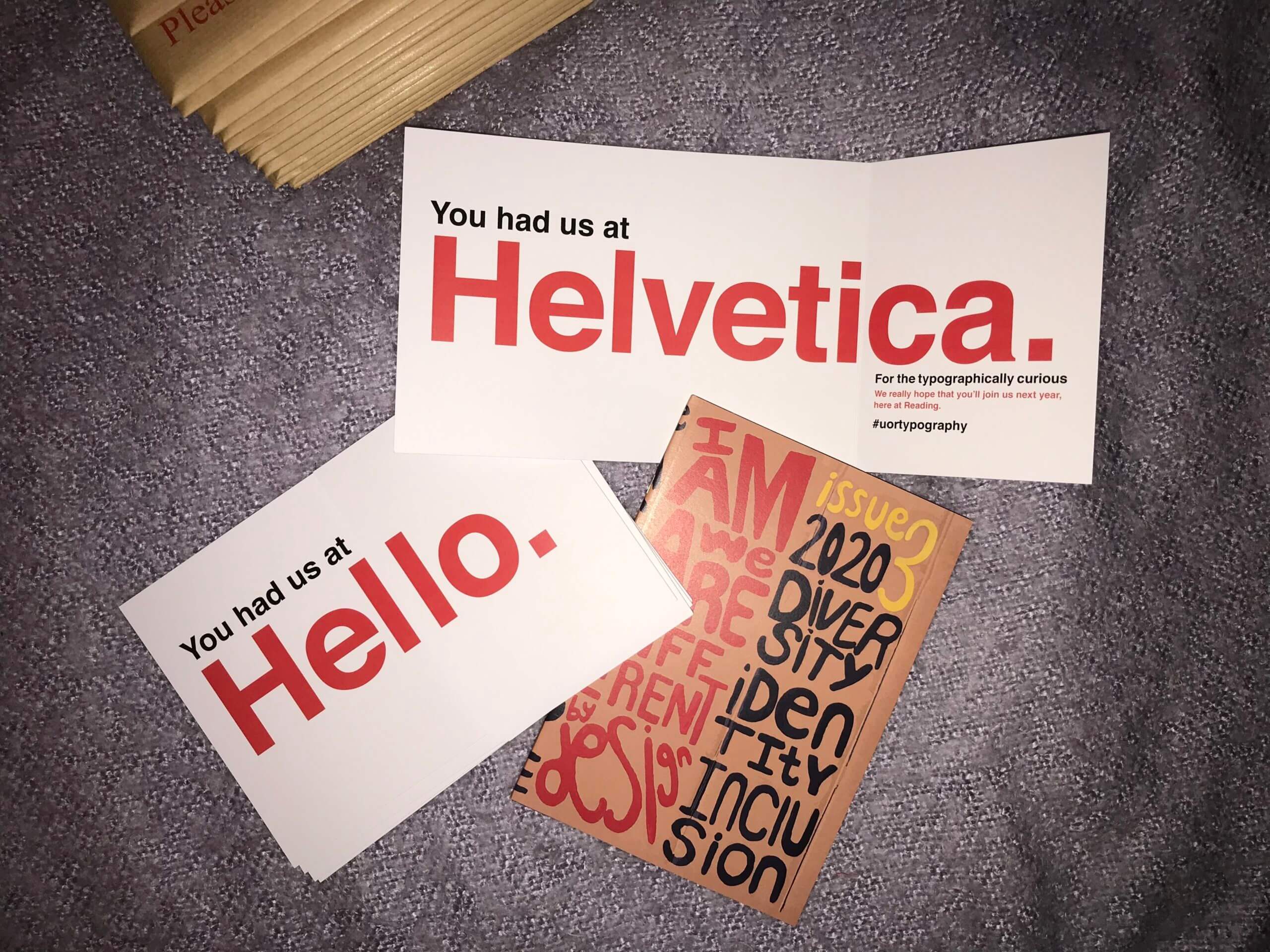
The portfolio mornings and applicant sessions were arguably the biggest part of this real job where most Saturday’s two members of our team would join our supervisor and tutor James and help him run the session. We felt having existing students have some alone time with the applicants helped to make the applicants more comfortable and gave them time to ask us more general questions related to university life. Following each portfolio morning, a personalised mailer was written and sent by Ruth to each applicant turned offer holder, commenting on their individual portfolios and aspects of the course that were discussed in the session. A copy of the departments diversity zine was also sent out, as seen in figure 4. These were also supported by emails and phone calls to the applicants, a personalised approach that proved popular and received positive feedback from the students.

Aside from portfolio days and running the Facebook group we were also tasked with smaller jobs to promote the department. One of these tasks was to create a promotional video for applicants that had a brief introduction about some of the students in the department (including ourselves). The creation of this video had the purpose of showing potential applicants that it doesn’t matter what background they have come from, graphic communication may still suit them. Using a variety of students helped to highlight our range of backgrounds despite still ending up on the same course.

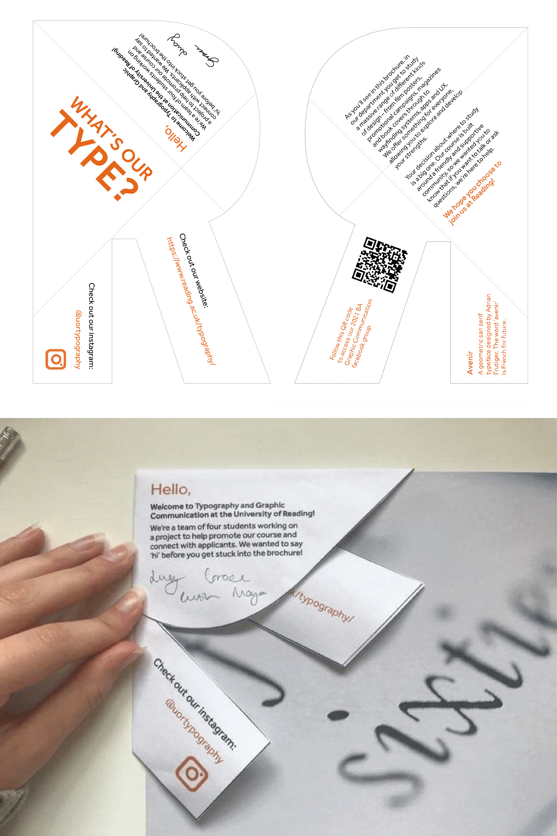
As a team we also created a mailer that was to be sent out alongside our course brochure. We decided as a team that we wanted the mailer to be integrated with the brochure, and thought we could achieve this by creating a folded ‘R’ (for Reading) to sit on the corner of the brochure (figure 5). The ‘R’ contained a personal message from ourselves and also some information about the typeface of the ‘R’.  Although this design was not produced for this year, the concept may be used within the next academic cycle.

Instagram posts
Figure 3: The series of posts designed for social media to promote the course


Image of the mailers sent to students
Figure 4: the mailer containing a personalised written note and a copy of the diversity zine sent to offer holders


The 'R' mailer
Figure 5: the ‘R’ mailer concept that would accompany a course brochure and intended to be sent out to prospects

Team work

As the yearly recruitment cycle progressed, it became clear that working as a team and delegating roles efficiently was the best method of ensuring success. The portfolio days that were held every Saturday from December through to April were mainly hosted by Ruth and Lucy to ensure consistency and so that each week ran smoothly. Ruth and Lucy formed a partnership and by the end were completely confident in running a portfolio day alongside James. Despite Maya and Grace not being involved in all the portfolio days, Ruth and Lucy had briefed us on what we needed to do so that everyone was able to step in if needed. 

Aside from the portfolio days, working as a team was important when trying to create an innovative method to recruit possible students. In our weekly catchup with James we were often briefed with a task to prepare for the following week. We decided it best to think of our own ideas ready for a team meeting where we could then collaborate and develop our ideas further. We found this the most useful method to generate ideas as we sparked thoughts of each other. 

Not only did we work as a team of four but James was also an element of our team where working with him was crucial to progressing through the recruitment cycle. James’ advice and insights into his previous experience of the recruitment cycle was helpful for us when pitching our ideas as James helped us to fine tune our thoughts into a successful plan.

Reflection

Working on this project during the Covid-19 pandemic created various challenges, mainly in generating and implementing mostly digital ideas, compared to the physical and more personable approaches used in previous years. As a team, we were required to adapt past outcomes in order to provide a relatively similar application experience for this academic year and we were conscious of increasing prospect participation at online portfolio days and continued interaction over social media and mailers. 

Measuring our success was slightly different and more difficult compared to other design projects we have worked on in the past, as we were more focused on applicant numbers and response rates, which we did not always have immediate access to due to confidentiality issues. However, it could be considered that this academic year is not comparable with other years due to the pandemic, which will result in changes to applicant behaviour despite our work to improve prospects. 

Overall, we worked coherently as a team throughout the year, having the opportunity to develop our creative thinking and strategy generation within the constraints of a mostly digital space. The project provided experience of working as part of a wider marketing team, as designers, consultants and idea generators, roles that could help inform our practice in our future careers. Personally, I (Ruth) have been able to improve my confidence and social skills in talking to a range of people online, especially at portfolio days answering applicant questions and promoting the department, which I can apply to upcoming job interviews. 

The transition of adapting social skills to work online I (Maya) found initially nerve wracking, however as we began the portfolio days I began to develop more confidence. The skills I developed through the portfolio days will be transferable as I begin to apply for jobs and undergo interviews. Overall, I feel that this job was an exciting job to be a part of, as the success of this real job has a direct impact on our own graphics department, which is unlike other real jobs.

— Ruth Bartley and Maya Goddard


Baseline shift animations 2020-21

Background

Baseline Shift is a series of design talks, events and workshops organised by a team of students for students at the department of Typography & Graphic Communication for the duration of the Autumn and Spring term. These talks happen on a weekly basis – every Wednesday, and are usually led by guest lecturers who are professionals in the subject. They aim at helping students expand and redefine their understanding of what a designer is, and what design can do.

I joined the team in the summer before the beginning of my third year at the department which made my job a bit challenging but also very engaging because of the ongoing pandemic. Since in-person teaching and events were limited to a minimum, the team had decided that all the talks for the upcoming year would be happening online. 

These talks had already been happening for a few years now so the team and I were provided with guidelines which were written by past students who had been working on Baseline Shift. 

Initial meetings

As a team we organised a few initial meetings between ourselves and the client – James Lloyd. These happened over the summer and we discussed how the new online events would commence in the upcoming year, what changes we might introduce to the guidelines and the talks, and how we would make them digital friendly, as well as discussing potential speakers we might invite. 

Research

In the first stages of the job we had to do a lot of research on how we might introduce new alterations to the branding as well as strategies for promoting the events online and in the department so that students would be aware of the importance and benefits of the sessions and come to our talks. We also had to look up potential speakers and suggest four whose talks we believe would be meaningful and engaging for students in different years – from Part 1s up to MAs. Since Welcome week was beginning on the 21 September, we had to get everything done and signed off by James by the 18.

Working as a team, we managed to decide on speakers, rethink Baseline Shift’s branding, including poster design and screen graphics, talk about roles in the team during the year and set up all of the promotional materials in one single InDesign file for ease of use. 

For speakers, I suggested four, but after a unanimous decision we only picked one of mine, which was the Bulgarian graphic and motion design Studio Four Plus who later went on to give a wonderful presentation. 

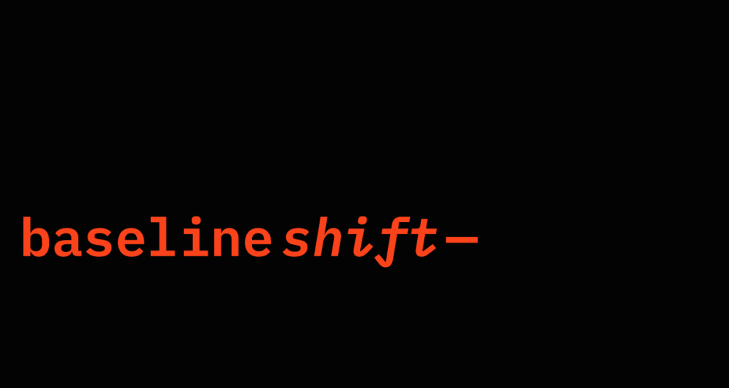
For changes in the branding, I personally worked on creating animations for Baseline Shift’s Instagram story, animations for Baseline Shift’s Facebook posts and an animation to be played on the department screen. All of these you can see below.

Animation I created for Facebook posts.


Spring Term

After organising a plan of action, the team started splitting into roles. We had two main ones: Promotion – two team members responsible for the creating and posting of promotional materials, and Attendance and blog writing – two team members responsible for attending Baseline shift (run on Blackboard Collaborate this year) to run, gather from and document the sessions each term. 

In the spring term I was grouped with another member of the team to do promotion, which meant I had to overlook the designs she created for every weekly event, make sure one of us posted promotional materials on Facebook and Slack (for MA students) on Monday and Instagram story on Tuesday, update the department screen graphics every Wednesday, take down and put away the old posters and print, cut and hang the posters for the new session on Wednesday. 

I also voluntarily handled all speaker contact in the duration of my time on the team which gave me the opportunity to make some lasting contacts within the design industry as well as improve my communication skills. 

Winter Break

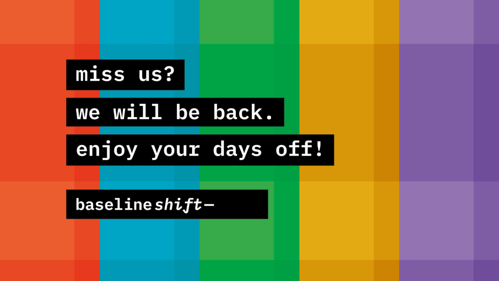
After a successful spring term, the team decided to meet up during winter break to talk about changes in the roles for next term as well as some updates on some of the branding material. We were looking for a new message for the department screen stating that Baseline Shift sessions would be back soon to be played during the break. I worked to create a new message which you can see attached below, however we decided that there was no need for such a message since there was no one in the department during that time. 

Message I created for the department screen.

Second Term

For the second term, the whole team switched roles so that everyone could experience every part of the job, which I believe was smart. That meant it was me and my partner’s turn to attend the sessions and write blog posts afterwards. We decided that at first I would be leading the sessions and taking notes while she would also be taking notes but write the blog posts afterwards which I then overlooked. 

I really liked this role since it challenged my fear of speaking in public, however having all talks online over Blackboard Collaborate made it a bit easier. Also, my camera did not need to be switched on which was great! I even got a few emails back from our guests saying that I had done ‘excellent chaperoning’. 

For some of the sessions me and my partner switched our attendance roles and she was the one leading the session while I had to write the blog posts. To be honest, this role was a bit more challenging but I’ve always had a problem with writing which I also managed to challenge working on this job and even slightly overcome.

Reflection

I really enjoyed being part of the Baseline Shift team and am even sorry that I was this late in joining and was only able to do it for one year. I believe this is a job that allows students to develop a range of skills from design and professional communication to public speaking and writing. I would recommend this job to anyone even slightly interested in developing their professional skills in all of these and other directions as well as to people looking to expand their contacts in the design world.