Category: staff

A July like any other in Reading

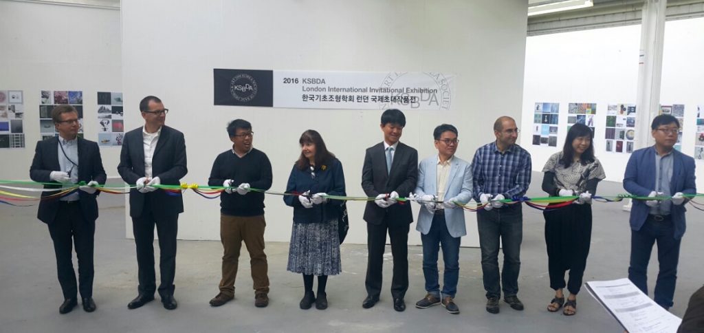
Ribbon ceremony
Ribbon-cutting ceremony in the Art Department gallery.

The Department of Typography did not get the memo that July is supposed to be a quiet period. We kicked off the month by hosting the KSBDA International Invitational Exhibition, its first stop after Seoul, and on its way to Katowice, Poland. The exhibition, attended by members of the current Board of the KSBDA and several past presidents, was held with the kind collaboration of the Department of Art. The visitors had the opportunity to examine material from the Collections in Typography, and discuss their use in teaching.

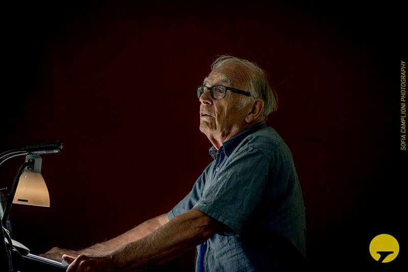
Michael Twyman at ICTVC
Professor Michael Twyman delivering the opening keynote at Thessaloniki.

The second week of July saw many staff, research students, and postgraduates fly off to Thessaloniki, to take part in the 6th ICTVC conference. The triennial event is spearheaded by alumnus Dr Klimis Mastoridis and aligns closely to the research strands of the Department. Several members delivered papers, and Emeritus Professor Michael Twyman delivered the opening keynote.

Monotype celebration
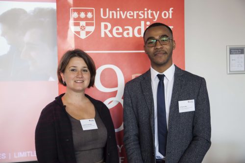
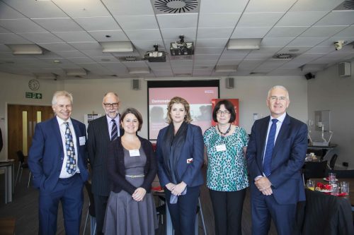
Celebrating the Monotype Studentship, from left: senior designer Malou Verlomme, Type Director Dr Nadine Chahine, the VC Sir David Bell, and Head of Department Professor Eric Kindel.

Back in Reading, we marked the tenth anniversary of the Monotype Studentship, a substantial initiative in funding support for our postgraduates. The Studentship is only one element of our deep collaboration with the company, which stretches from research support to technical training.

Over the two last weeks of July the Department was taken over by the annual TDi summer course. The international cohort (with participants from Bangladesh, Brazil, Canada, Dubai, India, Jordan, Korea, Malaysia, UAE, USA, as well as European countries and the UK) spent long days in sessions led by several members of the Department’s staff and student community, working in our studios, with material from the Department Collections, and personal staff collections. Through lectures and seminars, to hands-on sessions with archival material and letterpress equipment, the TDi provides a unique distillation of key areas of the Department’s narrative on typography and typeface design. Marek Jeziorek documented this year’s course in several albums, starting here.

Typography in Beijing

TDC opening

Soon after the conclusion of a successful visit by students from CAFA to Typography in 2015, we commenced working on a reciprocal visit to Beijing. As it happened, several strands of activity came together to make this an exceptionally productive visit. A short report follows below; the local organisers, led by CAFA teacher Liu Zhao, recorded all presentations for translation and reposting on the Chinese social networks, and microblogged almost every minute of the trip to a jaw-droppingly numerous online audience.

Opening the visit with a more formal occasion, Gerry Leonidas and José Scaglione (Reading alumnus and ATypI president) took part in the judging of the 8th Founder Type Design Competition. The event, held every two years, included for the first time Latin typefaces by Chinese designers. The next day, the winners were announced in the National Centre of the Performing Arts (the “Egg”), together with the opening of the TDC61 exhibition, the Chinese leg of the global tour of the annual design competition; and the opening of the “Chinese Type Modern 1919–1955” exhibition with material from the archives of Founder Electronics on the transition of Chinese type-making across technologies – with clear influence by Reading’s TDi 2015 course, in which Founder staff participated in.
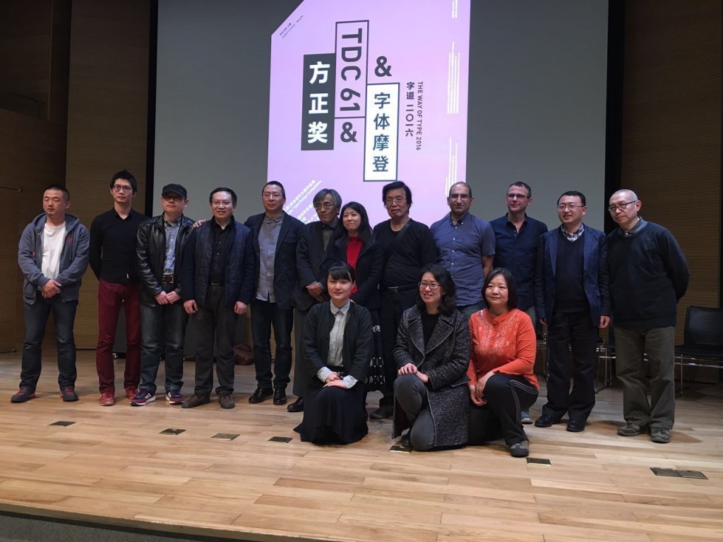
Font Forum line-up

Font Forum conference

The exhibition and competition awards served as the opening events for the two-day Font Forum, a conference on typeface design with speakers from China, Japan, and Europe, to packed auditoria. At the end of each day lively panel discussions demonstrated the interest of the student and professional audience, and the desire for stronger engagement with the international typographic community. (In the sidelines of the conference, plans were hatched to coordinate a BA module on typeface design between Reading and CAFA in 2016–17.)

workshop at CAFA

CAFA workshop

The main part of the visit was taken over by a workshop on typeface design at CAFA. The interest in Latin typeface design is considerable, and the skills of many students impressive. This is a sign of the gradual globalisation of Chinese design education, and the demands by the local professional employers for skills that can serve markets across language and script regions. Although the workshop was primarily focused on typeface design, there was great interest in typographic design, and especially for mobile platforms.
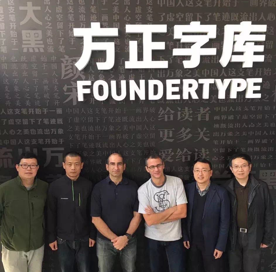
at Founder

Centre for Chinese Font Design and Research

Two visits at the Centre for Chinese Font Design and Research, hosted in the offices of Founder Electronics, focused on design issues in fonts for Chinese, design  tools and processes, and professional training for multi-script design. The second of the visits had very concrete aims, with Gerry orchestrating the localisation of Glyphs (the key font design application) into Simplified Chinese, to enable designers in China to experiment with new workflows.

CITIC publisher agreement

Starting in TDi 2015, Gerry Leonidas guided Liu Zhao to compile a list of books on typography and typeface design in English to be translated into Chinese by CITIC, one of the most prominent publishers in the country. The project is progressing well with many rights already secured, and schedules for the translations and launches in place. Gerry’s involvement in the curation of the series provides the opportunity for the University’s approach to typographic scholarship to be transplanted in a new market in a unique manner. This is part of a wider collaboration between the University, CITIC, and CAFA, with the aim of building up typeface design education in China.

Dongdao Design

Dongdao Design

Despite the timing on a Sunday evening, over 140 designers from Dongdao, one of the largest design agencies in China, turned up to listen to José and Gerry talk about typeface design solutions and studies. The presentations were followed by Q&A sessions and interviews, which will be posted on Chinese social media with subtitles.

p.s. ATypI in Beijing?

Seeing in person the typographically maturing environment in Beijing and particularly the concretely supportive attitude in CAFA convinced José and Gerry (president and vice-president of ATypI respectively) of the importance and timeliness of bringing the annual conference of the type design community to mainland China. They outlined the key parameters of a proposal with Dean Wang Min and Liu Zhao, and explored timing options. Look for announcements through ATypI!
Adobe publishes Bickham Script Pro 3

Bickham Script Pro 3

After several years of development, Adobe published the updated version of Bickham Script Pro, a connecting script based on the examples in George Bickham’s The Universal Penman. The typeface captures the complexity of the style perfected in the eighteenth century by writing masters, making use of a substantial set of alternate letterforms, ligatures, and swashes. Additionally, Bickham Script Pro 3 provides an extended character set that supports the Cyrillic and Greek scripts, as well as pan-European Latin. The typeface makes use of the rich variety of alternate forms in all three scripts, providing an innovative approach to display typography for Greek and Cyrillic.

In a series of blog posts by Sally Kerrigan, Adobe Type introduces  the project, the design and technical challenges, and the international team that contributed. Gerry Leonidas and alumna Irene Vlachou contributed to the project.


Looking at children’s reading books

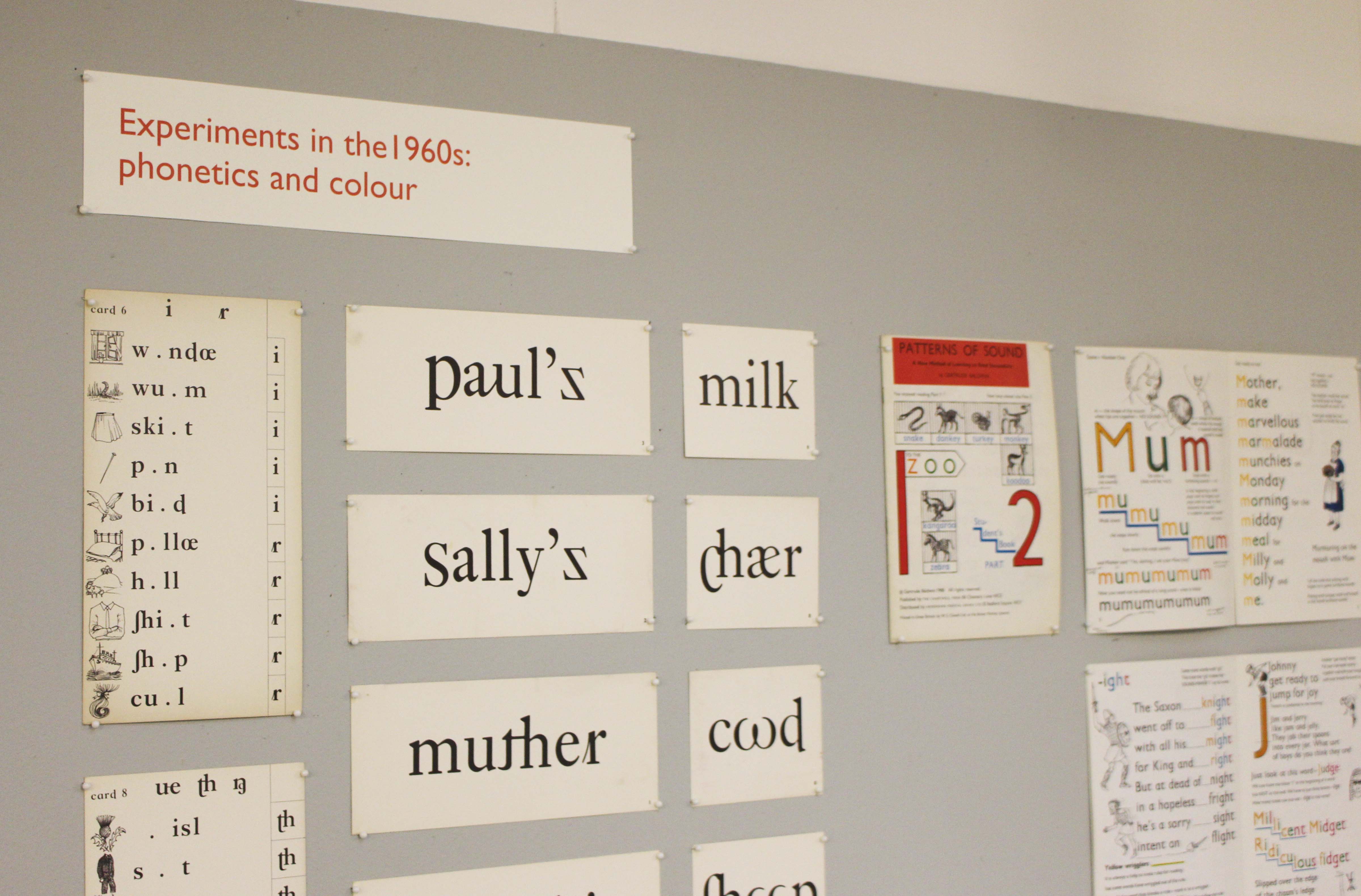
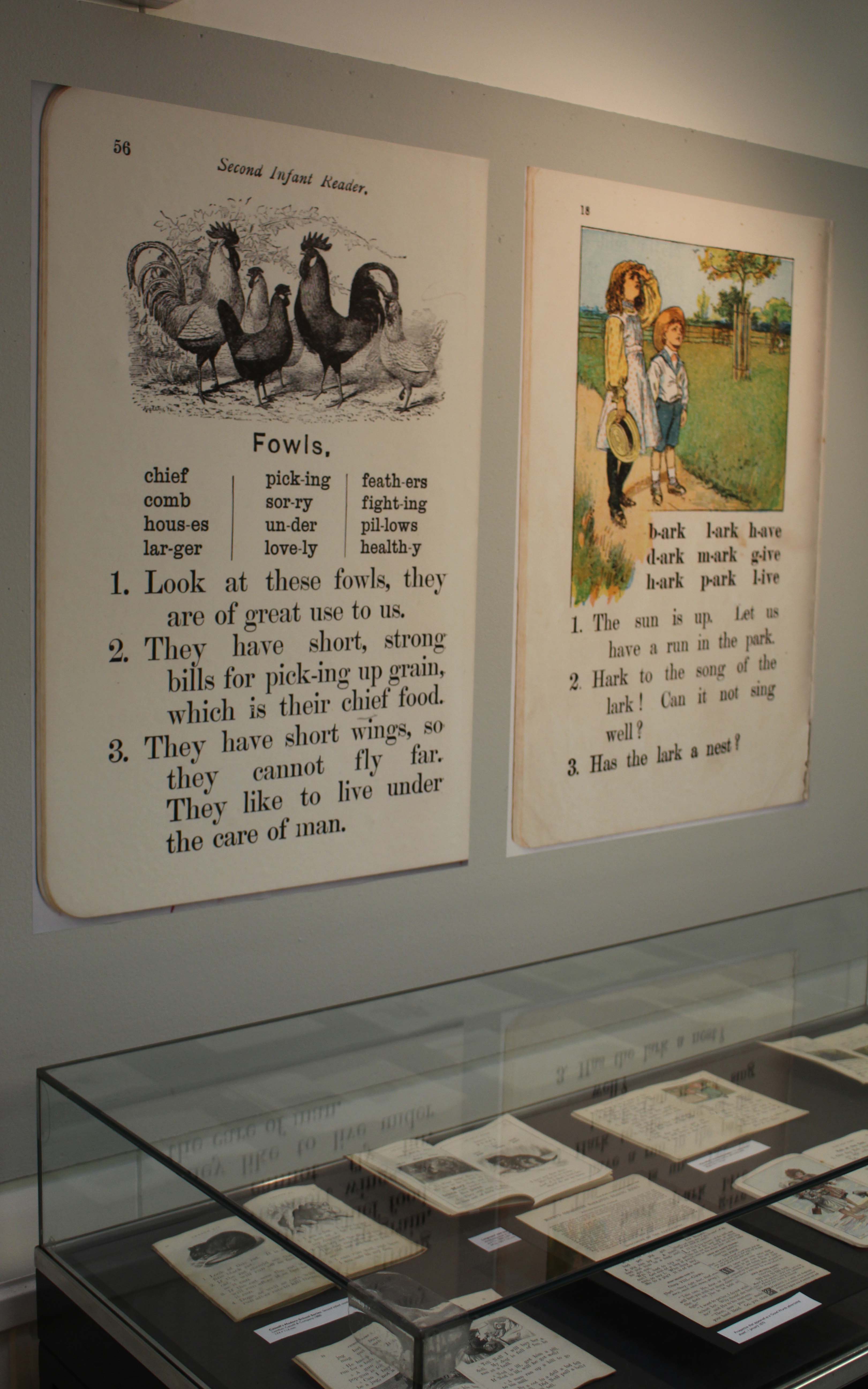
A collections-based research exhibition about typography and illustration in books for teaching reading from the 1880s to the 1960s.


kidsex2

Monday 11 January 2016 to Friday 18 March 2016

Open from 10.00 am to 4.00 pm, Monday to Friday

Department of Typography & Graphic Communication, ToB2, Earley Gate

More information from Laura Weill l.weill@reading.ac.uk

The use of typography and illustration in reading books for children has changed during the last hundred years. There has been a gradual shift from graphic conventions determined by printing and typesetting practice for adult readers to those more appropriate for beginning and emerging readers. Illustrations have become more important and many reading schemes used known artists to create the much-loved characters who featured in the narrative.

kidsex

In the Top Twenty – John Morgan

08_johnmorgan_aafiles-displayinitials
Lists and rankings are great fun, especially if you hit the upper reaches of the charts! That’s exactly what John Morgan, Reading alumnus and visiting teacher on our MA Book Design programme, has achieved in the Wallpaper* list of Top Twenty Graphic Designers. ‘Culture’s go-to art director’ is the way it describes John, picking up on his work for AAFiles, Tate Britain, the Venice Architecture Biennale, HMS Victory, and countless art-related publishing projects. Also cited by Wallpaper* as an ‘influential editorial designer’ is the external examiner for our BA programme, Simon Esterson.

Granshan hits the spot

Jae-joon Han at Granshan

Granshan is devoted to the development of typographic awareness in global scripts, through its annual competition and conference. This year Reading hosted the fourth conference, after Yeravan, Bangkok, and Munich. Over three days, the conference touched on the business of type design, training, support for minority and endangered scripts, the development of resources for complex scripts, and severals aspects of design for global scripts.

Victoria Sarapina

A tight schedule combined a dense pace punctuated by generous break times, to allow for new connections. To celebrate the fifteenth anniversary of the MATD, the first day was devoted to globally prominent speakers who were also graduates of programme.

Adi Stern

Lively discussions followed several presentations, and engaged gatherings continued long after each day’s talks had ended. Feedback for the event was overwhelmingly enthusiastic, creating combination of in-depth but accessible discourse in global typeface design:

The conference included two special events. The first celebrated the Murty Classical Library of India series by Harvard University Press, with a salutation by Tim Jones, and presentations by Fiona Ross, Rathna Ramanathan, and John Hudson. The second was a very special calligraphy duet with Timothy Donaldson representing Europe and Kang Byung-in representing Korea, in an impressively packed studio in Typography.

Granshan calliduel

The conference ended with an after-party organised by the current MATD students. More than twenty countries were represented by speakers, and many more by attendees, underlining the strength and extent of the current network of typeface design.An exceptional AV team produced a liveblog of the conference, and had uploaded most talks before even the end of the conference on the Granshan YouTube Channel.

The conference generated wide coverage and social media recorded very enthusiastic comments by attendees as well as speakers, exemplified by this tweet:

During the closing statements Boris Kochan announced that the 2016 Granshan will take place in Seoul. Follow @GranshanConf for updates!


Reading in Eye’s typography issue

Eye magazine cover

The latest issue of Eye magazine, the international review of graphic design, is dedicated to typography and typeface design. The Department is very well represented in the issue: it includes an extensive profile of Fred Smeijers, long-time collaborator of Eric Kindel on research in stencil letterforms, and past External Examiner for the MA Typeface Design programme. Our graduate Paul Barnes wrote a tribute to James Mosley’s contributions to scholarship in typography, and Gerry Leonidas led Beyond Latin, a panel article on typeface design for global scripts featuring John HudsonNeelakash KshetrimayumKamal Mansour, and Pascal Zoghbi.

‘Time(less) signs’ at Austrian Cultural Forum London

Showcase_1

The exhibition ‘Time(less) signs: Otto Neurath and reflections in Austrian Contemporary Art’ runs from 30 September 2014 to 9 January 2015, at the Austrian Cultural Forum London. It features a selection by curator Maria C. Holter from the ‘Zeit(lose) Zeichen’ exhibition first staged at Vienna’s Künstlerhaus in 2012, supplemented by original material from the Department’s Otto and Marie Neurath Isotype Collection (see image above). As part of the public programme accompanying the exhibition, co-curator Christopher Burke will give a talk on Isotype at the Austrian Cultural Forum on Tuesday 14 October 2014.

See also:

Interview with Maria Holter, exhibition curator

Zeit(lose) Zeichen

Isotype: design and contexts, 1925–1971