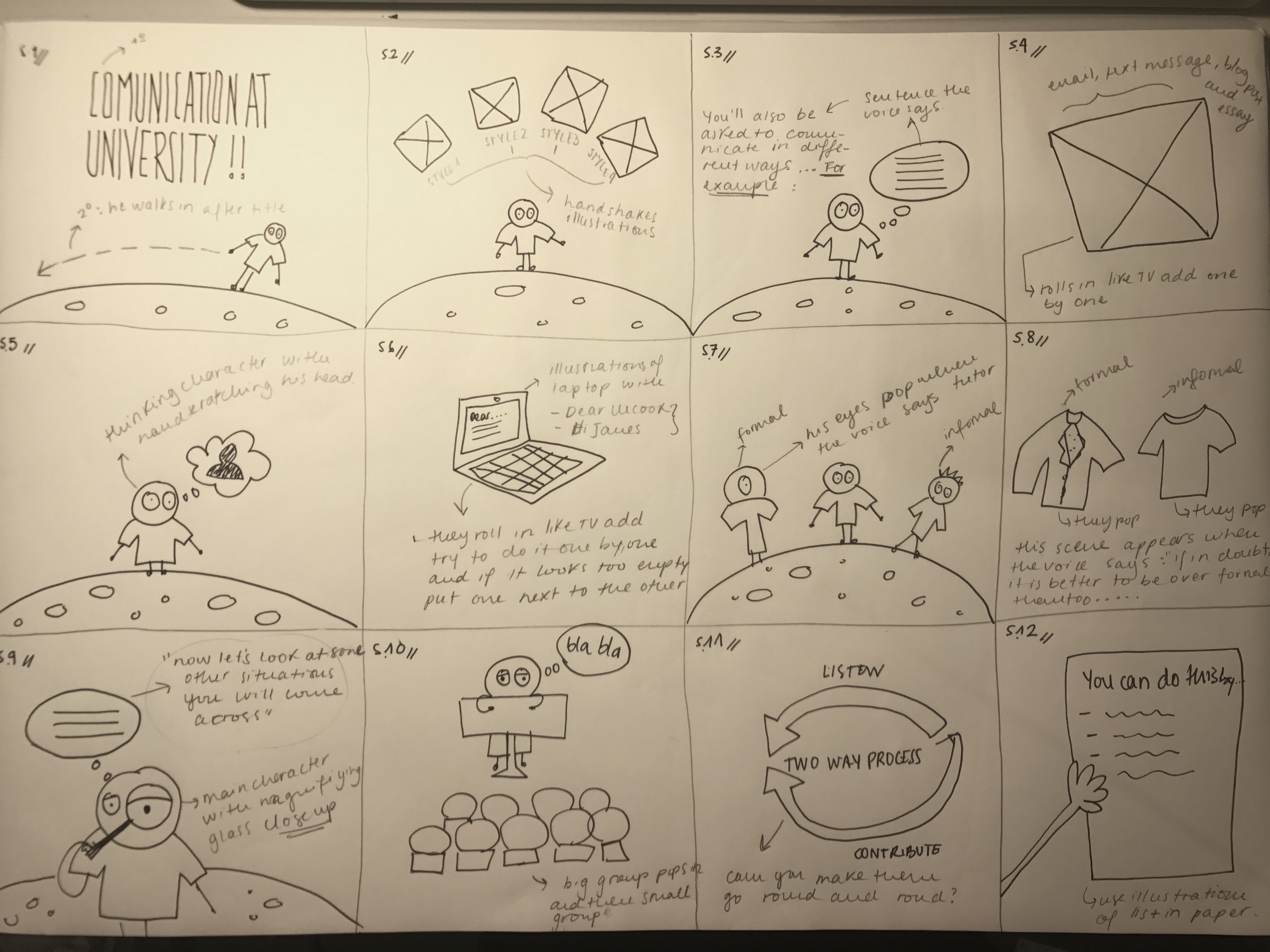
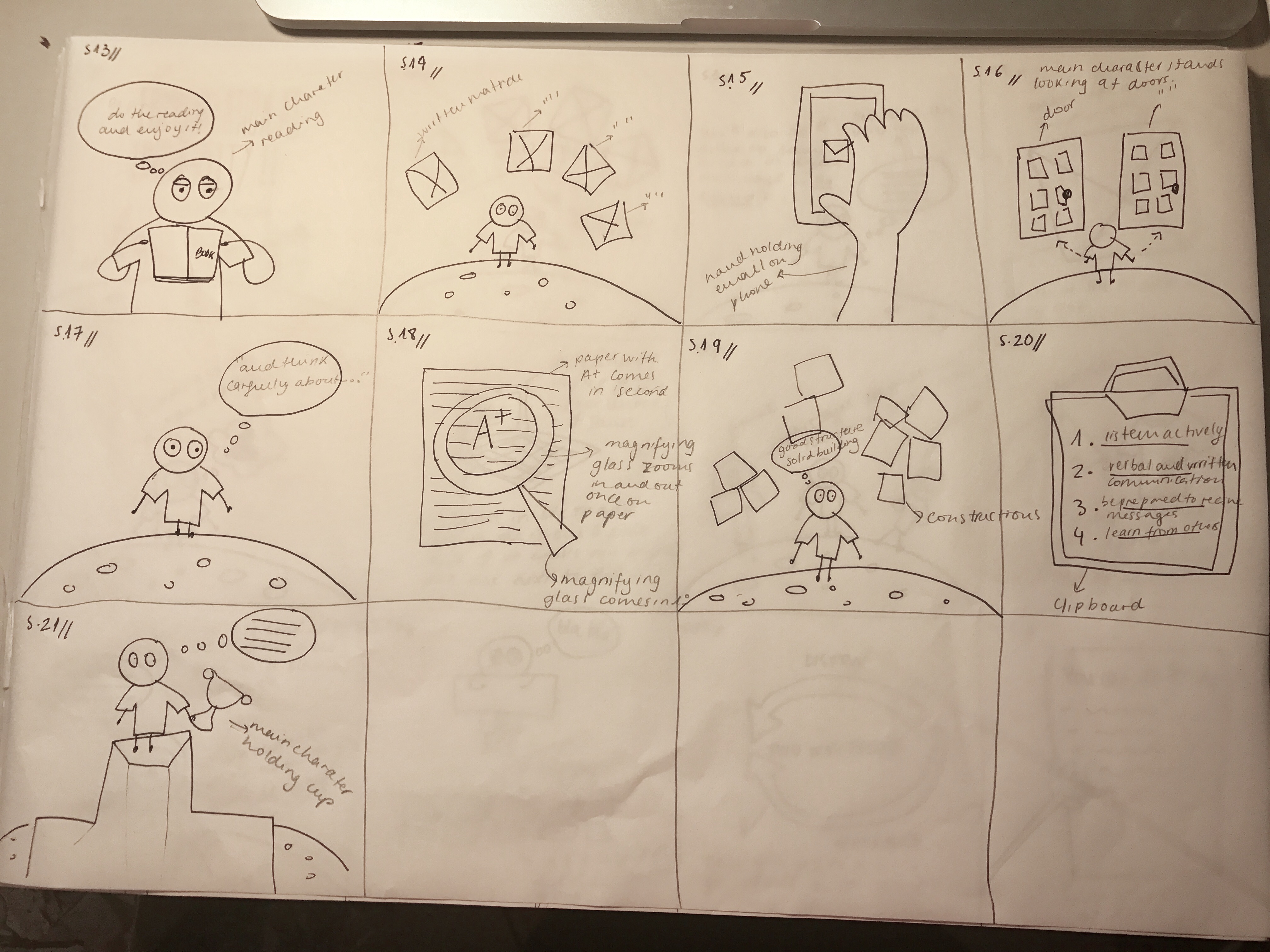
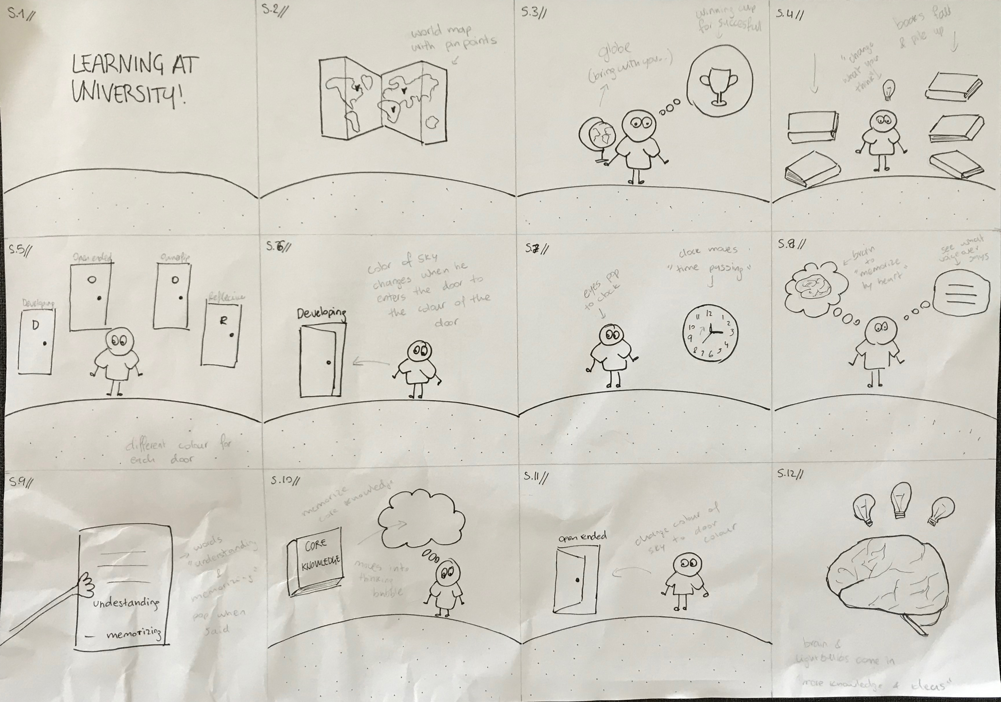
Review of design agencies project write ups
I looked at the way Pentagram structure their write ups on their website and with all of their projects they take a very image based approach, explaining most of their process in the captions beneath the images. I also looked at Designinc who also use large images, however they also feature three short paragraphs under the headings background, approach and results.
The brief
The brief was to come up with a functional clock design (clock face and hands) for the typography department and create a report to explain the design decisions made.
Purpose and function
The clock will be used in the typography department and so the audience is anyone who looks at the time in the building, including lecturers, students and visitors. It needs to be functional, so regardless of the design, it needs to still function as a clock and be fairly legible.
Requirements
The brief was quite open and the client wasn’t very specific. For the project to be a success, the he wanted me to explore lots of possibilities so that I could come to an informed decision on which design would be the most appropriate.
Research
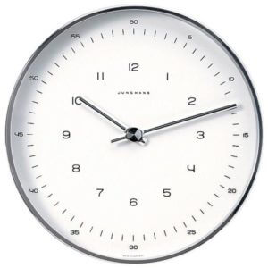
For my research, I looked into clocks designed by Max Bill, in particular his designs for kitchen clocks. I noticed how the numbers on the clock have been updated so that the main numbers represent the seconds rather than the minutes to better suit the purpose of the clock.
Concept
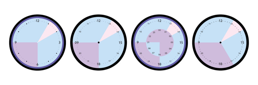
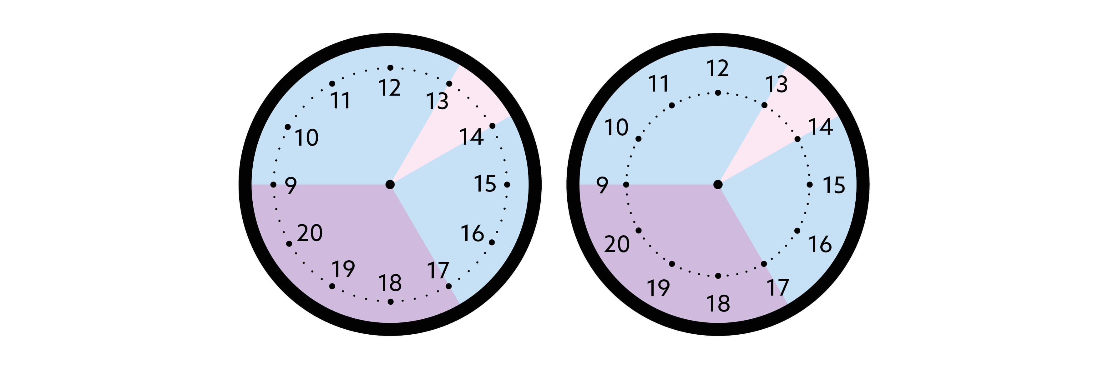
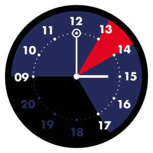
After seeing Max Bill’s clocks, I thought about how I could tailor my clock design to cater especially for the typography department. I decided to segment the hours into sections to show different groups of hours in the day. I began with the department closing hours in purple, open hours in blue, and lunchtime in yellow. Originally I had the opening hours from 9am until 6pm but when I spoke to the client, I was told that it would be better to go with 9am until 5pm as this was the times that the typography department ran lectures and official meetings.
I decided to push the concept further by adapting the numbers on the clock from the conventional 1 to 12. I thought that seeing as the majority of the time people work in the department during daytime hours, it would be more appropriate to use the PM numbers from the 24 hour clock, for example 13 instead of 1. I decided to use the numbers 09 through to 20 (9am until 8pm). I was quite worried to bring this up in the real jobs meeting as I wasn’t sure if it was ridiculous but I actually got some very positive feedback from the idea. I learnt from this that I should explain my ideas with confidence and not hold to see what the feedback will be before I appear proud of my designs. If I appear confident with my design decisions then others will be more likely to believe in my ideas as well.
I considered adding the other un-used numbers from the 24 hour clock around the middle but this became too complicated to read.
Design process
Numbers
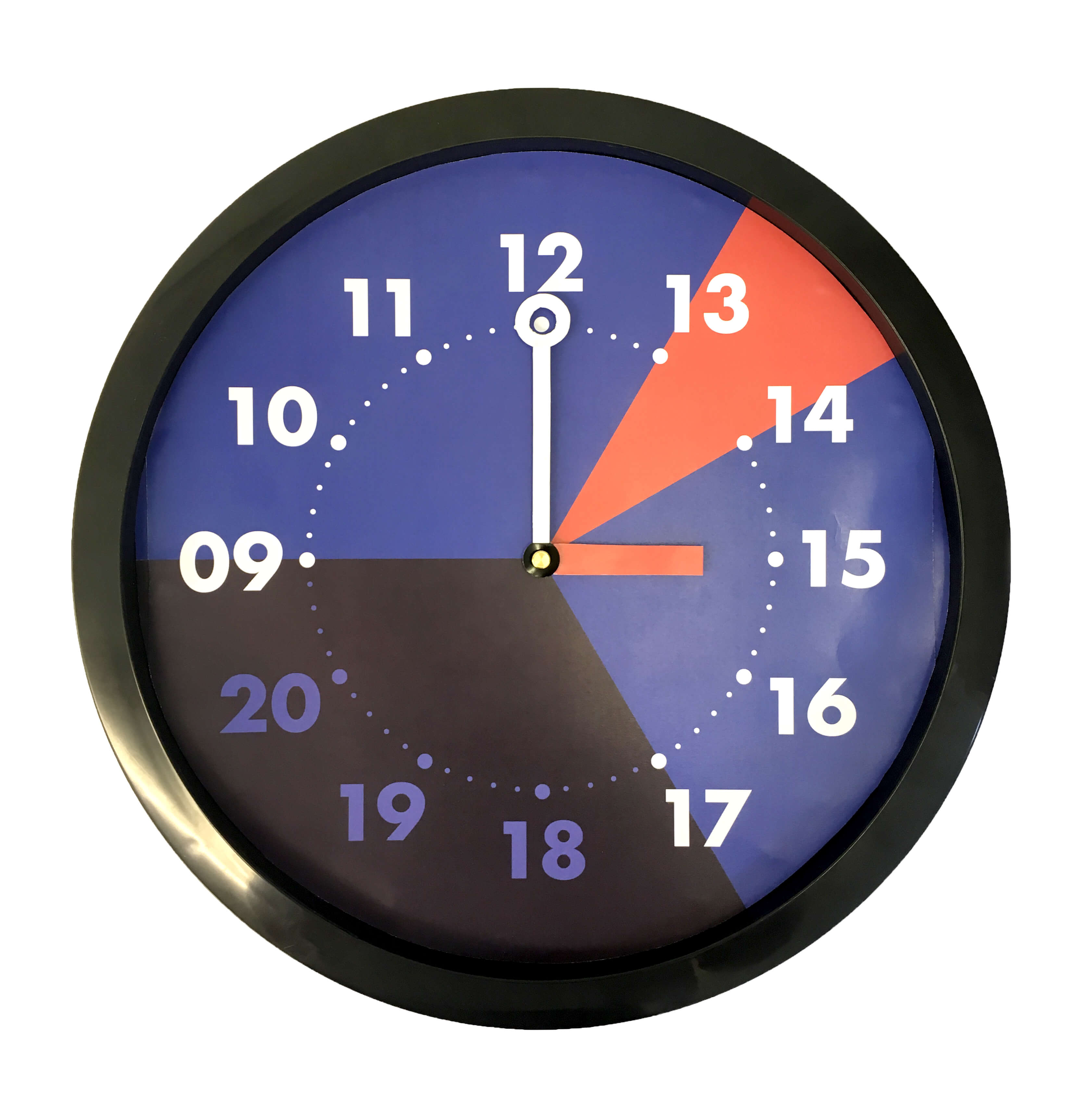
I began by thinking again about the number placement. In my original versions shown above, I had the numbers and the dots all in the same circle. This didn’t work well as in order to fit in all of the numbers, the type size had to be very small. I decided that they needed to be in different circles. I tried the numbers both on the inside and the outside and thought about how the dots and numbers would interact with the clock hands.
I decided that if I put the dots on the inside then I could make the minute hand interact with them. I thought of having a hole in the end of the minute hand so that when the hand moves round, the dots appear through the hole.
My first clock hand design was slightly too thin and due to the length of the minute hand, the two hands look out of proportion. I tried having the hour hand slightly thicker which worked better as it was shorter.
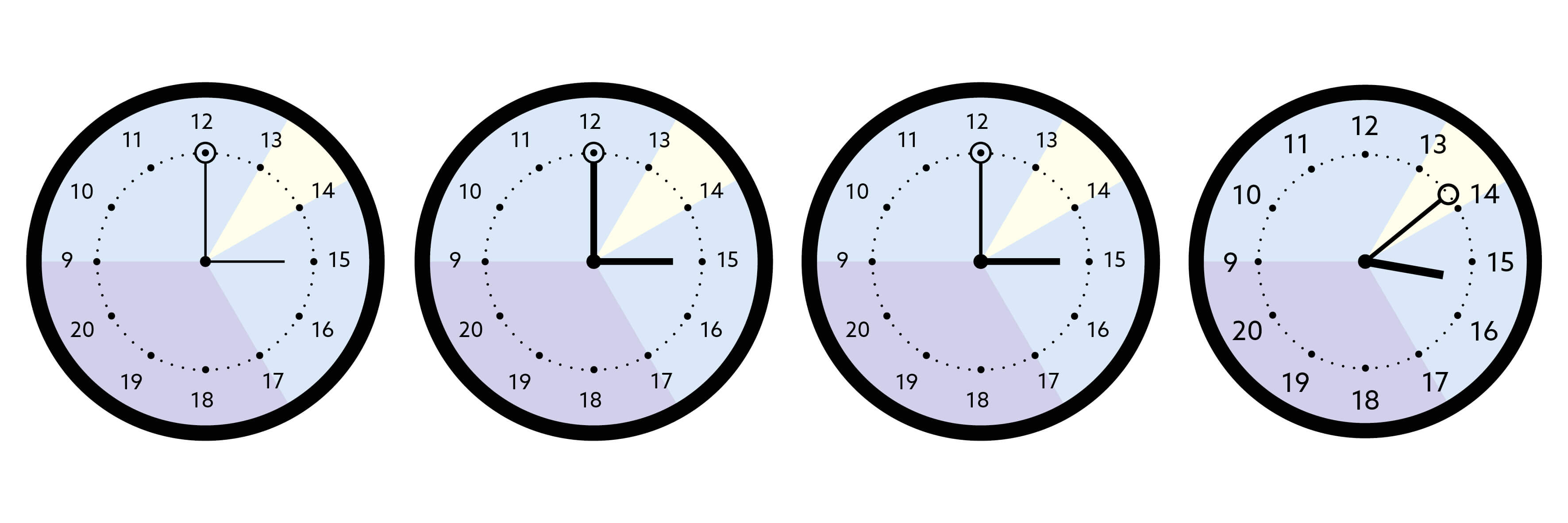
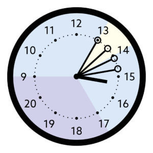
I tested the hand positions at different times on the clock to check that the interaction was smooth at all points. I adjusted the size of the hole so that only one dot would fit in at any one time.
pushing the concept
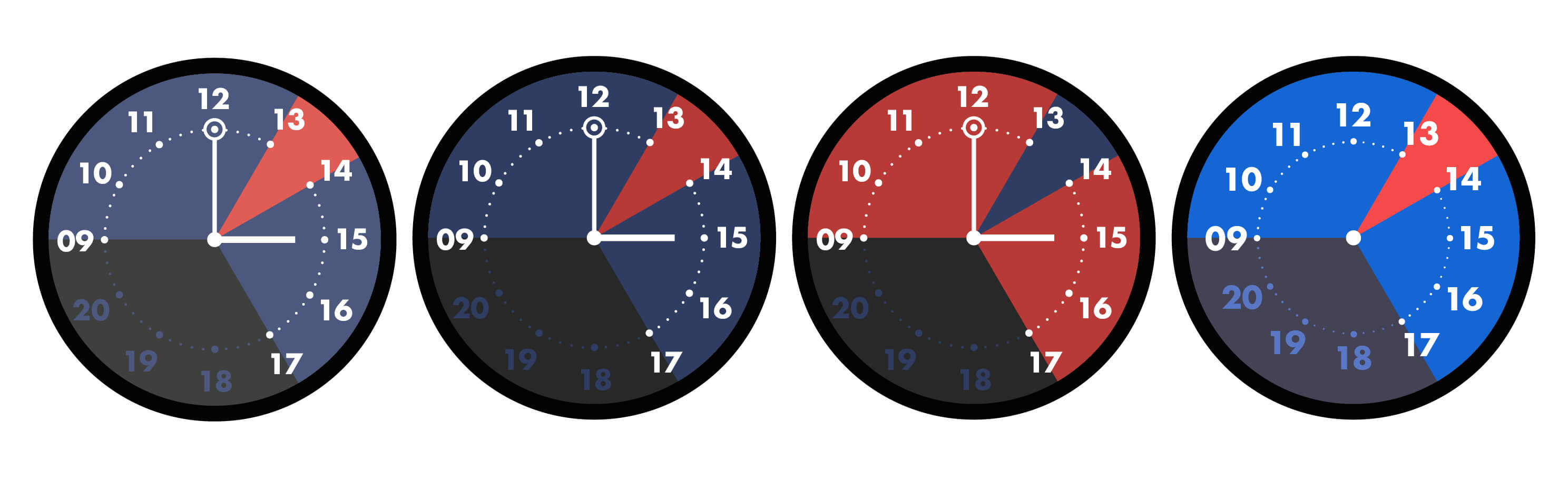
I showed my ideas to my supervisor and he seemed to think that the concept was interesting but thought that I could take it further. He encouraged me to really push the boundaries and think about how much information really needs to be in each segment and how clear it needs to be. In the yellow lunchtime segment, I tried removing the dots entirely to show that there is a break. The continuous, circular flow of dots literally stops between 13:00 and 14:00.
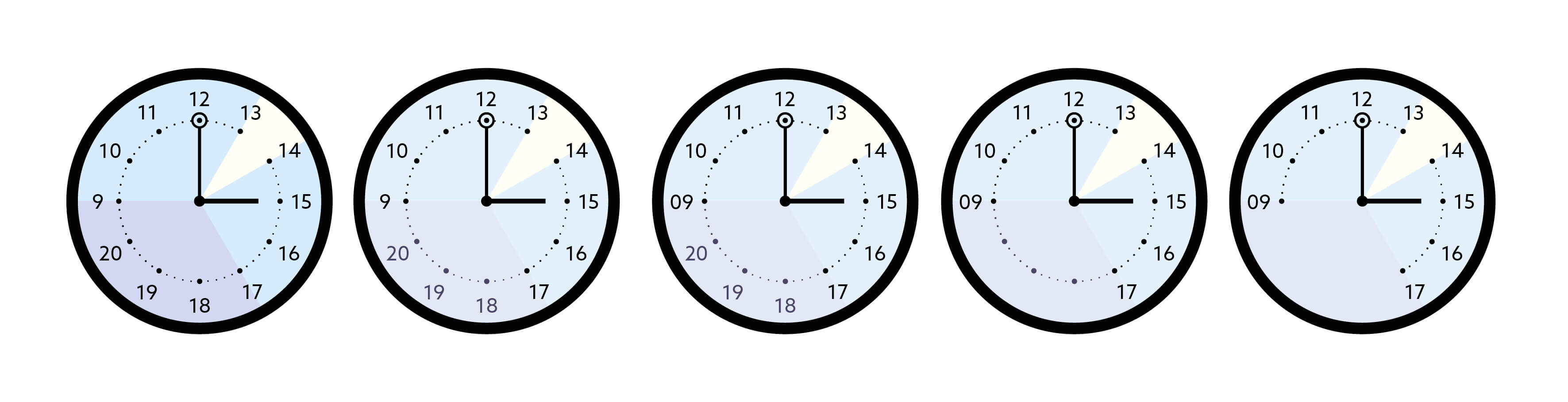
I also tried dulling the numbers within the purple segment by making them a dark purple colour rather than black. This is to push the idea that time is less important in the department between the hours of 17:00 and 09:00.
It occured to me that when we talk about the 24 hour clock in relation to one didget numbers, we usually add a ‘0’ before to clarify that it means AM. Because of this, I decided to change the ‘9’ to ‘09’ to remain consistant. This also improved the spacing of the 9 compared to the other numbers as previously, the single didget was vastly different in width.
I also tried a version without any numbers out of the hours of the department opening hours. I thought that this could still be functional as lots of clocks miss off all of the numbers except for 12, 3, 6 and 9 and there was still enough information to be able to tell the time. I decided however that it wasn’t as clear. I decided that this idea possibly pushed it too far, as although it makes sense conceptually, the brief still claimed that it had to be functional and deleting all of the visual cues did make it harder to read.
Futura research
I was encouraged to look into the typeface Futura and how it was used on clocks. I looked at some examples of clocks that used sans serif typefaces similar to Futura in the 1920s. They inspired me to try both the typeface Futura, and a new colour palette in my work and create something in a similar visual style.
The change in typeface made the clock instantly more legible as the letters were heavier and had more of an impact. The dark colours contrasted well with the white numbers.
Printing
I had to experiment quite a bit with the colour of printing as it always come out differently from what I was viewing on my screen.
Mock up of Possible Final deliverable
I have got to a point with the job where I have created a mock up of my design that I am happy with and am awaiting feedback on my design from the client. There were a couple of difficult things to accomplish with the mock up, for example cutting out the circle on the end of the minute hand.
Communication with client
Throughout the process I maintained regular contact with the client and showed him my work at different points for feedback although the project had a quick turn around. If there was a longer timeframe, we probably would have had more meetings.
This project was made both easier and more difficult because of the freedom I was given by the client. It was easier because he didn’t have a specific solution in mind meaning I could, to some degree, decide on my own concept and make my own design decisions. It was challenging as there was very little direction. I had to come up with my own ideas entirely and as long as I explored lots of options, the client was happy.
Overall
This job really developed me as an independent worker as I had to think creatively on my own, yet still satisfy the client. Overall, the project ran smoothly. I think if I started the project again, I would begin by printing designs at scale earlier as I learned more about the size and arrangement of elements once they were fitted into the frame than looking at them on screen. Having never done any clock design before it was an interesting job to work on. I have realised over the process that there is so much more to clocks than meets the eye and there are so many more possibilities than I initially imagined.