Our Client
Mrs Myrtle is an independent events company based in London, a small business enterprise which offer their clients a styling service for premium events. Each private occasion is tailored specifically to the requests of their clients, based on their specifications and requirements for high end events. The company was established by Jenny Hodges, who is also a stylist at Fabulous Magazine in London. Her company specialises in meticulously planning the intricate details of memorable experiences. The predominant quality of the company is their ability to source the best materials in order to produce the finest possible outcome for their consumers. This what gives the company a distinct identity and separates their work from other competing companies that provide a similar service.
Bespoke Works
As our portfolios are distinctively illustrative and hand-rendered, they demonstrate a confidence in the creation of imagery and lettering produced by hand. Our skill set indicated a correlation with the company’s ethos of fine, high quality, handmade features/props to be commissioned for private events. The client was looking to employ individuals who could produce typographically lead, illustrated signage. Upon the initial communication with the client, she emphasised how much she valued the commissioning of bespoke artwork, made directly by hand. We immediately felt an enthusiasm for this project as the client made a direct acknowledgement of our abilities and showed an appreciation for the skills required; she recognised this artistry is a rarity.
Deliverables and Specifications
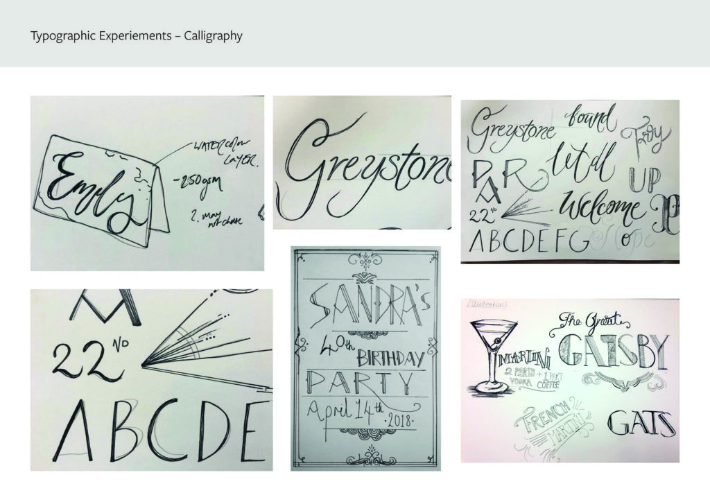
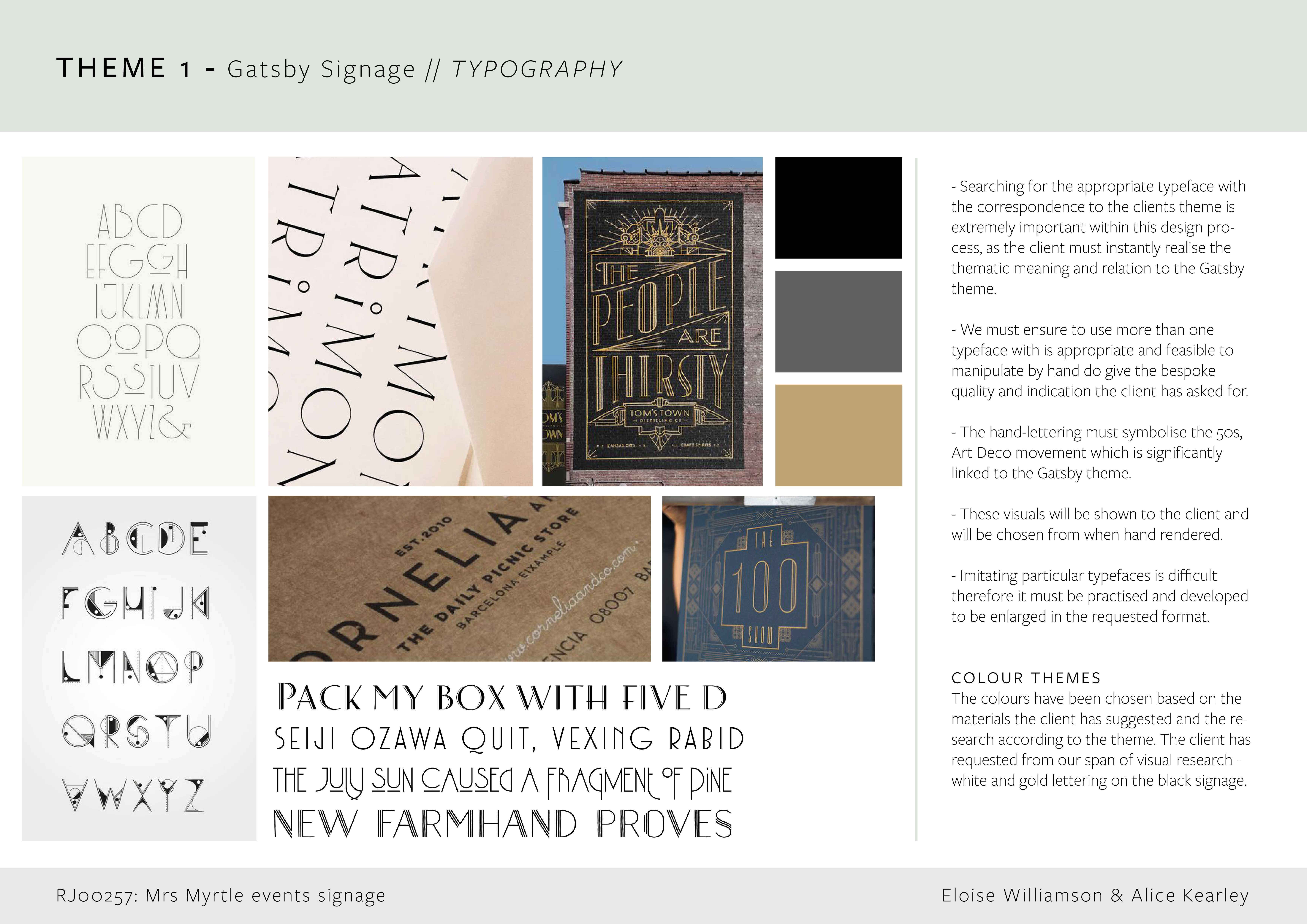
The client requested two A0, tailor-made signs for a Gatsby event, and a Vintage American event. This bespoke service was requested by Jenny’s two clients and encouraged by herself and her team. This type of sign is an immediate affirmation of the premium events that the clients are investing a significant amount of money into the production of. The client and ourselves shared a common understanding that a digitally produced sign would not have the desired effect. The company wanted a hand-lettered display illustrated to reinforce the theme of each party. The clients wanted an integrated composition, they were particular about the standard of calligraphy required to be drawn free-hand for each sign. After our initial first meeting we returned with inspiration boards based upon the content they required. This outlined the typographic distinction of each colour theme and appropriate iconography. We also presented the client with a number calligraphic experiments in order to develop our skills in this field of hand-lettering.
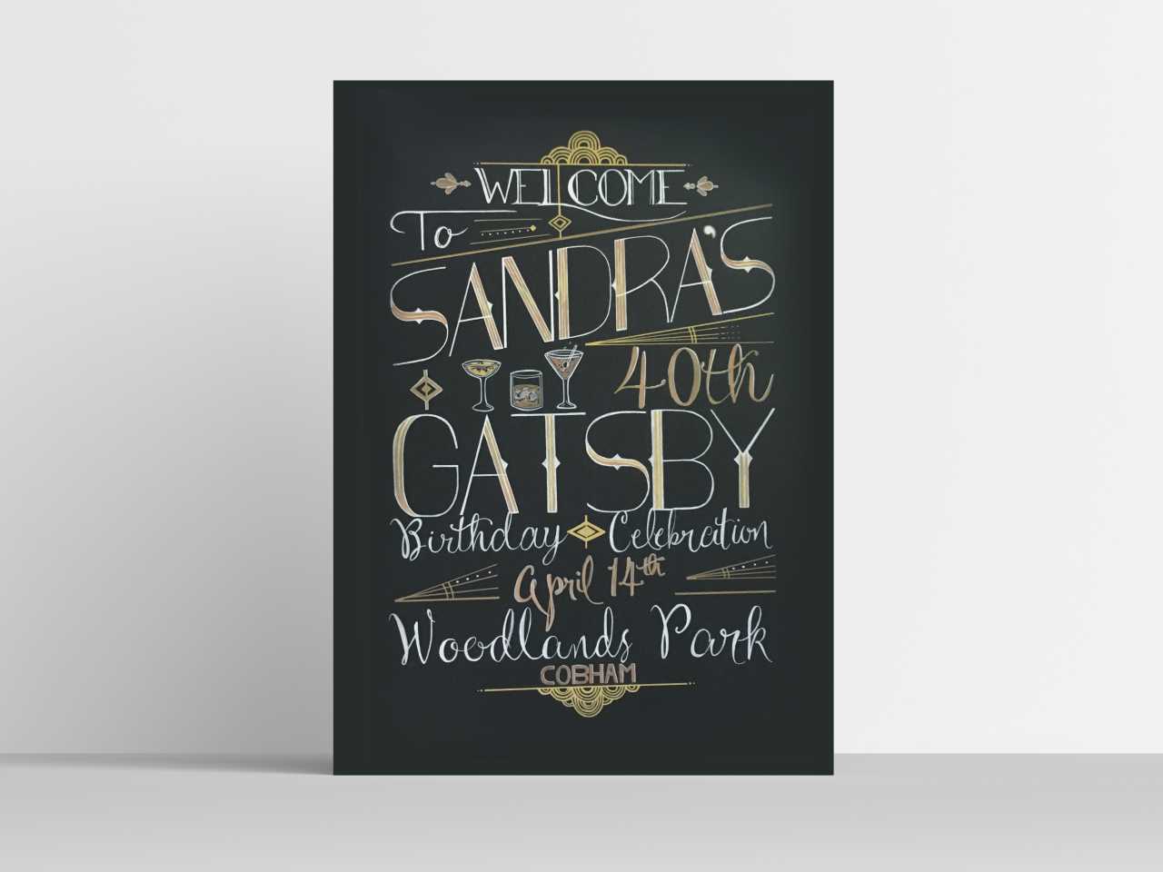
Alice Kearley – Deliverable 1 – Gatsby Sign
Design Features
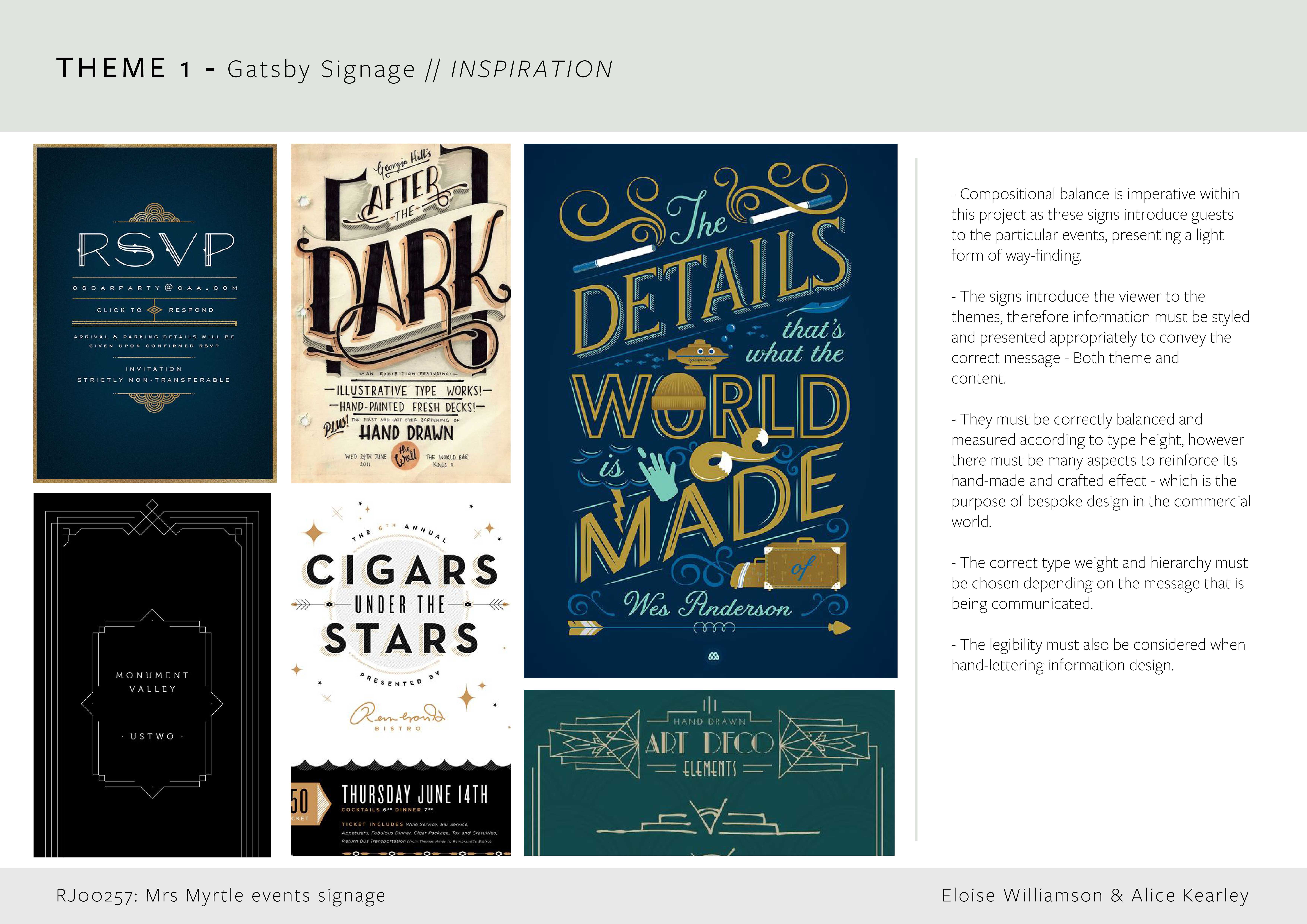
The client specified that she wanted the typographic elements of this particular sign to be decorative with large capitalised text and the smaller copy in the design to be written in a hand-written calligraphic style typeface. This sign combined both vintage, but specifically 1920’s typography indicative of the art deco style; though the client had an idea of the visual effect she wanted to portray, the final decisions about the design of these typographical features were left up to myself to design an overall outcome that replicated a 1920’s style cinematic typeface. These typographic styles are reminiscent of the art deco and art nouveau posters from the 1920’s and 1930’s. The thought-provoking aspect of this project was to replicate this style of writing but through a hand-written format; the client and I discussed particular features of this design, as the art deco style typefaces come in many different variations with a number of varying letterforms. She wanted the lettering to be similar to a style we found together through our research, this style of typographic treatment leant towards a more art deco style, specifically with decorative letterforms. I achieved this result by carefully choosing the placement of the lettering of the signage; it was incredibly important that the design featured an asymmetric layout, evocative of the art deco film and cinema posters of the 1920’s. The content of the design featured several different challenging elements in terms of the copy. The client specifically requested the information she needed the sign to include, and this was decision was mine to make about which typographic treatment would be allocated to more important information on the sign. Despite carrying out a fair amount of research into different styles of art deco typography, I did eventually create my own style of letterforms that consisted of a combination of these typefaces; this was not my intention, however the result was just as effective. The client explained that the design would be presented at the Woodland’s Park Hotel, Cobham. The location of this event was a sophisticated, high-end event, therefore it was appropriate to present the artwork in a gold decorative frame, supported by an easel. The client also made it very clear that the purpose of this signage was to function as a welcome sign to guests arriving at this event. Presumably as the guests were all familiar with the Gatsby theme, therefore the typographic details of this sign played an important and significant role in the idea of the event itself.
The Client’s Request for Copy:
- ‘Welcome to’
- Sandra’s 40th Gatsby Birthday Celebration
- Illustrations
- 14th April
- Woodland’s Park Cobham
- Additional decorative features
Production
The production of this sign was the most significant learning curve for me, in terms of learning how to produce a sign using specific materials, and practising the techniques of free-hand, bespoke calligraphy on such a large scale. It is fair to say that the production of this sign was challenging in some ways, and certainly required thought, practice and preparation. As the designer, I ensured I had thoroughly planned how I would begin this making process, so that I was able to produce a final result to the best of my ability; to a high standard suitable for the client’s high quality demands. The most challenging area of this production was to calculate the measurements for the each part of the text placement. Having discussed this layout with the client, I was aware that she wanted certain elements in the sign to be more significant than others. For example ‘Sandra’s 40th Birthday, Great Gatsby’ would be the most prominent text in the sign. I began by planning out a very rough sketch of this layout in an A4 format, and then from this calculated how much I needed to increase the text by in order for it to fit onto the A0 sized sign. This did work successfully, and I realised that this was an important stage in creating a balanced layout where the scale of each letter was increased accordingly. This step meant that less errors would occur later in the process when transferring the calligraphy by hand onto the sign. This planning process gave me a clear idea of the scale of each letter, so therefore I could plan the placement of each word onto the sign. The writing process was certainly the part that took the most time. Though I had decided which styles of typography the client wanted, I had to write this perfectly onto the board – this ended up being a very trial and error process but luckily as I had practised these skills before producing the final outcome, I managed to create this hand-lettering correctly the first time. Lastly, I decorated and finalised the design by using my illustrative skills to produce my own drawings of 1920’s cocktail glasses. This supplemented the design of the signage and finished the overall result very nicely. Overall, I feel that the experience was incredibly positive and I learnt a great deal not only about my skills in calligraphy and illustration, but perhaps more importantly the benefits of preparation and planning. Gaining as much knowledge as possible about our client was definitely one of our strengths, we ensured that we formed a good relationship with the client, and kept a continuous level communication with them.
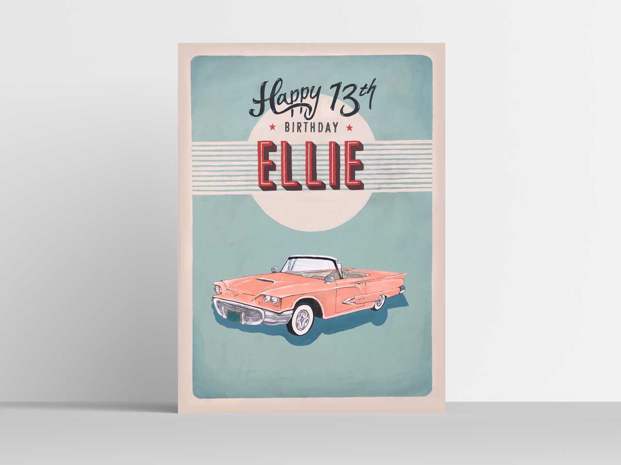
Eloise Williamson – Deliverable 2 – American Sign
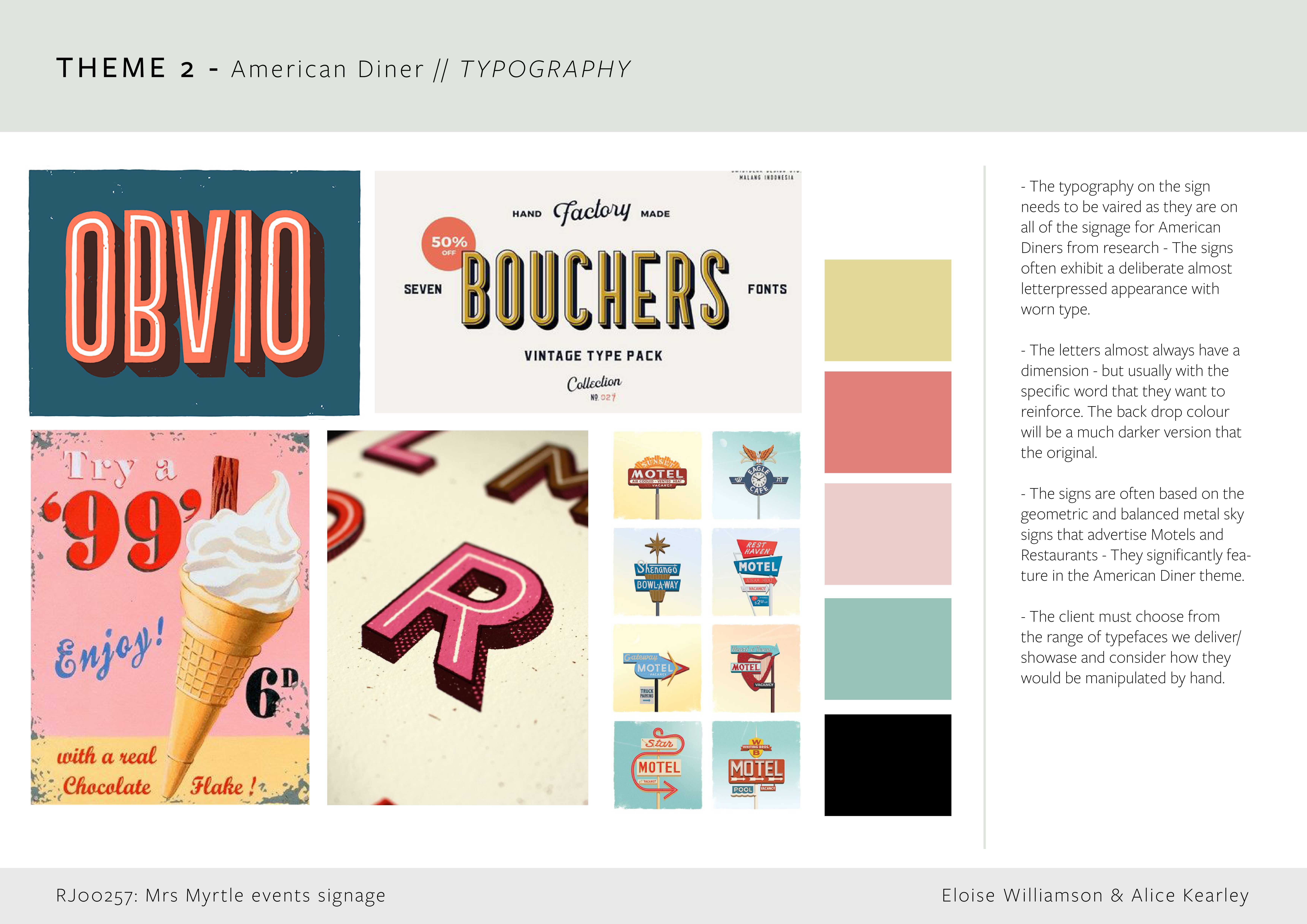
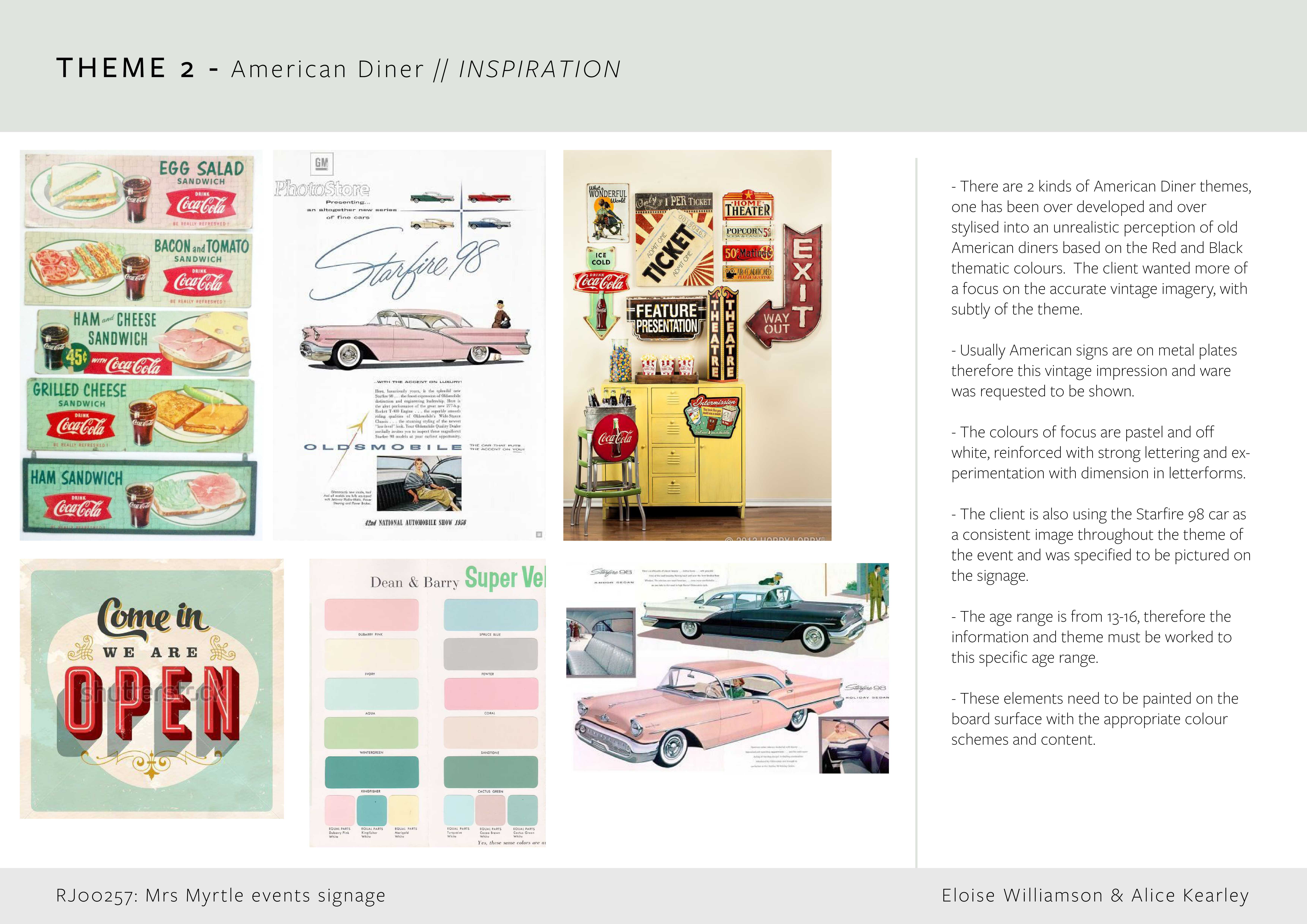
The American sign was to be situated at the front of the SO Bar in Richmond, London, where the event was to be held, as an immediate indication of the themed party to potential audience members. The sign wasn’t defined as wayfinding, but to brand the event within its theme, using the provided content styled appropriately to imply its message. Upon the first meeting with the client, they specified to what extent the sign was to be hand-made, as the quality of its creation and the consideration would also define the premium expense of the event. As the events theme included extensive use of colour in addition to its bespoke qualities, the client specified the design was to be hand-painted in addition to the use of calligraphic markers. This requirement was an exciting change, yet daunting and challenged my illustrative abilities. The client composed the layout design to be based upon my inspiration boards as proposed in the second meeting, the sign would imitate the impression of a vintage metal American signage, which was framed with a circular and striped structure to hold the lettered content. There would be three typographic distinctions which would organise the information, ‘Happy 13th’ ‘Birthday’ and ‘Ellie’, each typographic choice was outlined by the client and varying in the dimension of each letterform, a characteristic of American signage and design. The colour themes were decided upon, based on vintage pastel colours and off white with the Starfire 98 car, fully illustrated on the sign as a reoccurring iconographic feature throughout the event. As the event catered for a younger audience, the client required the design to be almost naively considered and illustrated to conform to the likes of its audience. Typography which indicates American thematic qualities derive from letter-pressed type which have worn surfaces and geometric LED type which are metal sky signs advertising Motel or Diners, this was research I considered throughout the process. The dimension of the typography is often indicted by a darker backdrop colour to reinforce the most important content and in this case, it was the name ‘Ellie.’ The compositional space was also a consideration to allow for the information to be legible and read without being overwhelmed by unnecessary content. The materials were sourced by myself as singular emulsion colour paints, the A0 board and the varnish enamel finish. These materials were considered to ensure the sustainability and professionalism of the signage. There were additional attributes that had to be organised and left to our responsibility to complete the outcome the client wanted to achieve. The vintage easel was located and hired from a props company, which I had to fix together per to the sizing of the Gatsby artwork to sit upon, in addition to applying a finish to the wood surface to look additionally worn as the client wanted it to fit in with the vintage style of the event (this adjustment was first allowed by the props company). I located the ornamented frame for the Gatsby sign which I sprayed gold with a varnish finish/enamel for the Gatsby sign to sit within. Additionally, a smaller clapper board was required to be made and illustrated for the American Signage
OVERVIEW:
While the style of this signage wasn’t my personal preference, this artwork was produced to meet exactly what the client had required using the specific content specified. The chosen typographic styling, colours, finish and naivety was catered to its younger audience and to meet the specific personas of this project.
The Clients specifications:
– A fully illustrated sign using the given content
– Well composed execution of information, without overloaded information.
– Appropriately styled to the required theme
– Well executed bespoke hand-lettering and illustrated design
– ‘Happy 13th Birthday Ellie’ and Fully illustrated Starfire 98 Car
– Hand-painted as required (due to this quality the events company’s clients were paying for)
– The varnish enamel finish
Client Feedback
The client contacted me via a previous client, admiring my menu designs and signage for another company, I have also produced work for her as the sign designer of her company over the summer of 2017. Due to the short turn around, a concentrated amount of work was undertaken to complete the signage to client’s requests and specifications for each event deadline. Although this isn’t best for us as busy students, it is of the interest of the client for us to work to their requests. The events company was extremely pleased with the outcome of the signage, impressed with the hand-painted outcome and typographic stylisation. Their clients were also sent the sign and got in contact with a great response to my final work. I have been allocated 2 upcoming design jobs with the same events company following shortly and the possibility of a regular position designing with them. Overall, a very positive response to my artwork.
Final Deliverables
Vintage Gatsby Blackboard Sign
Vintage American Sign
Alice Kearley & Eloise Williamson

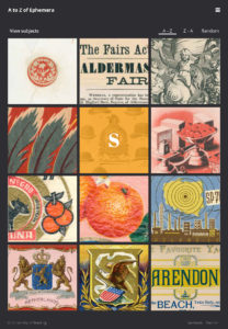


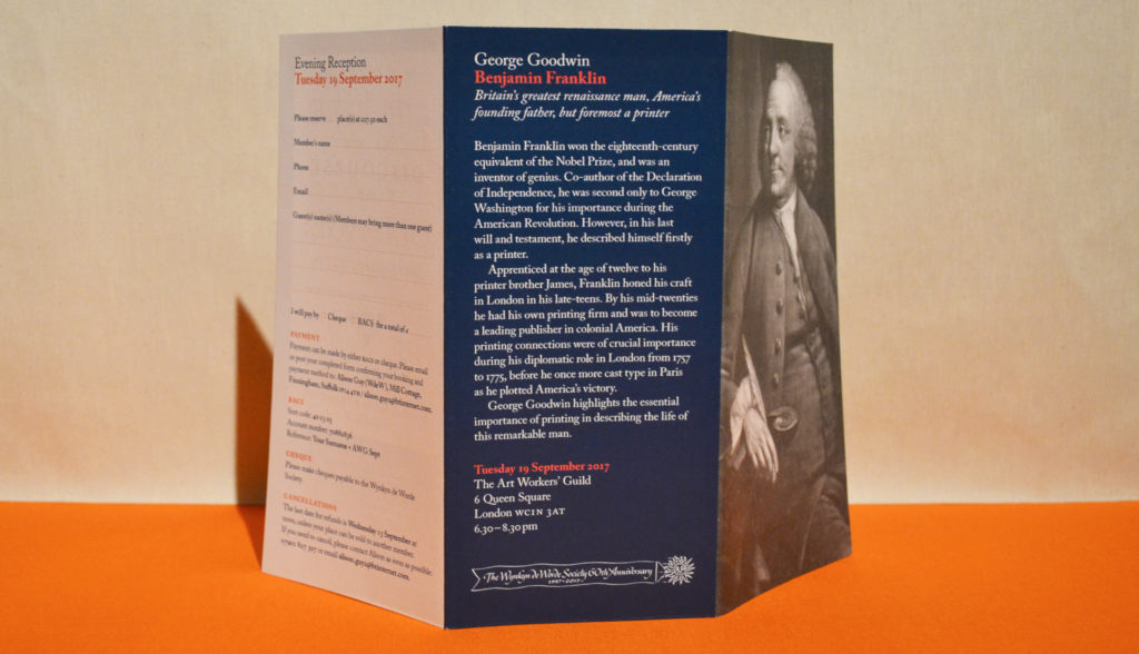
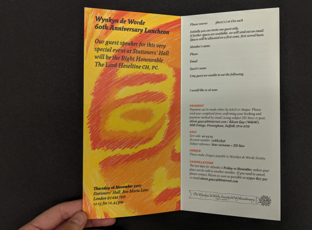
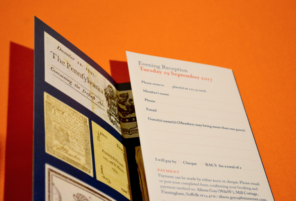 This was integral to appealing to an audience with strong and varying design taste. The cropping of images, not too loosely or tightly, was important when designing the form as it helped to retain the shapes of the objects in the images, but not to compromise the structure of the layout. Editing the levels in the images made them to print well on the paper.