
Background information
National Youth Guitar Ensemble (NYGE) is a charity which develops talented young classical guitarists in the UK by offering them world-class coaching facilities and the opportunity to play with other like minded individuals in ensembles.
TY3BP
As a group we had previously worked with NYGE in the TY3BP module. At the end of this module we presented them with a new campaign and brand identity. After this module was over, NYGE then approached us to ask if we could refine certain deliverables for this module in the form of a real job.
Restated brief
The brief was to create a set of illustrations for use in large scale print projects alongside an animation to be shared on social media as part of an upcoming campaign to encourage individuals to audition to join NYGE.
Process
During our initial meeting with the client we discussed target audience of the campaign and the message that they wanted the overall campaign to create. The client had also prepared an initial storyboard for the animation. We discussed this material in depth to make sure that we all agreed this was the right direction to take the campaign in. One area of particular importance was the length of the video; as the video would primarily be shared on social media it was important to make sure that the video was not too long (no longer than one minute). Ironing all the details out in the initial meeting was extremely crucial to the success of this project due to the tight turn around that the client needed for the final deliverables.

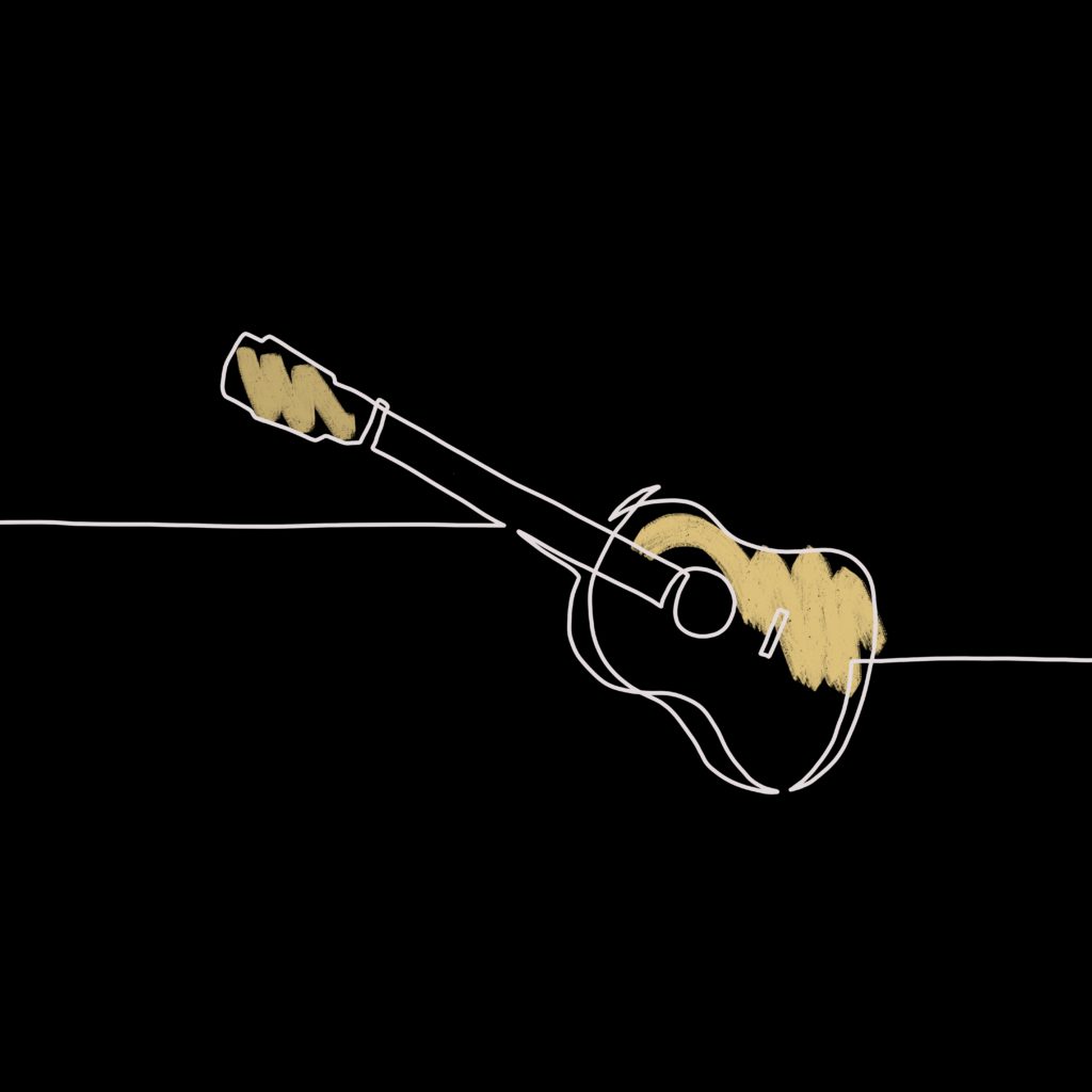
During this meeting the client had told us that they wanted us to pursue the existing style that we had established in the TY3BP module. As seen in the above photo this style used one continuous and fluid line to create an illustration. This illustration style was decided upon because we agreed with the client that this style helps showcase the dynamic composition of classical music.
After our meeting we had a discussion with our project supervisor about our meeting. It was mentioned by our supervisor that we should look at modifying the illustrations so that they can sit on top of a black background. The reason for this was to create a more classical feel which ultimately would better reflect the type of music that is played by NYGE. Carmen then mocked up an illustration to present to the client to see if they would be happy with this approach.

The feedback received from the client was extremely positive and they wanted us to pursue this slight change in artistic direction. Carmen then produced more illustrations which would match with the concept of the storyboard we had. The set of illustrations use continuous line drawings to complement the dynamic composition of classical music. The fluid movement of this line can also be associated with lines used in the brand identity which work as a reminder of the guitar’s strings. The colours used in the illustrations were taken from our secondary colour palette. The background of the illustrations was made black in order for colours and the outlines to stand out.
These illustrations would form the basic skeleton of the animation which would be produced by Cecilia. Once the illustrations were approved we started the animation process. As the illustrations are all done following a single line style, they were animated in order to give the impression of a moving line creating different shapes and figures. This made the video very dynamic and active, captivating the audience with curiosity of what the line will create next.
This continuous line effect also resembles the strings of a guitar. This process was made on Adobe After Effects, which allowed us to control and set the timings for the actions in order to give the viewer enough time to read the information displayed and appreciate the story the video tells.
The client had also requested that they would like the illustrations to be vectorised and made print ready so that they could easily be produced in large scale formats (A1 and larger). As the software used by Carmen could only produce RGB bitmap images it meant that the illustrations had to be converted into a vectorised CMYK file in order to be print ready. To do this Joseph had to trace over each illustration in Adobe Illustrator using the pen tool and convert the RGB colours to their closest CMYK match. Three versions of each illustration were created within the illustrator file:
- One version featured the original drawings as a set of strokes with the pen tool. This was needed so that the client could tweak the illustrations in future if necessary
- One version with expanded strokes and no colour. By expanding the strokes in illustrator the client now had a set of illustrations which would maintain the correct stroke width when resized.
- One version with expanded strokes and added in colour

With the deliverables nearing completion we presented the work to the client. The client was extremely happy with what had been produced however some slight tweaks were needed to both the illustrations and the video (such as small copy changes).
Final Outcome
Below you can see the final video and illustrations that were produced and handed over to the client.

Reflection
As a group we feel confident about the outcomes of this project and we believe it was a success. We received extremely positive feedback and they were extremely happy with the end result.
The quick turnaround of this project also highlighted to us all the importance of communication (as a team and also with the client). To start with there was a lack of communication between causing slight confusion over the date of deliverables, however this issue was quickly sorted out. From then on we provided the client constant on updates on the project. By maintaining good communication with the client we were able to better understand their needs and advise them on different design decisions.
“I really feel that your end product is innovative, eye-catching and perfect for our target audience.” – quote from the real job client!
Group members and roles
- Carmen Martinez-friele – Illustrator
- Cecilia Fraticelli– Animator
- Joseph Cooper – Artworker