Brief
To design print materials for an exhibition hosted by the classics department at the University of Reading entitled From Italy to Britain: Winckelmann and the spread of neoclassical taste.
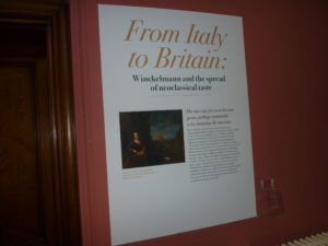
This distinguished exhibition was part of a two-year international celebration (2017–2018), of Johann Joachim Winckelmann, the ‘father’ of classical art archaeology and promoter of neoclassical taste in eighteenth-century Europe. It explored Winckelmann’s work and influence in Neoclassical Britain and in particular Reading (epitomized, for example, in Soane’s Simeon Monument in Reading’s Butter Market), as well as publicizing Reading’s Special Collections.
Deliverables
- An A4 trifold exhibit leaflet (in the form of a handlist of exhibited objects)
- Exhibition panels, A1 & A0 (in width)
Challenge
The turn around for this project was very tight because I inherited it from another student at the eleventh hour. I had only a few days to design the materials in order for them to be printed in time for the exhibition launch. I was galvanized by the time constraint; there was no time to procrastinate or come up with multiple solutions: the design simply needed to reflect the neoclassical subject matter and be pleasurable to read.
Handlist cover
The image supplied for the cover involved a semi-nude woman brandishing an oversized tambourine above her head. The tall proportions of the figure translated well to the narrow page format but the image required careful scaling and cropping in order to satisfactorily display fine details, such as the folds in her drapes, while also avoiding collisions with the type. Beyond merely avoiding collisions with text the ‘dancing woman’ gracefully interacts with the exhibition title (note the way the right hand cups the second line of the subhead).
Hickson_S_Winckelmann_handlist
Typeface
Using a neoclassical typeface revival for display type and headings was an expected but pertinent decision. I tested a number of didone faces and settled on ITC Bodoni 72. The face works well at large sizes (particularly the gigantic 435pt size on the A0 display panel), but is less successful as a type for headings in the handlist because the exquisite hairline serifs are rendered fuzzy once printed.
I chose to set the exhibition title in italics in order add a sense of movement and excitement (‘From’ Italy ‘to’ Britain) as well as a subtle nod to Italian design.
The clients wanted to use the didone type style for all text, including body copy. They were concerned that the sans serif I’d chosen (Skolar) was too modern and did not match the subject matter. I showed them some example copy set in Bodoni and managed to convince them that the fragile structure of the face was difficult to read at body size. The straightforwardness of Skolar contrasts well with the grandeur of Bodoni and links the neoclassical history with modern appreciation.
Design lessons
Typesetting a handlist was a good opportunity to learn how to properly create a numbered list with right ranging outdented numbers: a skill that will be no doubt required on future projects.
If I were to change one thing to the design of the handlist it would be the key. Reversing small type sizes out of a solid colour made the acronyms difficult to read. In future I’ll opt for bold as a more robust form of typographic differentiation for this purpose.
Copy editing
I suggested slight amendments to handlist copy in order to better serve the pace of the document. For example, I recommended placing a pull quote above the exhibition blurb, which required a slight alteration to the wording of the text. Prior to the real jobs scheme, I had never considered that my role as a designer would include writing and editing copy. Learning to do this well will be a valuable addition to my skill set.
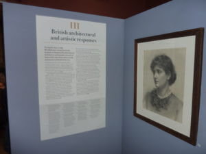
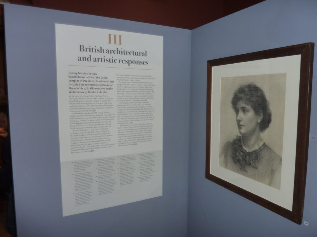
Designing the exhibition panels
The content of each exhibition panel was simple: a heading, body text and footnotes. I opted for a symmetrical centred layout to match the ethos of classicism, but coupled this with left aligned text for ease of reading.
Designing at this large scale was new to me (I’d never designed anything above A2) so lots of print tests were required to ensure the text was readable from a distance.
The main challenge was how to accommodate the amount of text on each panel (this varied significantly). I eventually surmised that each panel would need a discrete height that matched the length of text.
Working with the clients was enjoyable because their academic background informed my typographic detailing decisions with elements such as quotes and footnote markers. I’ve learnt that design conventions can differ in certain contexts. For example, footnote markers in books tend to be set using superscript numbers as these are less prominent than ‘normal size’ figures yet clearly visible. The clients insisted on using normal sized figures with surrounding square brackets for their footnote markers, as is the convention in exhibition design.
Conclusion
The real pleasure of this project was the opportunity to see my work displayed and used in the environment it was intended for and to witness real users interacting with it. After working mostly on small-scale print designs during this course it was exciting to see large typography come to life in a setting. I paid particularly close attention to typographic details on this project, as I knew any mistakes would be enlarged for all to see.
The clients were fully satisfied with my designs and were very complimentary about my professionalism; I even received a round of applause at the exhibition opening.