
Brief
Albert Elduque Busquets, a postdoctoral researcher in Brazilian Cinema from the Department of Film, Theatre and Television was looking for a student designer to design a catalogue which the content included essays written about ten Brazilian music films and also the information about when these films would be shown in the Reading Film Theatre. The catalogues would be printed by the Design and Print Studio and handed out to people who went to see these ten films. The catalogue needed to be sent to print no later than 15 December, so the client could receive some of the copies on 10 January, few days before the filming started.
Work process
The project began in June 2017, the only thing I was told in the first meeting with the client was what sort of content would go into the catalogue. And the client was unable to tell me the details of the content, budget, and deadline as these things could not be confirmed until late October Therefore, I did not restate the brief for this project. It was a huge risk to take as the client could potentially ask me to make unrealistic and late minute changes to the deliverable and it would be my fault if I failed to deliver them. Fortunately, this did not happen, and the catalogue was sent to print, and the copies were delivered to the client on time.
The majority of the content was long essays with at least 10000 words each, but there were also other types of content shown in the catalogue such as interviews, letters and poems. The latter needed to be dealt with differently with the change of the number of text column. For instance, all the interviews have a single-column introduction. I also learnt how to handle sections such as biographies and credit page. Having different image crops also made the catalogue look more fun and appealing to read and placing the film information spreads in the middle of the catalogue gives the reader a ‘break’ after reading pages of long text. I chose Freight Text designed by Joshua Darden from Phil’s Font as the typeface for this catalogue as there are many font weights available which helped me develop a typographic hierarchy of the articles much easier.
One of the things I learnt in this part of the project is that if other organisations were involved in a project and their logos needed to be included in the publication, their brand guideline must be strictly followed.
Production
The client requested 300 copies of the catalogue and had a budget of circa £1500. Initially, he preferred to have the entire catalogue in colour. However, we were later learnt that the cost would exceed the budget, so we decided to print everything in black and white except the film information spreads in the middle and the cover. The number of pages of pages also needed to be kept to the minimum. The original page format I chose was 210mmx210mm, but I later learnt that the 8 pages would be printed on A2 in section. Using a square format would mean wasting a lot of space. Therefore, I changed the format to 200mmx280mm which is smaller than A4 so that more content could be included in one page. I also learnt a lot about other things such as how to prepare a document that is print-ready and a comprehensive print specification from this part of the project.
Reflection
Not creating a restated brief and attending Real Job meetings regularly and the lack of communication between me and my supervisor are the biggest mistakes I made in this project. No doubt this had a negative impact on my professionalism and more importantly, I believe I missed out on a lot of useful and constructive feedback which could influence positively my design decisions and potentially bring the catalogue to a higher standard.
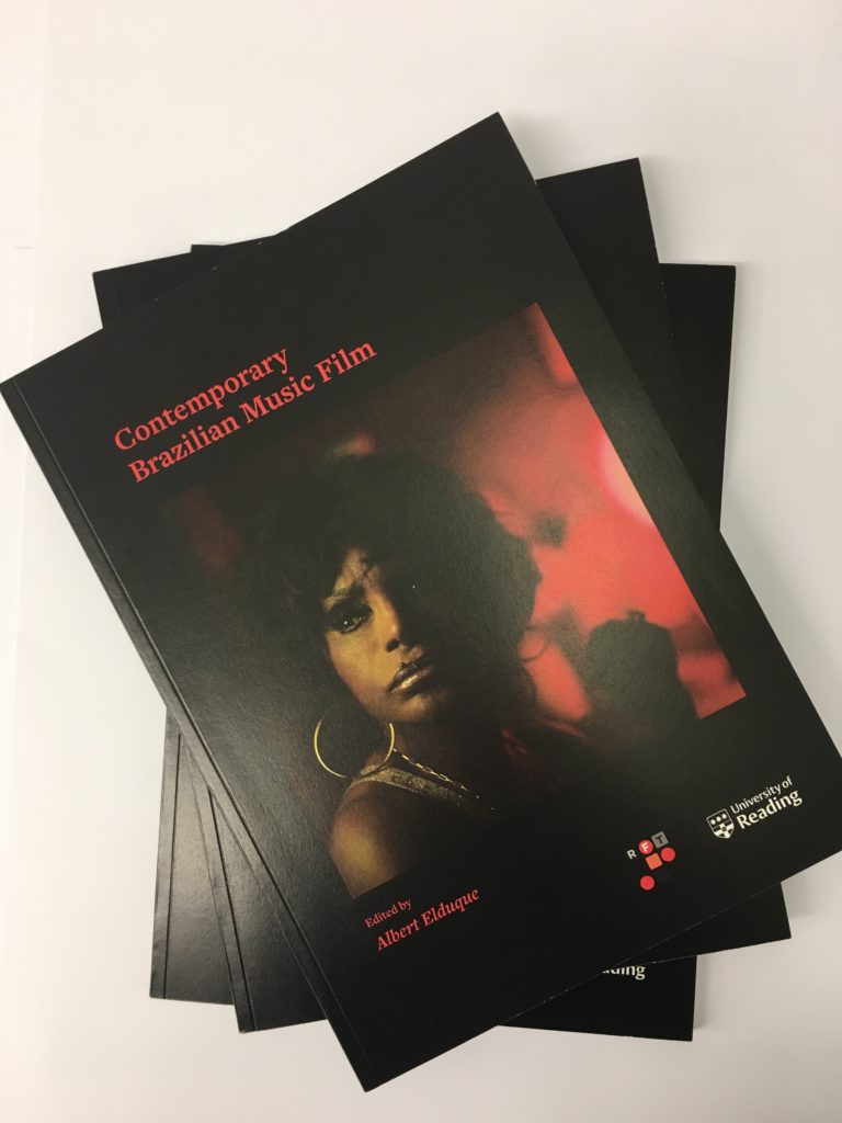
Moreover, I need to pay more attention to typographic details as my client occasionally had to point out the typographic inconsistency and errors throughout the whole catalogue, all of which should be my responsibility instead and there are also a few widows that needed to be fixed. Also, I need to be more careful with the alignment of text and image and more specifically, to learn to design book covers that look more impactful and eye-catching and reflect of the underlying theme of the content. I think the current cover of the catalogue lacks a bit of contrast and needs to have a stronger emphasis on the cover image as it is the element that catches people’s attention.
One of the things I am really not happy with the catalogue is the logo of the Arts and Humanities Research Council on the back cover as it has a white frame in its background which looks like a careless mistake. In fact, I did ask the client if the text of the logo could be inverted as the organisation did not provide the client with an inverted version of their logo, but the client thought I should leave it as it is as we do not have the permission to make any changes to the logo. The other is the quality of the images. Some of the images did not come out as crisp and striking as I expected them to be. Spending a bit more time on photo editing would have prevented this from happening.
On top of everything negative mentioned above, the project went fairly well. Despite the lack of communication with my supervisor, my communication with the client was effective and consistent and both sides were very responsive to emails which sped up the whole design process. What is more important is that It enhanced my communication skills with clients and printers and the skill of working with a limited budget, all of which would be very useful. I also gained a lot of confidence through showing my ideas and offering my opinion to my client and communicating with the printer and acting as an ‘intermediary’ between the two.
Moreover, this job was originally assigned to me and another student but the latter quit shortly after the design process began due to ill health. Working on a large-scale project like this one alone is a first for me. In the beginning, I was slightly intimidated by the scale of the project and worried I might struggle a lot due to my inexperience and therefore disappoint my client and supervisor. Fortunately, this did not happen, and I was able to overcome many challenges by seeking help from my peers and lecturers, as well as looking for solutions online and taking references from relevant books and previous real jobs of this kind.
Although there are many things in the catalogue that could be improved, I am generally happy with the final outcome and so as my client and supervisor. It is also encouraging to learn that not just my client is very pleased with the finish quality of the catalogue, but also some others such as my client’s manager from the F.T.T. department. Knowing that the time and effort I put into this project are appreciated is very satisfying. Finally, I feel very fortunate that I had the opportunity to work on a project of this scale and something that I have a strong passion for. The whole experience is extremely valuable, fulfilling, and rewarding. It equipped me with the skills and knowledge I need in the future as a book and editorial designer. This catalogue will be an invaluable addition to my portfolio and something I can proudly say ‘I did it all by myself!’


