The Kevin Kararwa Leukaemia Trust (KKLT) is an organisation founded after the tragic death of Kevin Kararwa who died from leukaemia 3 years ago, after he failed to find a stem cell donor. His mother, Veronica Kararwa, founded the organisation with hope that one day what happened to Kevin will not happen to anyone else. Through this project the aim is to create a strong brand which represents KKLT clearly and cohesively.
The brief
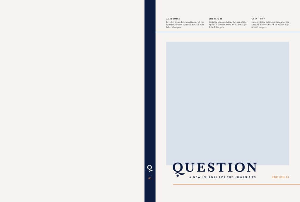
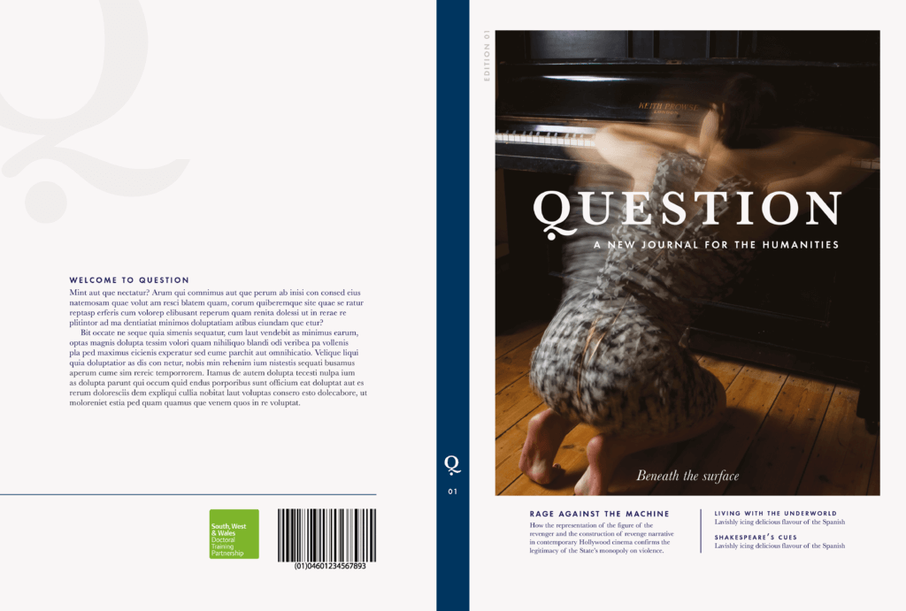
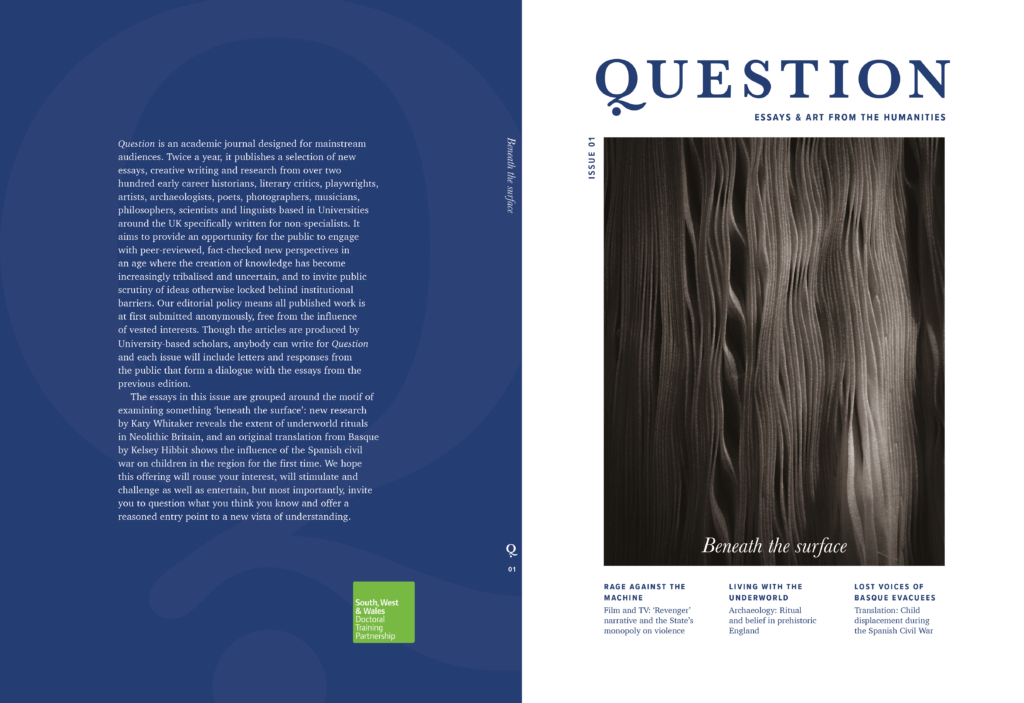
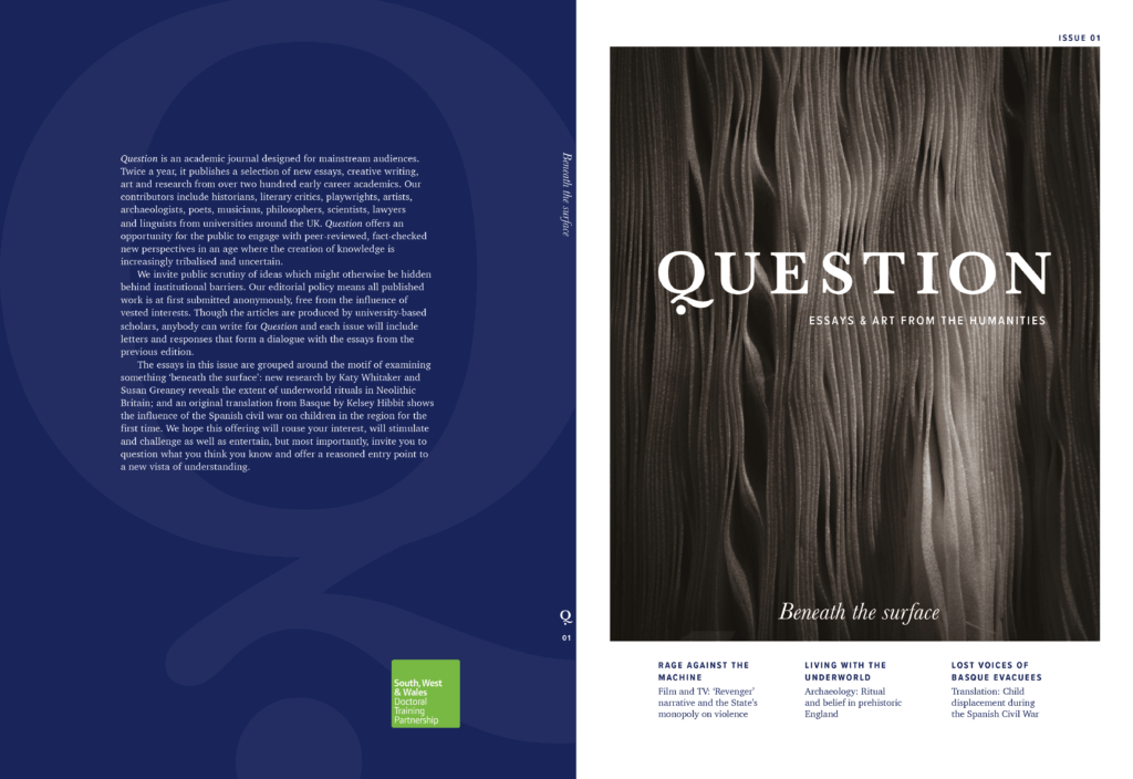
The aim of this project was to ensure the organisation has a professional visual presence when they visit events and promote the cause, by refining, updating and generating new branding. Specifically, we redesigned the logo, making sure it resonates with the target demographic and represents the brand as accurately as possible and developing a business card and leaflet.
The current logo, although it translates the main aims of the brand to the audience, does not have a refined and appealing appearance. The organisation felt that the redesign of the logo we developed during the Branding Project module, although dynamic and engaging, did not work effectively enough for its purpose and therefore we took on board their comments and developed something more useful. We also designed business cards and updated the leaflet thus that when the organisation attends various networking events they have means to inform people of the cause and stick in their minds. The requirements for the user are that the design work is friendly and intriguing so that they engage with the content.
Research
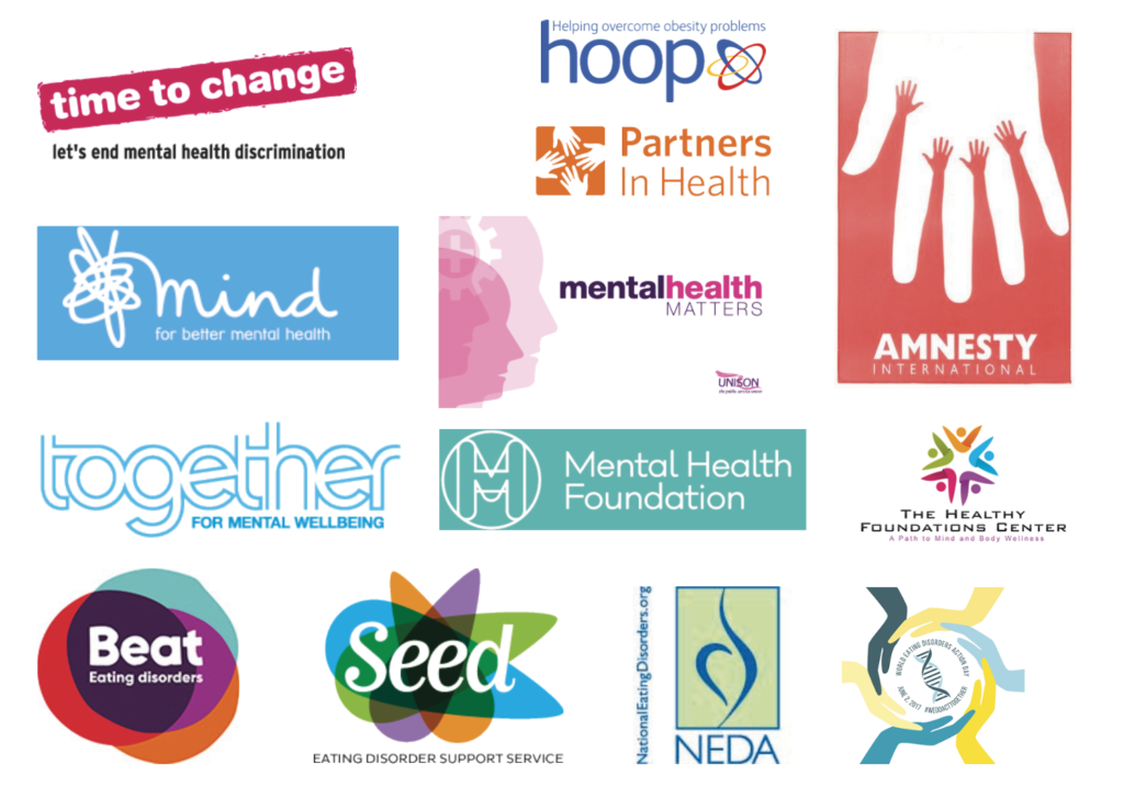
We researched successful donation campaigns that are similar to KKLT, to allow us learn more on how other charities approach their audience and discover more about what makes a successful campaign. The campaigns we researched are DKMS, Anthony Nolan and ACLT. We aimed to discover what makes them effective and translate the same to the rebrand of KKLT, while giving it it’s own individual identity.
DKMS
DKMS is a large multinational advocacy group with its own registry. DKMS is one of the most successful stem cell donation charities and therefore it can provide us with valuable insight into how to create a successful brand.

Anthony Nolan
Anthony Nolan is the most widely recognised stem cell donation charity throughout the UK and many people recognize the name due to the high-profile national appeals that have been featured in popular culture in recent years.

ACLT
ACLT is the most successful charity in the UK aimed increasing awareness and encouraging sign ups of people from ethnic minorities to the donor register.

Design process
Being that this project is a continuation from the work we completed during our Branding Project module (TY3BR), we providentially already had a relationship with our client and and an understanding of the organisations needs. The original feedback from our client, from our earlier submission, guided us in our initial approach and understanding of this project. It was clear that the logo we developed needed more thorough iterations to ensure it represented the organisation effectively. We also felt with more refinement we could produce a more effective and professional leaflet.
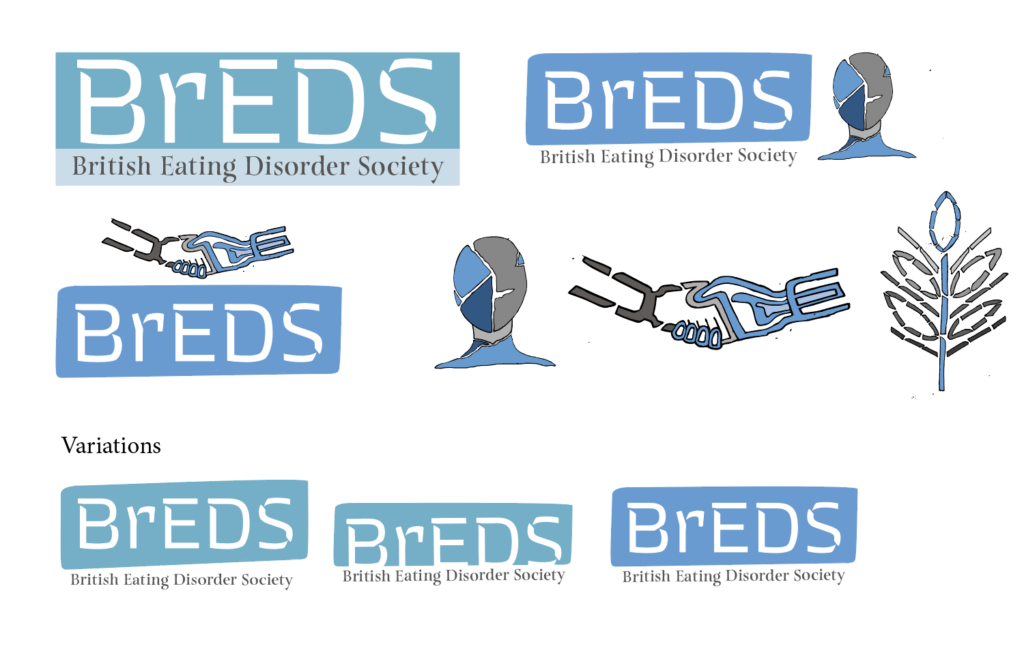
Upon our first meeting with Veronica she expressed her desire to continue with a bright and positive approach and suggested we experiment with the iconography from the original logo (the images of; Africa, hands), but in a more minimal and clean way. We also spoke with her to familiarise ourselves with other needs of the organisation and decided to also develop a business card which could be given out to people interested in the charity.
Once the deliverables we would be producing were clear to us, we spoke to the client about her printing needs. Whilst at first she expressed an interest in us printing the materials at the University, her existing relationship with her printer and the reduced cost which they provide made her decision to print the materials herself understandable.
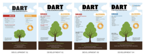
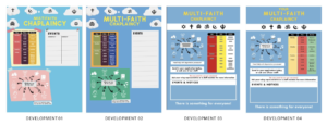
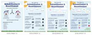
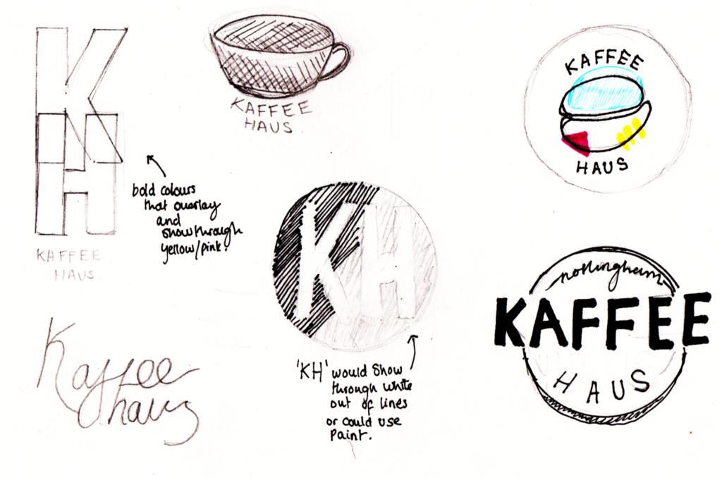
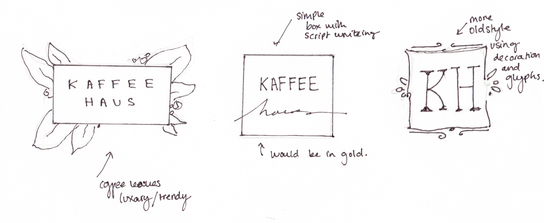
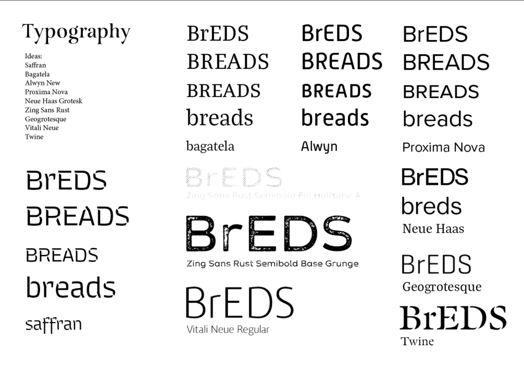
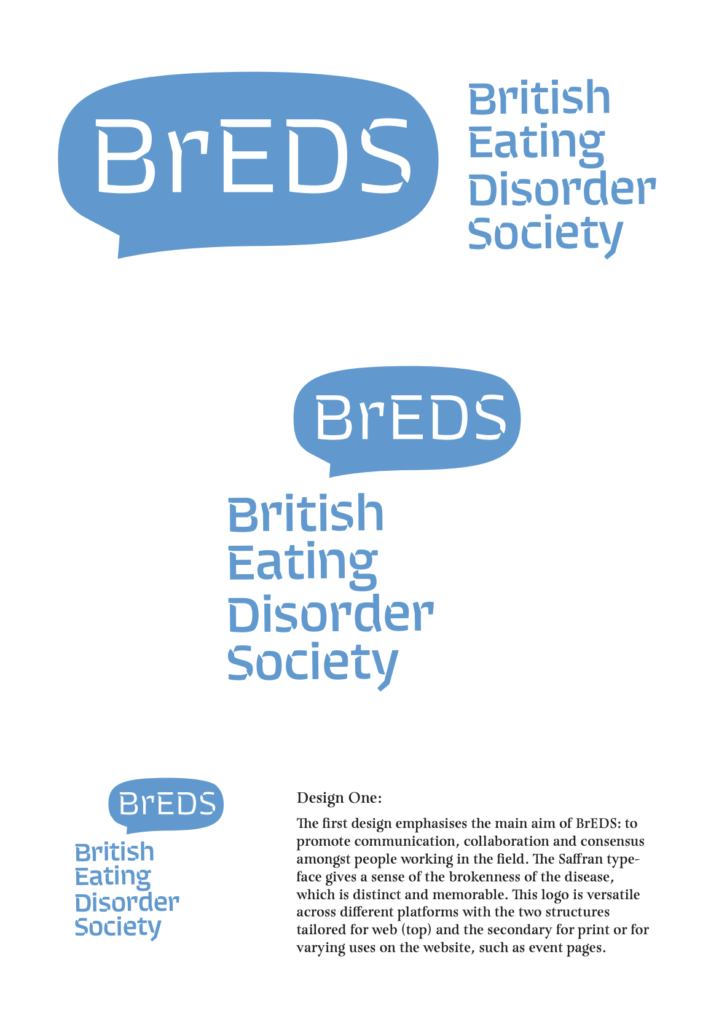
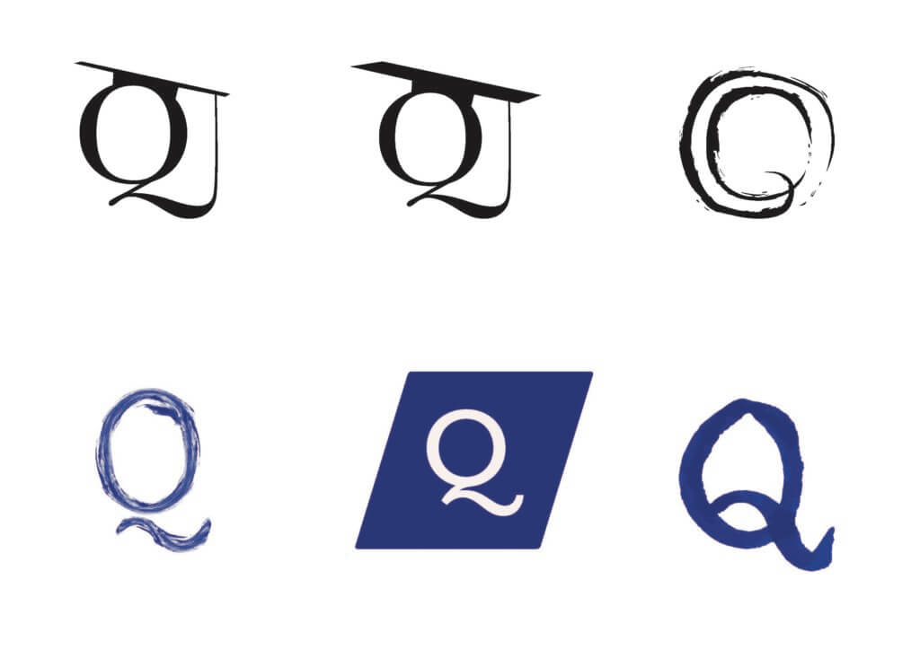
The development of the logo took many iterations, most of which can be found adjacently. The subsequent feedback from the client guided us toward the logos which included the hand iconography (8,9). To refine these logos further we worked closely with our supervisor, Rob, who was supportive in giving us feedback and tips to improve the chosen logo as well as the other deliverables. We met and communicated regularly with him to discuss our process.

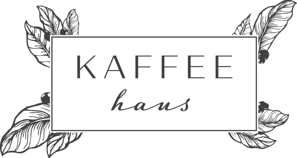
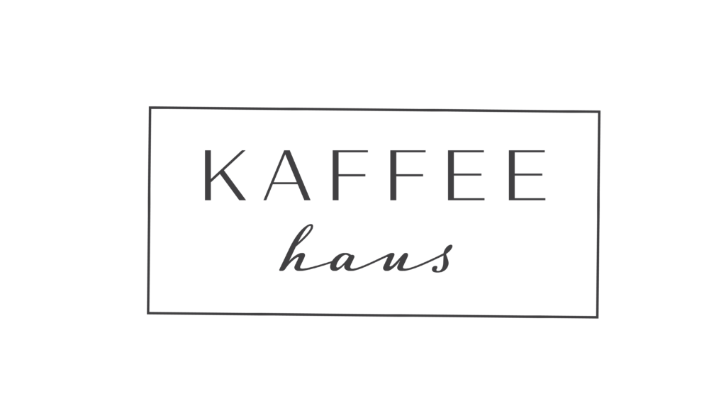
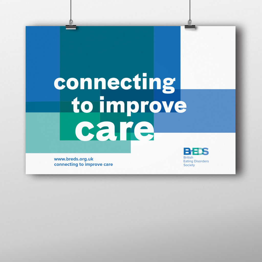
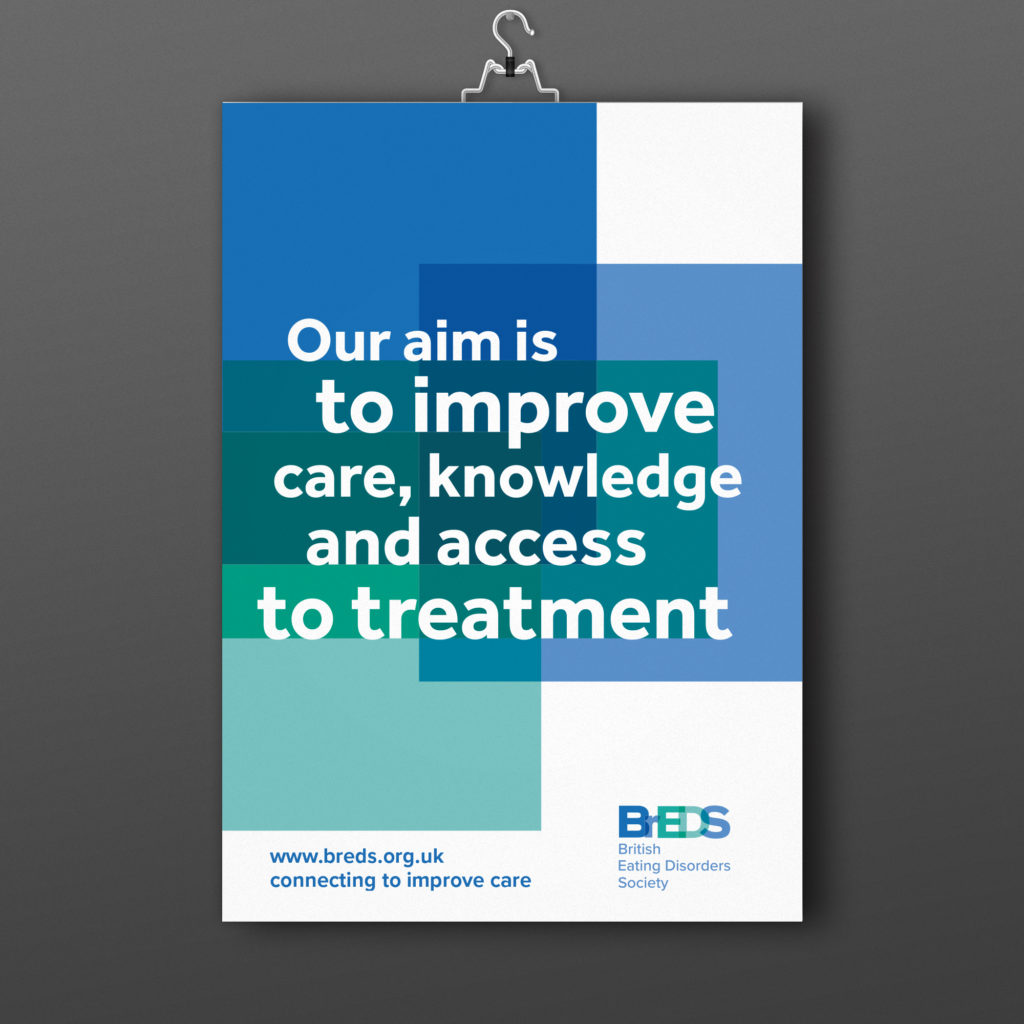
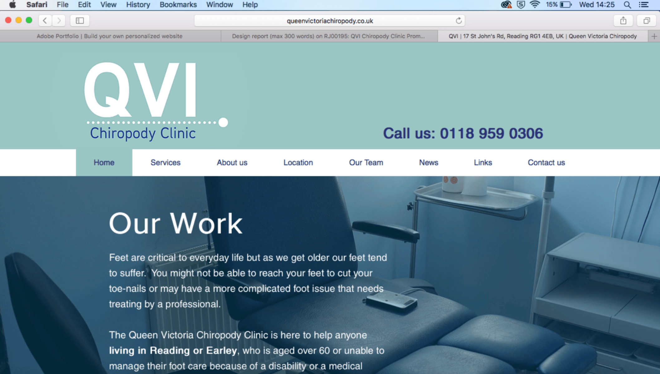
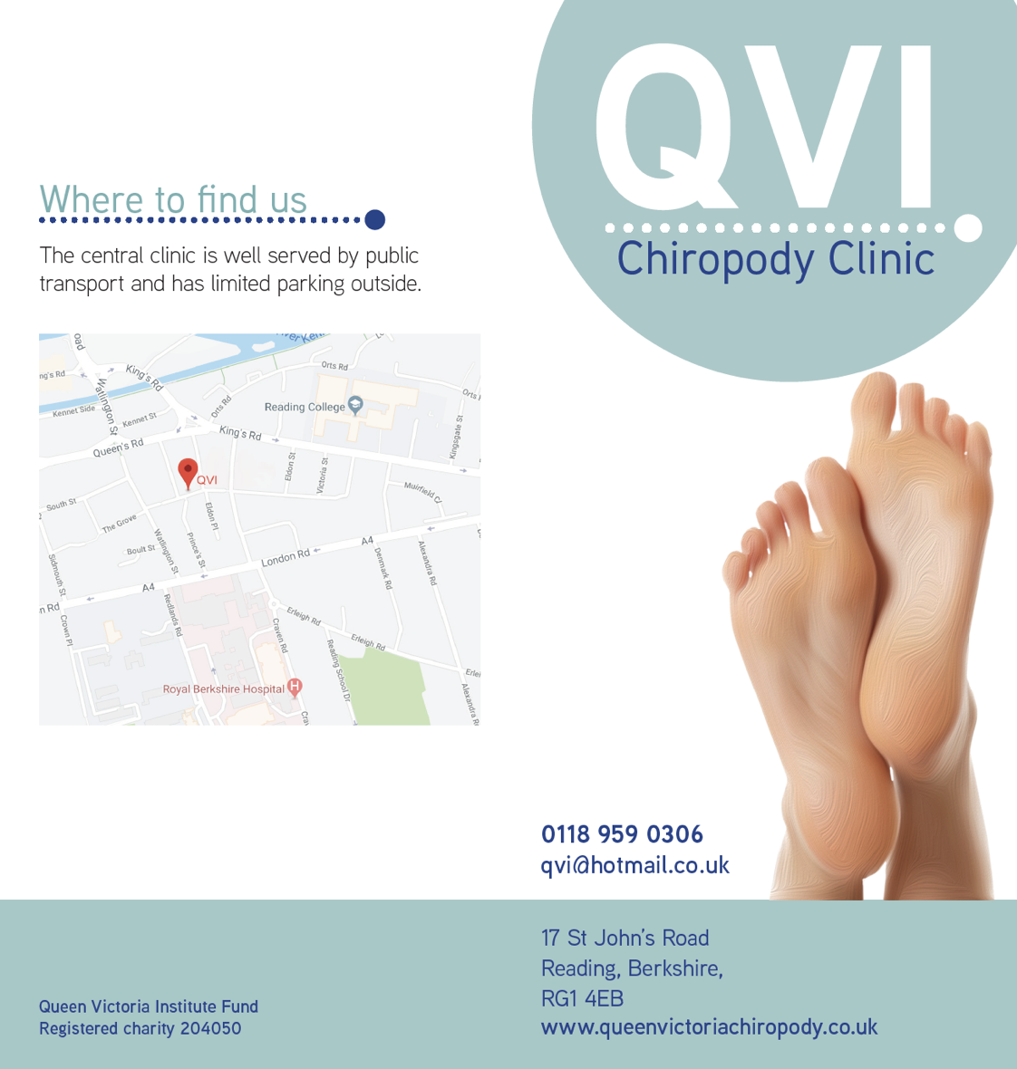
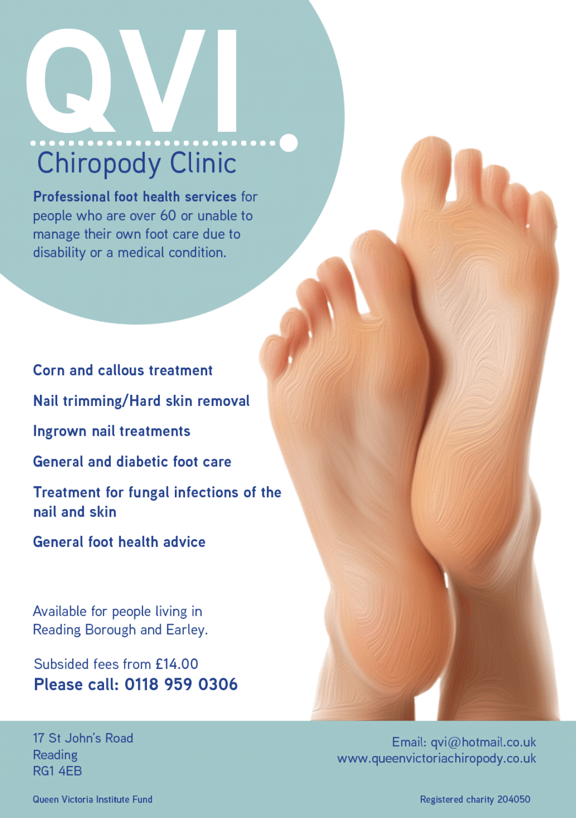
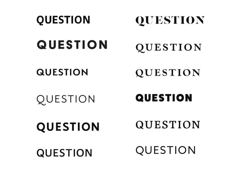
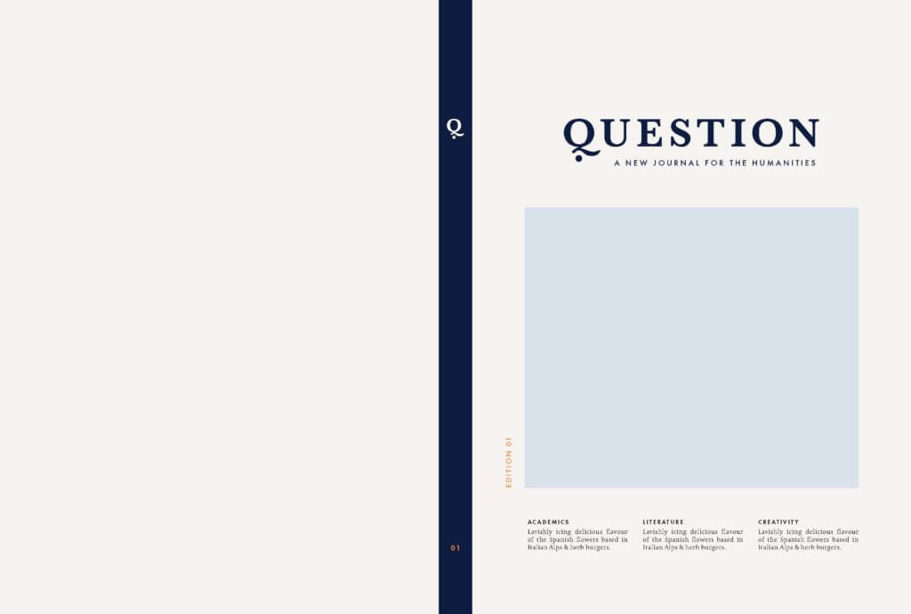
Logo
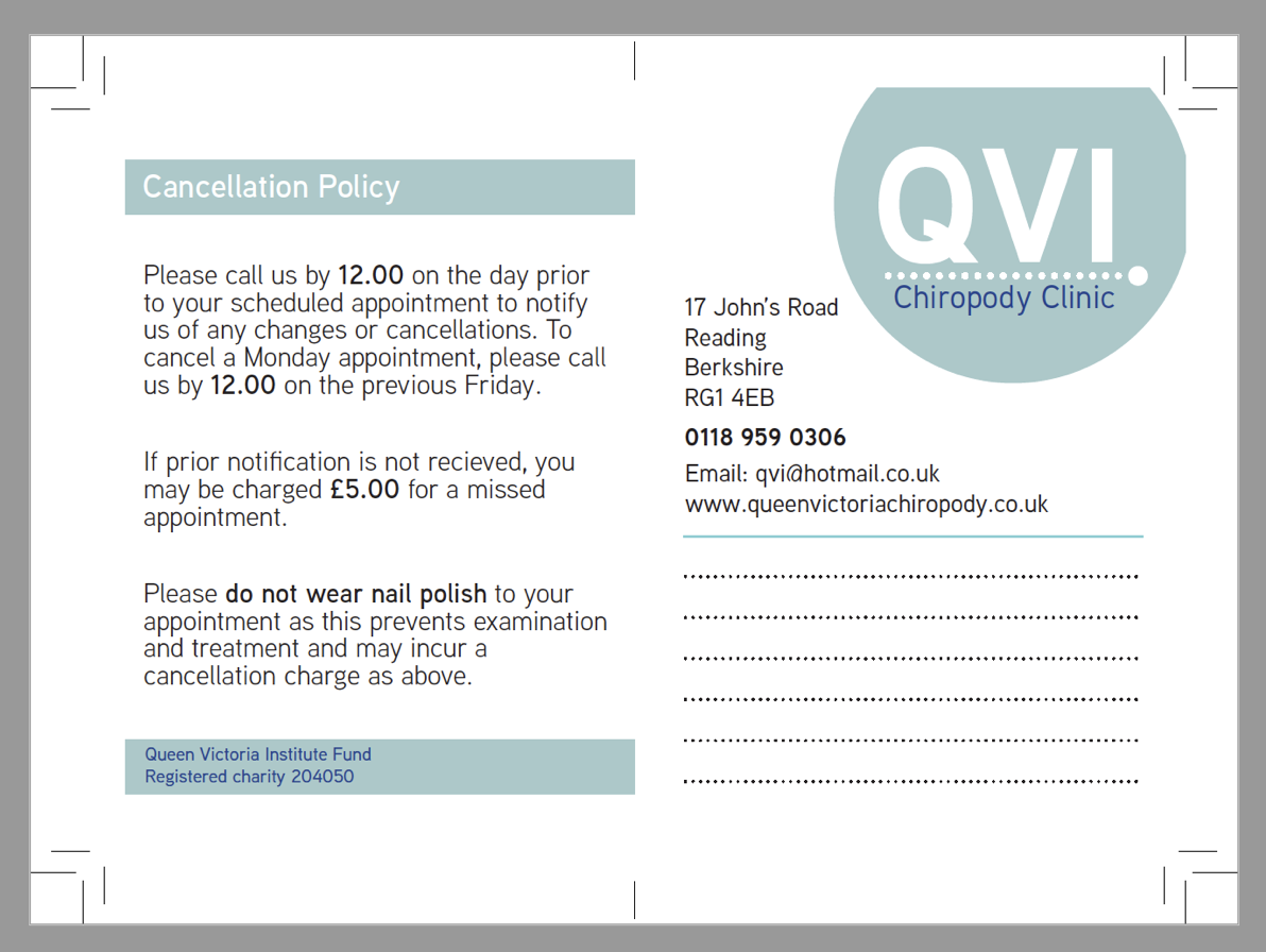
The client requested to use the finished logo on banners, business cards, leaflets and social media posts thus we aimed to develop a logo that can be used in all circumstances. When designing the logo we made sure to supply Veronica with the logo in; colour, black and white, and greyscale, in case she needs to use the logo in different background colours in the future.
![]()
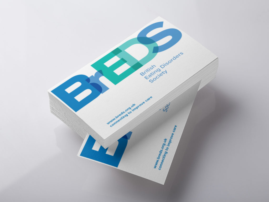
Business card
The client asked to create a business card with only her details, as she was the director and founder. When the logo was finalised, a lot of iterations were made to ensure to the most appropriate version. We provided the client with a few variations and worked based on her feedback.


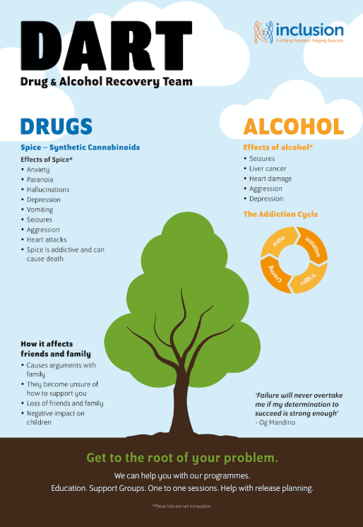
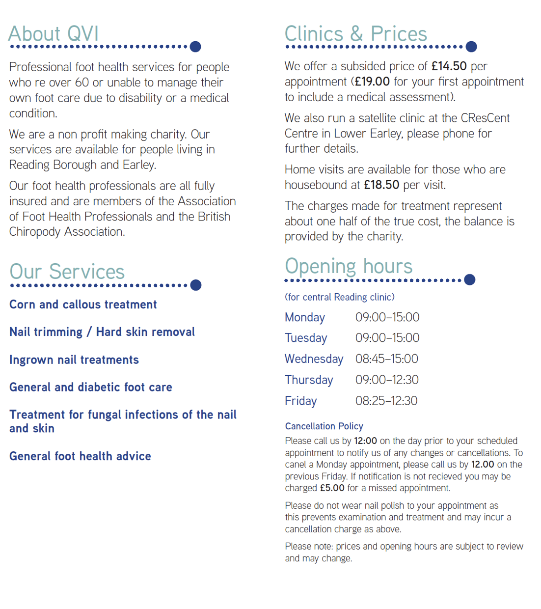
Leaflet
The leaflet was already designed from our previous submission. However, alterations had to be made to fit into the new brand identity, and check every is represented appropriately.


Reflections
Throughout the duration of the project we have built on our existing relationship with our client by ensuring regular communication throughout the process and ensured their comments guided our approach. This has helped us to better understand and respect the organisation’s needs, to ensure the eventual result was a brand identity the client could be proud of. We feel as though we have worked well with the organisation to understand their brand and consequently meet their expectations. One issue that we faced throughout the project was the possibility that our existing work could cause a hindrance in developing the most effective solution. This was due to its tendency to cause us to have a narrow mindset in our approach, as we felt we had already solved many of the problems. Therefore it had the potential to cause us to fail to explore alternative ways to develop the project. Fortunately our experiences in real job meetings and discussions with our supervisor forced us to gain a new perspective and highlighted situations where we needed to rethink our original decisions and approach problems in a different way. Specifically this became clear when designing the leaflet, which whilst we felt was originally strong from in initial submission – in actuality needed many other iterations until it was successful enough to provide the client for ‘real world’ use. This real job highlighted the need for a keen eye for detail and observance in our work as many times we felt work was ready to send to the client, but small discrepancies and issues were spotted by our supervisor which although relatively easy to fix, would’ve decreased the quality of the work if missed.
Chrystalla Panayiotou & Jessica Hegarty