
Designing Entre Playas’ signage was my first independent design job at The University of Reading. From the beginning of the project I understood that it would be a tricky task to take on as the final product would be situated abroad in Ibiza. This meant that throughout the project I needed to consider aspects which normally wouldn’t be a problem such as: the difference in climate, erecting the job in a foreign country and the location the sign would be manufactured.
Unfortunately when I first received the real job my schedule was extremely busy and as a result of this I had very little contact with my client. After many months I decided to speak to my client and arrange a new start time for the job when I was less preoccupied and had more time to focus on the project. This is something that I regret not doing sooner, I have now learnt from my mistakes and understand I need to be honest with the amount of work I can handle at one time. My client was extremely understanding and told me that the job was in no rush to be completed.
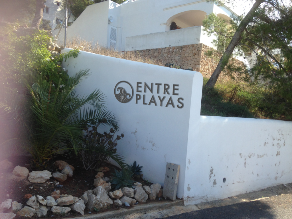
The Brief
The initial brief was to design three premium outdoor signs which reflect the Ibizan culture as well as representing the community within Entre Playas. The client wanted the signs to require minimal maintenance and be able to attach on various walls. One of the fundamental aims was for the signs to be visible for drivers and passers by on foot, considering back lighting which is already installed on two of the properties wall entrances. The signs were to replace the current outdated signage at Entre Playas and fundamentally enhance the community, adding value to the properties.
As my client lived in Kent face to face meetings were not possible, therefore I arranged to communicate via Skype, email and over the phone. This was something that did not phase me as I am confident in using technology to communicate.
Target Audience
To begin the process of creating the three designed signs I needed to understand my target audience. My main concern was the thoughts and perspectives of the residents at Entre Playas in Ibiza. In order to understand their views I asked my client for their contact details and devised a set of interview questions for them to answer. This was extremely beneficial as I was able to grasp the likes and dislikes of the original sign of 6 Entre Playas residence as well as receive insight to the changes they would like to apply to the new sign.
After collecting my data from the 6 interviews I devised 3 user personas – all three of different ages and with different views. This research helped me to understand that the main issues with the original sign were that the type size was too small, the style was not in keeping with the surroundings and the material used was not suitable for the climate.


Research
The research process for this real job was crucial as I wanted to ensure that the designs I produced were in keeping with the atmosphere of Ibiza, the climate and the price budget. In order to understand Ibiza’s character I researched the branding of various successful hotels, beach clubs and restaurants on the island. It was interesting to see how each created a modern, premium and stylish character through typography and logos.

This research was beneficial and helped me to understand the look and style I would introduce to the new signage design at Entre Playas.
It was vital that I researched examples of how signs can be produced. A mood board was devised to highlight various sign elements which could be applied to my design such as the material used (stainless steal, glass, wood), lighting (illuminated signs, lighting backdrops), shadows (reflected from the light) and dimensions (flat type, 3D type). The material which would best withstand Ibiza’s climate was stainless steel as the material is extremely resistant against weathering. As only two of the sign locations have available electricity mains I wanted to produce three signs which could be seen both illuminated and not.

Typography was the fundamental aspect of my real job, in order to produce a professional legible sign I researched various typefaces on Myfonts, Typekit and Adobe, where I found a great range of fonts which I thought were suitable for the new sign. To create three diverse designs I chose to research sans-serifed fonts, serifed fonts and hand written fonts. I wanted to include one of each into my designs to give the community of Entre Playas three various designs to choose from. Due to the nature of the course I have previous knowledge about typography, therefore choosing suitable typefaces was straight forward.
Sign Express, a sign company in Reading supplied me with a sample of a stainless steel 18cm high letter ‘K’ which I could use to experiment with. I decided to measure the gap between the wall and the letter K to understand how shadowing would effect the overall design. I measured the K at three distances from the wall: first at 2.5cm away, second at 1.5cm away and the third flat against the wall. These three measurements created different shadow outcomes, the best outcome being 1.5cm away from the wall -creating interesting shadow but not effecting the legibility of the character.


My research was sent to my client within a powerpoint presentation for him to read through. The powerpoint was created to communicate my findings with the client and help him to understand my thought processes throughout each decision made during the project. This real job has helped me to understand that constant communication with your client is a vital aspect of creating a great professional relationships as well as producing successful designs.
Design
When given the initial brief my client asked me to explore the idea of incorporating a logo with the sign. In order to investigate this further I developed thumbnail sketches of primary logo ideas to enhance the Entre Playas signage. This soon developed onscreen, vectorising the logos and comparing them with various typefaces which I had previously researched.
I showed my initial designs during a Real Job’s meeting and to my supervisor. Both meetings were beneficial as I collected positive and negative feedback about the designs. My classmates in the real job’s meeting suggested that I continued to experiment with the two wave logo as they believe reflected the name of Entre Playas. My supervisor also suggested that I avoided interrupting text with logos as it distracts the reader. Before sending my initial designs to my client I applied the feedback which I was given from both meetings. Throughout the process of my real job I began to understand the importance of showing my work to various people. There fresh outlook helped me to overcome problems and highlight issues which I wouldn’t have done myself.

After my clients feedback I further developed the typefaces and logos which he liked best. Further development helped me to uncover areas which I had not previously thought of such as layout, stroke and character spacing.
With the help from the Real Job’s meetings, my supervisor and my client I finally produced three final designs. Each design conveys a different typographic style but they all equally reflecting the modern and sophisticated character of Ibiza.


I created three mock ups with my final designs to show to my client and the residents of Entre Playas. This was a great way for myself and the client to visualise how the final product would look.


Production
The location of the site of Entre Playas played a difficult role in the production of the signage. My client wanted the signs to be manufactured in England to avoid a language barrier when discussing the work with manufacturers. This had its positives and negatives, although I was able to meet with the manufacturer in person the manufacturer was unable to see the actual sight where the sign would be implemented. To help the manufacturer understand the signage area I produced a guesstimate of the area size, this was from mine and my clients previous memory of visiting the site. I attached the measurements of the site as well as the height of the type which my client asked for (20cm tall). This was helpful as it allowed me to visualise how large the sign would actually be.

In order to produce the signage designs I contacted Signs Express, a company recommended by the university. I had a meeting with the centre manager Ian Richards who showed me the materials and application tools which could be used for my designs. Ian suggested stainless steel as the signs material and showed me various finishes that could be used. He also suggested using a large paper stencil to ensure that when the signs are erected in Ibiza the characters stay in the right position. Meeting with the Ian was extremely beneficial as he showed me various examples of signs he had produced in the past. With the materials and colours in front of me I was able to visualise how my signs were going to be created.
After agreeing on materials and size with my client Ian sent me three specs including their quotes – one for each design. I was then able to send my client these figures which he would then reveal to the community at Entre Playas. My client explained that the three sign designs would be put to a vote and which ever design is most popular would be manufactured.
final reflections
This real job taught me a lot in a short amount of time. Throughout the job my time management skills improved dramatically as I had to juggle various modules whilst working on the real job. This is a great strength as it will benefit me when I am working in the design industry. If I were to repeat the job I would have been honest with my client from the get go and expressed to him the heavy amount of work I had on when originally given the job. Although this was unprofessional of me I am glad I made this mistake as I now know to avoid it from happening again. After my initial mistake my relationship with the client was extremely professional and our conversations throughout the job were productive and fluent.
Throughout the job I felt it important to presented my work in a professional and accessible manner as I was unable to meet with the client in person. Presenting my work in a formal way really helped me to illustrate my thought process and ideas as well as communicate effectively with my client.
Contacting manufacturers and testing material was a steep learning curve, as I had to research and understand the restrictions each material used would create. After understanding which materials were best to use I then had to manage the cost of the product and our client’s expectations.
I really enjoyed working on this real job as it has exposed me to areas of the design industry which I have not previously visited. I will be staying in contact with my client until the signage has been put in place at Entre Playas, and I plan to visit the sight once the signs are erected.