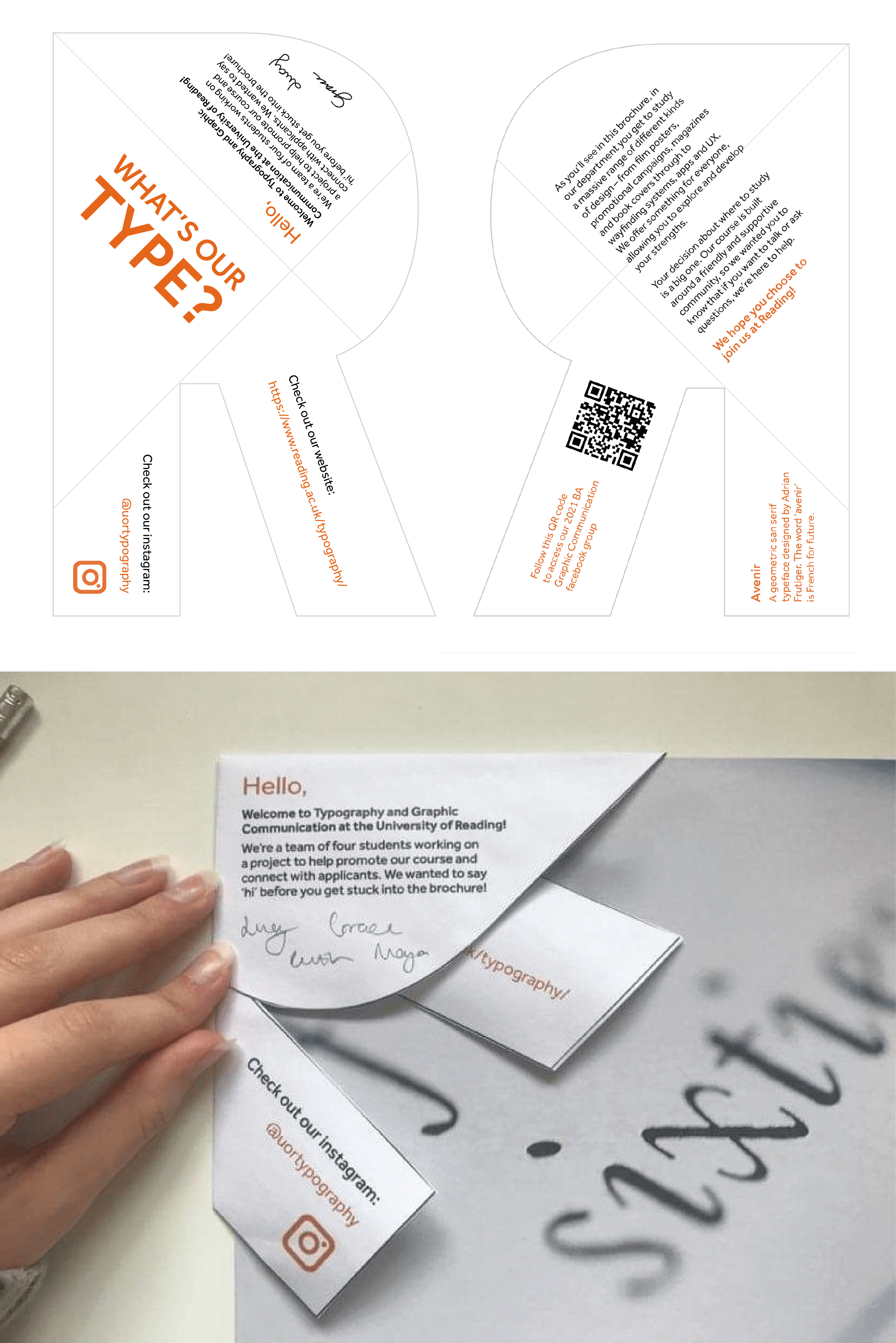
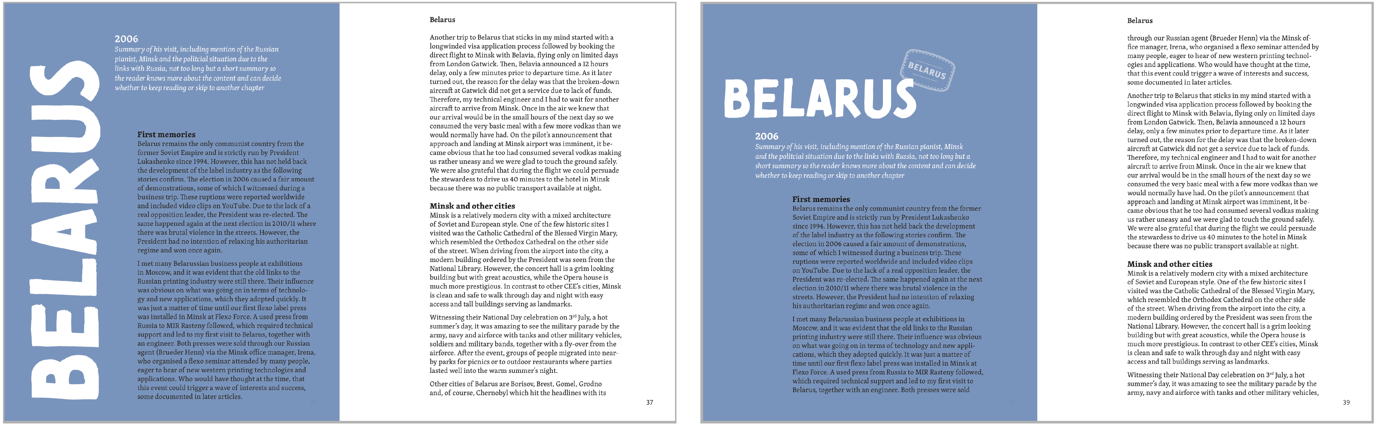
Brief:
The brief for this project was a bit different from the ones I have previously worked on; this was a two-week turnaround project to create two sets of simple logo guidelines. These guidelines were to be used by part 1 students in their TY1INT mobile design module, and so we had to consider usability for a less experienced group, and how they would go about using these guidelines.
The two brands I would be designing for were ReadiFood (Reading food bank) and Mobility Trust.
Organisation background:
ReadiFood is Reading’s food bank, run by Faith Christian Group. They provide emergency food parcels, sent in crates, to rough sleepers, and others who have been referred (referral only service).
They have schools, and donators who contribute to the parcels; tins, biscuits, and teabags are some of the most commonly given items, but there are also some toiletries available upon request.
“Urgent Food needs are; Tinned vegetables, tinned fruit, tinned potatoes, packets of biscuits and packs of teabags (80s’ & 160s’), Tinned meat meals (mince& onions, hotdogs, meat pies etc.)” – ReadiFood website.
ReadiFood is a member of the Independent Food Aid Network and not affiliated to the Trussell Trust.
People that use the organisation are rough sleepers / homeless people in terms of the receiving side, and then donators and schools will use the service for donating and aiding those in need.
Mobility Trust provides wheelchairs and scooters to those in need, who may not have the funding.
“Mobility Trust provides powered wheelchairs and scooters for UK residents who have severe disabilities and who cannot obtain such equipment through other means. We aim to reach and help people who, quite simply, have nowhere else to turn. We are the only UK charity that provides such broad support, regardless of age or cause of disabilities.” – Mobility Trust website.
Initial Ideas:
With this being a very short project, the initial ideas stage was important in being concise and straight to the point; having a solid starting place for these logo designs would be beneficial in moving forwards at a good pace. I tend to do my drafts/form ideas digitally, as opposed to on paper, as it allows me to copy elements across and re-use them in different ways easily.
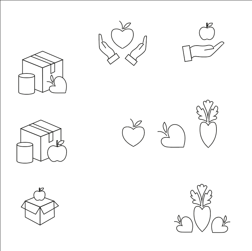
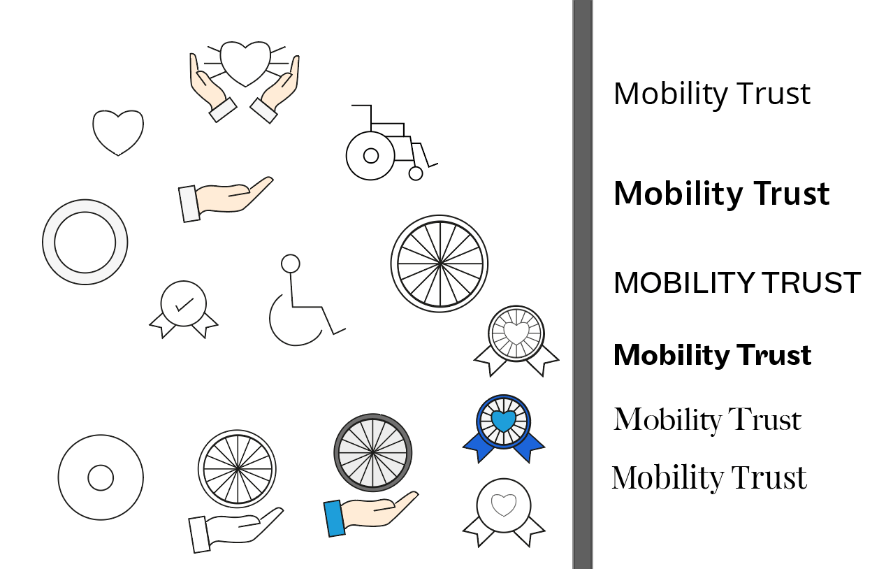
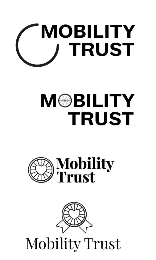
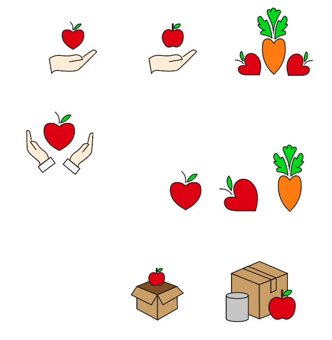
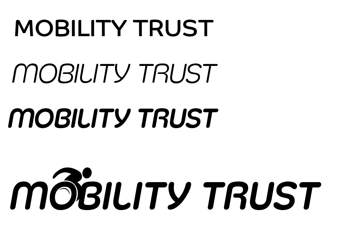
Initially, I was more comfortable designing for ReadiFood, as I had a strong concept of the food being heart-shaped, really obviously a charity, or having an apple icon as it was defined, recognizable, and legible. Mobility Trust, I felt should be more type-based due to the lack of imagery involved with inclusivity and the general topic of the charity. I had general ideas (fig 2) like the wheelchair, the wheelchair’s wheel, and a ‘badge’ style design to link closely to the “trust” aspect.
Development of ideas:
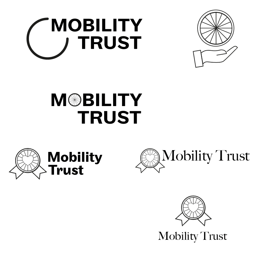
Clearly, Mobility Trust was not in a good position, however, I needed to make rapid decisions in order to get the deliverables finished in time. I combined the type and the imagery together (fig 3), to try and form some designs which could be used as logos, with potential stand-alone logos within.
Feedback at this stage for ReadiFood, my supervisor selected one of my logos to go forwards with (fig 7), and gave the following points:
“In the timeframe, I think this idea has the most potential. I suggest you work on:
1 – typeface choice (something that suits the illustration style)
2 – strengthen the outlines used in the illustration
3 – consider colour palette, is the brown the most suitable?”

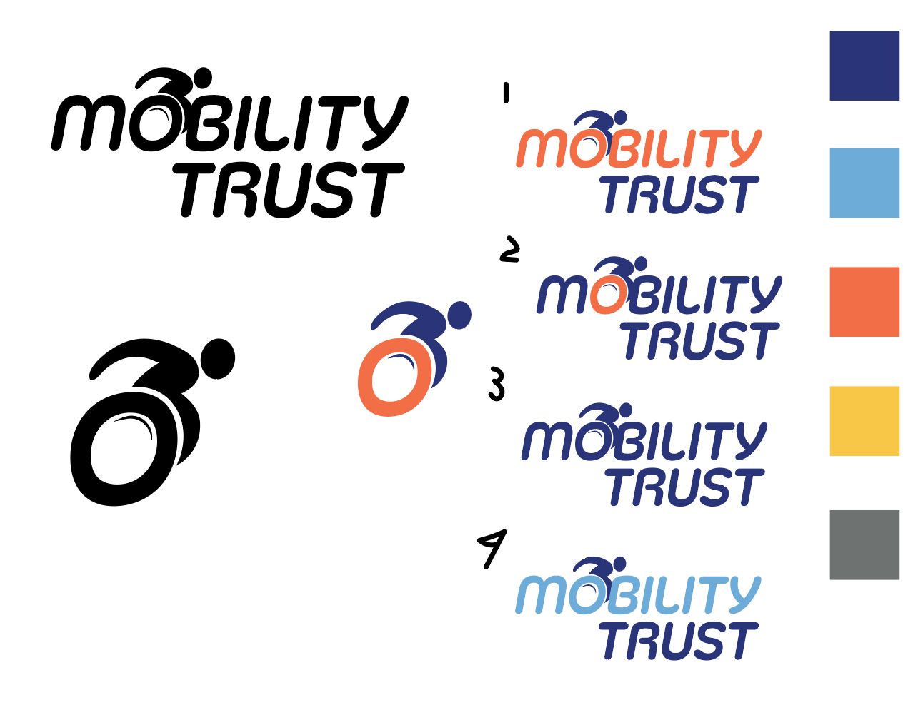
And for Mobility Trust, my supervisor done the same, and selected a logo with the most potential (fig 8):
“I think this has the most potential. Consider the following:
1 – typeface choice to suit the wheel, which is currently a solid line of the same thickness, the current typeface has slight contrast between thick and think strokes
2 – detail on the wheel, consider how small this logo might need to be and, therefore, the loss of detail in the wheel spokes. You may need to reduce the number (making sure it is still recognisable as a wheel)”
Improving developed logos:
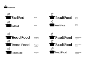
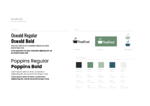
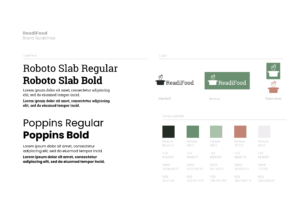
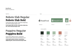
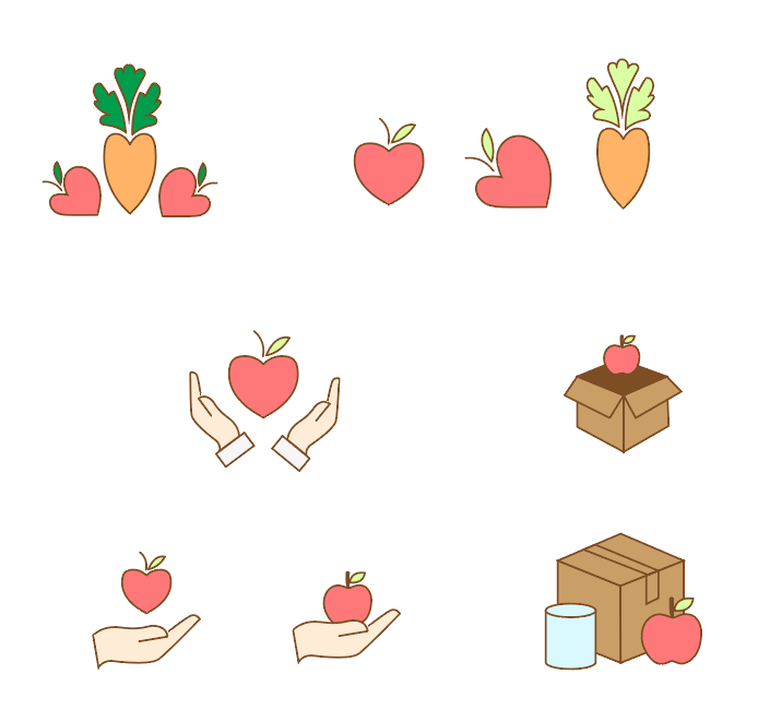
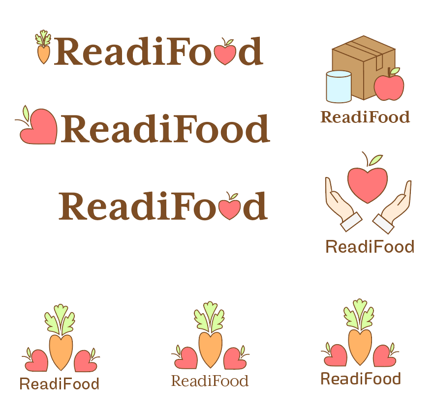
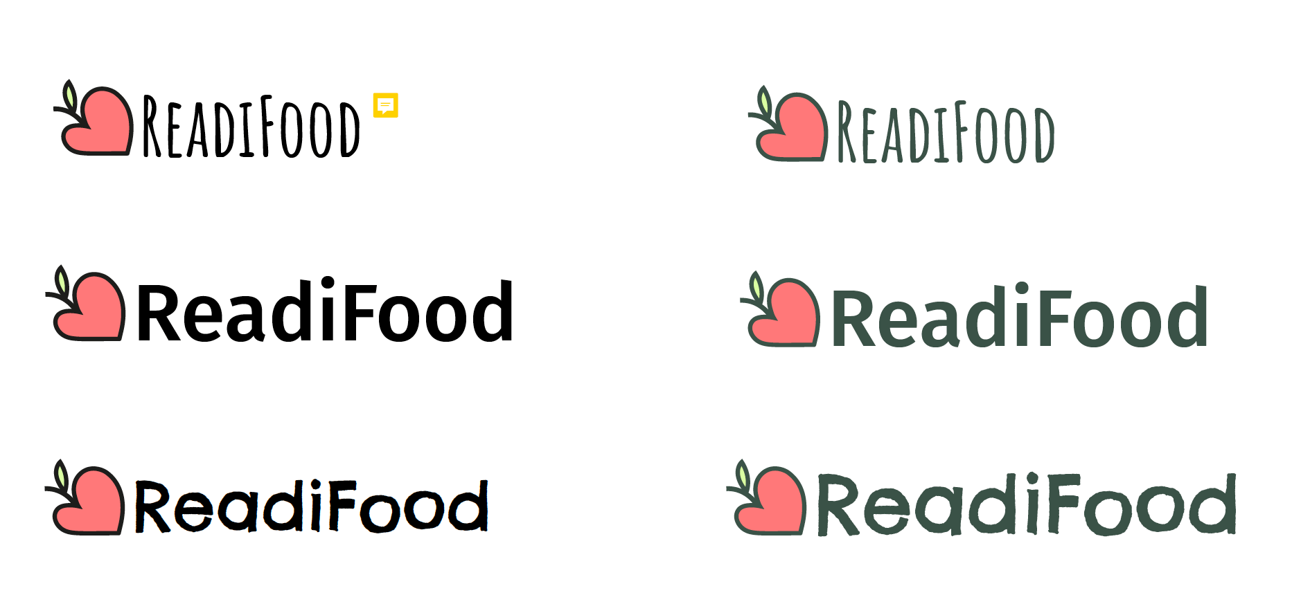
The three things to change up with ReadiFood are the typeface, the outline of the illustration, and consideration for the colour palette. Therefore, I brainstormed with a wide range of typefaces (fig 9) in combination with the illustration (which was altered to have a thicker outline), and came up with a colour scheme which could be used. From here, I picked which I thought the strongest choices were for the typeface (fig 10), and pitched them to my client/supervisor.
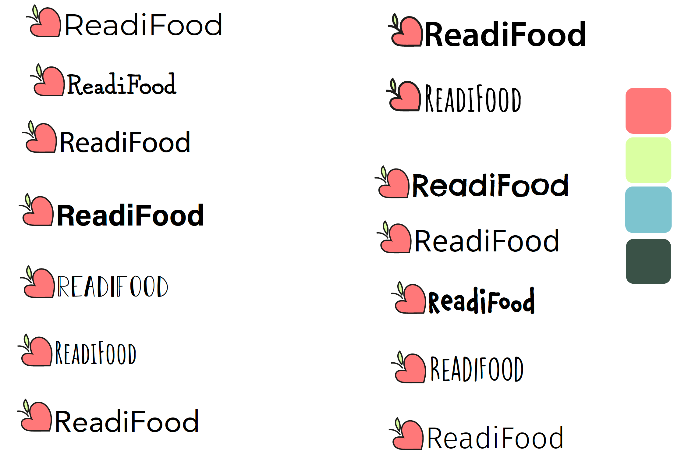
Feedback at this stage:
“all the colours need to have the same strength. At the moment the lime green needs slightly more strength (probably some black) so that it holds up against the other colours,” and there was a reference for the top left typeface (Amatic), which has a comment icon attached in figure 10. And the selected logo “demonstrates a good choice of typeface to accompany the illustration”
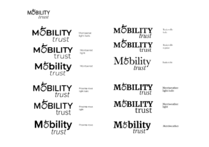
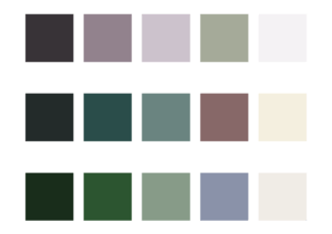
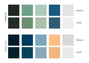
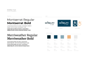
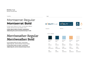
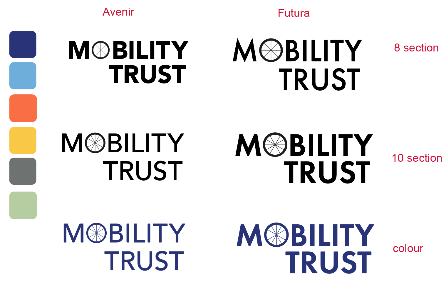
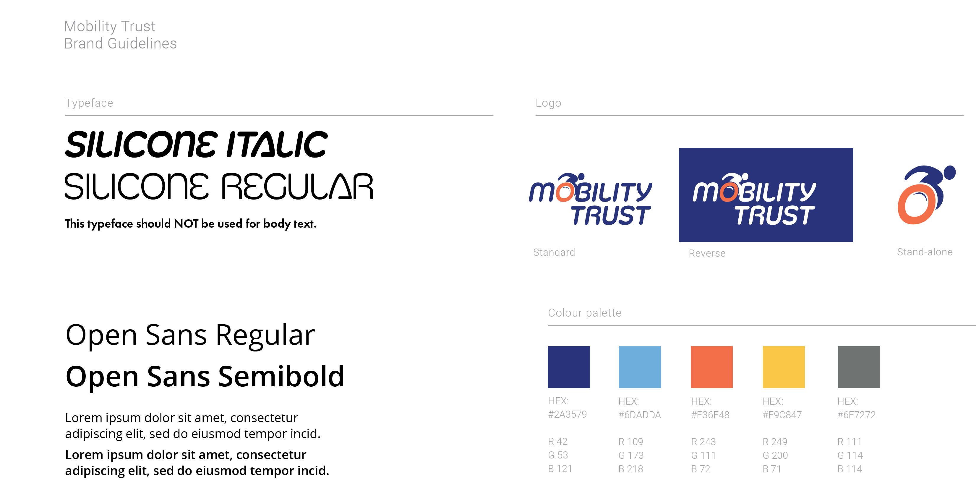
For Mobility Trust, the typeface was also a problem that needed refining, and the detail of the wheel needed exploring. Therefore, I added swatches of two separate monoline typefaces (fig 11) in different weights (Avenir and Futura), in an attempt to match the typeface to the illustration style. Also, I experimented with different levels of detail in the wheel illustration, as well as trying to put together a cohesive and appropriate colour scheme.
Feedback at this stage:
I expressed a preference for the coloured, 10 section Futura swatch, which my supervisor agreed with:
“Agree, this is the stronger idea. Suggest increasing the weight of the lines on the wheel spokes to strengthen these.”
And regarding the colour palette, minus the green swatch, “These seem a strong set to me. They have equal prominence in terms of their brightness, and similar salience (which you want in a colour palette where colours may need to work together and alone).”
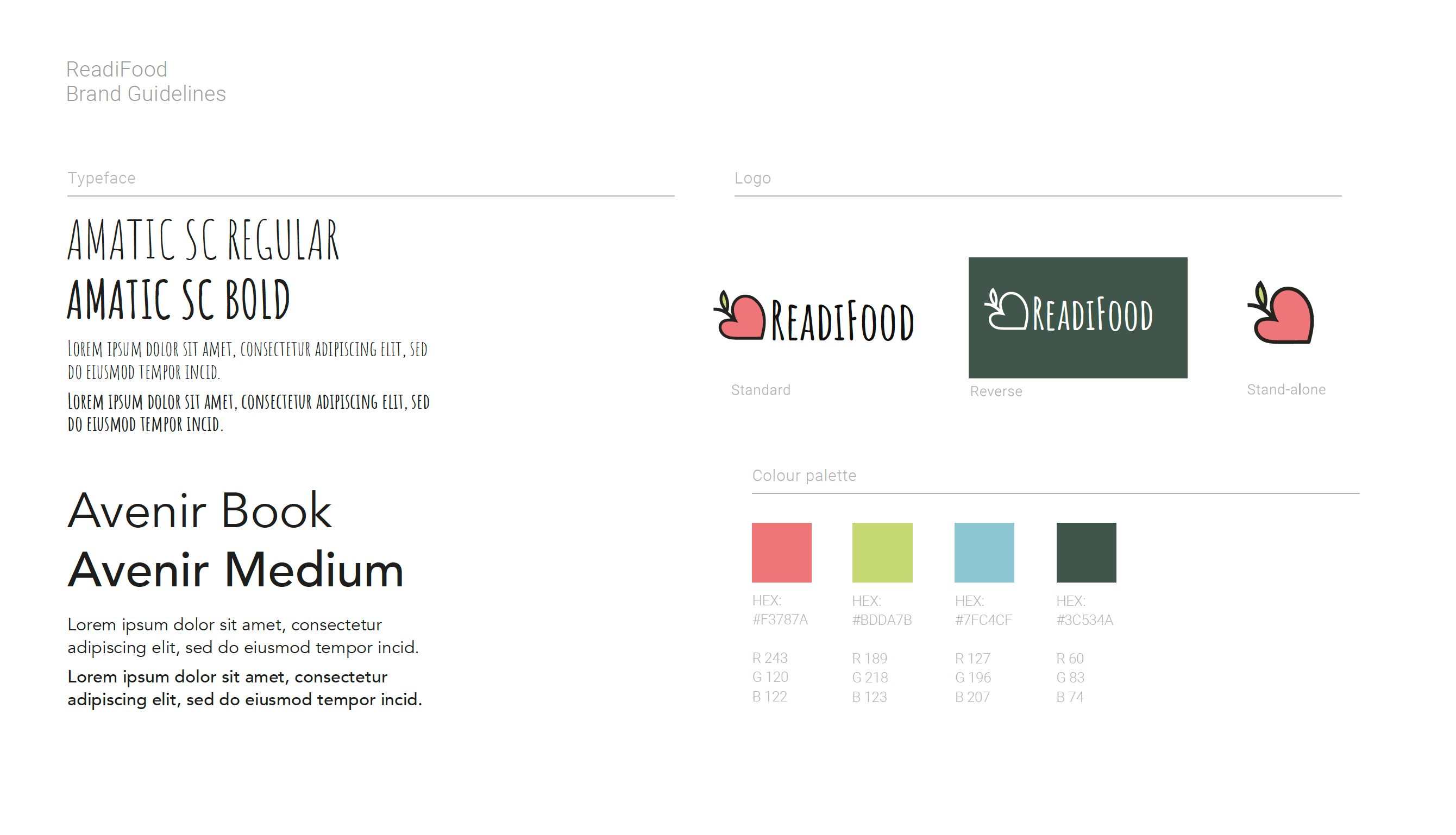
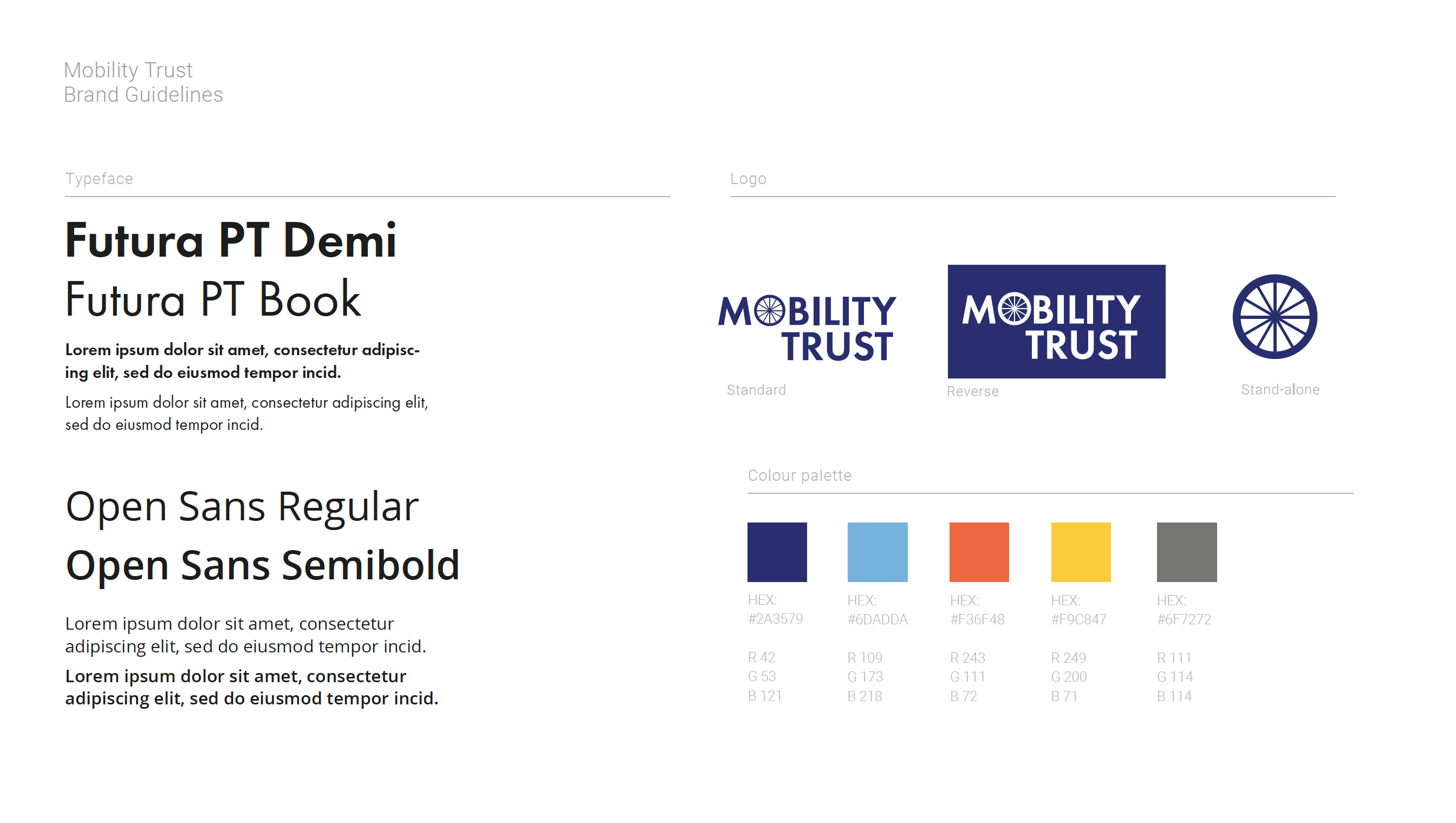
Working with guidelines
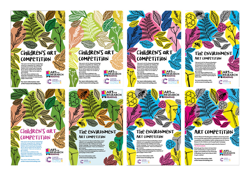
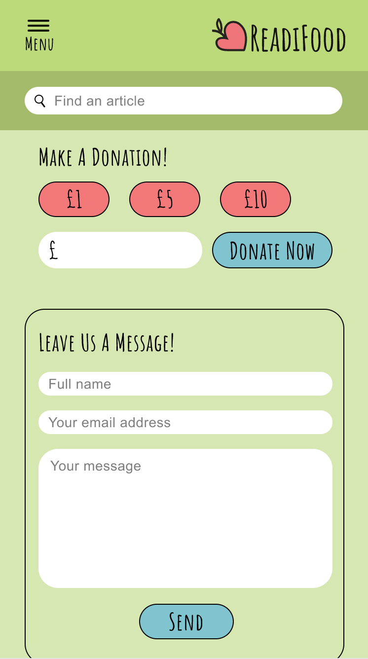
The sample set of guidelines was provided, so it was a case of changing images and typefaces, and colours, whilst keeping the same standard framework. The following images are the guidelines I submitted, and the guidelines which the part 1 students would be required to choose from (amongst others).
Final feedback from client(s):
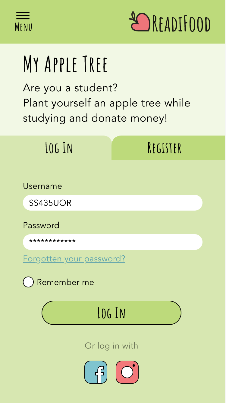
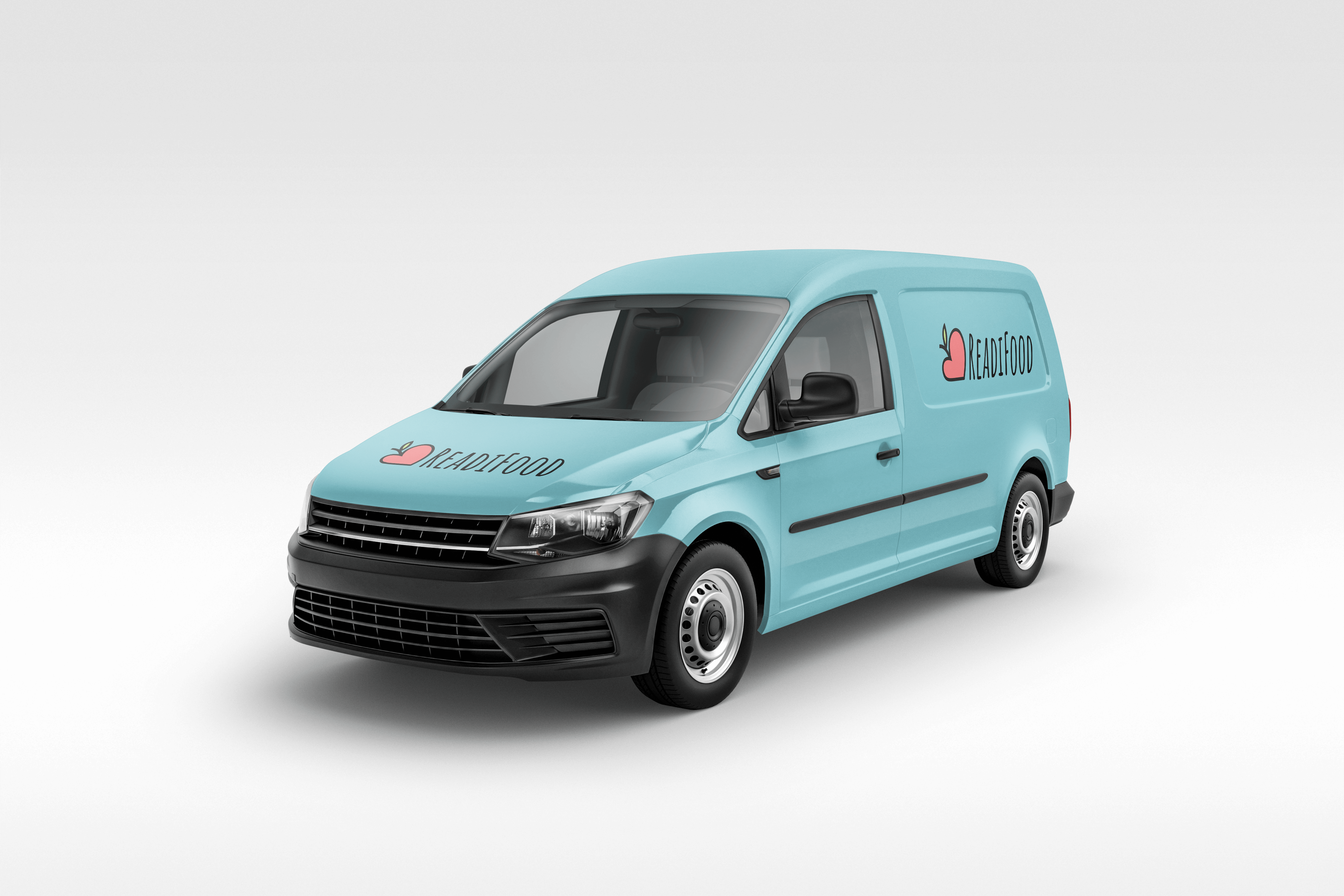
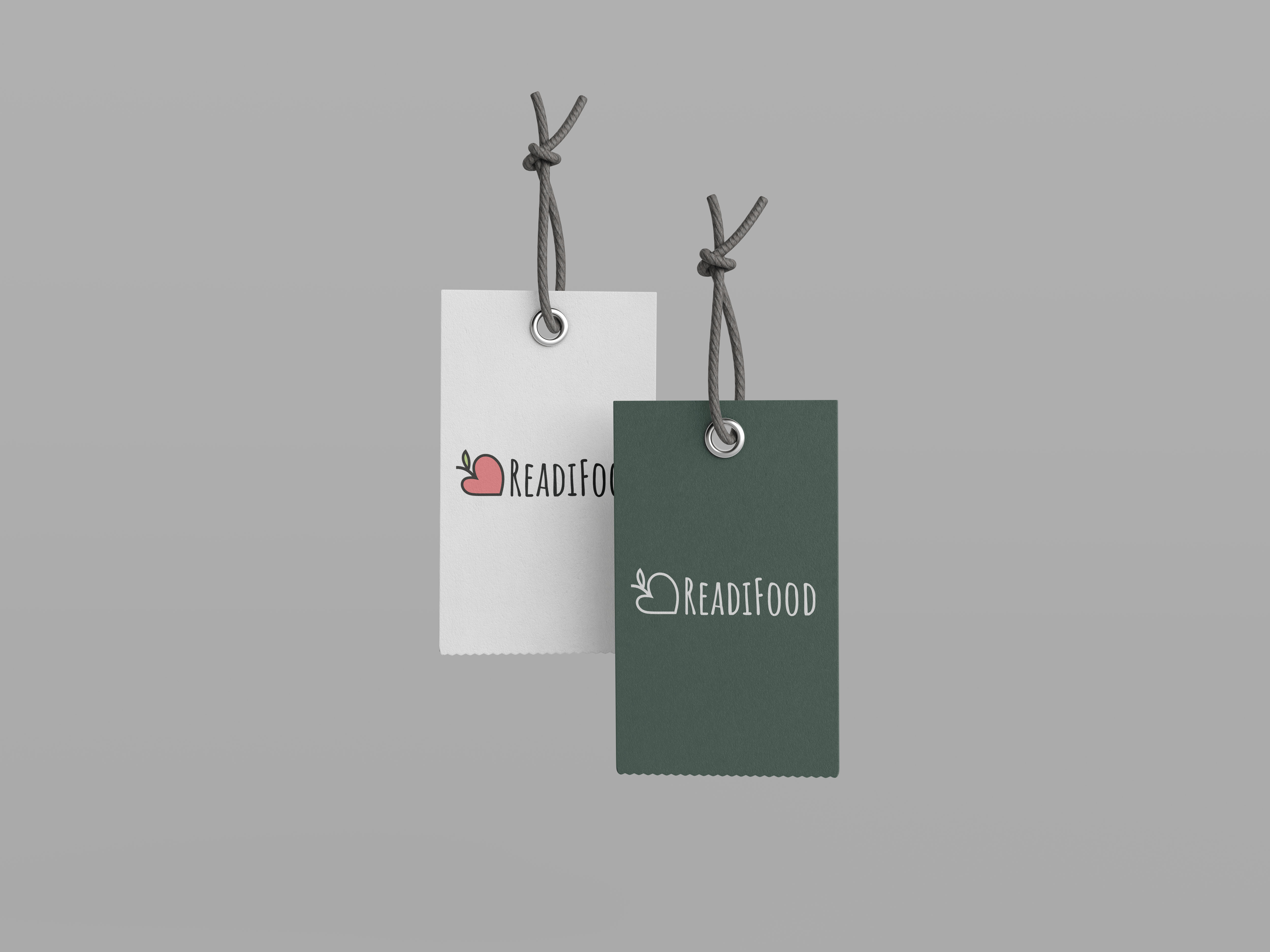
“The Readifood one is great. It’s a heart, it’s an apple, it’s a friendly font, its format means it works well in a mobile website header area.”
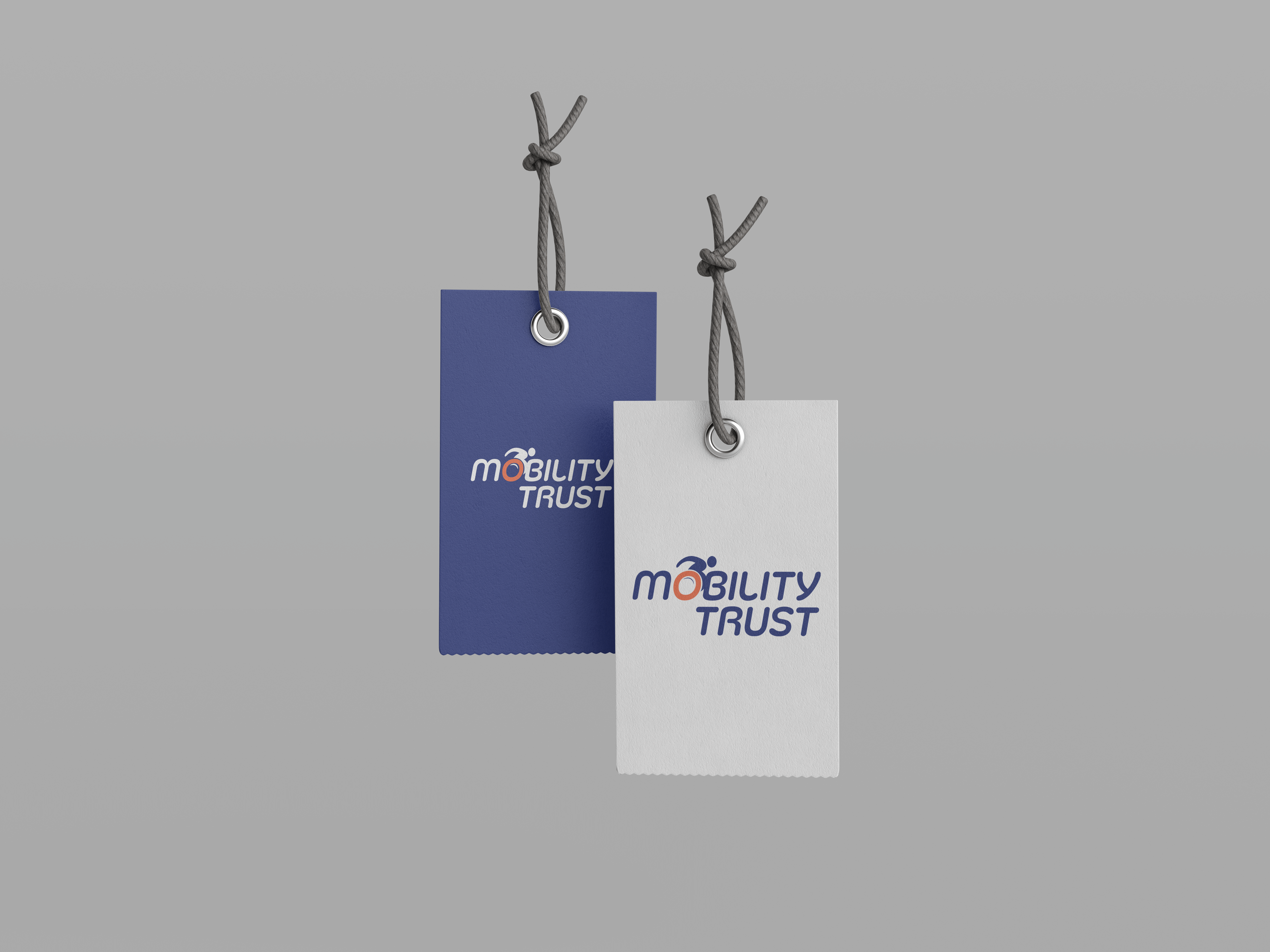
“I find the Mobility Trust work a bit cold and hard. The wheel looks like a wagon wheel or something from the industrial revolution, and the use of Futura is again rather mechanistic. The overall impression is more machine than human, which is obviously problematic. So do try to ensure that you map out any sensitivities among your stakeholders carefully, and don’t fall into obvious traps.”
From reviewing my work based on these comments, I also felt that the Mobility Trust logo lacked the charity aspect which ReadiFood has, and should have more movement. I aim to progress further on this logo and create something more usable for the charity when I come to submitting my work.
Feedback from Part 1 student/guidelines in use:
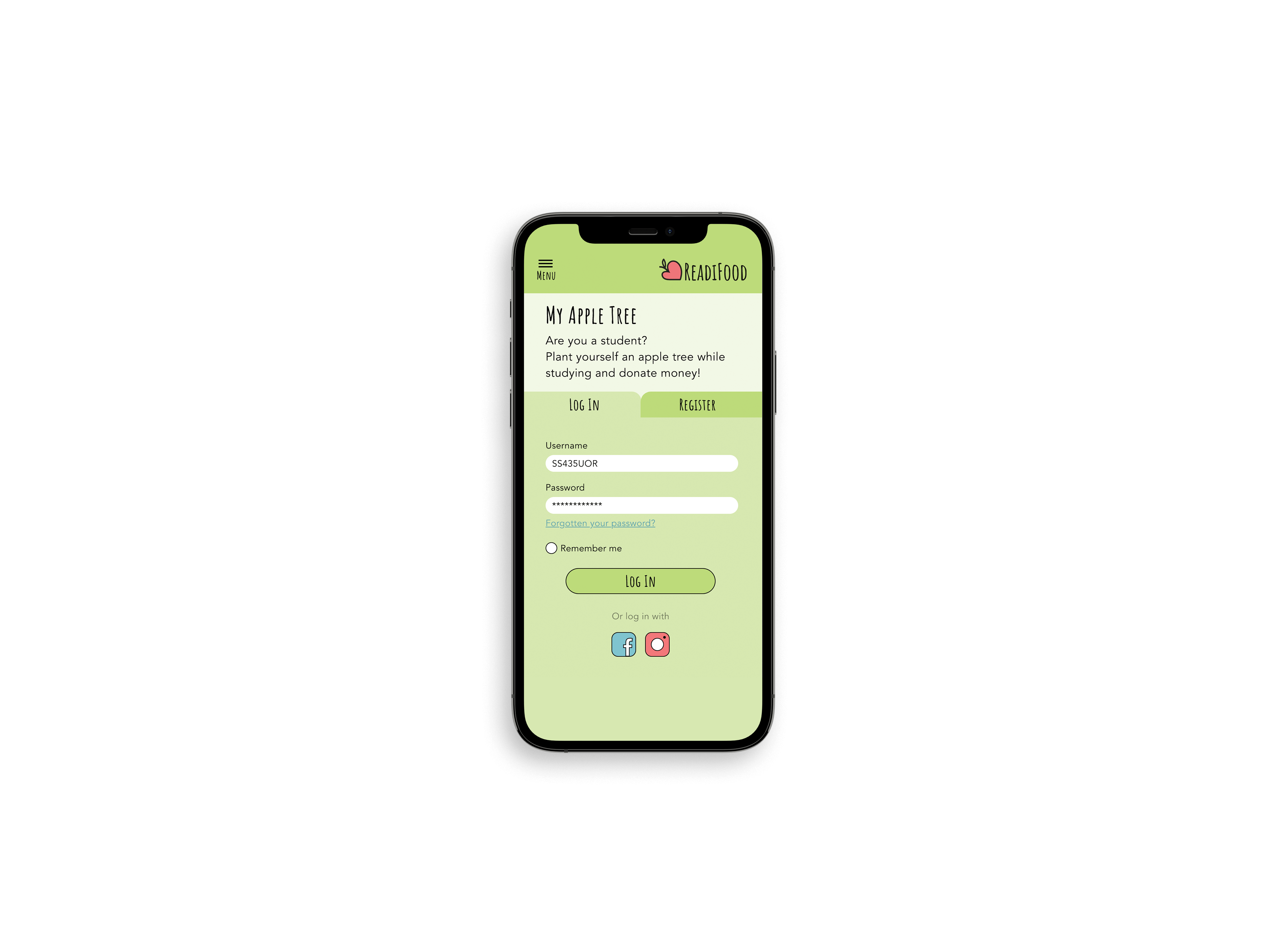
As the Part 1 students hadn’t done anything like this before, I was interested to see how they would have used the guidelines which were provided. I contacted 10 part 1 students, 1 of which had used my ReadiFood guidelines.
The questions I asked all students were:
- Which set of guidelines did you use? And why did you choose those over the others?
- Did you have any issues with using the guidelines? e.g any colour matchups, live type, etc.,
- When choosing colours from the palette, did you find yourself having to add more, or struggle to use the colours provided?
One part 1 student, Naomi, came back to me with the following:
“I am using the ReadiFood one. Your design attracted me the most at the very first sight haha maybe that’s because of my personal preference, but I really like how simple the logo is and also I think the Amatic font also matches with the logo style. Another point is the heart shape of the logo represents the image of a food bank in my opinion. As a food bank is a charitable organisation, what they are aimed to do is kinda like ‘spreading love to the people who are in need’. I found your logo is comparatively meaningful so I chose to use it in my prototype.

Reworking Mobility Trust:
I was unhappy with how Mobility Trust turned out, and so I chose to re-do my design as if I had more time. Notably, a lot of the issues which cropped up were because not enough thought had gone into the user and their needs, as well as the small time frame we were working in.
The main things to address were the overall feel of the logo; it was too rigid and mechanical before, and it should be full of life and movement. To do this, I had ideas of implementing a wheelchair and the acts of movement through italics.
Looking at the typefaces Co Headline (top) and Silicone (regular in centre, bold at the bottom), I liked how they were more rounded and had that movement which Futura does not. I wanted to combine this with a form of illustration, and revisited an earlier idea to have the wheelchair implemented. I like that Silicone is more friendly and is still equally weighted throughout to emphasize the consistency and trust in the organisation. The colours previously were working well, and so they stayed the same in these reworked ideas.
These logos of fluidity and movement, as well as a friendly and uplifting nature which Mobility Trust requires. When testing this on a sample of 10 people from different backgrounds, 100% of them recognised this as a wheelchair-orientated charity. And with that, I present my refined guidelines for Mobility Trust.
Showcase
![]()
Summary
This Real Job was challenging due to the time constraints, but I had a lot of fun doing something I was familiar with doing. It was really rewarding to see my guidelines in use by another student and get their opinions on the work I had done.