
Background
The Ure Museum
The Ure Museum can be found in the Classics Department within the Edith Morley building on the University of Reading’s Whiteknights campus. Before I started this job, I wasn’t familiar with the museum, however now I wish I had discovered it sooner as it is such an interesting asset to the campus. Before the COVID19 pandemic hit, the Ure Museum used to hand out physical exhibition guides to explain the beautiful objects in their exhibitions to vistors. However, the coronavirus pandemic has meant that this cannot happen and so, the museum have expanded their exhibition booklet to an online format. This is a really exciting step for the museum, as it is leading them into a new digital world – hopefully expanding their audience and encouraging more remote visitors from around the country.
I was assigned this real job with the task to design a digital exhibition guide for their upcoming exhibition – Troy: Beauty and Heroism, which is a spotlight loan from the British Museum, due to visit the Ure between September and December 2021. During my intial client meeting, I was told that the digital booklet would include a combination of images and text relating to each of the different objects in the exhibition. Originally the exhibition was meant to take place in February 2021 but COVID19 stopped this from happening – pushing the dates back. Upon reflection, I’m glad that this happened, as it meant that I could spend longer on the project – handing over a design at the end that I am really happy with.
Restated Brief
The main deliverable for this project was an interactive eBook , of which vistors could download remotely to read about the exhibition objects on their phones, tablets or laptops. Due to the exhibition being a spotlight loan, it was important that I incorporated in both sets of branding to create an exhibition guide with reflects the branding of both museums. As the Ure Museum and British Museum already have very strict guidelines, I had to ensure that I was considerate and consistent in my designs.
The specific objectives
Within the restated brief, my specific objectives for the job were that:
- The eBook must be easy to navigate for a reader – including the use of clear, interactive links.
- There must be clear divisions to show the three main sections of the exhibition.
- The prelims and end matter must be easy to find and read.
These three objectives gave me a clear starting point and a constant focus throughout the project, which helped me to stay motivated and on-track. Due to not having any specific software requirements to create the eBook in, I was free to chose an appropriate software, which I found really interesting as I learnt a lot about how eBooks can be made.
Changes to the brief
As the brief was very focused from the start, I didn’t encounter may changes. Although, due to the exhibition date being pushed back to a lot later in the year, it gave me some freedom and more time to get to know my client, which I really appreciated. However, at times I think that this did make the design process feel very lengthy, as I ended up working on the project for a couple months longer than originally scheduled.
Research
To start the ideation process, I began by looking at examples of other digital exhibition booklets to discover what navigational systems worked well, as well as mainly studying typeface sizes and the treatment of images and prelims/end matter. One particular example I was drawn to was the Pompei exhibition at Grand Palais (available to view at: https://www.grandpalais.fr/pdf/Guide_Visite_Pompei_GB.pdf). I liked this example as it is quite simple, yet effective, due to the large typeface, limited colour palette and straight-forward navigation system. As well as this, the clear clickable links within the guide related to the specific objectives I had been set as part of my brief, therefore, I used this resource as inspiration for starting my eBook.
I think that the guide is so easy to navigate as the different sections are clearly divided by large headings and the navigational bar is consistent on every page. This encouraged me to consider consistency during my own design process. However, the Pompei exhibition guide also urged me to think about what things didn’t work so well, or were missing, so that I could incorporate these into my own design. One thing I did find confusing with the booklet, was that the clickable links were not highlighted, so there was no immediate indication of which parts of press. This research was valuable to my designs as I knew that as a user, this is something I subciously look for online. Therefore, when designing the Troy exhibition guide, I used colour to show which links were interactive – furthering the clarify of the navigation system for the reader.
Creating the eBook
Due to my lack of experience in creating eBooks at the start of the job, I had to spend a lot of time discussing options with my supervisor. Having professional insight into the area gave me a lot more knowledge, of which I can now take forward for future projects. After researching different softwares, I finally decided to design the publication in InDesign as I had a lot of experience working with it and so I felt more comfortable. It was a really interesting process creating the eBook as I had never created an interactive pdf before – I thought it would be really time consuming but the process was very straightforward and by creating basic mockups I was able to experiment with different types of navigation.
Navigation
I started by focusing on navigation as I didn’t want to waste time creating layouts which could then be effected by changing the navigation. By the time I placed the text in, I was glad that I had this thought rationale, as I changed the original navigation system from a bar running down the left page margin, to small icons at the bottom of the page.


From using InDesign for editorial projects before, I was able to create a plan of what elements I wanted to focus on first. I started off by considering the following:
- Margins and columns
- Master pages
- Headers and footers
- Running heads and folios
- Stylesheets
- Paragraph and character styles
I chose to start the design with these page features as I wanted to create a strong foundation to place the text into.
Branding
After designing the main layout of the guide by using masterpages for different sections, I then moved onto the design stage. Having the Ure Museum’s brand guidelines was really helpful as it limited my choice of what colours and typefaces I could use. When I first met with my client, they gave me a selection of previous design jobs commissioned for the museum and these really helped me to get a feel of their branding. Looking through other examples, gave me a clearer idea of what the exhibition guide should look like in order to be consistent with other designs that had been created for the Ure Museum as they all clearly utilized the same colour schemes, graphic devices and typefaces. This job was my first experience of working on brand guidelines and I really enjoyed it as it gave me a clear direction with my designs.
Alongside the Ure Museum, working with the British Museum was a huge privilege. I was in frequent contact with their Press and Marketing Manager, who regularly assisted me along the project. Creating contacts with someone from such a respected company has been one of the most rewarding parts of this job. I received the British Museum’s brand guidelines for the Troy exhibition and had to ensure that I read them and understood them before I sent anything to my client. This process largely improved my proof reading skills as I had to read the text through many times to ensure it was all correct.
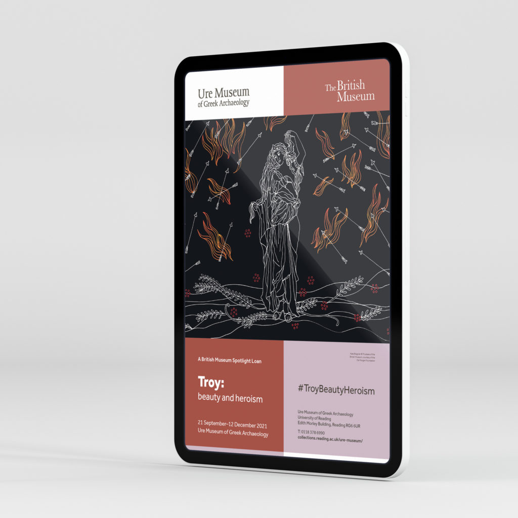
The cover
The final part of the design process, was designing the front cover for the exhibition guide. This part was where I incorporated in the British Museum’s branding – using their logo, featuring exhibition image and exhibition layout guide. As well as the booklet being consistent with the rest of the Ure publications, it also has to be consistent with the publications being produced by other museums working with the British Museum for this exhibition tour. This is why I chose the layout for the cover. I decided to change the boxes into the Ure Museum brand colours to add their touch to the British Museum’s layout. I think that the cover nicely combines the two brands together.
Originally, the whole publication was set in the Ure Museum’s blue brand colour. However, after placing in the images on the front cover, it seemed appropriate to use their orange brand colour instead – to create harmony between the text and images. Overall, the client and I agreed that this colour scheme worked a lot better than the original – which taught me that I should’ve furthered my experimental process within the brand guidelines at the start.


Reflection
I have thoroughly enjoyed working on this project with the Ure Museum, as it has improved my editorial and reader navigations skills, as well as teaching me many new skills – including how to create eBooks and how to work with brand guidelines. Being trusted to work on a project with the British Museum has also improved my confidence as a designer. Receiving such positive feedback from my client has been a huge highlight of the real jobs scheme for me and having the opportunity to create connections within the branding and marketing world has made the lengthy process of this job worth it.
Coming away from this project, I feel as if I could’ve worked more efficiently to still finish the job closer the original deadline, however having extra time allowed me to work with my client for longer, which I really enjoyed.