
Background
The Department of Typography and Graphic Communication at the University of Reading building wayfinding needs some refinement. The department needs a distinctive sign to indicate the building upon arrival. The design of an external wall graphic needs to be impactful because the sign would need to be noticed from afar from the enterprise car park for students, delivery and prospect students coming for application day, open days etc.
Brief
The brief was to design an external wall graphic for the department that can easily be recognised and needs to represent the department and the students and tutors alike. The final deliverable would be a press-ready pdf and the ai file ready for production by the department.
In the brief we stated, the success of this project would come from the users being able to recognise the building. The building would be eye-catching in an effective and positive way. The success of the project also depends on if the graphic elements represent the building and the department. Throughout the project, we ensured that the graphic elements were a representation of the department and are relatable with the tutors and the students. We wanted to make the department as user-centric as possible this was demonstrated through the surveys taken and the frequent feedback between students to get their perspective on what the department means to them. Although the real job has yet to be finalised as we wait on the specifications of the new windows our client and our supervisors alike have stated that the current design proposals are very encouraging.
Communication
Throughout the project, we had regular meetings with our clients and supervisors as well as attending frequent real jobs meetings. We felt it was important to get a different perspective to make sure we were in the right direction through the project especially after both of us have never designed wall graphics before. We also communicated with our peers to get their perspective on what they would like to see in the wall graphic. We conducted a survey to get the perspective of both the tutors and students and collated this to get an idea of what we could do moving forward.
Schedule
The schedule for this project has been disrupted heavily due to the COVID-19 pandemic. The original deadline was 20/04/2020. This has led to the project having to be stalled for a couple of months. The project is still currently progressing as we wait for the specification of the new department windows. At first, the project was progressing gradually without interruption and after the covid restrictions, we were limited to what we could do. We were able to successfully carry out the survey where we were able to make progress with making design decisions. Once we had an idea of the colour scheme and themes via the mood boards and survey, we were able to start proposing designs to our supervisors and our client. The process was mostly moving swiftly barring lockdowns in between. The designs were refined and edited during the months of feedback from our supervisors and clients.
Design Process
We attempted to start our design process with a general mood board (see Trello) showcasing different variations of wall graphics, both indoor and out. This collection of images is so we can gain inspiration from and look to gain any insights that may not have been so apparent beforehand. These general ideas would stand as a basis that may allow us to incorporate further ideas to at a later point in idea generation. During this time, however, we realised that the job at hand is very much to do with the community within the department than just the department itself. We realised that we wanted the people who reside within the building to be reflected in the graphic also; a more personal approach to the department would make more sense for this specific real job. The best way we thought we would do this is by creating a survey for all members of the department, staff and students, to take part in. The questions would be set up to try and gauge what the community thought that the building represented and what they wanted it to represent. These answers would go on to inform much of the decisions going forward and acts as a basis for us to refer back to in order to progress. Answers to do with the actual visual identity of the department are the best for these types of decisions; an example would be the colours that people came up with when they thought of the department.

From here we started on initial ideas for the graphic, and now we had a stronger basis for idea generation from the survey. Immediately we started to incorporate these findings within our work; some of which displayed the most popular answer for the colour that attributes to the department. Some of the initial designs also attempted to go the route of modern via the feedback that the departments do not represent modernity in design as much as they should, and some took the opposite route of embracing the traditional and historic look and feel of the department. We also took to approaching the graphic in multiple ways, some being with the use of type, some with the use of photography, and some with illustrations. We wanted to try out multiple solutions, and the brief in general is one that would allow us to do so. Throughout the entire project we had also been trying out different approaches to where exactly on the wall we would be designing the graphic for; the brief was left open for us to choose ourselves what the best option may be, and our client also shared this sentiment when asking him. He would often tell us that he wanted us to have more control over design decisions and that making decisions on things like where the graphic should be would detract from finding possible design solutions, and could essentially stunt creativity. This did allow for us to flex our creativity where we wished, but it did make it difficult when making decisions, and at times felt like too much freedom was given to us. The further we moved through the process the more we started to hone in on more solid concepts and ideas that would genuinely reflect the department and those insides.


Our next set of ideas incorporated the inside of the building. The interior of the department is very distinctive and has many pieces of ephemera and many old display pieces on the walls and in the hallways; we decided to take these as inspiration. Not only do they represent the inside of the building and its unique visual interior, but they also embody a large part of what is recognised from the department; its historic collections and general historic reputation. Moving from here, however, we would attempt to work in more modern elements to balance out the more traditional part of the concept; it would also allow meaning that we hit another criteria that were mentioned in the survey. This part would be to do with what was missing from how the department was being represented. This is the point where we decided to integrate the more modern use of iconographic illustrations. The icons did well to balance the traditional with the modern, especially when we started to illustrate the historical ephemera also.
At this point we had also decided on the use of multiple colours pointed out from the survey. We were also in conversations with Geoff to do with the application of the actual graphic, giving us the choice of multiple types of wall mounted panels. 
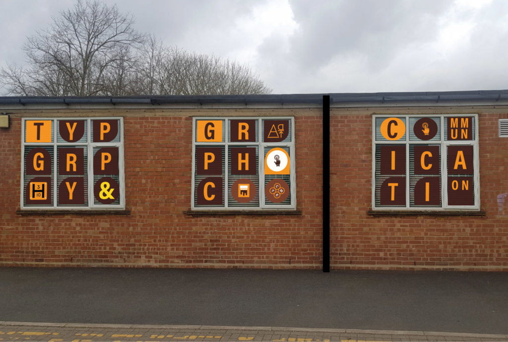
At this point we had also decided on the use of multiple colours pointed out from the survey. We were also in conversations with Geoff to do with the application of the actual graphic, giving us the choice of multiple types of wall-mounted panels.

Around this time, we were given feedback from our client regarding a suggestion of placing the graphic onto the windows, and after further conversations with Geoff, we were given the green light for a whole new avenue of designs. Our proposals now included ideas that would be placed onto the windows using a one-way see-through material called Contravision.

Unfortunately, as a new door opened, new problems arose. The department is due to get new windows installed and even up until submission it has remained unclear exactly what the dimensions of the windows are to be. Instead of waiting, however, we made the decision to move forward instead of lingering for an unknown amount of time. As a result of not knowing what the specific dimensions were, we took the initiative to base our designs on the most recently installed double glazed windows in the department at the time.


At the point of submission, we have not been able to finalise our designs and achieve a press ready outcome. Due to the nature of our job it was been agreed on that we will submit what we have at the moment, and make it as close to a convincing set of proposals as we can. It is to be noted that we will also be carrying on the real job after submission, and so the concepts we are submitting are currently still in development. Both our client and us as a group, believe that the concept is such that is flexible in application and is able to be adapted effectively to a new set of window dimensions if need be; until we get the correct dimensions from the project manager, we will be continuing with the sizes we have at the moment.
Feedback
We are still yet unable to get feedback for the final product however based on the progress we have made so far it has been mostly positive from the client and the supervisor. Overall our client has been happy with the progress we have been making and has often remarked our concepts as quite strong outcomes with a good amount of potential when finally implemented. A word from our client to justify this; “you have so far made very good progress on the real job, and have found a viable, realistic and attractive design direction, which shows considerable promise. I look forward to you continuing with the project so you can bring it to a successful conclusion in the coming weeks, following your submission of work completed to date.” Our supervisor is also encouraged with our current proposition and once we have the correct window settings we believe we can create a design that represents the department in a distinctive and eye-catching way.
Thank you from the team working on RJ00412