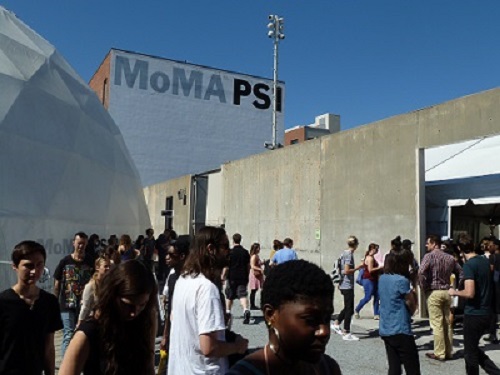
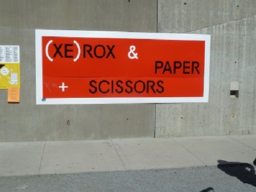
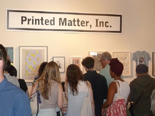
Last week saw the annual, simultaneously programmed, Art Book Fairs at MoMA PS1 in New York and the Whitechapel Gallery in London. Contributors from the Typography Department’s Art Information symposium, first staged in April at London’s ICA, presented again in New York and organiser Ruth Blacksell was invited to talk at NYCUs Artists Institute space in Manhattan. John Morgan, who will follow on at the Artists Institute this Autumn, presented live at the London Fair with his sell-out Whitechapel event ‘I will not make any more boring books’. Amongst the plethora of conference presentations and events across locations, other highlights included AA Bronson in conversation (London), the ‘Unbinding the book’ projects (London), ‘Publishing as research and development’ featuring the web-based magazines Triple Canopy and East of Borneo (NY), Norway’s Kunstnerbøker focus (NY), David Reinfurt of Dexter Sinister on Bruno Munari (NY) and Emily McVarish from California College of the Arts on the book designs of Phil Zimmerman (NY).
As students were settling into their Halls for Welcome Week and the start of the new academic year, Sunday marked the return of several members of the Typography family from the annual ATypI conference, a highlight in the calendar of international type professionals. Held in Barcelona’s impressive new Museu del Diseny by MBM Arquitectes the conference was especially significant for Typography: to celebrate the award of the Sir Mischa Black Medal to Michael Twyman, the Association invited him to deliver the Keynote lecture on the topic of “Typography as a university study”. (The image above, of visuals marked up by Tschichold for a facsimile edition of Vespasiano’s 1572 writing manual, is from Michael’s collections – and seen by postgraduates who join his seminars.)
Forty years after the foundation of the Department of Typography & Graphic Communication (and a few more since the inception of the original course, in the late 1960s), Michael’s integration of history, theory and practice continues to define typographic education. These ideas have proven not only resilient, but prescient: graphic communication education worldwide is moving towards these ideas, holding Reading as a model for both new courses and institutions realigning their design studies.
(Above: Fiona Ross and Michael Twyman in Barcelona. Photos by Elena Veguillas)
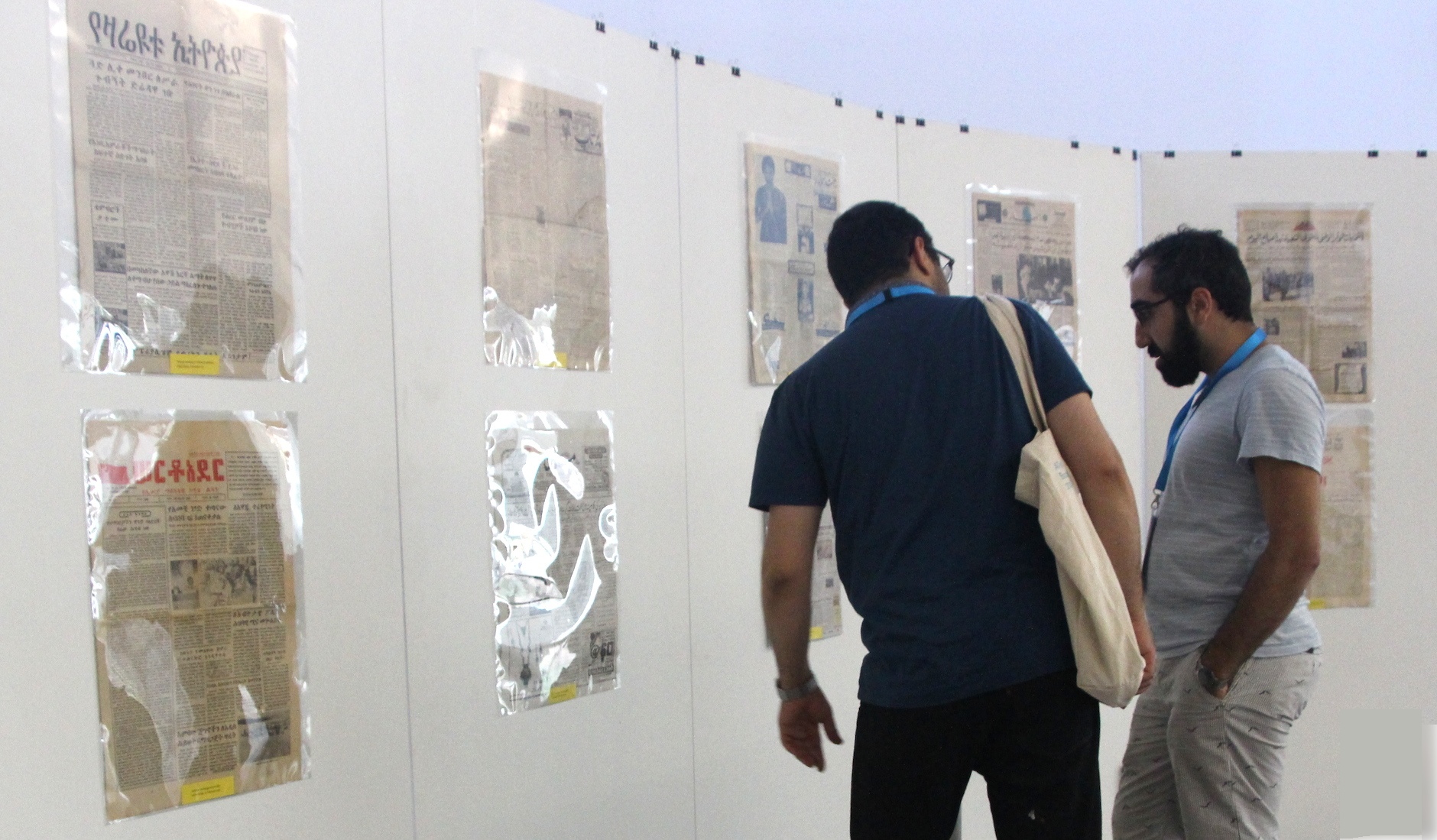
Borna Izadpanah and Behdad Esfahbod reviewing the Urdu section of the exhibition.
ATypI president (and Reading alumnus) José Scaglione’s announcement that ATypI 2015 will take place in São Paulo, the first South American location for the Association, which will bring the conference closer to the substantial community of Brazilian alumni.
Kicking off a busy week for Typography staff, Gerry Leonidas spoke to a full hall at Smashing Conference in Freiburg. The new talk focused on typefaces from a web designer’s perspective, and included key notions for evaluating typefaces. Web design professionals are increasingly interested in typography and typeface design, where the Department’s expertise has many contributions to make. By way of a reminder, Marko Dugonjić (amongst many other things, SmashingConf reporter on Twitter) noted:
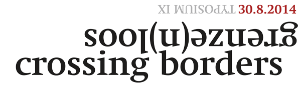
The ninth Typosium, organised by Initiaal, took place at the Museum Plantin Moretus in Antwerp on 30 August, with the theme Crossing Borders/Genze(n)loos. Our own Jo De Baerdemaeker, Fiona Ross and Gerard Unger were amongst the presenters. Gerard spoke about his Alverata project, a contemporary typeface drawing on romanesque sources and employing a wide range of historically-inspired alternate shapes. Fiona wand Jo conducted a Dialogue on type, looking at a range of projects for global scripts. Pictures on Jan Van der Linden’s photostream.
Sponsored by Monotype, the 2014 TYPE& events in Tokyo included a masterclass for professional typeface designers, and presentations and panel discussion on multi-script typography and typeface design. The events captured the growing interest by Japanese type foundries to expand into Latin typeface design, and gave an opportunity to discuss Reading’s approach to developing multi-script design skills. Gerry Leonidas ran the masterclass on the first day of the event, and presented on the second, answering many questions on the MA Typeface Design programme’s contribution in the area. Reading alumna and Monotype employee Reiko Hirai was instrumental in the success of the event.
Sponsored by Monotype, the 2014 TYPE& events in Tokyo included a masterclass for professional typeface designers, and presentations and panel discussion on multi-script typography and typeface design. The events captured the growing interest by Japanese type foundries to expand into Latin typeface design, and gave an opportunity to discuss Reading’s approach to developing multi-script design skills. Gerry Leonidas ran the masterclass on the first day of the event, and presented on the second, answering many questions on the MA Typeface Design programme’s contribution in the area. Reading alumna and Monotype employee Reiko Hirai was instrumental in the success of the event.
This Thursday evening, 23 January, Eric Kindel will join Fraser Muggeridge and Tom Bloor for a discussion and tour of nearly five decades of posters designed for Modern Art Oxford, now on show in ‘Notice! Modern Art Oxford in Print’. Details here … see you there!
MAU visitors and Reading hosts, from left Ms Aki Amitani, Professor Yoshiro Goto, Gerry Leonidas, Toshi Omagari, Professor Gerard Unger, Yui Yoshitomi, Julian Moncada, Mari Kitamura, Akiko Maeda, Yukiko Aoshima.
Marking the University’s new connection with the Mushashino Art University of Tokyo, two staff members and four students visited the Department of Typography & Graphic Communication for an intensive week of typeface design. The group, led by Reading alumnus Professor Yoshiro Goto of the Visual Communication Design Department, used their time in Reading to conclude a collaborative project devised by Prof. Goto and Gerry Leonidas, and delve deeper into the Department’s research-informed approach to typographic practice. Their schedule combined dedicated sessions, as well as shared tutorials and seminars with current BA students. The group also took part in sessions of particular interest by Professors Michael Twyman and Gerard Unger. Assisting generously throughout the week were fellow alumni Julian Moncada and Toshi Omagari (also a MAU alumnus).
Students in the Department are used to discussing design issues with staff in small groups, or one-to-one settings. This allows us to adapt to the students’ experience and perspective, and gives us the opportunity to build a lesson around investigation and inquiry. But sometimes we have to address large audiences, and build explanations for unfamiliar listeners. In most cases our students don’t witness this side of our work.
Although more lectures are captured than ever before, it is often the case that the camerawork is not great, or – more often – the audio is lacking. Fortunately, the good people at Besquare did a great job at the Ampersand Conference in Brighton. The just-uploaded lecture by Gerry Leonidas on Vimeo is an excellent introduction for new students on the kind of monologue they are unlikely to experience in the Department.
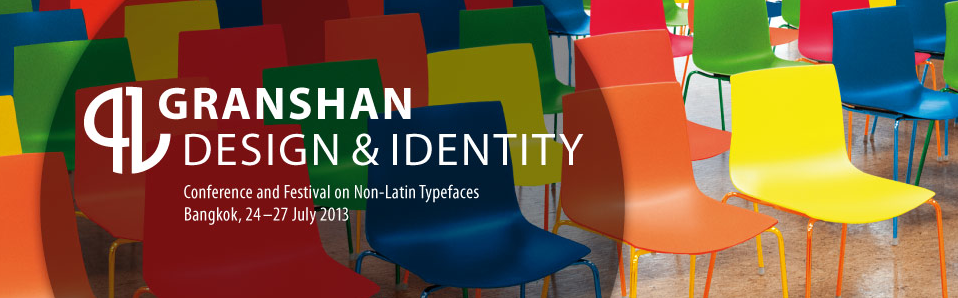
The University of Reading is a partner in the 2013 Granshan: Design and Identity conference in Bangkok, currently under way. The Department is contributing with a special version of the “From hot-metal to OpenType” exhibition, which opened to the public yesterday in the library of Chulalongkorn University.