Category: events

Exhibiting Aspen

600px
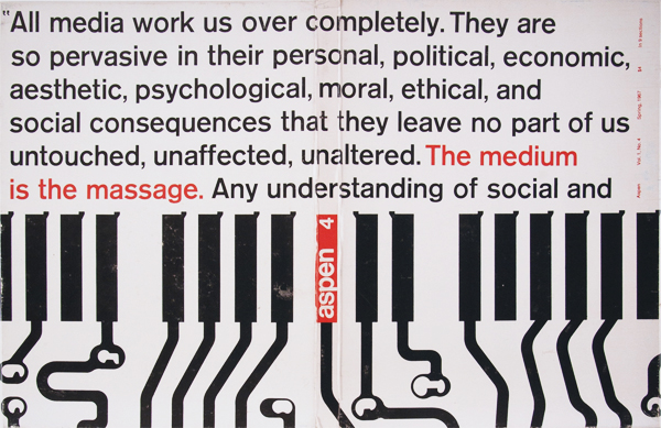
Aspen, described in the 1960s as ‘the first three-dimensional magazine’, was produced in California and published in New York on an irregular schedule from 1965 to 1971. Many leading figures in contemporary North American and European art and cultural criticism were involved in its production as editors, designers or contributors and this, along with its unique format, has contributed to its art historical importance and continued relevance to contemporary art and design practices of today. Rather than bound printed pages, Aspen was issued in a customized box or folder containing a wide range of items including posters, postcards, tickets, booklets, reels of Super-8 movie film and ‘flexi disc’ phonographic recordings. These different published formats turned the magazine into a space where artists were able to move outside the gallery and engage with a broader social and political sphere. As the magazine’s editor Phyllis Johnson put it: ‘Aspen presents actual works of art! Exactly as the artist created them. In exactly the medium s/he created them for.’ Few complete sets of Aspen remain and this exhibition provides a rare opportunity to see items from across all ten issues as well as many important individual pieces which have acquired specific art historical and cultural significance.

Hosted by the Department of Typography & Graphic Communication from 18 June – 2 July 2013 (Monday–Friday / 9am– 5pm). This joint exhibition by the Department of Art and the Department of Typography has been curated and designed by MA Book Designer Lisa Stephanides. The exhibition is supported by the Arts Committee at the University of Reading. We would like to extend our thanks to Professor Alun Rowlands from the University of Reading’s Department of Art for his generosity and support in the loan of this collection.

Reading at ICTVC 5, Nicosia

Reading at ICTVC 5, Nicosia

ICTVC 5

Reading staff and graduates have returned from the fifth International Conference on Typography & Visual Communication, hosted by the University of Nicosia. ICTVC is the brainchild of Dr Klimis Mastoridis (a Reading alumnus) who, since the first event in 2002, has given the conference a distinct character that sets it apart from most such events. Amongst typography-orientated events, ICTVC is probably the most diverse in the range of academics and practitioners it brings together. And, even in this smallest of its iterations, it attracted speakers and delegates from four continents.

The combination of research and practice makes ICTVC a very good fit for Typography, and it was no surprise to see the Department represented well. The speaker lineup included staff members Mary Dyson, Gerry Leonidas, and Sue Walker, and current PhD candidates Sallie Morris and Niki Sioki. PhD alumni Petra Cerne Oven, Sue Perks, Karel van der Waarde, and MA alumni Julián Moncada, Elena Papassissa, Vaibhav Singh, and Adi Stern also presented papers.

For a general report on the conference, head over to Mark Barratt’s post on the Eye magazine blog.

Reading in Berlin

The annual TypoBerlin conference is a major fixture on the European design calendar, bringing together over 1,500 attendees in the Haus der Kulturen der Welt in Berlin. Erstwhile staff member Ken Garland opened this year’s conference with a talk on the theme of “touch”, taking the audience on a journey through senses and ideas, culminating with a very personal and touching – pun intended – story. Department  graduates Paul Barnes and Marian Misiak talked on making typefaces from Cornish vernacular lettering, and Polish type design heritage from the Communist era respectively. Gerry Leonidas spoke on the emergence of typeface design as α professional discipline with global reach. Slanted magazine have  been reporting on their blog on Ken, Paul, Marian, and Gerry.


Another contribution to the Venice Biennale

Adobe Thai, a typeface designed by Fiona Ross and Tim Holloway, features in this visual project by Zurich-based artist Dafi Kühne – 40 posters in 34 languages – presented at the Biennale in 2012. You can watch the production process on Vimeo:

You can read the artist’s documentation, where he thanks Fiona, research student Titus Nemeth, and MA graduate Toshi Omagari for the help with the non-Latin typeface layouts.

ICON print identification course

ICON print identification course

This week we were pleased to welcome members of the Institute of Conservation, for whom we ran a hands-on print identification course. To find out more about our short courses, including next week’s poster workshop in conjunction with the V&A and the Arts Council England Subject Specialist Network (Wednesday 24 April), contact Diane Bilbey (d.j.bilbey@reading.ac.uk)

We run regular two-day short courses explaining printing ­processes, specially tailored to the needs of librarians, archivists, ­curators, and social historians. Led by Martin Andrews, each day focuses on one of the three main processes – letterpress, lithography, and intaglio – and participants are able to examine original printing materials and prints from the Department’s extensive collections, and try out tools, materials, and techniques in hands-on sessions. By the end of the course you will be able to indentify a wide range of printing procesess, take prints yourself, and use the replica Gutenberg press featured in Stephen Fry’s ­television documentary.

¶ For more information on the Posters SSN, contact Catherine Flood (c.flood@vam.ac.uk) at the V&A

Design is not a matter of surface appearance

Typography supports the Design Commission’s launch on 13 March 2013 of Restarting Britain 2: Design and Public Services, and strongly endorses its opening statement: ‘Design is integral to the DNA of each and every public service. Design is not a matter of surface appearance.’

Prof Sue Walker, who contributed written evidence to the Commission, has also been invited to become a member of the Associate Parliamentary Design and Innovation Group (APDIG) to highlight existing work in the design research field that has not yet been exploited by policy makers and those in government, to point to design research as an untapped resource for policy makers. The group will report to a parliamentary seminar in June.

APDIG brings together colleagues from universities recognised for excellent and relevant design research. Information design research has much to offer government and public services through its user-centred and often collaborative methods, as well as through research outcomes that inform the presentation of complex material, in print and online.

An example of research-led information design is the Centre for Information Design Research’s work for the Behavioural Insights Team, a group of economists and psychologists working within the Cabinet Office, to help with a trial they are running to support unemployed people looking for work. Earlier this week the forms were shown in the Independent in a piece describing the impact made during testing.


Pencil to Pixel travels to NYC

PtPNYC

When the Pencil to Pixel exhibition opened in Wapping last November, visitors were treated to a rare selection of typeface design and type-making objects from the Monotype Archive. The inspiring exhibition was accompanied by a special issue of the Monotype Recorder celebrating the work of Robin Nicholas, and an exceptional special issue of Eye magazine.

Today the exhibition announced the dates and location for its New York City run, in May. The exhibition is supported by the Department (which also claims amongst its alumni the curators of the exhibition).

Colloquium upcoming: ‘Printed image and decorative print, 1500–1750’

On Friday March 22, Eric Kindel and James Mosley will contribute papers to the one-day colloquium ‘Printed image and decorative print, 1500–1750’ being convened by Reading’s Early Modern Research Centre. They will both present projects and artefacts associated with the Académie Royale des Sciences in Paris. Eric will discuss the invention of stencil duplicating by Christiaan Huygens, and James will explore a text and an unknown iconography of the making of books that were constituents of the Description des Arts et Métiers.

More information
Booking

Steen Ejlers on the Danish lettering tradition

Steen Ejlers 2009Danish architect and graphic designer Steen Ejlers wil be talking in the Department on Monday 25 February at 10am about the Danish lettering tradition of the 20th century.

Steen Ejlers is associate professor at the Institute of Design & Communication at the Royal Danish Academy of Fine Arts. His current research project ‘Danish Font Design of the 20th Century’ is a culmination of many years of historical interest in type design, and he has published books on Claus Achton Friis, Gunnar Biilmann Petersen, and Ib Andersen.