Author: Test User

Student–staff collaboration on biodiversity tracking tool

KiteSiteSignagePalmer2014

The University has launched its biodiversity mapping tool, KiteSite, which is to be used in teaching to track sightings of plant and animal life and, through GPS, map their location on campus. The tool was developed from existing open-source software by a joint team of biologists, computer scientists and designers as part of a University-funded Teaching and Learning Development project. Typography and Graphic Communication student, Liam Basford (pictured centre), developed the branding and communications for the project. He is with Bethany Everett (left), one of a group of student volunteers who tested the tool, and Alison Black, of Centre for Information Design Research, who was part of the academic team involved in the project.

Getting from A to B: inspiration from the archives


AAroutepage

Our collection of twentieth-century town plans, road maps and route plans includes four AA Route Sheets that were individually made in the 1940s for the trips members wanted to take.

The little booklets contain a combination of directions, maps, town plans and points of interest. The routes outlined in our recent acquisitions are London to Bournemouth, London to Liverpool, Chiswick to Middlesbrough and Middlesbrough back to Chiswick. They contain ‘places of interest’ descriptions of parts of the route: ‘Much pleasant woodland & some high ground after leaving Winchester’ as well as a detailed account of the route, in an abbreviated form that makes sense in context:  ‘under second rly.br.bear lt.into’.

By 1948 AA membership returned to the pre-war level of over 700,000 and demand for routes like these increased rapidly, particularly when petrol rationing ended in 1950. The evocative ‘places of interest’ information was dropped at this time when details of the return route were added to the reverse of the route sheets. These route guides were the Sat Nav of their day, ideal for people that wanted a handy set of instructions on how to get from A to B.

 Laura Weill, Typography Collections assistant

Doing a PhD at Reading

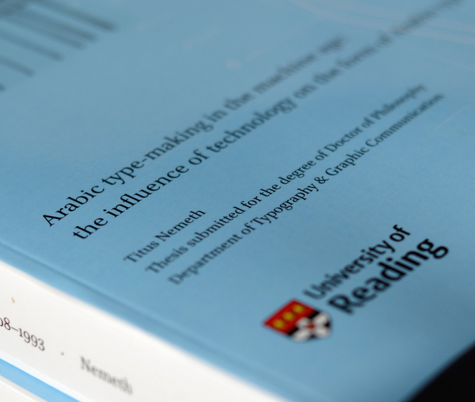
Titus Nemeth thesis

Titus Nemeth submitted his PhD thesis in 2013, on the evolution of Arabic type-making under the influence of changing technologies. The thesis spans the period from 1908, when the first adaptation of Arabic to mechanical typesetting introduced machine-aided composition; and 1993, when the adoption of Unicode marked the end of typeface design’s association with specific platforms. Titus’ research was supported by an AHRC Studentship.

Titus’ PhD represents a number of type-related research projects drawing on archival material, and is a useful reference for all researchers in this area. He has now published on his blog an engaging reflection on his experience doing a PhD at Reading. His article is a source of inspiration and guidance for potential researchers, and contains useful advice for research at this level.

The PhD was not Titus’ first experience in Reading. He had graduated from the MA Typeface Design in 2006, having completed an important Latin/Arabic typeface and a dissertation on Arabic newspaper typography.


Full house at TYPE& in Tokyo

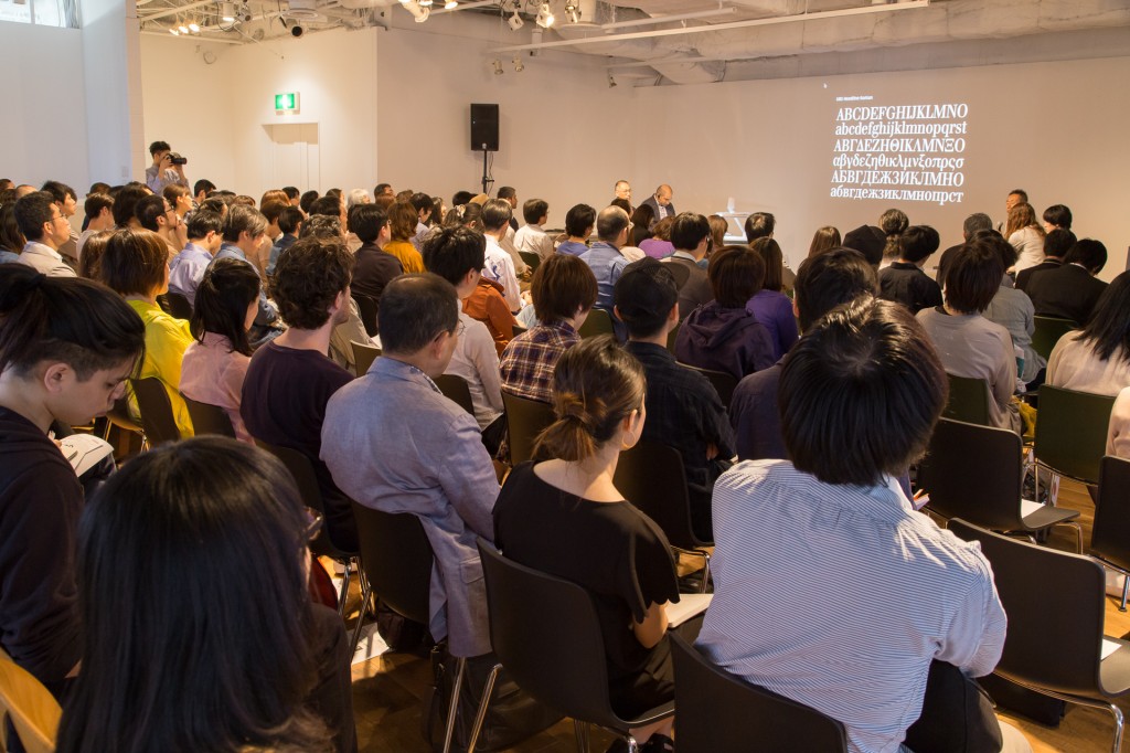
TYPE& Tokyo


Sponsored by Monotype, the 2014 TYPE& events in Tokyo included a masterclass for professional typeface designers, and presentations and panel discussion on multi-script typography and typeface design. The events captured the growing interest by Japanese type foundries to expand into Latin typeface design, and gave an opportunity to discuss Reading’s approach to developing multi-script design skills. Gerry Leonidas ran the masterclass on the first day of the event, and presented on the second, answering many questions on the MA Typeface Design programme’s contribution in the area. Reading alumna and Monotype employee Reiko Hirai was instrumental in the success of the event.

Gerry will be moving to a different part of Tokyo to spend a week at Mushashino Art University, and give a public lecture at the Toppan Printing Museum.

Art Information symposium at the ICA – Saturday 26 April 2014

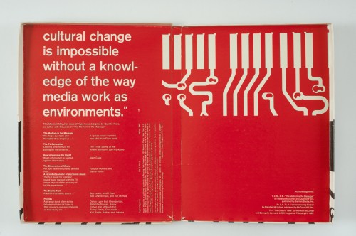
This one-day event looks at acts of publishing in contemporary art & curatorial practice.Aspen#4_box_McLuhan_inside

Organised by Ruth Blacksell, Programme Director of the MA in Book Design, this event features presentations by Jo Melvin, Chelsea College of Arts, London; Lucy Mulroney, Syracuse University Special Collections Research Center, New York; Stuart Bailey, Dexter Sinister/The Serving Library, New York; and John Russell, Professor of Art at the University of Reading. Click here for more information and tickets.

Журнал «Шрифт» features the MATD

Moment from the Type Journal interview

The notable Russian online journal «Шрифт» (“Type”) published a substantial interview of Gerry Leonidas, programme director of the MA Typeface Design. The interview, which focuses on Reading’s pioneering approach to typographic education, is accompanied by images of student work and moments from the Department captured by Evgenia Basyrova.

The original text of the interview, in English, is available on this page.

Banks and Miles Christmas tins and drums

2014-01

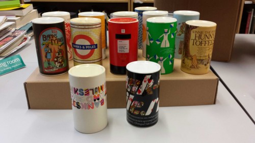
We are delighted to draw attention to some items from the Banks & Miles Collection. This lovely set of 17 tins and drums were kindly donated by the once chief architect to the Zoological Society of London. Colin Banks and John Miles were the society’s typographical and graphic design consultants. The donor was also a close friend of the duo at the time.

These tins and drums were sent out by Banks and Miles each Christmas to clients and associates, each relating to design work they had done that year. The examples in the collection range from the late 1960s- mid 1980s. Some of the tubs even contain their original contents.

Our examples include a London Underground design, dating to 1979, when Banks and Miles revised Edward Johnston’s classic sans for London Transport. This drum contains two napkins with a red underground logo reading ‘Banks and Miles’. Another using the distinctive British Telecom design, this contains a very helpful international dialing code card. In 1975, they referenced their iconic work with the Post Office, turning the tub into a mini post box.

These are such lovely objects, especially those containing their original gifts, showcasing some really great examples of classic British Design.

Michael Twyman awarded Sir Misha Black Medal

We are delighted to announce that Professor Michael Twyman has been awarded the 2014 Sir Misha Black Medal for his contribution to design education.

Professor Sue Walker recalls:

‘Writing about ‘Typography as a university subject’ in 1970, Michael identified four ‘basic beliefs’ that governed the structure of the Reading course:

  • the visual form of typography should relate closely to the language used and its organisation reflect and reinforce its meaning;
  • typographic designers should understand the technical means at their disposal;
  • the reader must be respected;
  • typographic design is planning in relation to the above three, usually in the context of a client, an organisation, a budget and a deadline.

These statements are still relevant today, and have influenced the approach to design taken by our students.’