Author: Test User

Branding workshop with Part 3 students

Chris Washington-Sare and students working on the brand proposition for There4Reading.
Chris Washington-Sare and students working on the brand proposition for There4Reading. 

Alumnus Chris Washington-Sare (1985-89), from Pentatonic Marketing, joined us this week to deliver an all-day workshop on ‘How to help charities develop their marketing proposition’ for Part 3 students, as part of their current practical project, ‘Not-for-profit branding and design thinking’.

Learning through a series of short presentations, group work and practical exercises, students were able to develop a marketing strategy for real charity clients ‘More than Food’ (a Trussell Trust food bank initiative), Team Berkshire (a initiative of Get Berkshire Active), There4Reading (Youth Volunteering in Reading) and Kileva (Helping communities in Kenya).

Students gained marketing insights on brand values, the importance of a vision and mission, how to understand and present the functional and emotional benefits of an organisation, how to identify the points of differentiation, and the brand personality. The day ended with a session on social identity and the use of semiotics in branding.

Our students loved it:

“I found the branding workshop very informative and worthwhile. It was useful to look at the project from a marketing perspective rather than as a designer. This gave me and my team a clearer understanding of our competitors, target audience and our charities vision.”

“The day was structured well, as we went through the process right from the beginning to the end. This gave chronology and a greater clarity to how the brand develops from initial research to a vision/mission/values which begin to hint at the imagery of the brand.”

Typography has a special relationship with many of our alumni. We very much value their contributions to ensure that our current students can see where their experience at Reading might lead.

Student competitor analysis for ‘More than Food’ looking at Points-of-Parity and Points-of-Difference.

‘Time(less) signs’ at Austrian Cultural Forum London

Showcase_1

The exhibition ‘Time(less) signs: Otto Neurath and reflections in Austrian Contemporary Art’ runs from 30 September 2014 to 9 January 2015, at the Austrian Cultural Forum London. It features a selection by curator Maria C. Holter from the ‘Zeit(lose) Zeichen’ exhibition first staged at Vienna’s Künstlerhaus in 2012, supplemented by original material from the Department’s Otto and Marie Neurath Isotype Collection (see image above). As part of the public programme accompanying the exhibition, co-curator Christopher Burke will give a talk on Isotype at the Austrian Cultural Forum on Tuesday 14 October 2014.

See also:

Interview with Maria Holter, exhibition curator

Zeit(lose) Zeichen

Isotype: design and contexts, 1925–1971

Reading presence at the New York & London Art Book Fairs

MoMA

Last week saw the annual, simultaneously programmed, Art Book Fairs at MoMA PS1 in New York and the Whitechapel Gallery in London. Contributors from the Typography Department’s Art Information symposium, first staged in April at London’s ICA, presented again in New York and organiser Ruth Blacksell was invited to talk at NYCUs Artists Institute space in Manhattan. John Morgan, who will follow on at the Artists Institute this Autumn, presented live at the London Fair with his sell-out Whitechapel event ‘I will not make any more boring books’. Amongst the plethora of conference presentations and events across locations, other highlights included AA Bronson in conversation (London), the ‘Unbinding the book’ projects (London), ‘Publishing as research and development’ featuring the web-based magazines Triple Canopy and East of Borneo (NY), Norway’s Kunstnerbøker focus (NY), David Reinfurt of Dexter Sinister on Bruno Munari (NY) and Emily McVarish from California College of the Arts on the book designs of Phil Zimmerman (NY).

NY Art Book Fair

The London Art Book Fair at the Whitechapel Gallery

Xerox

Printed Matter

Launch of dementia carers’ handbook

Dementia Handbook

Last week saw the launch of the Berkshire Healthcare handbook for carers of people with dementia. The handbook is the product of a joint research project between Centre for Information Design Research and Berkshire Healthcare Foundation Trust to understand the information needs of carers of people with dementia and respond with an appropriately designed resource. Once the handbook itself has been launched our research will continue, to examine how it is used; and the complete process of initial research, design development and user feedback will be made public so that it can be used by other healthcare organisations, in the UK and elsewhere. The project has been commissioned by Berkshire West Confederation of Clinical Commissioning Groups as part of their response to the Prime Minister’s Dementia Challenge which was set up to encourage innovative approaches to dementia care.

Although there has been increased media coverage of dementia over recent years, it is still a poorly understood condition, and most people have no idea of the medical and social support services that are available to help someone with dementia stay independent. The handbook aims to fill gaps in people’s understanding and provide practical tools that will help family members and friends who are looking after someone who has dementia.

The handbook has been developed with the input of scores of carers, who have contributed to interviews about their experience, reviewed drafts of the handbook content and commented on design prototypes. Similarly, professionals from Berkshire Healthcare’s dementia services have also given their input, helping shape the handbook from the beginning of the project. Involving people who will use information resources in their development is standard practice at Centre for Information Design Research and the Cochrane Review has recently cited evidence for the effectiveness of health information that is developed with the input of its potential users.

The collaboration between CIDR and Berkshire Healthcare started with the development of a pain assessment questionnaire for carers to complete, to help doctors understand the pain symptoms of people with dementia who were admitted to hospital and to adjust their pain medication accordingly. This questionnaire has been trialed successfully at the Royal Berkshire Hospital and is now being presented at geriatric medicine conferences as an example of the positive impact of empowering dementia patients’ carers to contribute to the process of care.

Centre for Information Design Research is now carrying out a range of projects relating to health care, including tackling medicines waste, increasing the detection and treatment of acute kidney injury in hospitals and documenting assessments of patients’ capacity to make decisions about their treatment.

The Dementia handbook for carers has been designed as a paper resource, which is what research showed carers needed. The boxes of copies taken to the launch were snapped up, with comments from carers that it was just what they had been looking for.  But it can also be accessed on-line at www.berkshirehealthcare.nhs.uk/dementiahandbook.

The Handbook has featured on Meridian TV, BBC Radio Berkshire and Jackfm.

A very special ATypI

Jan Tschichold's corrections

As students were settling into their Halls for Welcome Week and the start of the new academic year, Sunday marked the return of several members of the Typography family from the annual ATypI conference, a highlight in the calendar of international type professionals. Held in Barcelona’s impressive new Museu del Diseny by MBM Arquitectes the conference was especially significant for Typography: to celebrate the award of the Sir Mischa Black Medal to Michael Twyman, the Association invited him to deliver the Keynote lecture on the topic of  “Typography as a university study”. (The image above, of visuals marked up by Tschichold for a facsimile edition of Vespasiano’s 1572 writing manual, is from Michael’s collections – and seen by postgraduates who join his seminars.)

Forty years after the foundation of the Department of Typography & Graphic Communication (and a few more since the inception of the original course, in the late 1960s), Michael’s integration of history, theory and practice continues to define typographic education. These ideas have proven not only resilient, but prescient: graphic communication education worldwide is moving towards these ideas, holding Reading as a model for both new courses and institutions realigning their design studies.

Fiona Ross and Michael Twyman

(Above: Fiona Ross and Michael Twyman in Barcelona. Photos by Elena Veguillas)

Reading’s presence at the conference was notable. Eric Kindel and Gerard Unger delivered presentations, as did no less than ten MATD alumni, with two more taking part in panel sessions (Azza Alameddine, Nathalie Dumont, Paul Hunt, William Montrose, Toshi Omagari, Michele Patane, Dan Reynolds, Dan Rhatigan, Alice Savoie, Liron Lavi Turkenich; and Veronika Burian and Nadine Chahine respectively). Fiona Ross co-curated (with the regrettably absent Vaibhav Singh) the exhibition “Making news: type technologies in transition in newspapers across the world”. The selection of items from the Department’s Collections & Archives are a source of fascination and discussion by type designers, and reflect the growth of interest in global scripts.

Making News exhibition
Borna Izadpanah and Behdad Esfahbod reviewing the Urdu section of the exhibition.

ATypI president (and Reading alumnus) José Scaglione’s announcement that ATypI 2015 will take place in São Paulo, the first South American location for the Association, which will bring the conference closer to the substantial community of Brazilian alumni.

Web designers go for typefaces

slide from SmashingConf

Kicking off a busy week for Typography staff, Gerry Leonidas spoke to a full hall at Smashing Conference in Freiburg. The new talk focused on typefaces from a web designer’s perspective, and included key notions for evaluating typefaces. Web design professionals are increasingly interested in typography and typeface design, where the Department’s expertise has many contributions to make. By way of a reminder, Marko Dugonjić (amongst many other things, SmashingConf reporter on Twitter) noted:

Crossing Borders in Antwerp

typosium 2014

The ninth Typosium, organised by Initiaal, took place at the Museum Plantin Moretus in Antwerp on 30 August, with the theme Crossing Borders/Genze(n)loos. Our own Jo De Baerdemaeker, Fiona Ross and Gerard Unger were amongst the presenters. Gerard spoke about his Alverata project, a contemporary typeface drawing on romanesque sources and employing a wide range of historically-inspired alternate shapes. Fiona wand Jo conducted a Dialogue on type, looking at a range of projects for global scripts.  Pictures on Jan Van der Linden’s photostream.


Fiona Ross is awarded the SoTA Award

Fiona Ross receives the SoTA Award

In a room bursting with applause and cheerful congratulations, Fiona Ross was awarded the prestigious SoTA Typography Award for her design and teaching work, during the TypeCon conference in Washington DC. The event began with prerecorded messages by graduates sending their congratulations from many countries holding up warm messages in some of the many scripts Fiona has supervised, followed by salutations by John Hudson and Gerry Leonidas.

Fiona’s first career in type design started when she took the job of coordinator for non-Latin typefaces at Linotype in 1978. John Hudson reminded the audience that “Over the following decade at Linotype, Fiona would build the non-Latin design department into the most technically and aesthetically creative team of its kind, employing designers, draughting staff and computer programmers selected by her. At a time when other companies were busy converting their old metal and photo types to the new digital technologies, Fiona undertook an extensive programme of innovative new typeface design for Indian, Arabic and Southeast Asian scripts, often working closely with the newspaper publishers and editors who were Linotype’s biggest customers.”

Hudson continued: “In addition to developing new designs for Indian scripts at this pivotal moment of technological change, Fiona also pioneered the use of phonetic keyboard input, using software to drive the visual display of characters, rather than requiring the typesetter to enter text in visual order. This model, in which phonetic character strings and visual glyph strings are separated—the now familiar separation of content and display—, influenced both ISCII, the Indian national standard for computing, and the Unicode Standard.”

Hudson outlined the many collaborations between Tiro Typeworks and Fiona as an independent consultant, starting with their collaboration, with Tim Holloway, on the redesign of the Yakout Arabic newspaper typeface: “…the first of many collaborations, each of which has been a wonderful adventure for me and a fascinating education. Together, we have made new types for Adobe, Microsoft and Linotype, in a range of scripts including Arabic, Bengali, Devanagari, Tamil, Telugu, and Thai. In the past two years we have been honoured to create custom types for the publishing of the Murty Classical Library of India by Harvard University Press.”

Fiona’s research focuses on the relationship of technology and typeface design, and has led to texts such as her book on the history of Bengali type, a key reference for the script. Her texts offer an exemplary model for the integration of research into typeface design, and are central to the building of a global reference library for non-Latin typeface design.

Through her teaching and supervision in the Department of Typography over the last 15 years, Fiona has helped establish the methodology for research-informed typeface design that is central to the MA Typeface Design programme, and a key element in a range of PhD projects. Important research projects on Arabic, Tibetan, and several Indian scripts, bear the mark of her approach. Far beyond the supervision within the Department, Fiona’s sharing and nurturing attitude to researchers and designers from around the world fosters an attitude of collaboration and learning that defines non-Latin typeface design today.

Reading group
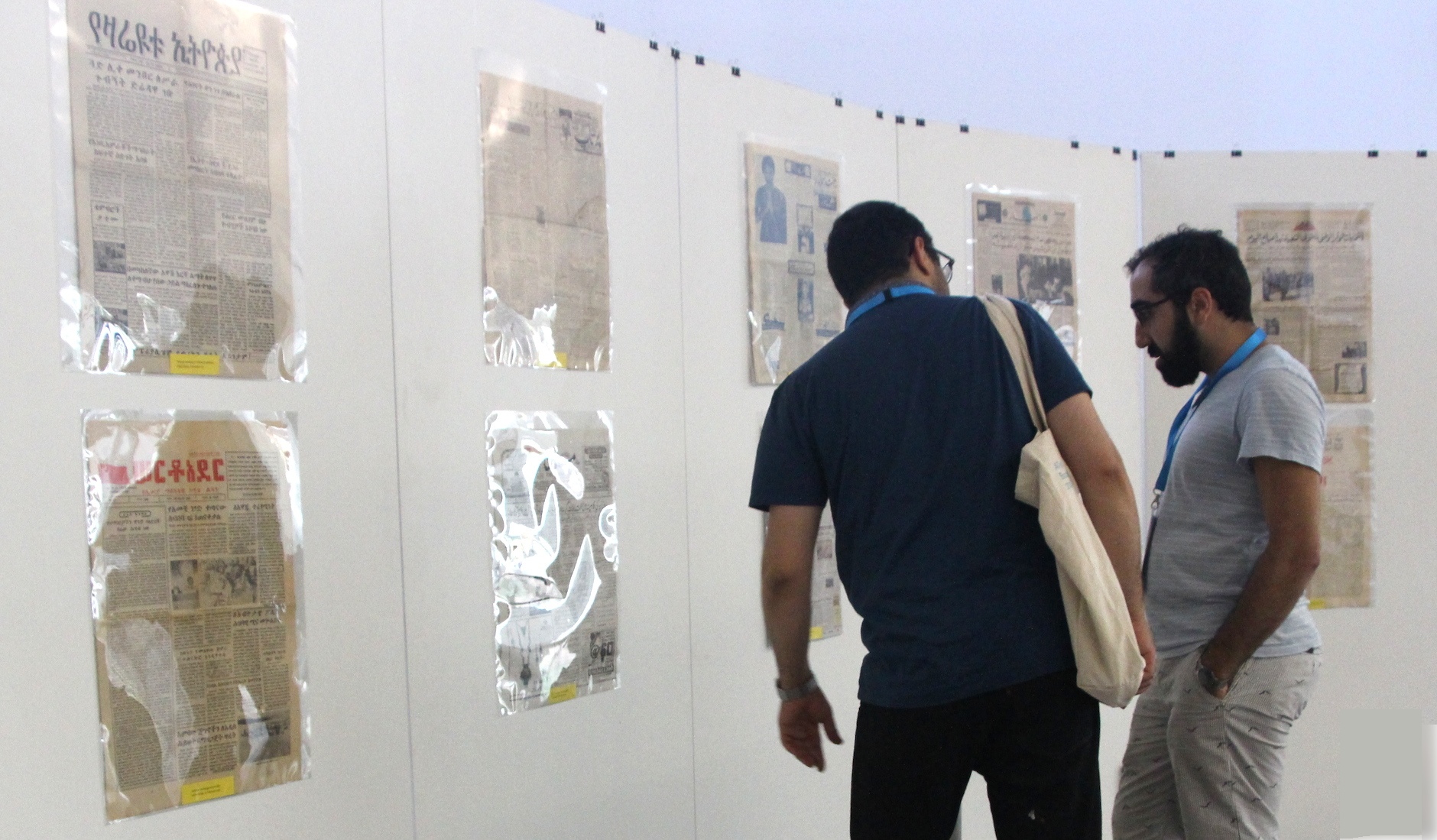
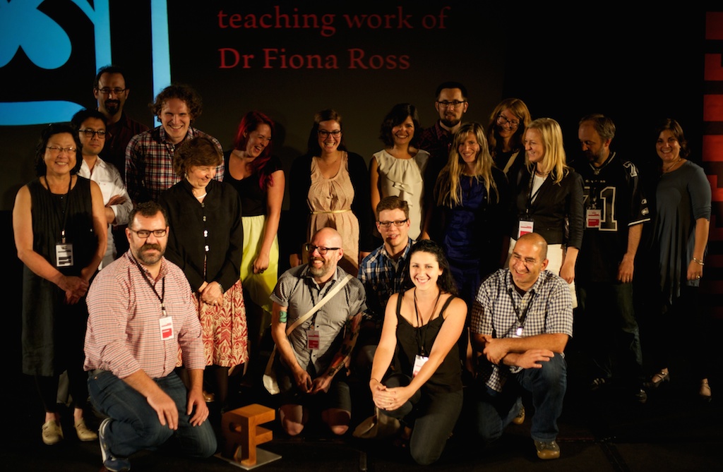
(Photographs by Laurence Penney)

This is not about fonts

QZ article on fontsQuartz just published an extensive report on the globalisation of the typeface design market and the impact on the communication sector, with support from Gerry Leonidas, alumnus David Březina, and a reference to MATD alumna Juliet Shen’s design for Lushootsheed.

Quartz’s post is another entry in a the growing list of articles in business and general interest publications about typefaces, evidence that awareness about the importance of typeface design is spreading to fields far outside the design sector.


Thesaurus of ephemera terms

In November 2013 Typography’s Centre for Ephemera Studies (CES) published a Thesaurus of Ephemera Terms, which is freely available for download here, in two versions: alphabetical and top term order.

Ephemera Thesaurus

Top term report

At present there are no plans to provide a searchable version. While not wishing to undermine the integrity of the thesaurus it is understood that users will adapt it for their own purposes as circumstances change.

We would welcome any comments and suggestions for improvement received before the end of 2014, as we intend to issue a revised version in 2015.

Please send comments and suggestions to ephthes@reading.ac.uk.