Earlier this week Gerry Leonidas joined Bernard Baker, Business Development Director for the Public Sector at SAS UK in a series of radio interviews to discuss the just released ‘Communicating with the Citizen’ report, commissioned by SAS and carried out by YouGov. The marathon session (seventeen radio stations in one day!) picked up on the report’s clear indications that the public wants forms to be more clear, to see a greater use of online channels for communication with the government, and to explore positive incentives in form-based communication.
Author: Test User
BA and MA final displays of work
The public viewing for the BA and MA displays of work this year is from Tuesday 19 June to Saturday 23 June. This will include work by BA Graphic Communication, MA Book Design, and MA Information Design students!
We are open from 9.00am to 5.00pm, and on Saturday from 10.00am to 3.00pm. All are welcome to visit; some helpful location information is here, or contact Charlene McGroarty (c.mcgroarty@reading.ac.uk) for more information.
Gerard Saint in the Department

Inspiration and a fresh perspective for the next Part 3 project was provided last week from Gerard Saint, founder and creative director of Big Active.
Big Active, who are responsible for the visual image of hundreds of artists since it was founded in the early 90s, (notably Keane, Beck, Goldfrapp, Basement Jaxx) work on the philosophy that the best work is appropriate to the ‘spirit’ of the artist or band. Ideas and input to the final brief comes from ‘all sorts of people’ — from the band or artist themselves to their management and the record label. Each project, Gerard told us, is really different; some artists have a very clear idea of how they want themselves and their sound to be ‘packaged’, others prefer less involvement and take their lead from the creative thinking and image making of the designers, illustrators and photographers that form part of the Big Active network.
Gerard spoke about the changing landscape of music design. In a world where CDs and downloads are essentially delivering the same information, and, furthermore, consumers can ‘cherry-pick’ tracks without hearing the whole album, designers need to rethink the physical product in a way that gives it a reason to exist outside the digital content it carries (make it collectable! make it interactive!)
He is optimistic: ‘It’s just the medium of delivery that is changing. CDs, vinyl, digital formats can sit side by side, each making the most of its own particular strength. Music design is becoming a much broader discipline; that can only be a good thing for designers in the future.’
Questions from students went into extra time and students were invited to visit the Big Active studio in London.
Black ephemera: printed depictions of people of African descent
On 4 July 2012, the Centre for Ephemera Studies is holding a study day that will focus on the ways in which black people from the African and Caribbean diaspora have been represented in printed ephemera over the last two hundred years.
Beginning with images printed before the abolition of slavery, ephemera have provided various opportunities for advertisers and others to depict black people unfavourably for their own ends, including packaging, advertising, trade cards, sheet music, postcards and greetings cards.
With contributions by twelve speakers – including historians of black culture, curators, ephemerists, and those concerned with community relations and racial equality – the study day will discuss the graphic and verbal stereotyping that resulted from these practices. An exhibition of ‘black ephemera’ will illustrate some of the most common, and troubling, forms of stereotyping, and will provide a backdrop for discussions.
This one-day symposium (starting at 10.30am, until early evening on Wednesday 4 July) will cost £50 to attend, including lunch.
If you would like to attend, please email Diane Bilbey (d.j.bilbey@reading.ac.uk). Further details and booking form are here: Black ephemera study day.
Collaborative type design in Adobe Creative Suite 6

The new Creative Suite 6 will ship with a Devanagari typeface in two weights, designed collaboratively by Tim Holloway, Fiona Ross and John Hudson. The new typeface, first released in 2011, had to be legible in both screen and print in text-intensive documents, while addressing the challenges of the heavier weight and offering a distinctive, modern interpretation of the script. The typeface takes a new approach to a traditional script, achieving a dynamic, fluid style with open counters, delicately flaring strokes, and a rounded treatment of distinguishing elements.
This design approach is intended to counter the effect of repetitive verticals and horizontals prevalent in earlier typefaces. OpenType features and a character set of around 800 characters are employed to achieve a more sophisticated typographic texture, utilising alternative contextual forms, and regional variants.
More details and images on the Adobe Typblography blog.
Star Wars internship at the Theme Group

Local design agency Theme Group change their road sign every month, using pixel art to mark an anniversary or seasonal topic. The winner of the May competition was Part 1 student Craig Melvin, whose design reminds passers-by that this month is the 35th anniversary of the Star Wars film premiere. Although Craig would have preferred the sign to go up on May the 4th (ed. Oh, come on!) he is pleased with his internship at Theme during the summer vacation.
Reading types in Oxford English dictionaries
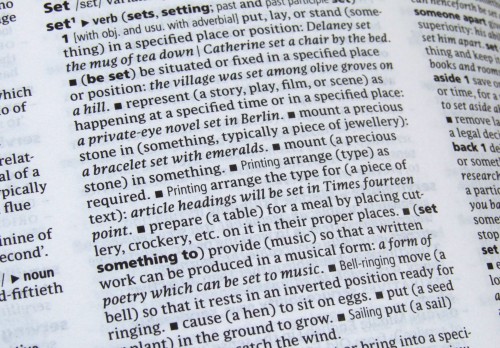
Many of the various printed editions of Oxford dictionaries are now typeset principally in Parable, a typeface designed by Christopher Burke, Research Fellow in the Department. These include the Concise, Compact, Paperback, Pocket, Little, and Colour Oxford Dictionary as well as the Oxford Paperback Thesaurus. Parable is also used effectively in the Oxford Dictionary of English (pictured) – a hefty hardback representing contemporary usage – for the entry texts, alongside Frutiger and Argo (designed by our Visiting Professor, Gerard Unger).
Christopher designed Parable between 1996 and 2002, specifically for use at small typesizes in books such as dictionaries and bibles. It was introduced into the Oxford dictionary range in 2004 by OUP designer Michael Johnson (also an alumnus of the department) when he was redesigning the Concise Oxford Dictionary. At Michael’s request, Christopher designed an alternative italic ampersand especially for the entry ‘ampersand’, because the dictionary’s editors were uncomfortable with Parable’s Granjonesque one. (See more about this here.)
Typography on Radio 4!
Gerry Leonidas and Paul Luna contributed to the BBC Radio 4 documentary on the ampersand – Ampers-fan – at 4pm on Monday 30 April. Here’s the link to the programme on iPlayer.
Introduction to wood engraving
Rob Banham has a new appreciation for the art of wood engraving after his first attempt at the process. He was one of the first students to take ‘Introduction to wood engraving’ at St Bride Library. Material from the Library, including blocks and prints by Thomas Bewick and Eric Gill, provided inspiration during six weeks in which the students were guided from their first nervous cuts through to printing an edition of their first block. The course is run by painter and printmaker Peter S Smith who currently has his work on show at St Bride along with prints by Rob and the other students. St Bride offers a variety of printing and printmaking courses in their Print Workshop.
Typography in textbooks, in Warsaw

The International Conference Od „Ala Ma Kota” Do E-Matury in Warsaw will bring together typographers, designers, publishers, entrepreneurs, teachers, and policy makers from different European countries, to explore the correlation of the design of educational materials and efficiency in education.The rapid-fire event (TED-style condensed presentations of 16 minutes each) will review the current thinking on paper textbook design, and question how to design for new technologies entering the classrooms, from primary to higher education. Gerry Leonidas will link conventional typography with the interactive, expansive, and global typography emerging in text-intensive publications. Bringing things full circle, Gerry first spoke of these trends in Warsaw: nearly five years ago, in the 1st Book Design Lectures by the STGU (English report by the Book Institute here) on “Book design in transition: a threat or an opportunity for designers?”


