Author: Petra Easton

En dash!

For this project we were set to design our own movie listings flyer, sized A5. The aim was to understand hierarchy or text and to appropriately apply this through spacing, colour and extrinsic features of type. It took me a while to get started with this because there were so many different paths I could take, for instance, I had to decide which pieces of information to prioritise over others.

I ended up putting the movie title as the most important by making it the largest text size (other than the main title) as well as making it bold. I differentiated between other pieces of text by using italics, different weights and sizes. In an attempt to stop the repetition of information I decided to make each column correspond to a different month, however due to lack of space on the second column I had to be a little more creative with my placement of November, making it vertical and sit on the side of the column. I’m still not to sure if this was the right thing to do because I’m slightly worried that it isn’t too clear that the second column belongs to November or not.

It was helpful to go through some critique with the class on some examples of work, this reminded me that I had been hyphenating wrong and had to go through and change everything to an en dash.

 

Psycho

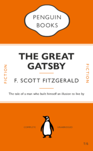
This was my first time using Indesign, I found it interesting how you can attach certain elements to text (in this case, lines) that would move with the text depending on what was written. I decided to base my second Penguin cover off the 1960 psychological horror Psycho. I played around with different ideas at first, for instance adding blood splatters across the cover or some sort of water damage effect to highlight the shower scene but I ended up going with a much more subdued look, just adding some drips down the title (although I am worried this makes it look slightly tacky and halloween-ish). I also changed all the colours to greyscale because the film is in black and white.

An exploration of protest

For this task we were challenged to create two similar images- one that perfectly encapsulates the keyword and another that would change the meaning. My word was ‘Protest’. At first I had difficulty figuring out where to go as protest could mean so many different things, it meant I found it hard sticking to an idea. Eventually I decided to explore two variations of protest, one being huge organised protest in which large groups of people come together, and the other being a more individual and vulnerable protest. The oppressive force in both of these images would be the policeman, due to the recent examples of police brutality throughout the world as well as that same brutality but on a much more personal scale (for instance, domestic violence). Both images include the policeman in full riot gear, with one of them having silhouetted protesters in the foreground, and the other having a mother and child. I definitely think I could have detailed these images better to perhaps push further the idea as I don’t think it is easy enough to understand without the explanation with it.