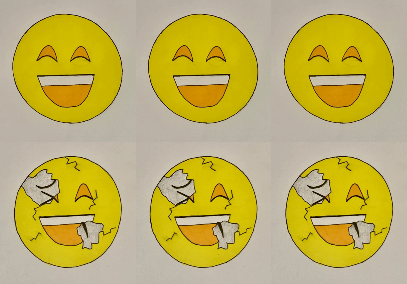
For Sara’s project, I was given the word “happiness”. The first thing that popped into my head was the classic smiley emoticon. After trying to explore other ideas I chose to go with the emoticon as emoticons nowadays are like a universal language, it’s almost guaranteed that my theme would be understood.
For my altered version of my original image, I chose to have cracks and pieces broken away from the smiley face revealing small hints of a sad, monochrome face. The cracks and fragments missing from the face were to show how fragile happiness can be and that sometimes even someone who looks like they couldn’t get any happier, are still pretending to smile. I chose to strip away the colour from the face behind the smiling mask as happiness is often associated with bright colours, particularly yellow. I felt that taking away that bright colour helped to increase the contrast between the two faces, therefore making it easier to differentiate between the two.
If I were to do this again I would have liked to use adobe software to use the original emoticon and then edit it digitally.

