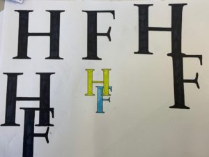
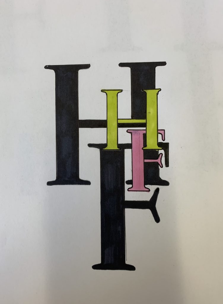
In todays session, we used our initials to create a monogram, experimenting with Futura and Garamond. After experimenting with both, I felt that my initials worked best in the Garamond font. I began to play around with different variations of the letter together. Alongside this, I researched brands that have used a monogram logo and how and where it has worked successfully. I came across the Dior monogram logo that has recently proven to be very popular. I was inspired by this to layer ,y letters over each other. I thought this looked a little dull so I began experimenting with colours.
For my final idea, I mixed in my two experimentations to create a monogram print. I really liked how this turned out and how the colours worked with each other. Next time, I would play around with the positioning of the letters a bit more to ensure they were legible.


